University Anniversary Logos
Eastern Michigan University 175th Anniversary Logo

There are a few elements that show up regularly in both anniversary logos as a whole and designs for universities, and while this holds to a fairly traditional design, it does so in a nice clean pckage. Around the outside of the circle is the name of the university, in the center is the big number for the years of operation. A few laurel leaves curving around the sides to fill in the gaps and two rings to hold it all together and you've got a simple but effective design.
More Details →Lake Tahoe Community College 50th Anniversary Logo

This is a fairly simple but surprisingly unique anniversary logo lockup. Yes, it starts with the classic number fifty on the left and uses the word "years" in a short ribbon which are all common elements. But the flag extending from the right side of the zero to hold the college's traditional logo is something i haven't seen before. It's a nice little design that gives the school a nice little package to work with.
More Details →Salem Academy & College 250th Anniversary Logo

In a classic style, this logo takes advantage of the three digits in their anniversary number to connect and overlap each number to create a creative, unique number mark that also creates space along the top right for a shortened name of the university. Around the number 5 sits the years of operation with the full name sitting below to create a simple, balanced logo that would work great in many contexts.
More Details →Illinois Valley Community College 100th Anniversary Logo
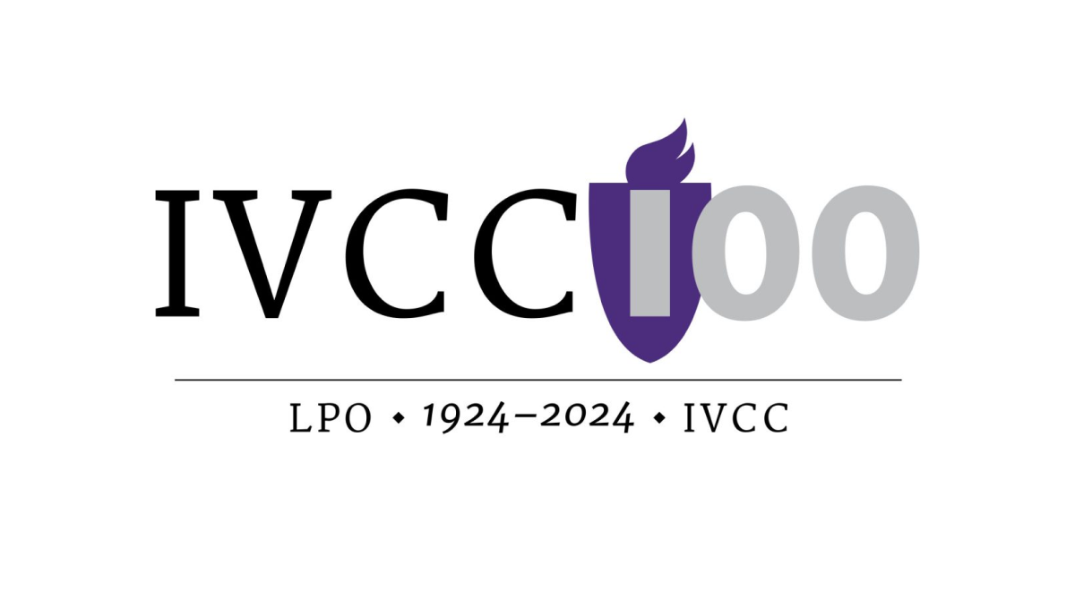
Universities have a unique feel, voice, and set of imagery that is used neatly and effectively in this logo for Illinois Valley Community College. A flame in the school's classic purple color sits behind the first part of the number one hundred, a serfed typecase from the original logo spells out their abbreviation of the school, and a little extra context sits below for a simple but balanced design.
More Details →De La Salle School 70th Anniversary Logo
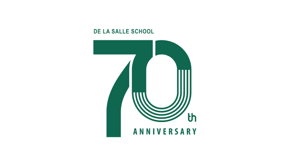
This clean design goes big on a large number 70 to mark the occasion of the celebration and places the name of the school along the top of the number seven and the word annivesray below the number zero. The mark may not be as easy to swap with their traditional logo, but with a clean style and wider shape it's a great fit for banners, swag, and events that often accompany the way universities celebrate the occasion.
More Details →University of North Texas 125th Anniversary Logo
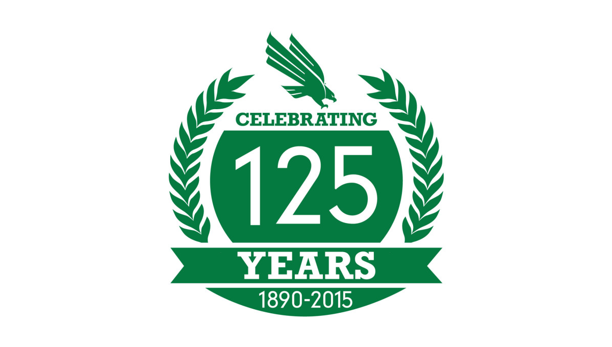
With a classic laurel-leaf style of many crests and anniversary logos, this mark uses these illustrations to create a simple, round shape to work with. Inside that shape is a large number 125 along with the words celebrating, years, and the years of operation. A ribbon holds some of these words while the gab between the laurels at the top is filled with the university's traditional logo.
More Details →Northern Illinois University 125th Anniversary Logo
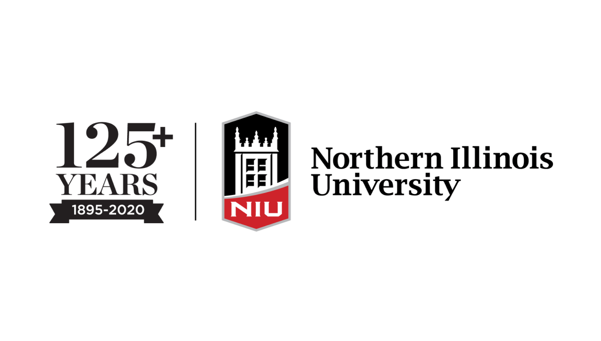
With the popular vertical-line style as the foudnation, this university placed their traditional logo on the right side of the line and a stylized number to higlight the anniversary they're celebrating on the lft. By using the same typefaces alongside the original logo, this mark makes no mistake about which brand is celebrating and creates a clean, well-designed package that can be used easily in marketing collateral.
More Details →Governors State University 50th Anniversary Logo

With an offset number 50 as the canvas for this logo, the designers filled in the zero with a dark blue and placed the university's traditional logo in the center to make it easy to tie this back to the original brand. Around the outside of the zero sit the name of the university and the years of operation, with a vertical flip between the two to keep most of the letters right side up and improve readability.
More Details →Wright State University 50th Anniversary Logo
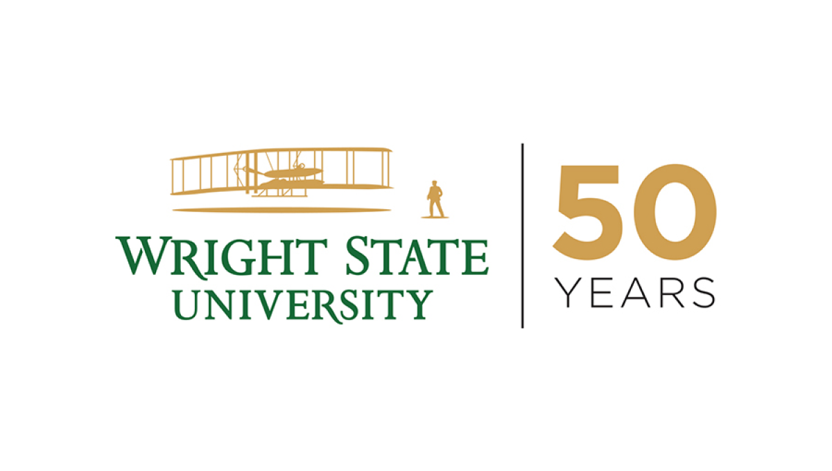
Using a style that is becoming more and more common for anniversary logos, Wright State simplye takes their traditional logo and places a vertical line between that mark and a simple anniversary mark that focuses on the number rather than a unique design. In this cast, a large number 50 in their brand gold with the word "years" below in their brand green.
More Details →Drexel University 125th Anniversary Logo
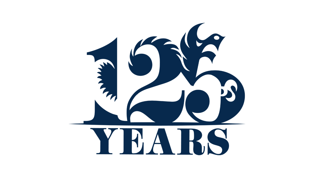
Designed by a student as part of a year-long project, this beautiful anniversary logo combines a large, block number 125 with the school's famous dragon logo to create a design that, remarkably, is easy to identify both elements within despite using a single color. With a block word "years" below, this is a beautiful example of design and art in a thoughtful, meaningful logo.
More Details →University of Chicago 125th Anniversary Logo
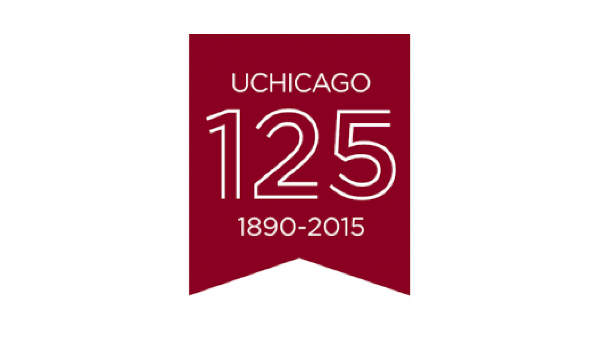
Keeping it simple, this logo uses a vertical ribbon-style banner in the school's main brand color to create a space for this celebratory mark. With a line-art depiction of the number 125 in the center, the name of the school above the number, and the years of operation below, this mark checks all the boxes in a clean, simple package.
More Details →DePaul University 125th Anniversary Logo
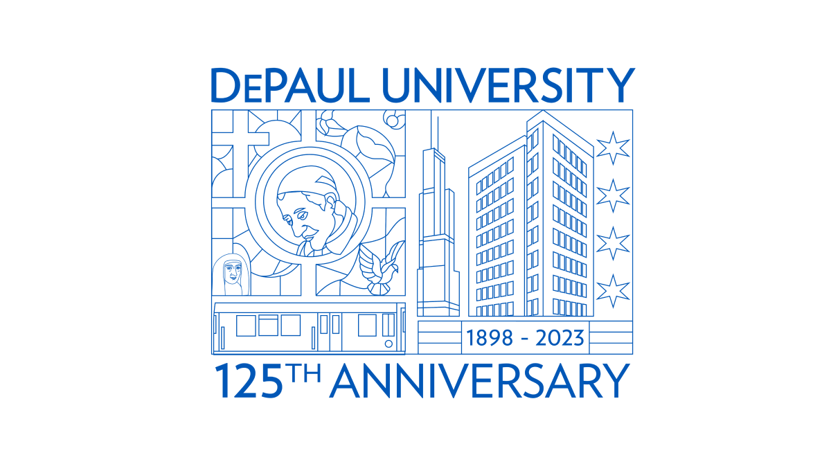
Using beautiful line art of the city in which this university is location and famous figures from their story and history, this annivesary logo is an incredible design that stands out from traditional annivesary logos. With this art at the center, playing the name of the school and the year that is being celebrated above and below in the same brand blue is all that was needed to balance out this design.
More Details →Carlow University 90th Anniversary Logo
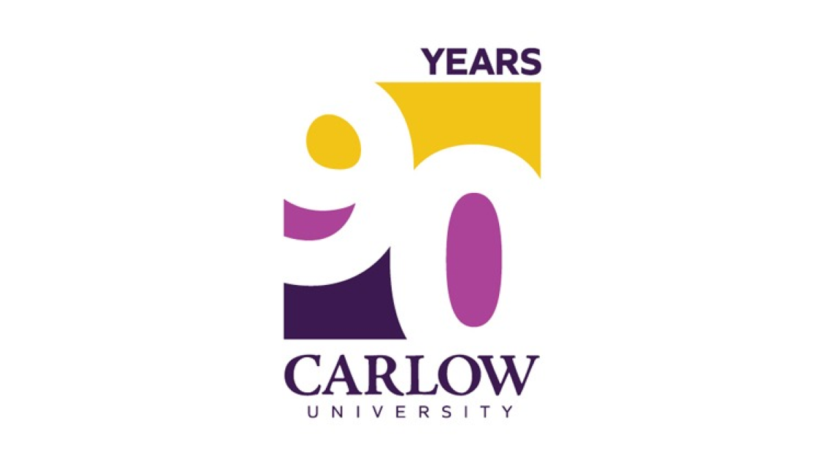
This logo clever uses negative space to blend the year they're celebrating with their brand colors. They start with a vertical rectangle that holds a staggered number 90 that goes edge to edge. The white number leaves spaces for three colors in the top, middle, and bottom of the rectangle with the word "years" at the top and the name of the university at the bottom.
More Details →University of Missouri - St. Louis 60th Anniversary Logo

This logo sets the stage with a large number sixty with the six shifted up from the zero. Inside the six sits the years of operation for the organization, inside a filled-in zero sits the school's trident mark. This strong mark sits to the left of the name of the organization in black text, stacked on two lines and lined up vertically with the zero.
More Details →Columbia International University 100th Anniversary Logo
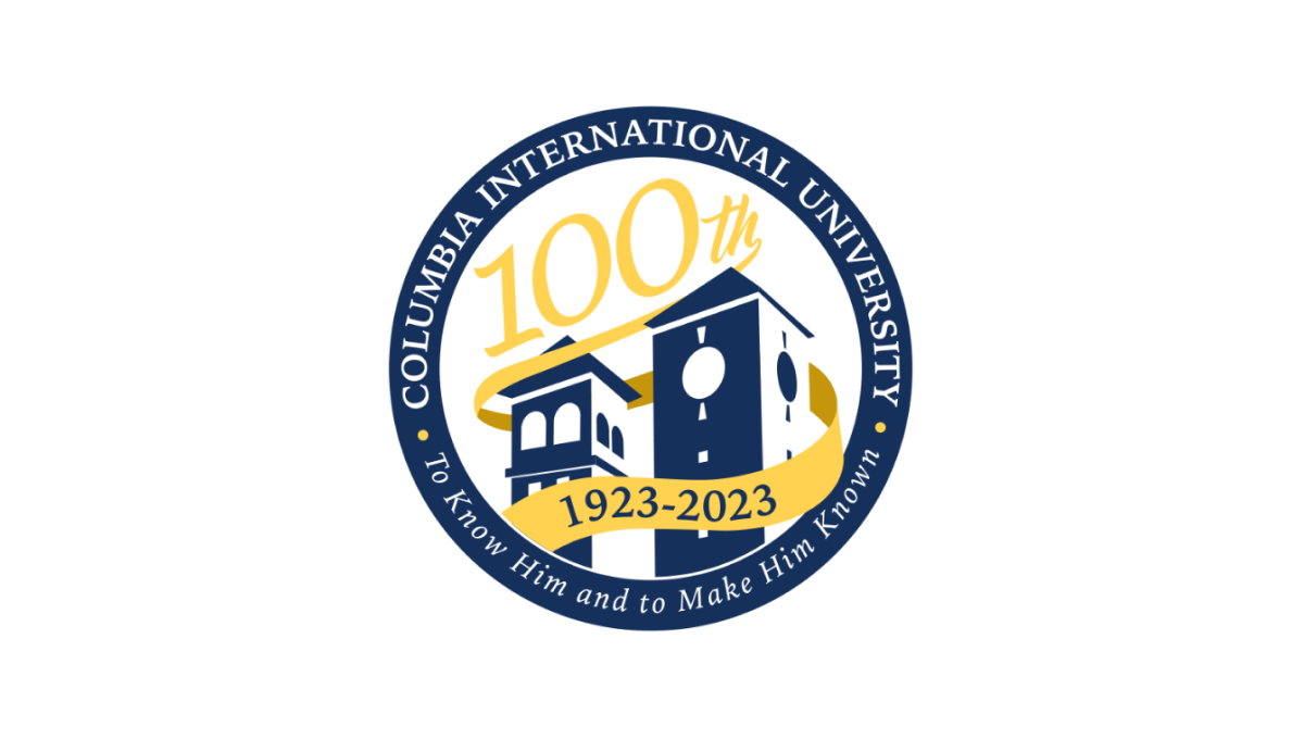
This logo uses a circle with a thick, navy blue border as the foundation. Inside that rim sit the name and mission statement of the school. Inside, a three dimensional silhouette of the school's famous buildings fills in the lower half of the space with a large number 100 in yellow following the angle of the buildings to neatly use the rest of the area inside the circle. A ribbon wrapping around the buildings then completes the design and contains the years of operation.
More Details →California Coast University 50th Anniversary Logo
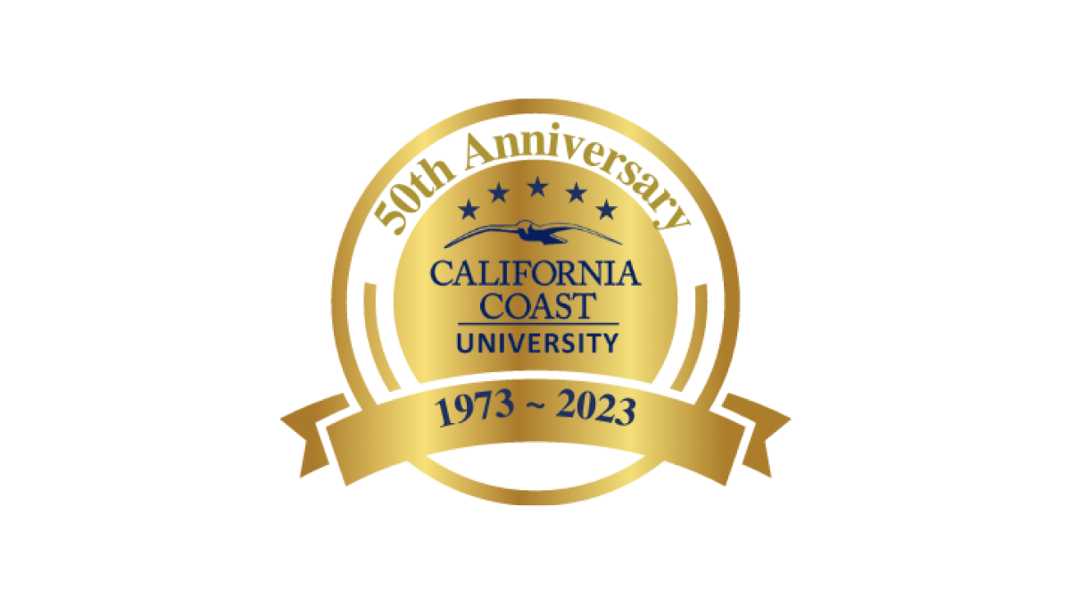
With a very class "seal" style shape as the base, this logo from California Coast University simply adds some dark lettering inside that seal shape to crate a mark that does it's job and doesn't require to much complexity. Like many of this circular, seal-shaped logos, they've also added a ribbon at bottom to display their dates of operation.
More Details →