Number Anniversary Logos
Hardwood Classic 45th Anniversary Logo
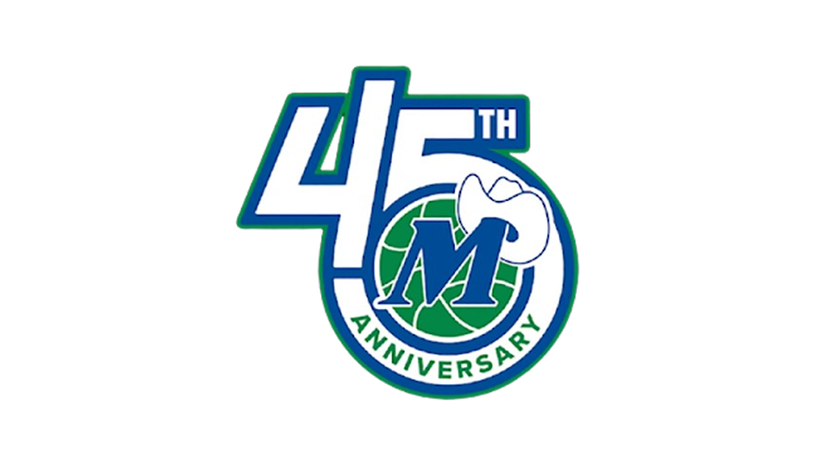
This anniversary logo has a clean, compact design with a bold and modern appearance. The anniversary number is the main focus, while a circular emblem is blended into the layout to give the design a unified look. A simple blue, green, and white color palette creates a fresh and professional feel, and a small graphic element adds a touch of personality. Overall, the logo presents the milestone in a clear, balanced, and recognizable way.
More Details →Family Guy 25th Anniversary Logo
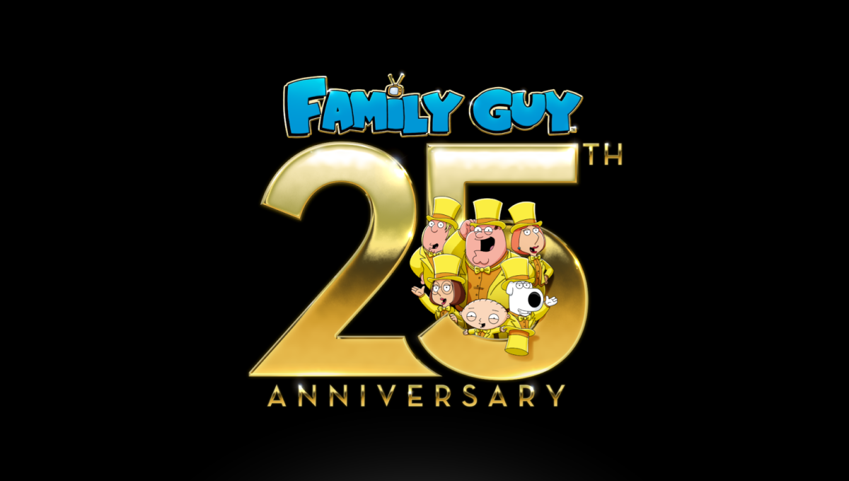
This anniversary logo has a bold, celebratory style with a playful and eye-catching layout. Large metallic numbers create a strong focal point, while bright colors and familiar illustrated characters add personality and energy. The milestone is clearly emphasized, with the characters integrated into the design to create a sense of fun and connection. A dark background helps the gold elements stand out, giving the overall logo a festive, polished, and memorable appearance.
More Details →Scott & Company 30th Anniversary Logo
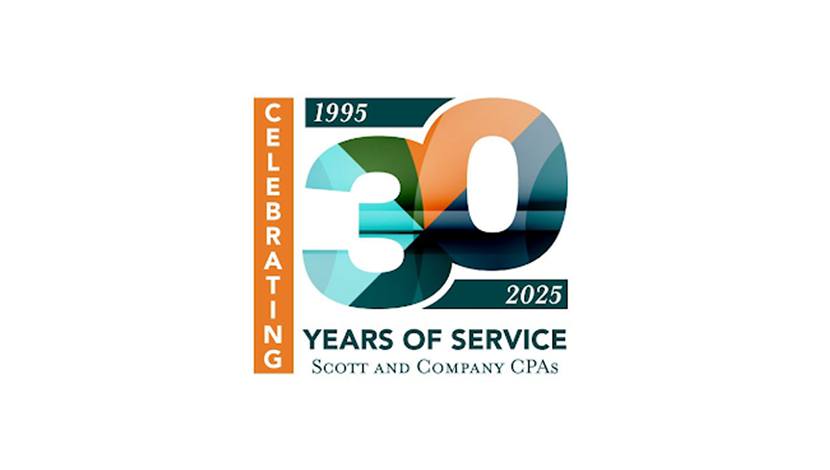
This anniversary logo features a bold “30” design with layered geometric shapes and soft gradient colors that create a modern and professional appearance. The mix of teal, orange, and dark blue tones gives the logo a balanced and polished feel. Simple date details and clean typography help highlight the milestone while keeping the design easy to read. Overall, the logo has a corporate yet celebratory style that feels contemporary, recognizable, and suitable for long-term brand recognition.
More Details →Disney Shanghai 10th Anniversary Logo
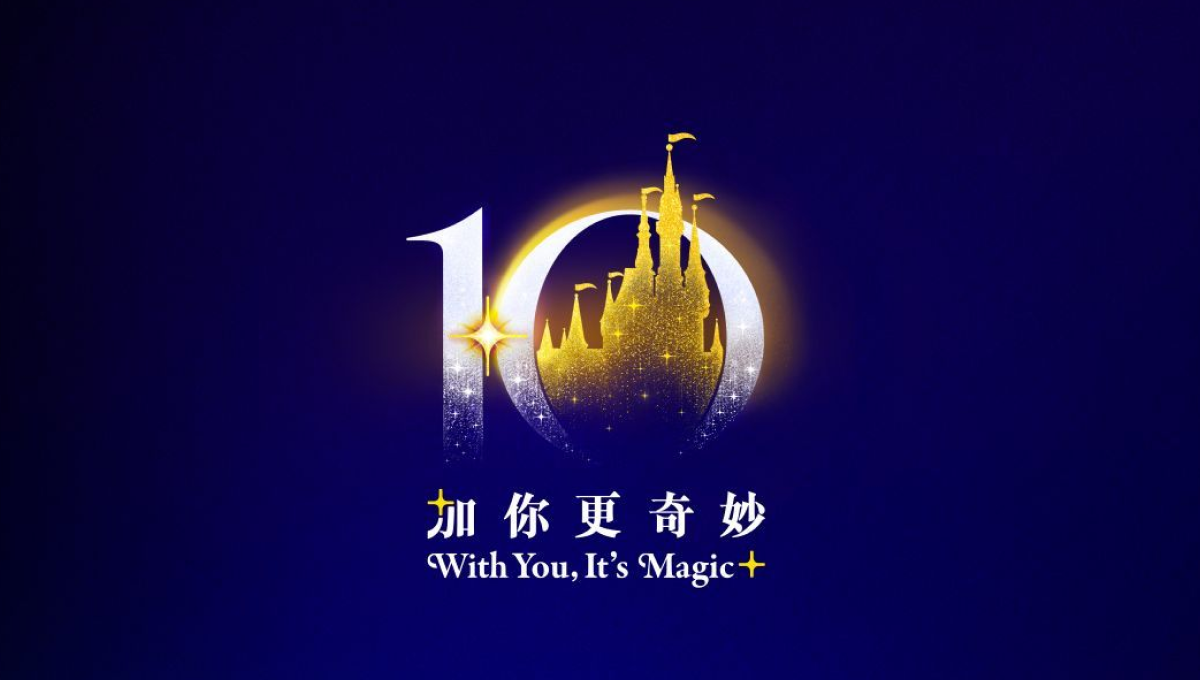
This anniversary logo uses a rich blue and gold color palette to create a polished and celebratory feel. The large “10” is designed with soft glowing effects, while a castle-like silhouette in the center adds a sense of imagination and wonder. Small sparkling details help give the design a magical atmosphere without making it overly complex. The mix of elegant typography and simple visual elements makes the logo feel memorable, festive, and connected to a long-standing brand celebration.
More Details →Kahuna 25th Anniversary Logo
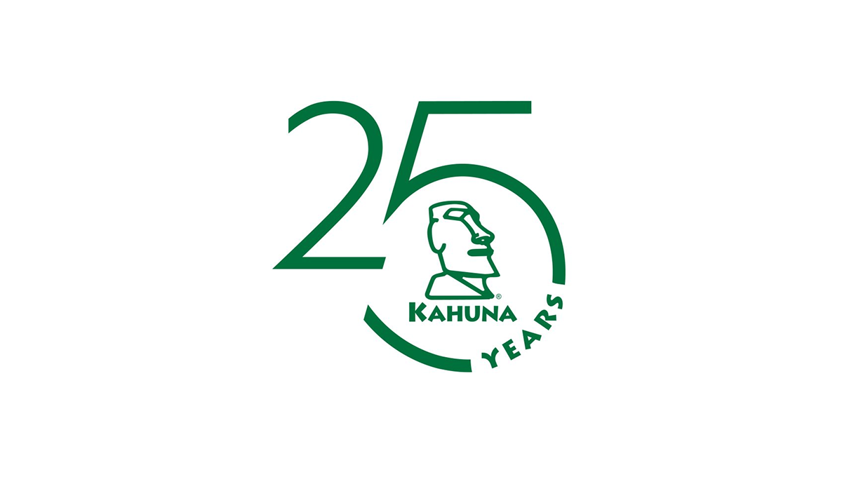
This anniversary logo has a clean and modern look with a simple green color theme. The large “25” design creates the main shape, while a curved circle element gives it a balanced and connected feel. In the center, there is a stylized island-inspired figure that adds character and brand identity without too much detail. The “Years” text follows the curve in a subtle way, helping the overall design feel smooth, professional, and celebratory while still staying minimal and easy to recognize.
More Details →HellermanTyton 50th Anniversary Logo
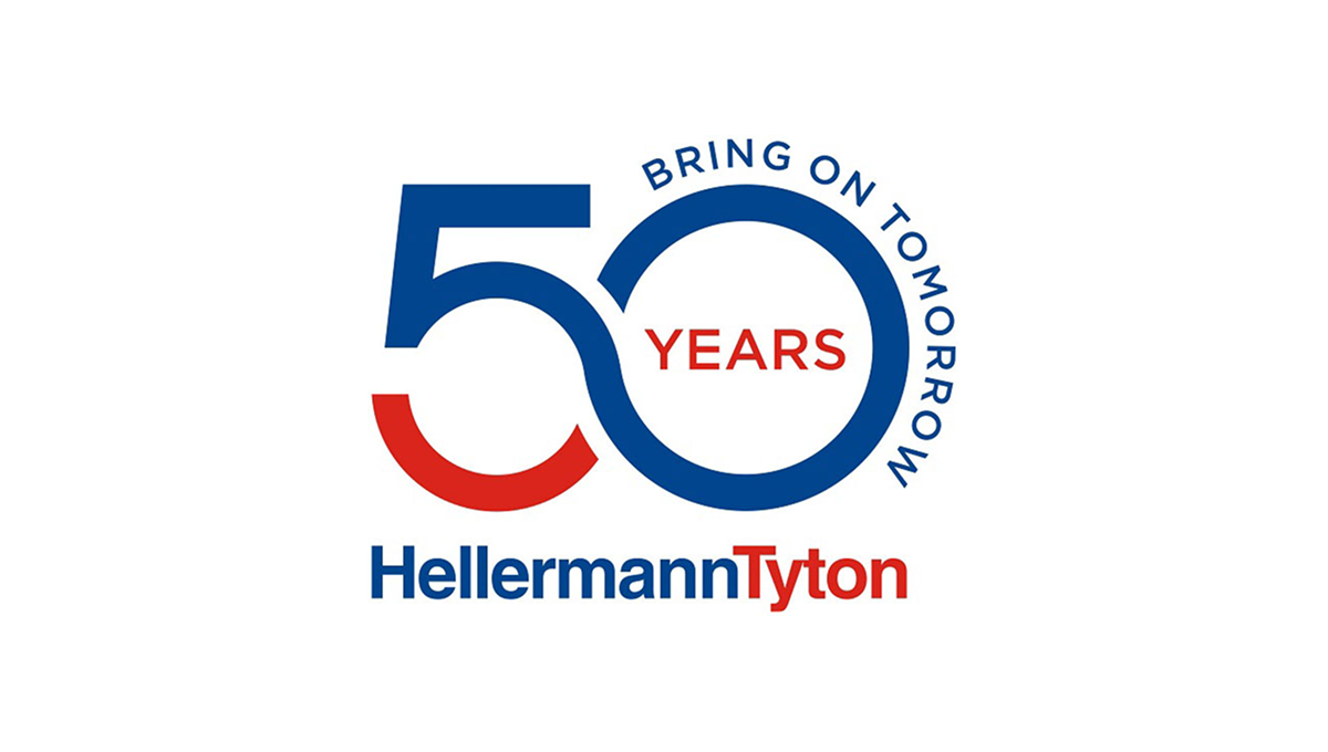
This anniversary logo uses a clean, modern style with bold shapes and clear text. The number “50” is large and flowing, forming a smooth, connected shape that feels forward-looking. Blue and red colors give it a strong, confident tone. The words “Bring on Tomorrow” suggest progress and optimism, while “Years” marks the milestone. Overall, the design feels professional, stable, and focused on long-term growth and experience.
More Details →Guiness World Records 70th Anniversary Logo

This anniversary logo is a nice take on the traditional guinnes world records logo. They just placed a '7' of the same style in front of their logo-- and BAM! Anniversary logo! It works really well, with the traditional logo being a 0 and having all the classic elements as the normal logo. The classic blue color works well to mark an imporant milestone.
More Details →Sunday Night Football 20th Anniversary Logo
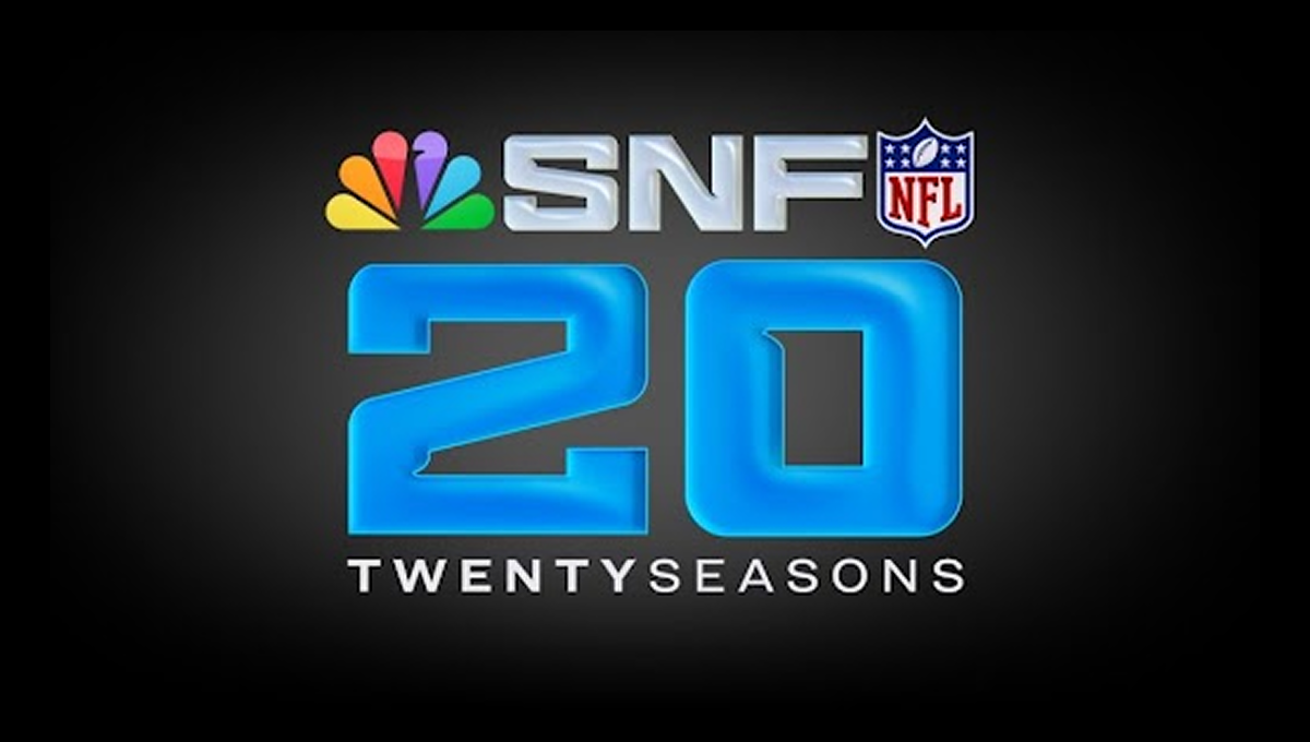
This anniversary logo has a bold, modern feel that highlights a major milestone. Large numbers sit at the center, giving the design a strong and confident look. Bright, glowing colors add energy and excitement, while familiar symbols suggest a well-known sports tradition. The layout feels polished and professional, with clean lines and balanced spacing. Overall, the design feels celebratory, current, and focused on marking an important moment in time.
More Details →Ski Utah 50th Anniversary Logo
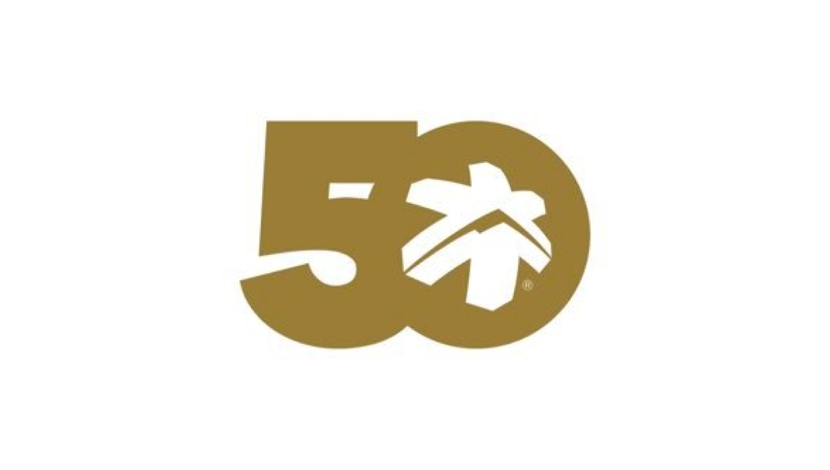
This anniversary logo highlights the number 50 in a bold, smooth shape that feels strong and unified. The design uses simple curves and solid forms that fit together naturally. A small graphic element inside the zero adds a hint of character and meaning without being too specific. The gold color gives it a warm, classic look that suggests celebration and longevity. Overall, the logo feels clean, confident, and respectful of an important milestone.
More Details →Brundage 65th Anniversary Logo
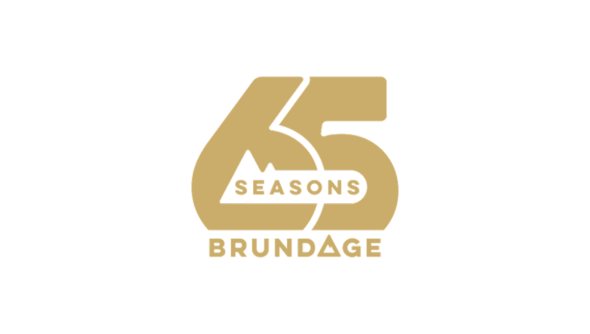
This anniversary logo features the number 65 in a bold, rounded style that feels solid and confident. The design is simple but carefully balanced, with the word “Seasons” placed across the center and “Brundage” below. A small mountain shape adds a subtle natural element without drawing too much attention. The gold color gives the logo a warm, celebratory feel, marking an important milestone.
More Details →Sugarloaf Mountain 75th Anniversary Logo
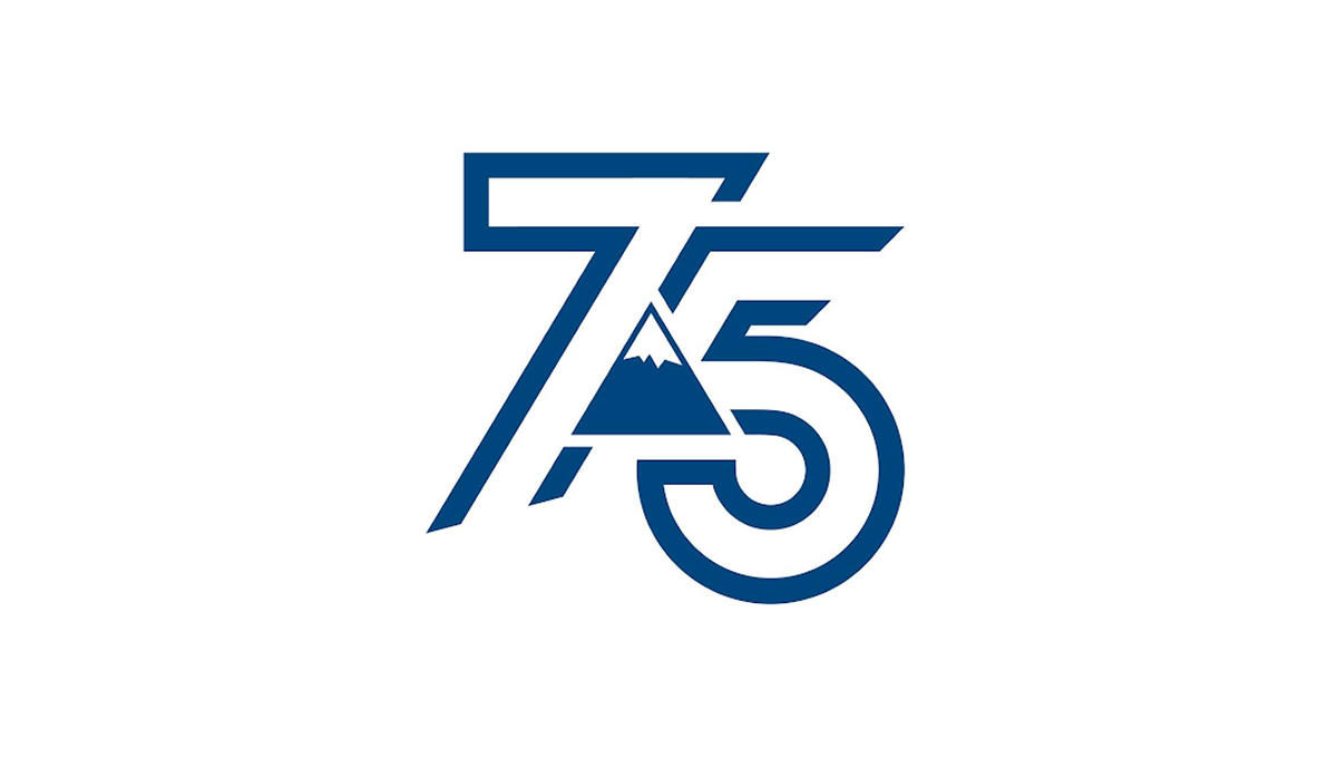
This anniversary logo shows the number 75 in a bold, clean style. The numbers are shaped with smooth, modern lines that feel strong and balanced. A simple mountain shape appears in the center, adding a quiet sense of place, history, or growth. The blue color gives it a calm and trustworthy feeling. Overall, the design feels modern but respectful, marking an important milestone without being too detailed or busy.
More Details →Heavenly Mountain Resort 70th Anniversary Logo
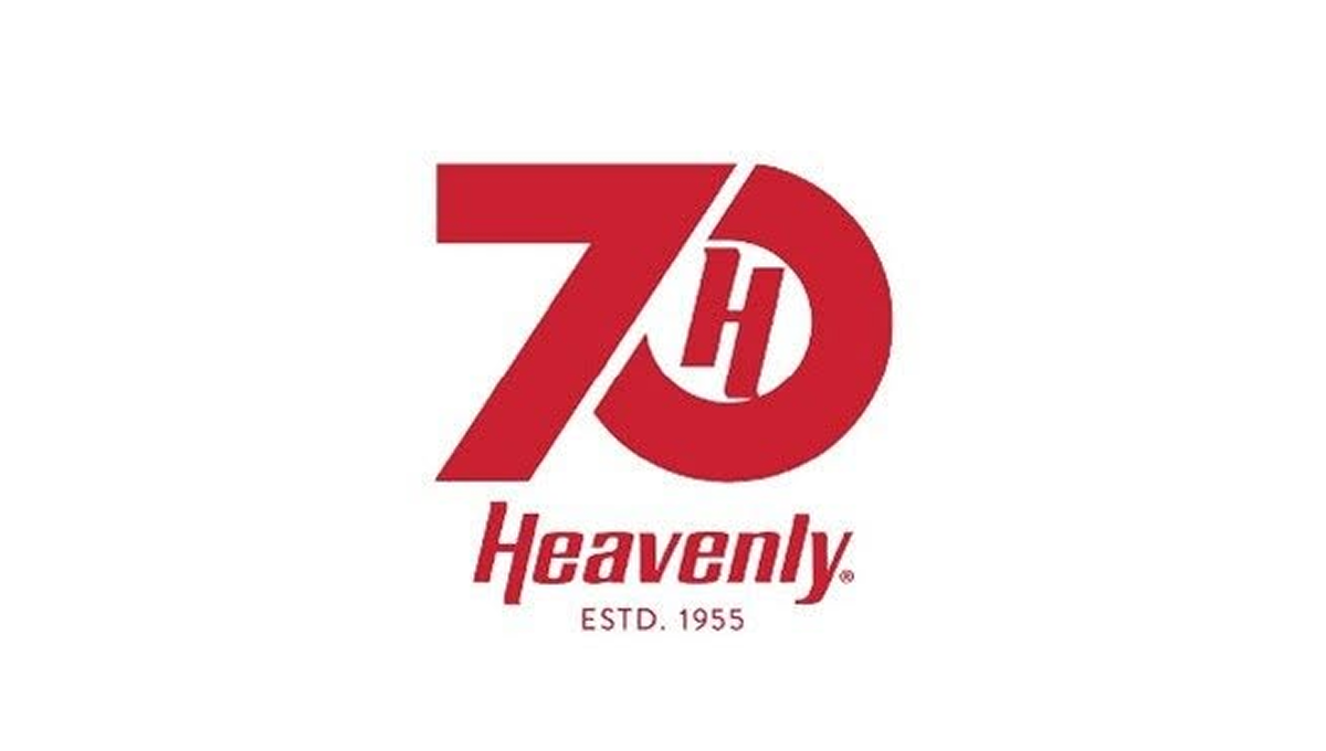
The anniversary logo has a clean and balanced look that feels modern but also familiar. Simple shapes and smooth lines come together in a calm, thoughtful way. The design suggests a sense of time passing and shared history without showing too much detail. The colors feel steady and respectful, giving the logo a warm but professional tone. Overall, it quietly marks an important milestone while staying clear, flexible, and easy to recognize.
More Details →Whistler Blackcomb 60th Anniversary Logo
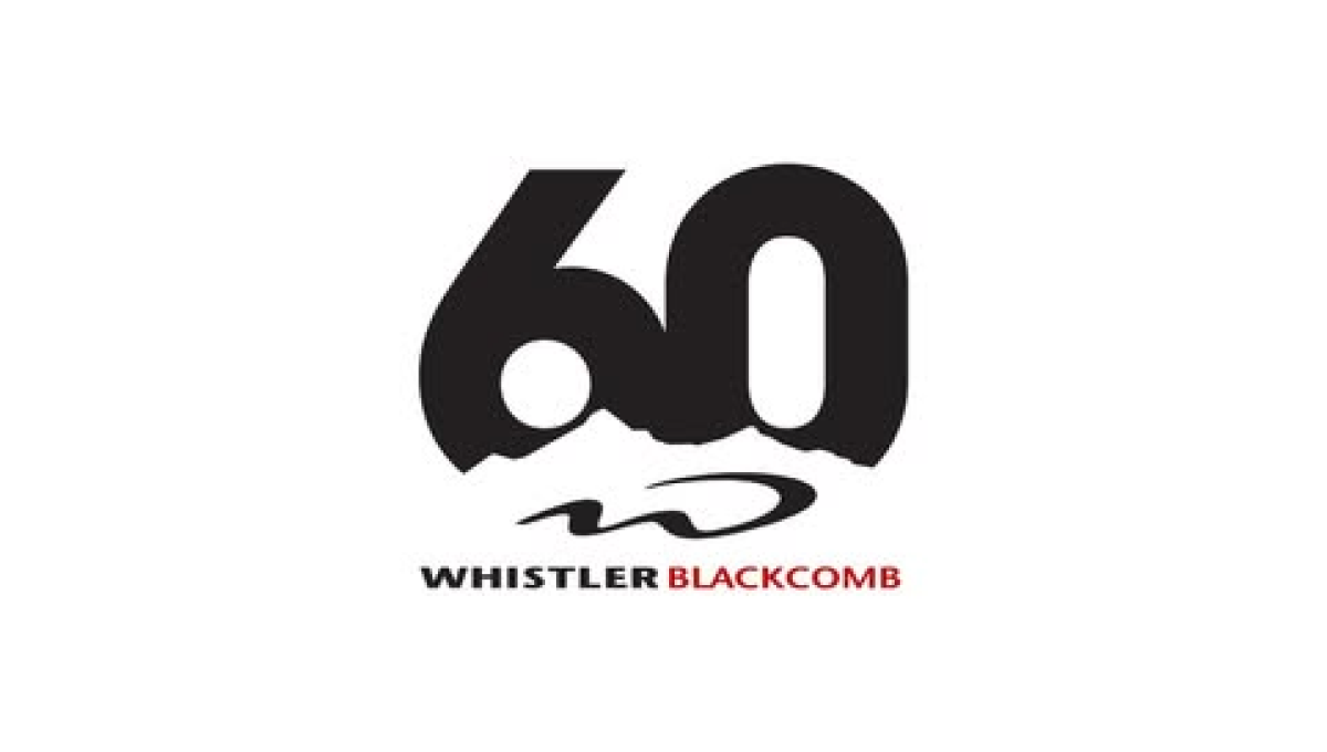
The logo centers on a large, bold 60 in dark lettering, with a rough, uneven edge along the bottom that suggests mountains or natural terrain. Below the number is their logo. The name appears underneath in clean, straightforward text, with a small pop of color for contrast. The overall design feels modern and minimal, marking the anniversary in a strong but understated way.
More Details →Martock 60th Anniversary Logo
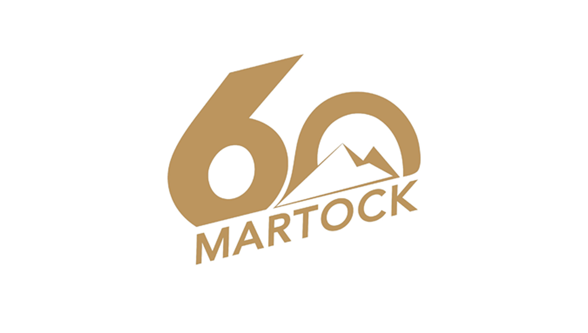
The logo features a large, bold 60 as the main focus, using smooth, rounded shapes. Inside the zero is a simple mountain outline that hints at an outdoor setting. Below, the name appears in clean, angled lettering that feels modern but grounded. The single warm color gives the design a calm, unified look. Overall, it feels straightforward and confident, marking an important anniversary without too many extra details or decoration.
More Details →Castle Mountain Resort 60th Anniversary Logo
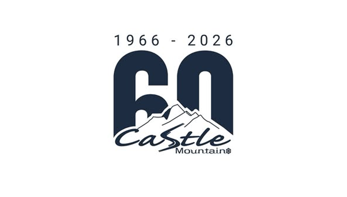
The anniversary logo shows a big 60 in dark block numbers with the years “1966 – 2026” above it, marking six decades. Below the numbers is a simple mountain shape and the name of the resort in a casual, flowing script. The style feels calm and grounded, with smooth edges and easy contrast between the bold numerals and the softer text and graphic, giving a clean and clear sense of time passing and celebration.
More Details →Napa Auto Parts 100th Anniversary Logo
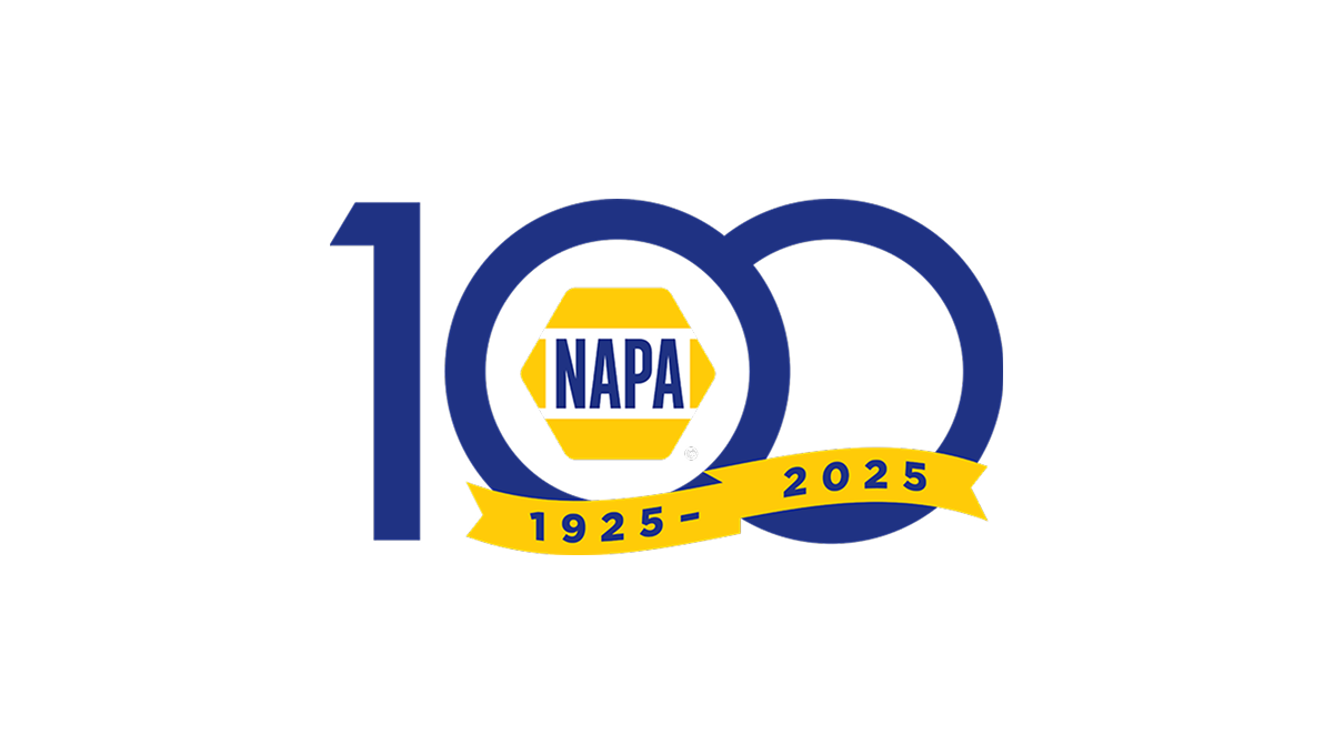
The anniversary logo shows a large, simple 100 with the classic NAPA badge sitting at the center in bright yellow and blue. Below that, a curved band has the years of the celebration in plain numbers. The basic colors and clear shapes give it a clean, straightforward look that marks an important milestone for the brand.
More Details →Mattel 80th Anniversary Logo
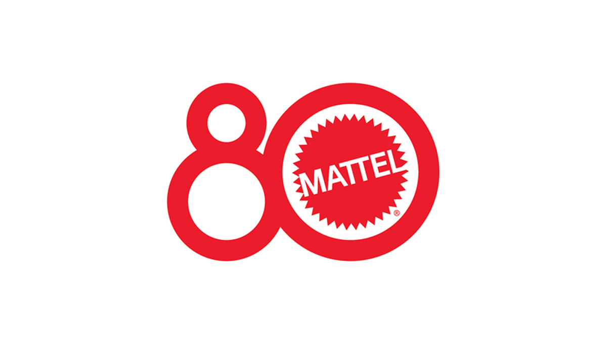
The anniversary logo shows a big, red number 80 where the zero is a bold circle around a familiar brand mark. The brand name sits in the center of that circle in plain, strong letters. The style feels bright and simple, with smooth lines and a clean look that catches your eye. It uses one color and a clear shape to hint at a long history and a big milestone moment.
More Details →Jaws 50th Anniversary Logo

This 50th anniversary logo has a bold and dramatic style. The number “50” is big and solid, with the word “JAWS” placed tightly above the number in its well-known red lettering. The colors are on the dark side, giving it a strong and serious feel. The design feels classic and a bit intense, matching the tone of what it’s celebrating, while still keeping things clean and focused.
More Details →SMI Snowmakers 50th Anniversary Logo

This anniversary logo has a clean and simple look, with soft colors and a modern feel. The number “50” is the main focus, standing out in bold, simple lettering. A short message underneath states the anniversary. Overall, it gives off a calm, respectful tone—something that feels official but still warm and thoughtful, made to honor a meaningful milestone.
More Details →Vanguard 50th Anniversary Logo

This anniversary logo is made up of a large number "50" with the signature V in the center of the 0, for Vanguard. The logo is made in a clean, bold red color, making it stand out from the white background. The font is simple and bold, giving it a strong look. In conclusion, the logo is a simple, creative way to celebrate this company's anniversary.
More Details →Disc Golf Pro Tour 10th Anniversary Logo

This anniversary logo has a bold and sporty feel, with a strong number “10” that stands out clearly. The design uses sharp lines and a modern font, giving it an energetic and active vibe. The colors are bright and eye-catching, helping the logo feel fresh and exciting. Overall, the logo feels confident and lively, celebrating the anniversary in a clean and upbeat way.
More Details →MT Rose 60th Anniversary Logo

This anniversary logo has a smooth, elegant look with a large number “90” that draws attention right away. The company name appears below in a clean, simple font, giving it a classic and steady feel. The colors are soft but still noticeable, and there’s a curved banner that adds a nice touch of movement. Overall, the design feels calm, proud, and timeless.
More Details →Brock Built 40th Anniversary Logo

This anniversary logo features a clean, modern design with a bold number "40" that stands out clearly. The company name is displayed in a strong, straightforward font underneath, giving it a solid and professional feel. The colors are simple and balanced, creating a calm and confident look. Overall, the design feels respectful and steady, marking the anniversary in a clear and tasteful way.
More Details →Dungeons and Dragons 50th Anniversary Logo

The Dungeons & Dragons 50th Anniversary logo showcases a dynamic fusion of fantasy and modern design. The number 50 is designed in a brilliant gold font, with a head of a dragon in the center of the 0. The accompanying "Dungeons & Dragons" text is presented in their signature font, balancing tradition with a forward-looking approach. This emblem effectively honors the game's storied past while signaling its continued evolution.
More Details →Rudolph the Red-Nosed Reindeer 60th Anniversary Logo

The anniversary logo for Rudolph the Red-Nosed Reindeer features a minimalist design that emphasizes simplicity and abstraction. The logo utilizes bold lines and circular shapes to represent Rudolph's iconic features, such as his nose and antlers. The use of negative space and geometric forms gives the logo a modern and clean look, while still maintaining a festive and recognizable connection to the beloved holiday character. This design approach reflects a contemporary take on traditional holiday imagery.
More Details →Tomy Toys 100th Anniversary Logo

Some logos seem to be well equiped to pair with a number of add-on to celebrate something like an anniversary logo and this is one of those. A rounded blue rectanged with the name of the company anchors the traditional logo on the left and by placing a stylized number 100 to the right - in this case by turning the zeros into an infinity sign - they've got a balance package that keeps the original logo as both the main element and the focal point of the design.
More Details →Vox 10th Anniversary Logo

Vox is a classic example of a company that cares deeply about brand consistency. And when you care about consistency, it can sometimes be either challenging or uneccessary to create an anniversary logo that adds in a bunch of new elements. So, Vox didn't. They took one of the existing brand fonts, made it nice and bold for a number 10, and placed their logo inside hugging the right line of the number 10. Clean, on-brand, effective.
More Details →Fair Lawn 100th Anniversary Logo

When you're hitting a big number, I love designs that really put that front and center. In this case, a large number 100 in yellow sits behind a simple graphic of a prominent landmark. To the left flies a banner with the word "anniversary" and below sits the name of the town that's celebrating the occasion. It's a simple, clean, and on-brand design that would work in a lot of situations.
More Details →Poynter 50th Anniversary Logo

Simple doesn't have to mean boring as this anniversary logo from Poynter proves. Yes, it's a simple number fifty with the usual word mark sitting above. But by adding just a little bit of depth to create the appearance of a three-dimensional, fading and twisting surface to that number? They created a really simple, but clean, design that matches the tone of the company overall without overcomplicating the design.
More Details →Wintergreen Resort 50th Anniversary Logo

While the resort does have other lockups of this mark they're using, the simplicity of this design is worth showcasing alone because it's a great reminder that anniversary logos don't have to be complicated. That doesn't mean this logo isn't beautifully designed - the block number 50 with offset numbers is neatly balanced with the resort's original logo placed inside - but it does mean that they didn't overthink it. The result is both effective and really sharp looking.
More Details →Family Search 130th Anniversary Logo

Nothing fancy, this anniversary logo starts with a base of the traditional logo in the horizontal layout. Above that they place a bit of a tagline or mission statement in the secondary orange color sometimes used with this brand. At the top is a large number 130 with just a bit of gradient applied to the brand green for a little depth. The result is clean and recognizabe.
More Details →Hard Rock Hotel 50th Anniversary Logo

Hard Rock is a powerful, well-known brand. So at the center of this logo they placed that name in the distinct, edgy font their brand is known for. Behind and around that mark is a large number fifty broken up into multiple lines to give it plenty of presence but a little less weight. Finally, a simple EST 1971 sits above the zero for a little balance plus added reinforcement for the anniversary meaning within the design.
More Details →Red Roof 50th Anniversary Logo

While their red, angled roof line is a simple shape, it's also easily recognizable thanks to five decades of brand building. So to celebrate those years in business, Red Roof simply placed a large number fifty below that distinct angle using a similar weight and the same red they'd used for so long. The result is both simple but extremely effective in a tidy package.
More Details →The Consumers Association of Singapore 50th Anniversary Logo

In this case, we don't have to guess what their design concept was. To quote from the case study (see "source" link for this logo) about this logo, "The logo integrates the anniversary tagline to highlight the theme of the anniversary — Past, Present and Future. The arrow is designed with a sense of motion to represent the passage of time. The logo concept incorporates the arrow into the shape of the number 50 to create a sense of motion — moving forward. While the arrow head denotes the future, the circular motion of the arrow reflects how the past can provide a strong foundation for CASE to strive towards greater excellence in the future."
More Details →Millennium Challenge Corporation 20th Anniversary Logo

While this logo may seem simple and harder to recognize than other, well-known logos, the star shape containing an adaptaion of the American flag is the organizations original logo that is used across their marketing campaigns. With just a simple number 20 peeking out from the left side of that mark, they created a new mark that celebrates the occasion without overcomplicating the design.
More Details →Jacksonville Jaguars 30th Anniversary Logo
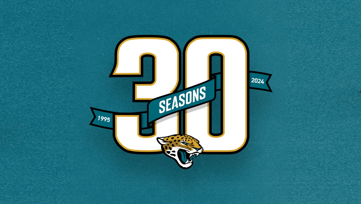
Using classic sports number styling with a textured background in the team's famous green color, this mark sports a large number 30 with a ribbon weaving in-and-out of the number showing the years the organization has been around and the word seasons. At the bottom center is the team's well-known mark to make a clean design that ties neatly back to the original brand.
More Details →D Magazine 50th Anniversary Logo
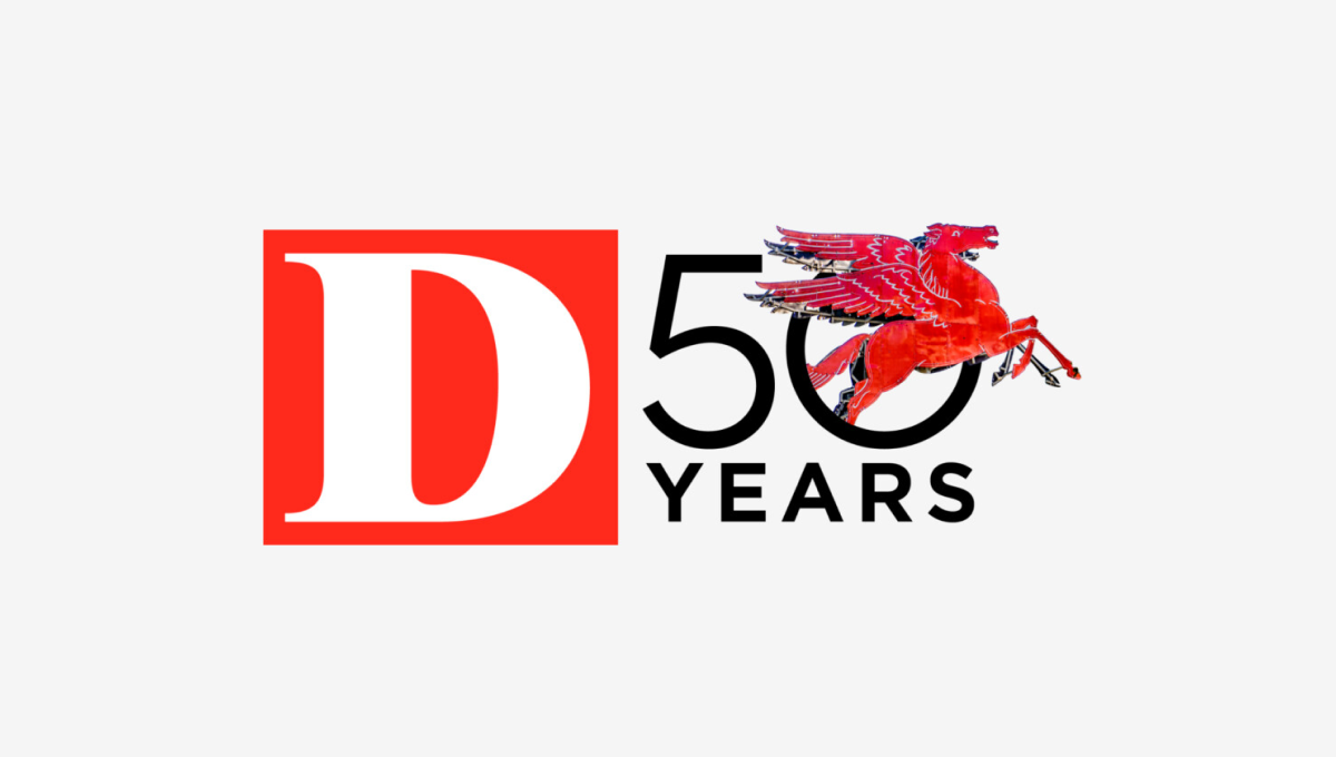
Rather than describe this logo ourselves, we'll just quote the team on this one. "Our in-house designers and art directors wrestled for months about what D’s 50th anniversary logo should be. What would feel like ‘D’? What would be bold and design-forward but not conflict with our existing (already iconic) logo? What have other brands done? Do we even have to do one at all? After dozens of versions and rounds of meetings, we ultimately returned to the original concept presented by our digital product director Ricky Ferrer. When we all first saw it, it felt like ‘us’. It also felt like Dallas: always in motion, full of iconic people and places."
More Details →Park City Resort 60th Anniversary Logo
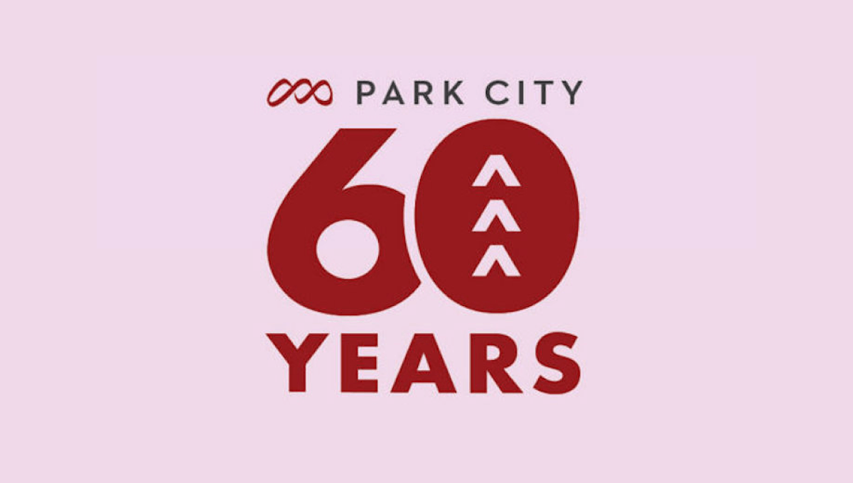
Park City Resort's 60th anniversary celebration needed a simple logo and this design combined the resort's original logo at the top, a large number 60 with shapes to tie the number back to the mountains the resort is famous for, and the word years at the bottom all on the brand's original brick red color.
More Details →Orlando Magic 35th Anniversary Logo
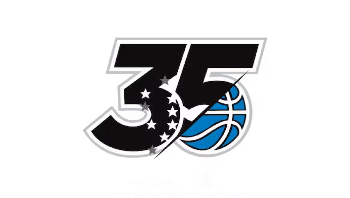
This logo has rarely been used outside of the context of the team's games, name, or traditional logo, so this minimal design that builds on a large number 35 does a great job of weaving the original blue basketball mark into the classic, block style lettering from sports to make a clean logo that looks great on everything form their home court to team swag.
More Details →FIS 100th Anniversary Logo
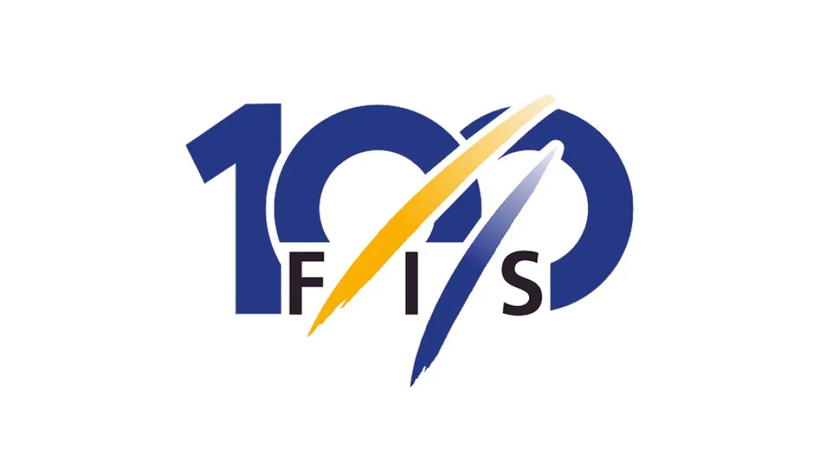
The organization behind professional skiing and ski racing, FIS started with a large number 100 in their classic blue color but added another of their brand colors, yellow, in two streats representing the tracks their members form down the mountain. With their traditional logo woven in at the bottom, this made for a really sharp, clean anniversary logo.
More Details →Nigeria Foundation 20th Anniversary Logo
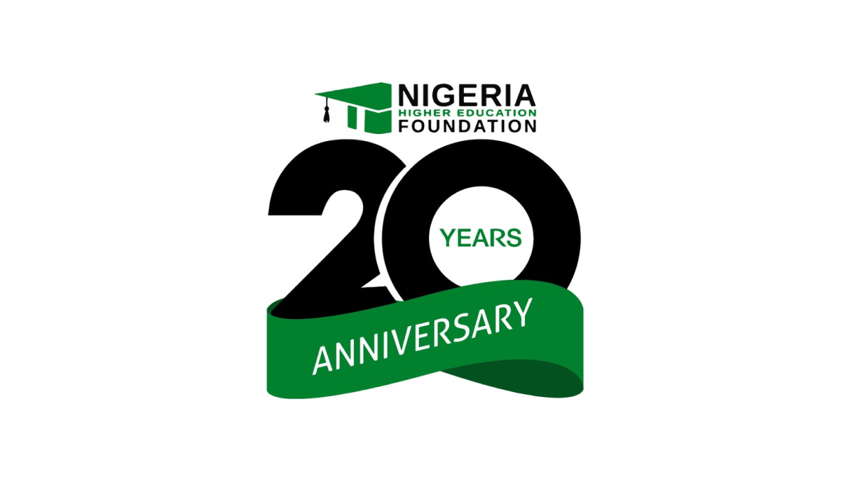
This logo takes a smart approach of combining two separate, but complimentary, designs: the traditional logo at the top and a number mark below that. This number mark features an overlapping number twenty with a three-dimensional ribbon covering up the bottom part of the number in the same brand green as the original logo. The result is clean, simple, and effective.
More Details →Sesame Street 50th Anniversary Logo
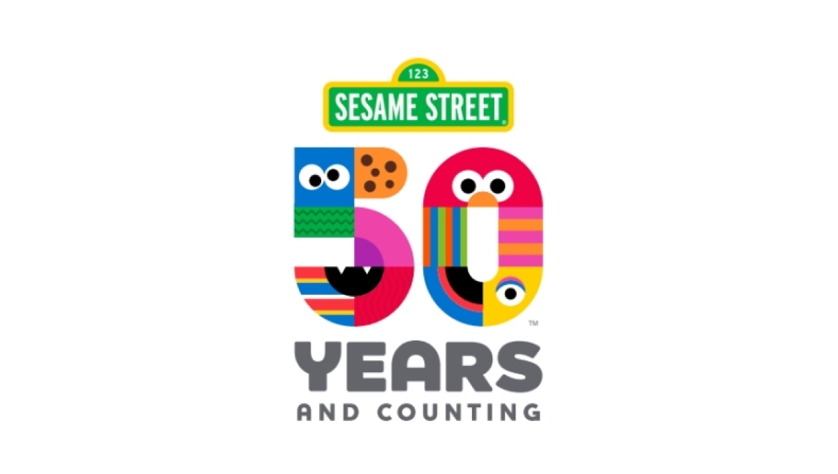
There are so many classic visuals within the Sesame Street story and this logo found a way to weave many of them - from Cookie Monster to Big Bird - into a single design. The result is a colorful number fifty that, set below the traditional street sign logo, is both representative of the story as well as a playful vibe that is perfectly on brand.
More Details →Matchbox 70th Anniversary Logo
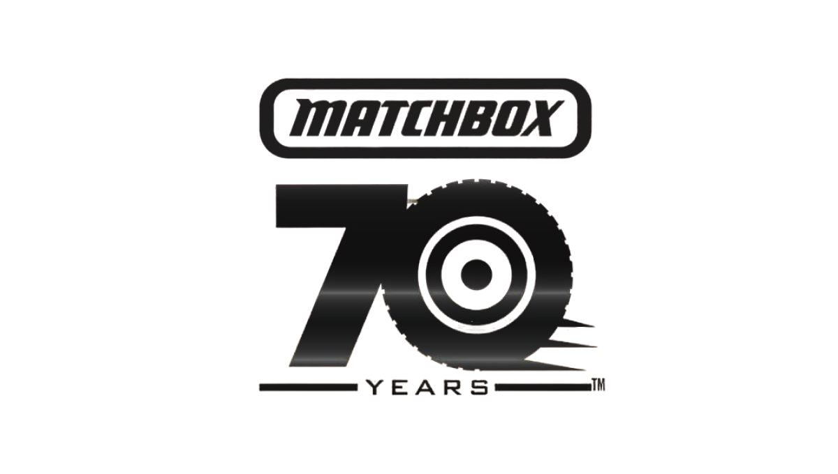
This simple logo from Matchbox starts with the classic logo at the top and a block number 70 below that. With a theme around cars, the clever design concept of using the number zero as a wheel and a few streaks coming off the right side to convey motion created a strong mark that was easy to tie back to the original shape. The square-ish shape also made it easy to use on social media.
More Details →Utah Jazz 50th Anniversary Logo
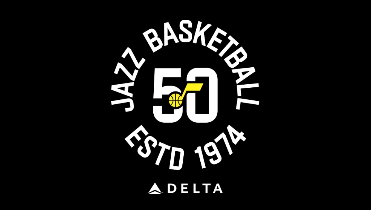
The team has embraced a number of colors over the years, but the black background of this logo and yellow mark in the center were a nice tie to one of their more popular and recent combinations. With a large number 50 in the center and the note mark laid above, this created a clean, but recognizable brand they could use in a variety of situations. In this case, wrapping the name of the team and the year it was established (along with their stadium sponsor) for a nice lockup for use online and in print.
More Details →Snowbasin 75th Anniversary Logo
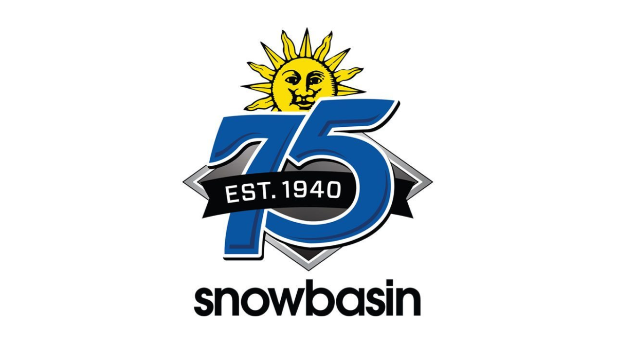
Featuring a large number 75 in the brand's usual blue, this logo adds a few simple elements in and around these digits. First, the brand's traditional mark peeks up from behind the 75. Next, a black ribbon holding the years of operation weave in and out of the main number mark. Finally, the traditional work mark for the resort sits at the bottom to make a fun, but recognizable design.
More Details →Wolf Bay 50th Anniversary Logo
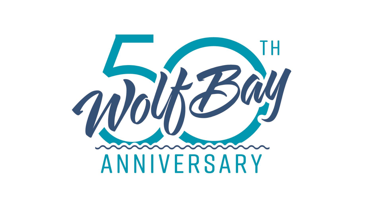
This logo may be simple, but it's also really clean and effective without having too many parts. A large number fifty sits behind with the traditional word mark of this restaurant cutting across at an angle with a little bit of padding around the edge to avoid bleeding. The word anniversary at the bottom clarifies the reason for the design and adds a bit of balance.
More Details →Carl's Jr. 80th Anniversary Logo
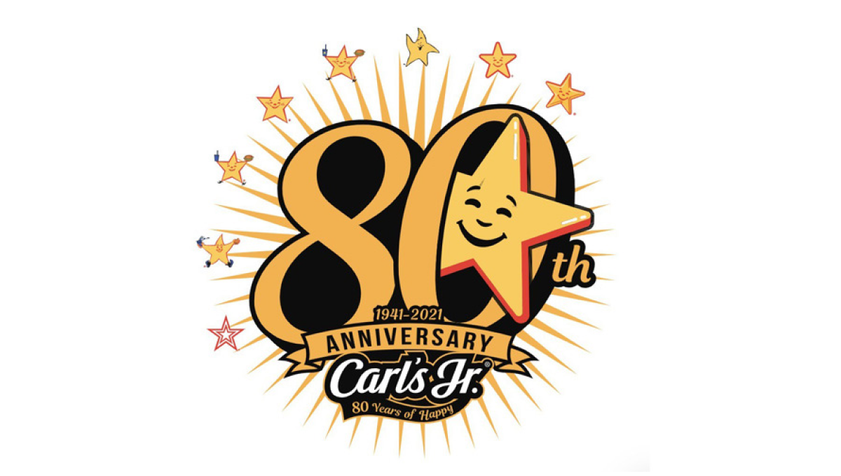
Using the chain's classic colors and fonts, this logo starts with a large number 80 in the center. Around the outside sit 8 of the famous stars the brand is known for with a larger version of that well-known shape peeking out from the zero. At the bottom sits their traditional logo to create a fun, creative logo that's also neatly on brand and easy to tie back to the original.
More Details →Bull & Bush Brewery 50th Anniversary Logo
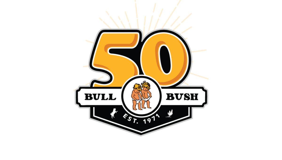
With the brewery's traditional logo held in an small oval, this logo builds behind that with a large, playful number 50 peeking up from behind to match the style and vibe of the traditional brand. To the side of the logo is a ribbon-style rectangle holding the name of the berwery with a label showing when the business was established filling the area below the logo.
More Details →IDEA Health & Fitness Association 40th Anniversary Logo
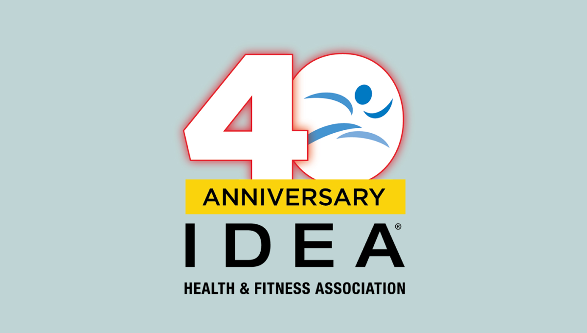
A large, block number 40 anchors this anniversary logo design. Both are outlined in red but the zero holds the blue mark that's traditionally used for this fitness organization's brand. Below is a yellow rectangle with a black word "anniversary" with the name of the organization sitting below to create balanced shaped that fits well in a square or circle avatar.
More Details →National Football League 100th Anniversary Logo
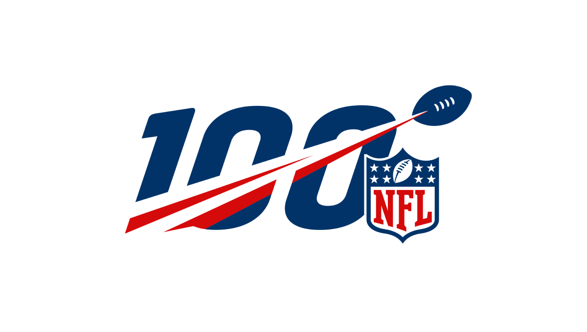
A logo that was seen time and time again by millions during the league's 100th anniversary, this mark features a large, block number 100 with a football streaking from the lower right to the upper left with a red line flowing behind. Finally, the league's traditional logo sits just to the bottom right to add balance and make the mark easy to recognize.
More Details →Nike 50th Anniversary Logo
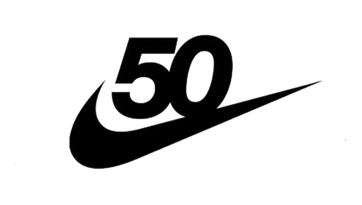
Nike has one of the most powerful brands in the world. Even more, it's incredibly recognizable on a few levels. Take the number 50 in this design, for example. Even if it were just that text, there's a good chance millions of people would still recognize it. With the swoosh below this logo is as powerful as it is simple.
More Details →Barbie 50th Anniversary Logo
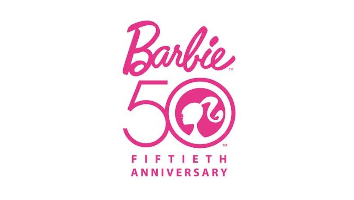
There's only one color to use when celebrating Barbie's anniversary and they started with that as an instantly recognizable foundation for this mark. With the traditional logo above, Barbie's famous ponytail inside the zero of a large number 50, and the usual additional text to commeration the occasion below, this logo combined recognizable elements with a clean design.
More Details →United Nations 70th Anniversary Logo
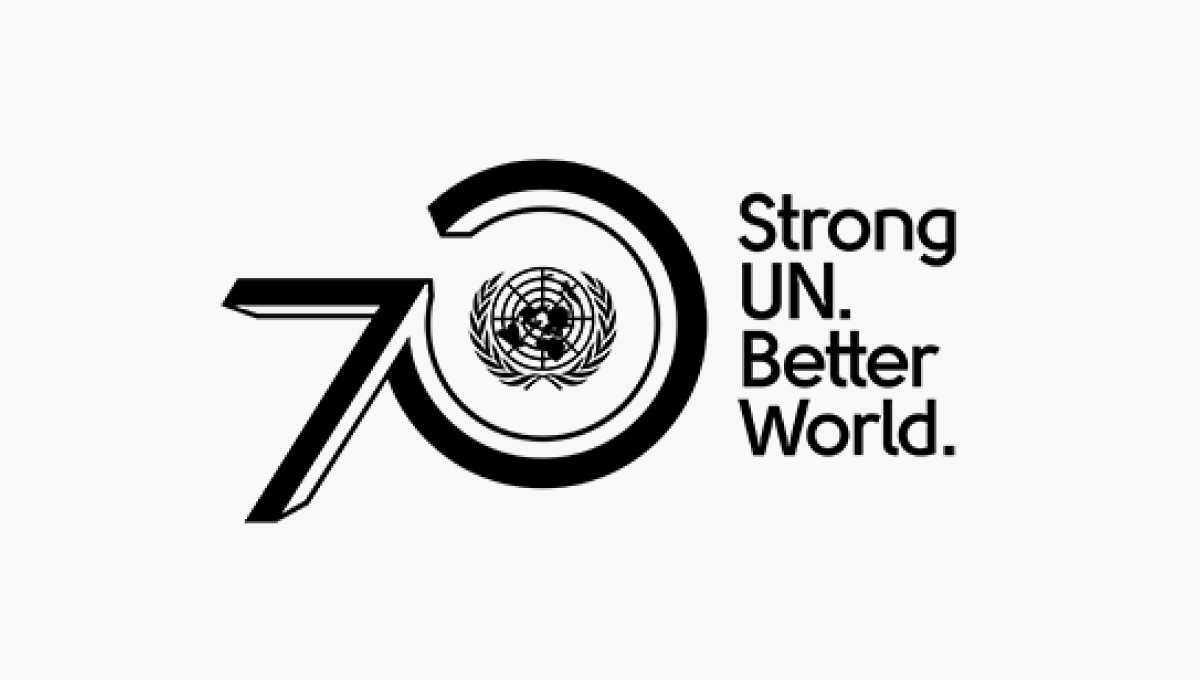
The United Nations logo is one of the most recognizable in the world, so placing this near the visual center of their design was a great move. By placing the number zero around that mark and the number zero ahead of it using a similar style to the logo, they create a strong lockup that's clean and on brand. A tagline to the right rounds out this design and adds a little bit of visual balance.
More Details →De La Salle School 70th Anniversary Logo
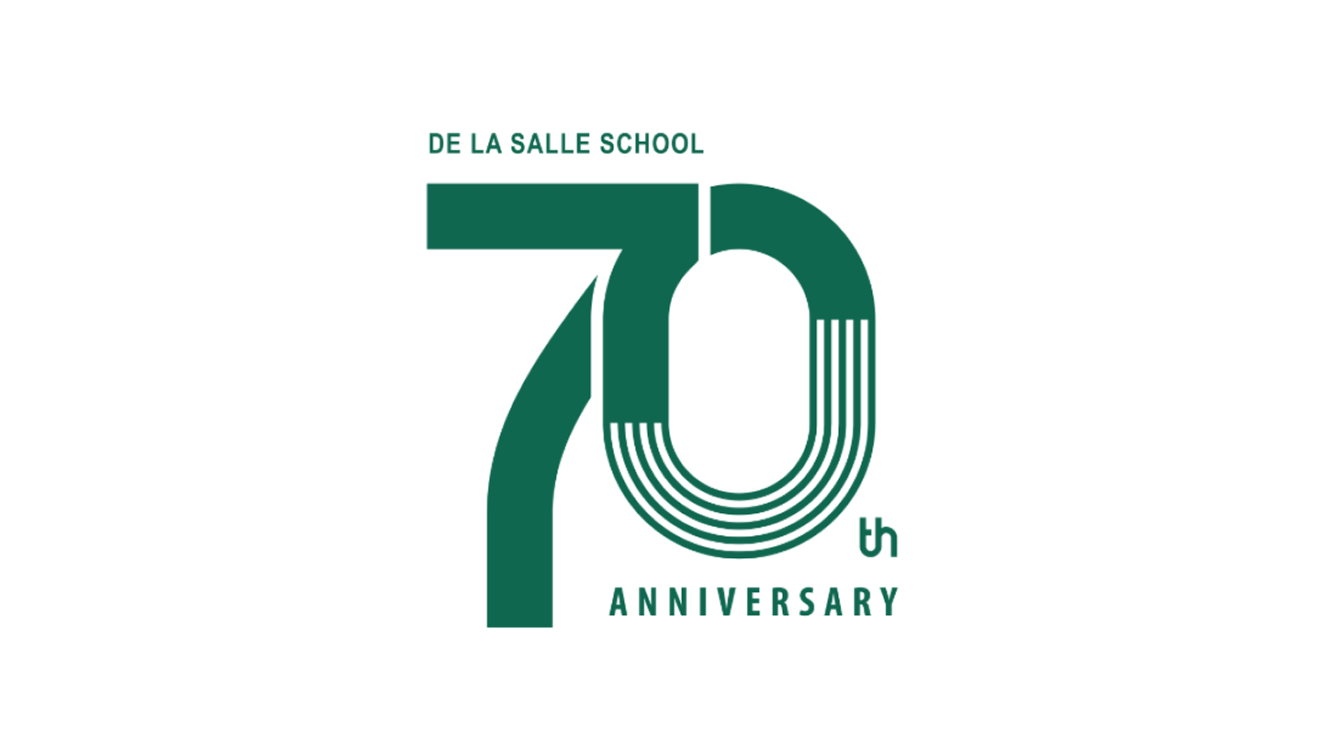
This clean design goes big on a large number 70 to mark the occasion of the celebration and places the name of the school along the top of the number seven and the word annivesray below the number zero. The mark may not be as easy to swap with their traditional logo, but with a clean style and wider shape it's a great fit for banners, swag, and events that often accompany the way universities celebrate the occasion.
More Details →Netflix 25th Anniversary Logo
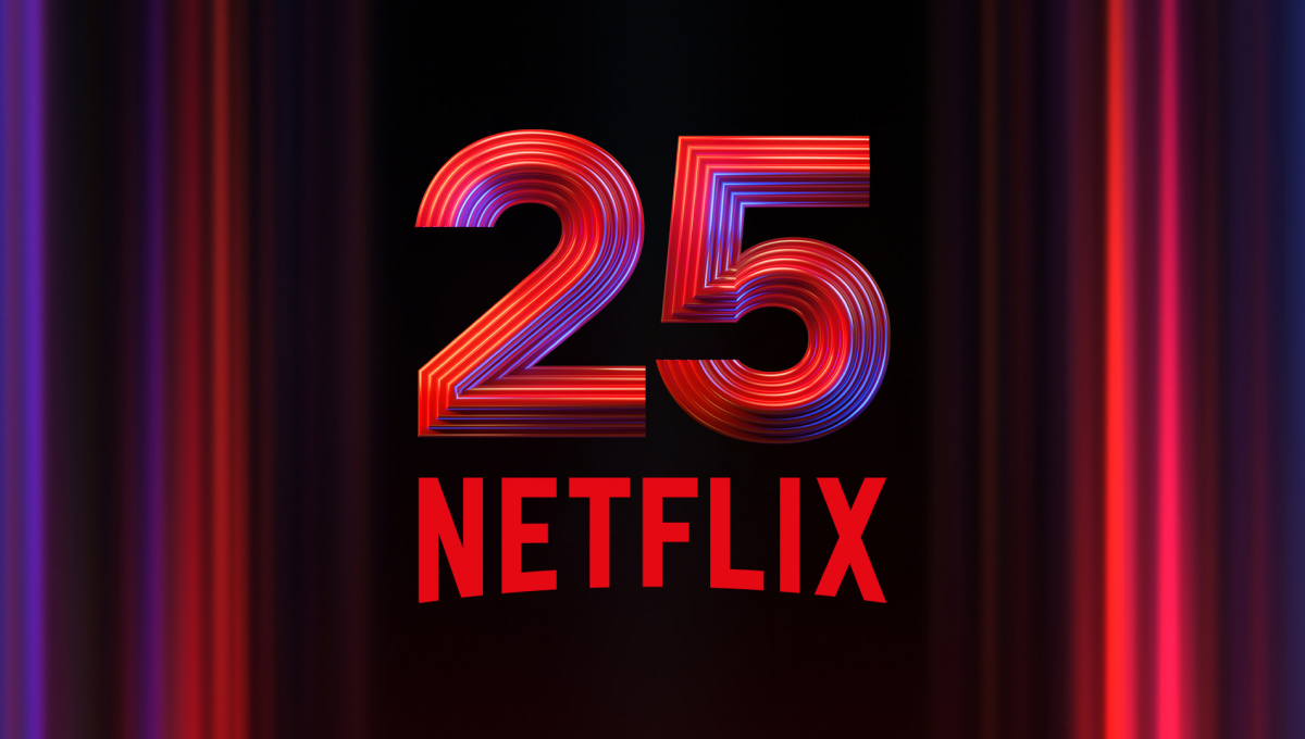
Netflix is famous for many things, but one of their most famous is the opening animation that precedes each video in their library. So when celebrating their 25th anniversary, they used a similar style - almost a still image from that sequence - as the backdrop to easily tie this design back visually to that part of their brand. In the center is placed a multi-faceted number 25 with their traditional logo below.
More Details →Lego 90th Anniversary Logo
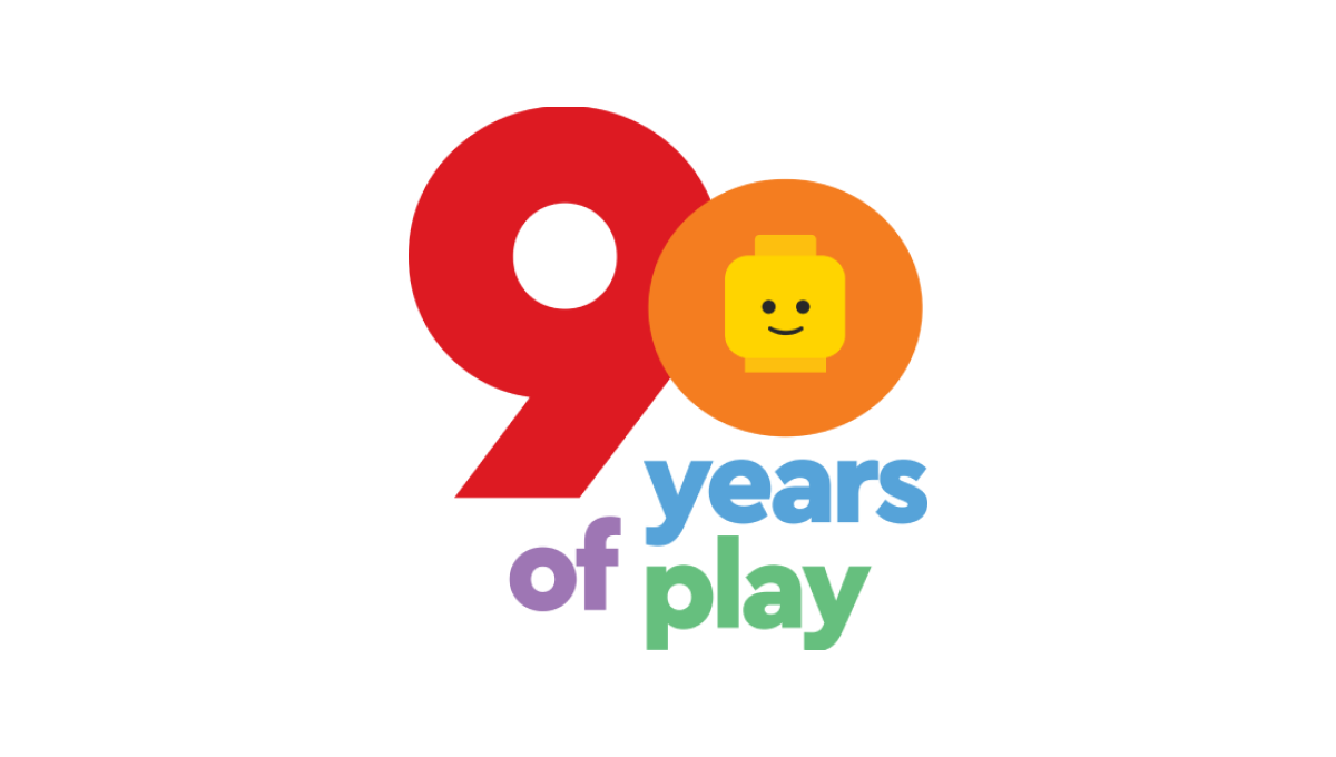
As a toy company, Lego started with mark with a playful, large number 90 in the primary red and yellow colors used in their traditional logo. Below that number are the words "years of play" in blue, violet, and green to continue the playful theme. Finally, the head of the company's famous mini figure toys is included in the middle of the zero to tie this design back to the Lego brand.
More Details →Goya 85th Anniversary Logo
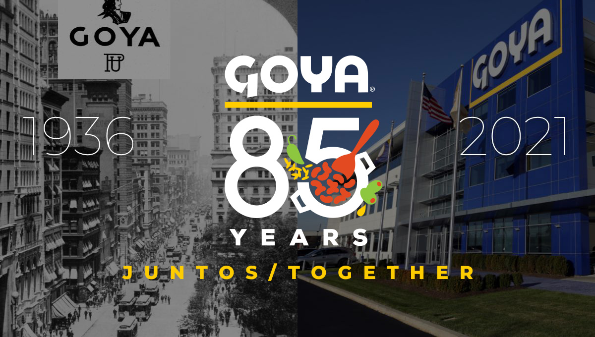
Starting with the company's original logo at the top, this design uses that logo's already existing yellow underline to create separate and shape for the rest of the logo. Below that sits a large number 85 with small illustrations of the fruits famously used in their foods with the word "years" at the bottom to complete the shape. In various lockups like the one pictured, they've also included the years of operation on the sides and a tagline at the bottom.
More Details →Epec 65th Anniversary Logo
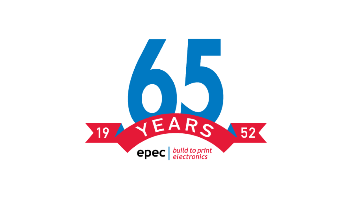
This simple logo uses the brand's primary blue and red colors - a large number 65 in blue rising up from behind a curved ribbon in red - to both spend the message and create a little bit of negative space at the bottom of this mark. In that mark they placed their usual logo for a simple mark that's both big and easy to use but also ties back to the original brand.
More Details →Ruskin 65th Anniversary Logo
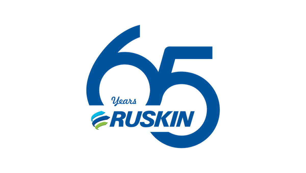
Ruskin's 65th anniversary logo starts with a large number to mark the reason for celebration with a slight offset and overlap. This number, in the brand's traditional blue color, creates the backdrop for the brand's primary logo to be placed across the bottom of the six and into the gap of the five. This creates a clean mark that's easily recognizable as relating to the normal brand.
More Details →Dr. Fred G. Blum 30th Anniversary Logo
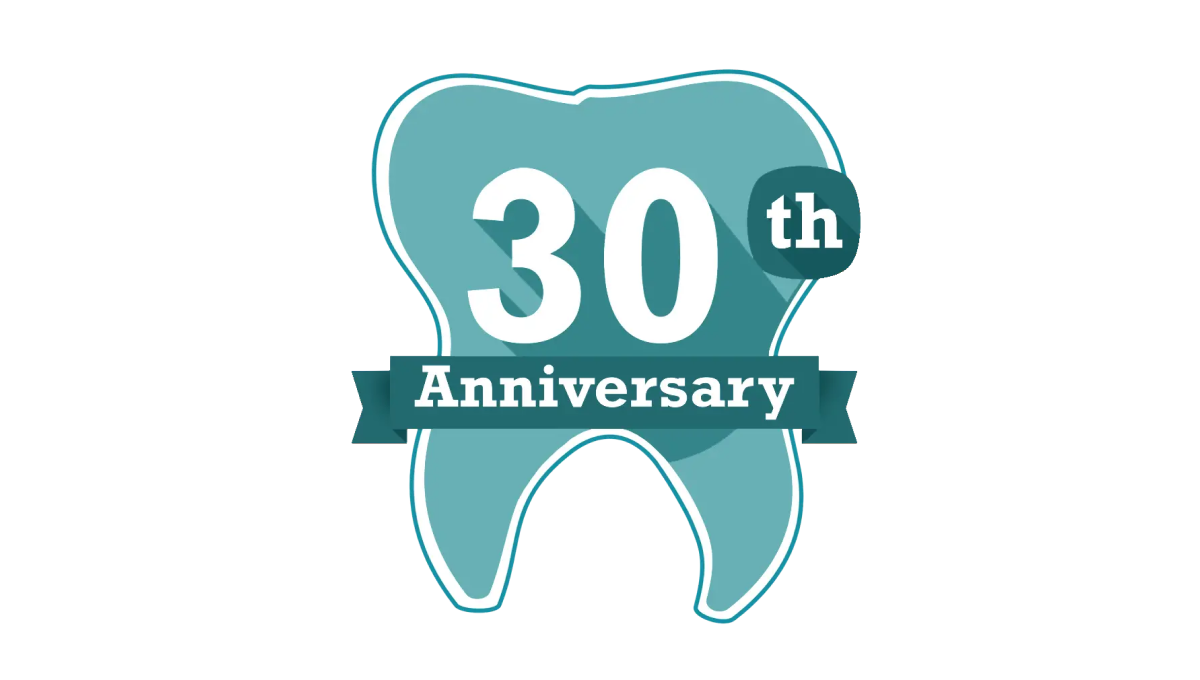
Another mark that celebrates the anniversary in a fun, on-brand way but doesn't try too hard to start fresh with an adaptation of the original logo, this tooth shape creates a simple backdrop for the anniversary in question. With the dental practices traditional teal color in place and used nearby the original logo and practice name, it was a fun way to celebrate without having to change the usual mark.
More Details →Perfect Teeth 20th Anniversary Logo
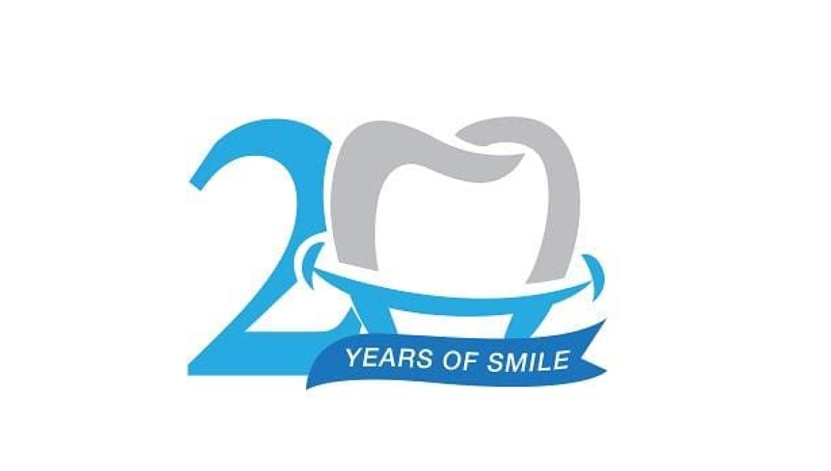
While this mark doesn't contain the name of the company celebrating their arrinversary, the clever use of the tooth shape as the number 0 is the 20th anniversary mark makes it clear what type of business is in question. And used only in places their original log would sit makes it easy to use this on-brand, playful mark without losing the tie to the original brand.
More Details →Governors State University 50th Anniversary Logo
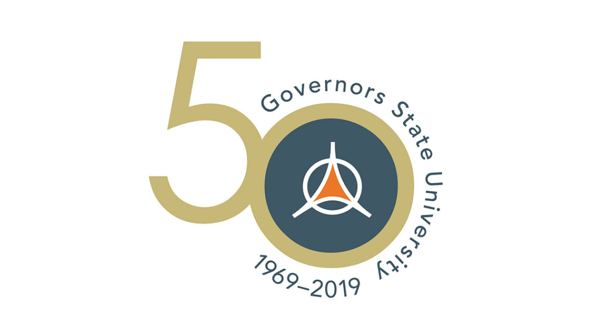
With an offset number 50 as the canvas for this logo, the designers filled in the zero with a dark blue and placed the university's traditional logo in the center to make it easy to tie this back to the original brand. Around the outside of the zero sit the name of the university and the years of operation, with a vertical flip between the two to keep most of the letters right side up and improve readability.
More Details →City of Waukesha 125th Anniversary Logo
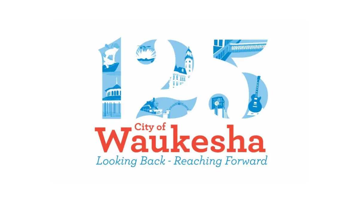
This logo places illustrations from many of the city's most notable landmarks in the number 125 to create a nice visual anchor for the city's anniversary. Complimenting the traditional red of the original logo, the number uses multiple shades of blue to keep the clear edges of the number but provide enough contrast to make each landmark easy to identify.
More Details →Traditional Bank 120th Anniversary Logo
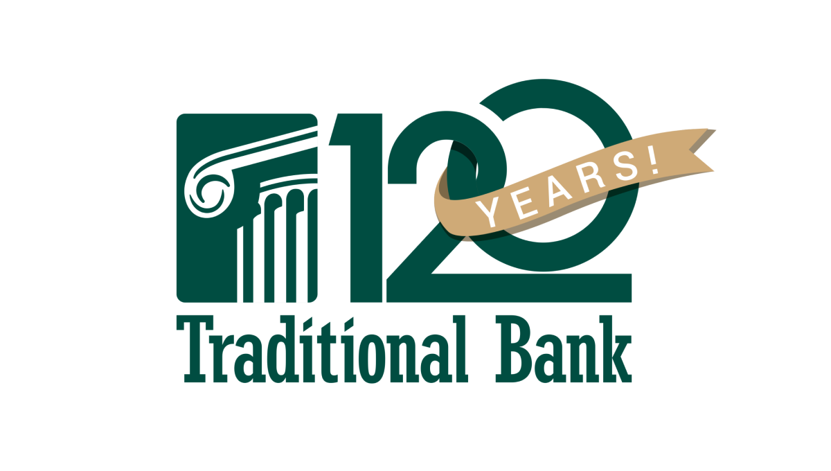
Normally the silhouetted columns in this logo sit in line with the name, but for this logo design they placed that mark above the words and enlarged it slightly which created room for a large number 120. This number features overlapping characters and a vertically offset 0 as well as a gold ribbon holding the word years that wraps around part of the number.
More Details →Metairie Bank 70th Anniversary Logo
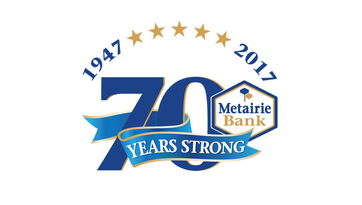
This design makes the number 70 in their brand blue the main visual feature, but also places many elements that sit layered above that logo. Curving above the number at the top sit a series of stars separating their years of operation, across the lower part of the number is a ribbon, with the original brand logo sitting in shape covering a portion of the remaining number.
More Details →Drexel University 125th Anniversary Logo
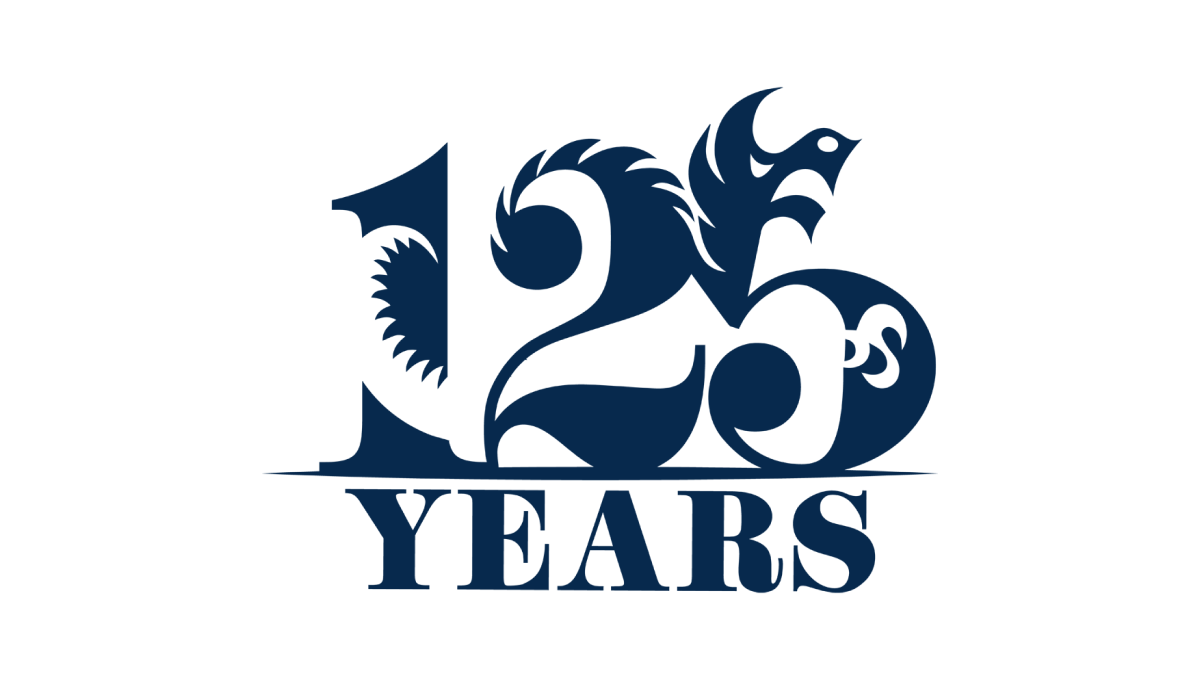
Designed by a student as part of a year-long project, this beautiful anniversary logo combines a large, block number 125 with the school's famous dragon logo to create a design that, remarkably, is easy to identify both elements within despite using a single color. With a block word "years" below, this is a beautiful example of design and art in a thoughtful, meaningful logo.
More Details →Cambridge Community Center 90th Anniversary Logo
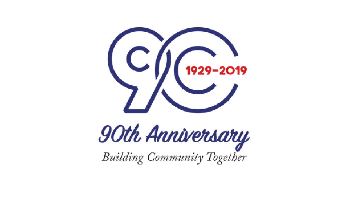
This line-art style logo starts with the year of the annversary in large, outline-style characters that slightly overlap to create a nice, compact shape. Inside the zero are the years of operation. Below the number sits a written recognition of the anniversary with the center's motto and goal written below to balance out the design.
More Details →Detroit Lions 90th Anniversary Logo
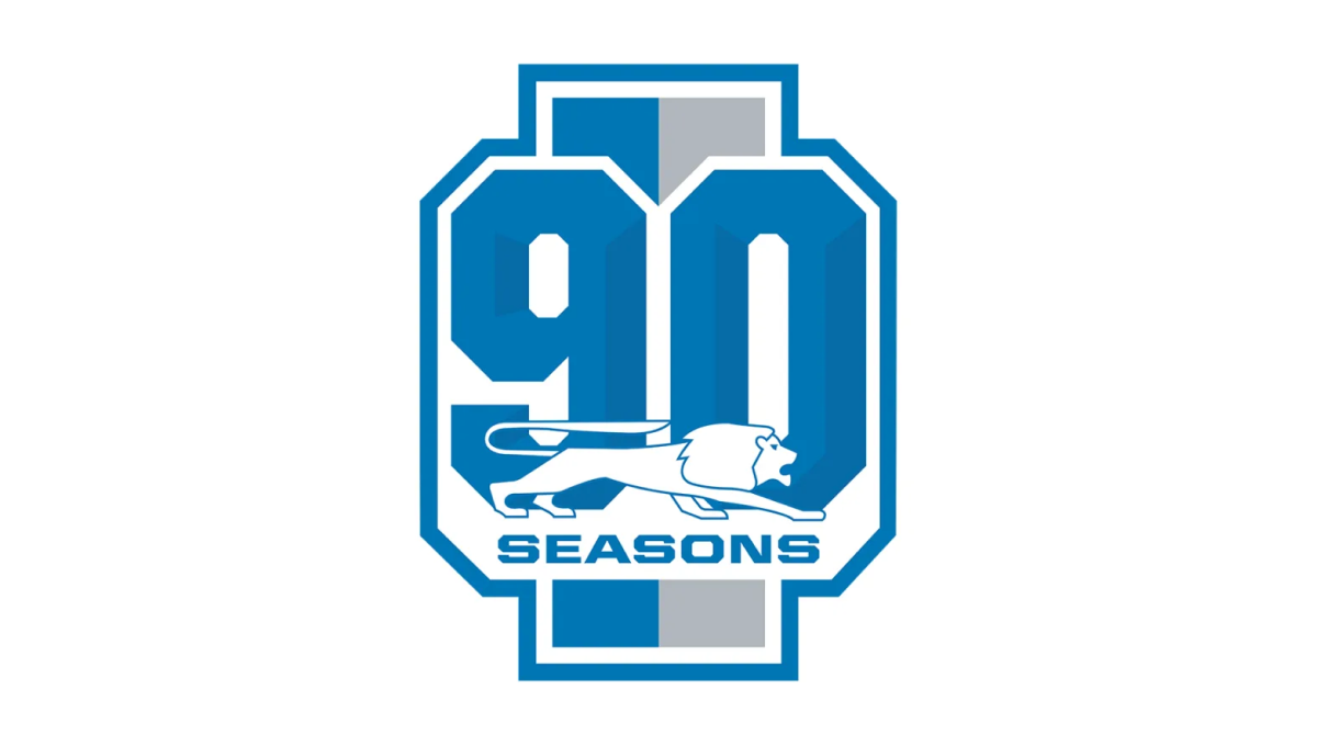
With a vertical rectangle as the backdrop that is divide into the brand's two primary colors, this mark then places a large, block number 90 in front those bars to create a unique, simple shape. Around the edge is the classic colored borders and white gap famous for sports logos. Finally, the original lion mark is placed overlapping the bottom of the 90 with the word seasons below that.
More Details →Bridgestone 90th Anniversary Logo
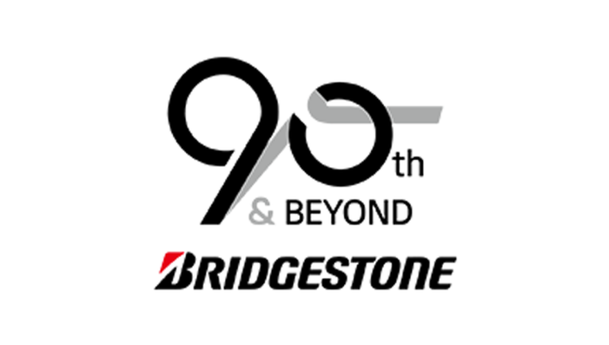
Starting with the original logo along the bottom, this logo uses a clever number mark made to look like tire burn-out marks representing the main product the company sells. Rather than just leave the mark as is, they also added the words "and beyond" to reprsent that this is a milestone on their journey rather than the end.
More Details →Carlow University 90th Anniversary Logo
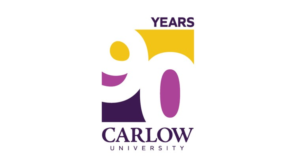
This logo clever uses negative space to blend the year they're celebrating with their brand colors. They start with a vertical rectangle that holds a staggered number 90 that goes edge to edge. The white number leaves spaces for three colors in the top, middle, and bottom of the rectangle with the word "years" at the top and the name of the university at the bottom.
More Details →Sega 60th Anniversary Logo
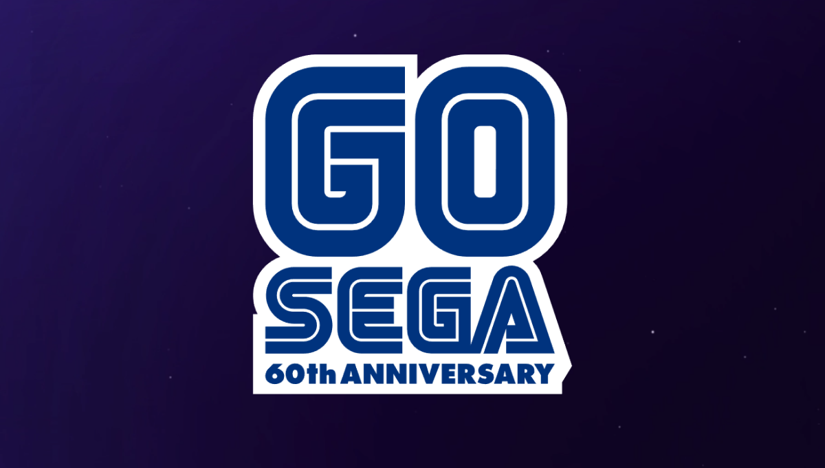
One of the most well-known aspects of the Sega brand are the block letters with a thin, inner-line creating a unique typeface that becomes even more easily recognized in their classic blue. In this case, they simple placed a large number 60 above their traditional word mark and the phrase "60th anniversary" below in the same typeface and color to create a nice mark that would work well in a variety of situations.
More Details →City of Virginia Beach 60th Anniversary Logo
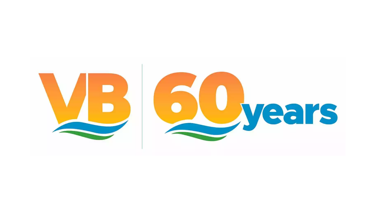
Borrowing from the city's well-known VB mark, this anniversary logo uses the same orange gradient of the VB in the original mark for the number sixty in the anniversary version. Below the same blue waves of the original mark sit with a large word "years" just to the right of this mark in the same blue as the wave. This logo also features the original mark just to the left of this new mark for an easy-to-recognize lockup.
More Details →University of Missouri - St. Louis 60th Anniversary Logo
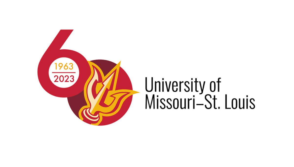
This logo sets the stage with a large number sixty with the six shifted up from the zero. Inside the six sits the years of operation for the organization, inside a filled-in zero sits the school's trident mark. This strong mark sits to the left of the name of the organization in black text, stacked on two lines and lined up vertically with the zero.
More Details →Buffalo Bills 60th Anniversary Logo
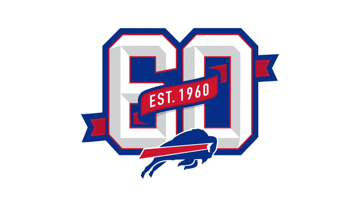
This logo builds on the classic shape, style, and format of the numbers you may see on a football jersey. Weaving in and out of both the number six and zero is a ribbon that identifies what year this footbal team was established. Below that sits the Bills' original mark to make it clear which team this logo is tied to which also reflects the colors used in the ribbon and numbers.
More Details →Samoa Independence 60th Anniversary Logo
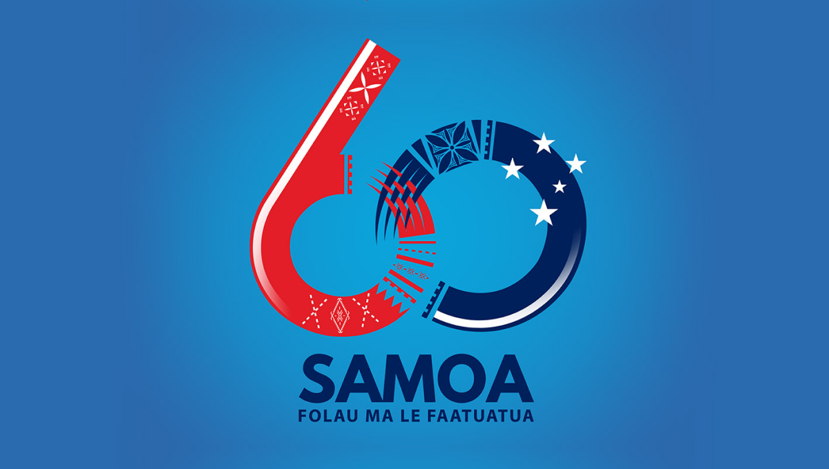
Designed for a light blue background, this logo starts with a large nuumber 60 with the ring of the six and the left side of the zero elegantly overlapping using patterns and shapes tied to the Samoan culture. At the bottom sits the name of the country with a series of starts just above and to the right of the zero to create balance and add extra meaning.
More Details →USA-Mali Diplomatic Relations 60th Anniversary Logo
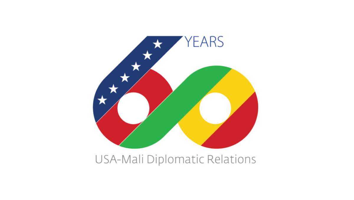
Starting with a large number 60, this logo uses diagonal stripes in the colors of both contries with a thick, green stripe creating a bridge between the two numbers and color palettes. On the upper left diagonal a line of stars is placed to represent the USA, to the right the word years sits, and below this number is a simple description of the occasion in a light, thin typeface.
More Details →Fountain Valley 60th Anniversary Logo
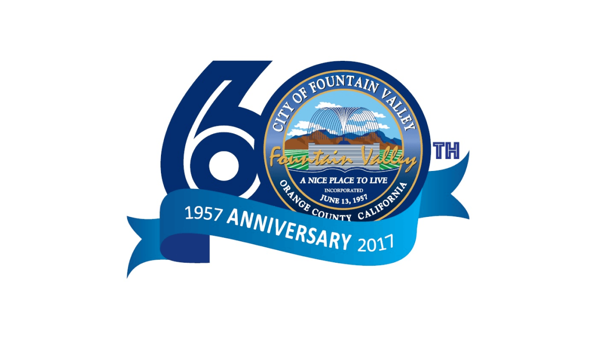
This logo starts with a large number sixty in a dark blue color. In the number zero, an illustration of a foundation sits inside a small seal-style shape with the town's name, motto, and location. Below that a lighter blue ribbon holds the word anniversary with the year the city was founded on one side and the year of this anniversary on the other.
More Details →National Park Service 100th Anniversary Logo
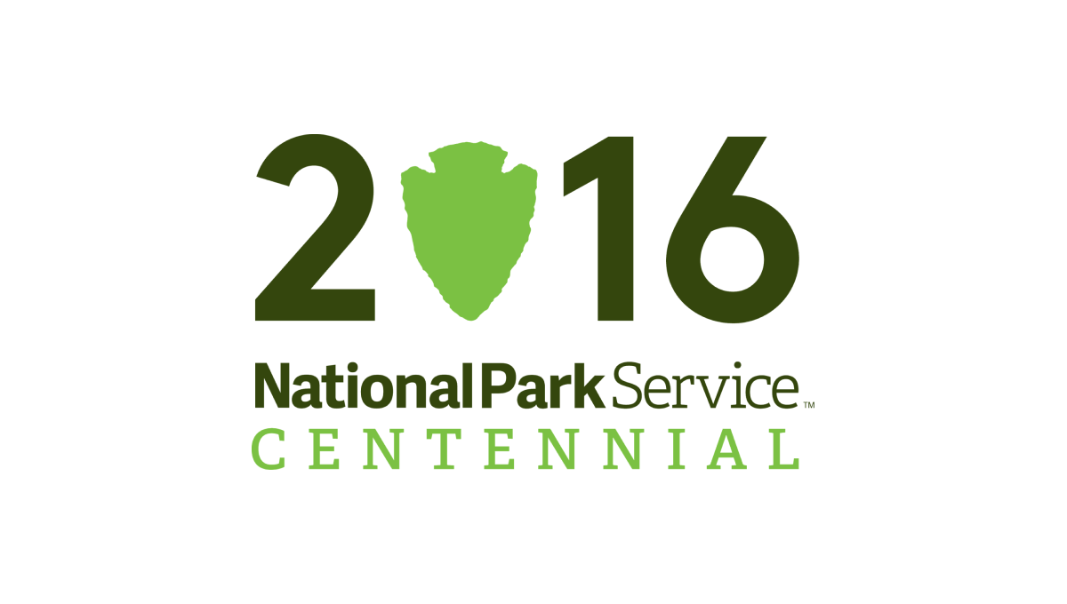
Starting with a large, block number 2016 to signify the year of the annivesary, this logo takes a recognizable shape that holds the National Park Serivice's primary logo - a downward pointing arrowhead - and swaps that for the number zero in a slightly lighter green. Below the number sits a word mark with the name of the organization and the word "Centennial" below in the same green as the arrowhead.
More Details →Bryce Canyon National Park 100th Anniversary Logo
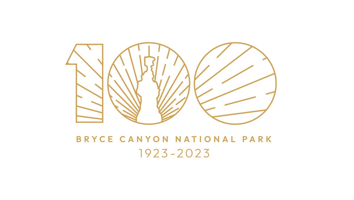
Bryce Canyon's centennial logo uses gold line art for the vibe in this design. A large number 100 contains a clean line-art depiction of the park's famous hoodoo formations with sunset-style lines emerging from behind and filling only the area with the number. Below, the name of the park and the dates of operation are placed in the same color as the mark above for a clean, balanced design.
More Details →United Way of the Midlands 100th Anniversary Logo
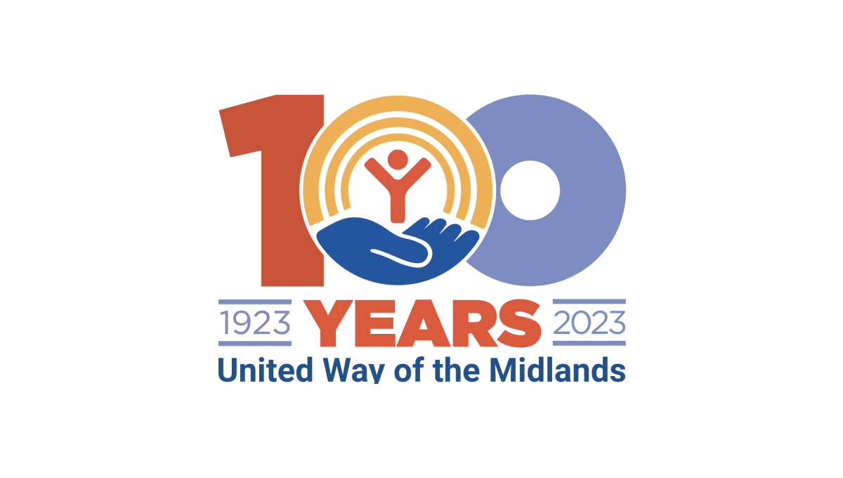
Like other United Way anniversary logos, this logo uses the classic red, gold, and blue colors of the original brand with a large, block number 100 in the center to anchor the logo. The United Way logo sits neatly in the center zero with the word "years" bloe and tha date range on either side to add balance. Finally, the name of the chapter is displayed at the bottom for a clean, on-brand logo.
More Details →Warner Bros. 100th Anniversary Logo
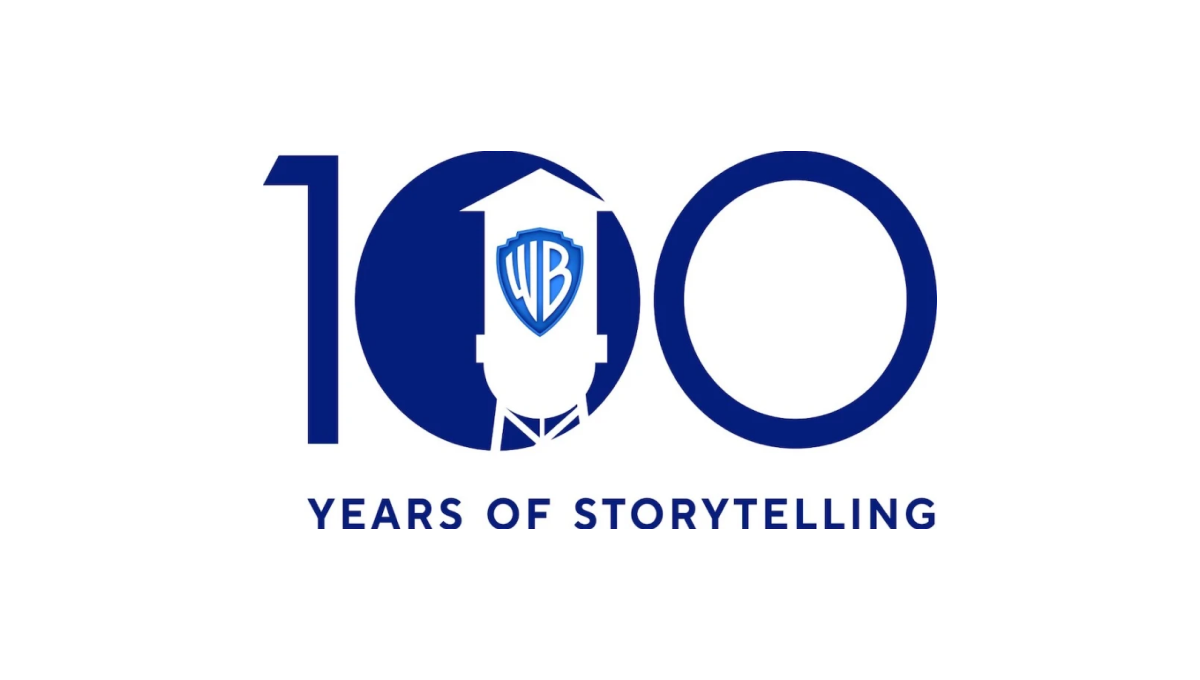
Starting with a large, block number 100, this logo fills in the first zero to create a canvas for their design. Next, the famous Warner Bros. watertower is placed inside that first zero with a slightly different blue color holding their traditional WB badge. Below the number 100 the words "years of storytelling" give the 100 context and reinforce what their brand is all about.
More Details →DC Hospital Association 40th Anniversary Logo
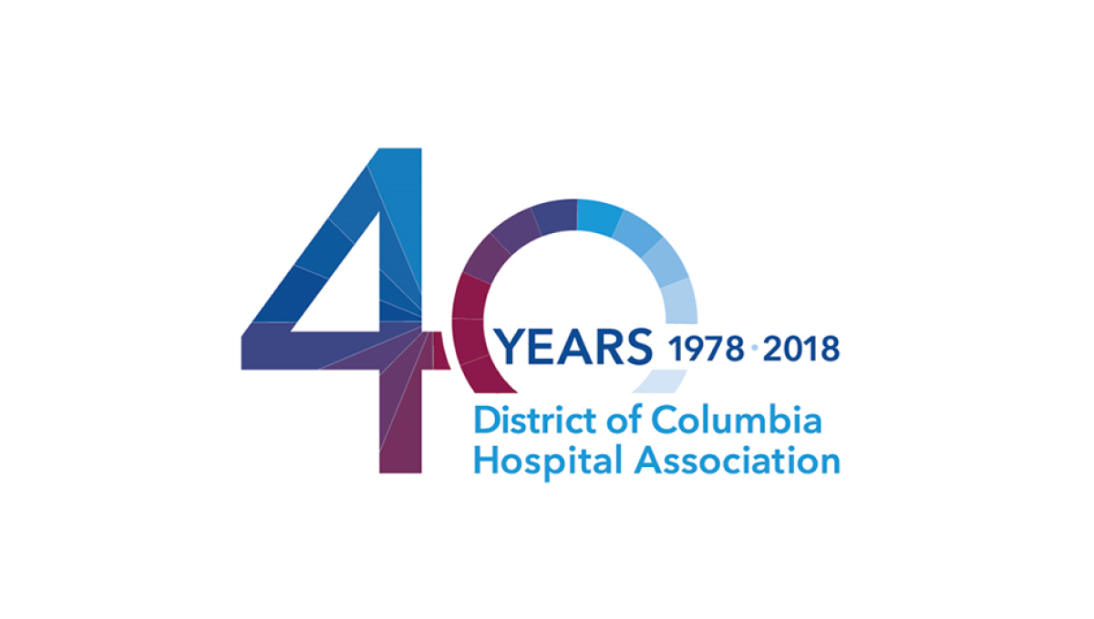
With the organization's name is light blue normal text and the word "years" with a date range above late, this logo takes a large number 40 and places it to the side and behind of that block of text. This makes the 40 easy to read by keeps the logo compact and balanced. Multiple colors used in this brand's identify break up the number 40 and add a slight gradient going left to right.
More Details →Nicklaus Children's Hospital 70th Anniversary Logo
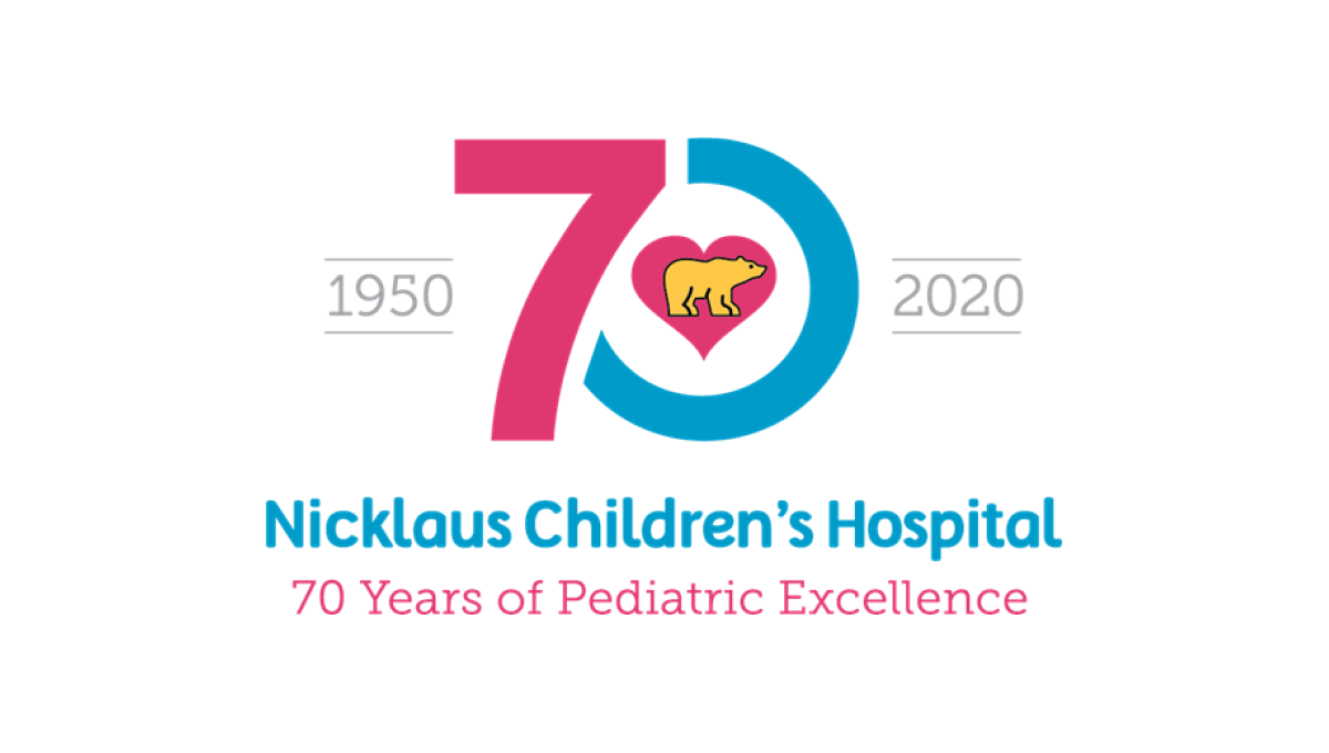
This hospital has a very recognizable logo with a golden bear (Jack Nicklaus' famous nickname and mark) inside a pink heart. By using that mark as the focal point and building a blue and pink number 70 around it, this created a tie back to the traditional brand and gave them space to add wording below and to the sides of the logo, clarifying the name for those not as familiar with the original.
More Details →Silver Cross Hospital 125th Anniversary Logo
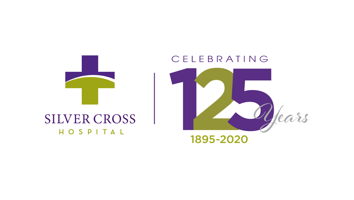
Similar to how some branded events ask partners to place their logo next to the event's logo with a line between for an co-branded marketing, this logo does something similar with a line between the traditional logo and a stylized number with a few words for balance and clarity around. With the number in the brand's original purple and gold/green, it's a simple way to create a clean, effective anniversary logo variation.
More Details →Paynesville Hospital 60th Anniversary Logo
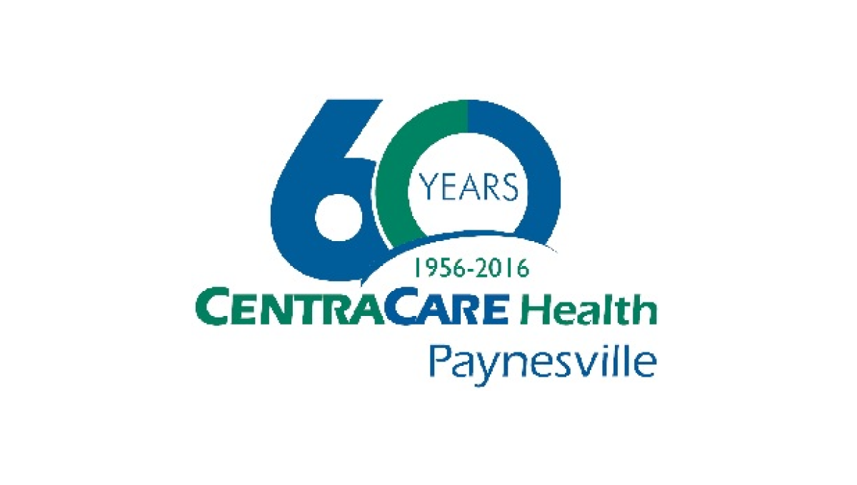
One of the strongest ways to build an anniversary logo is to start with a large, block-lettered versio of the anniversary year. Instead of a "th" this logo opts for the word "years" inside the 0 while this mark rises up from behind the traditional logo and adds a little carved out space to include the years of operation. With everything matched to the original blue and green brand colors, it ties back nicely to the original.
More Details →Memorial City Medical Center 50th Anniversary Logo
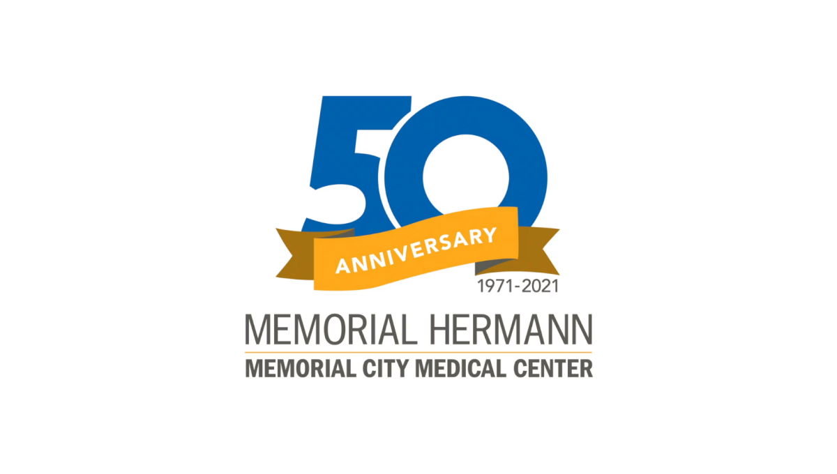
This hospital logo puts their name in dark, block letters at the bottom and simply adds a clean garphic above that to highlight the occasion for this adaptation of their brand. A large, block number 50 in blue is covered on the bottom third by an orange ribbon that contains the word "anniversary" and sits just narrower than the words below for a nice, vertically tapered shape that would work great on a website, swag, or social media avatar.
More Details →Komori America Corp 100th Anniversary Logo
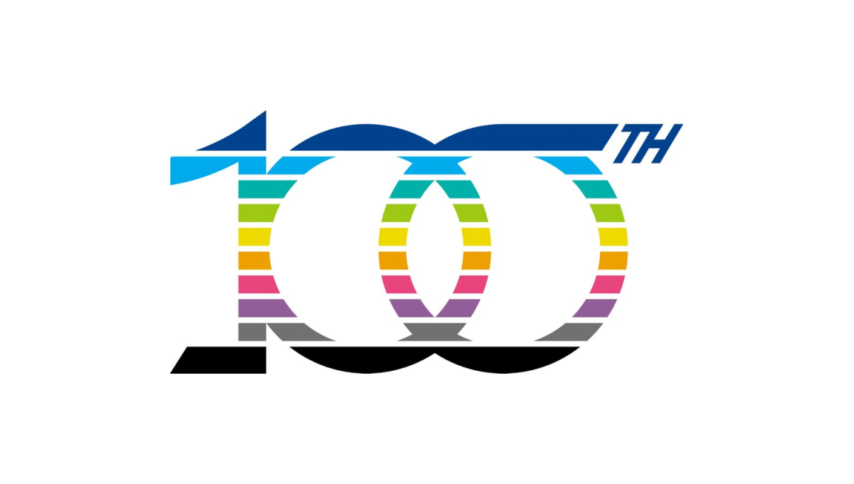
This mark is full of meaning. First, the ten horizontal bars that make up the design represent the 10 decades they've been in business. Next, the color palette points to the industry they work in - printing - and all the possibilities those various colors can represent. Finally, a few upward-turning points symbolize progress and advancement going forward.
More Details →Minecraft 10th Anniversary Logo
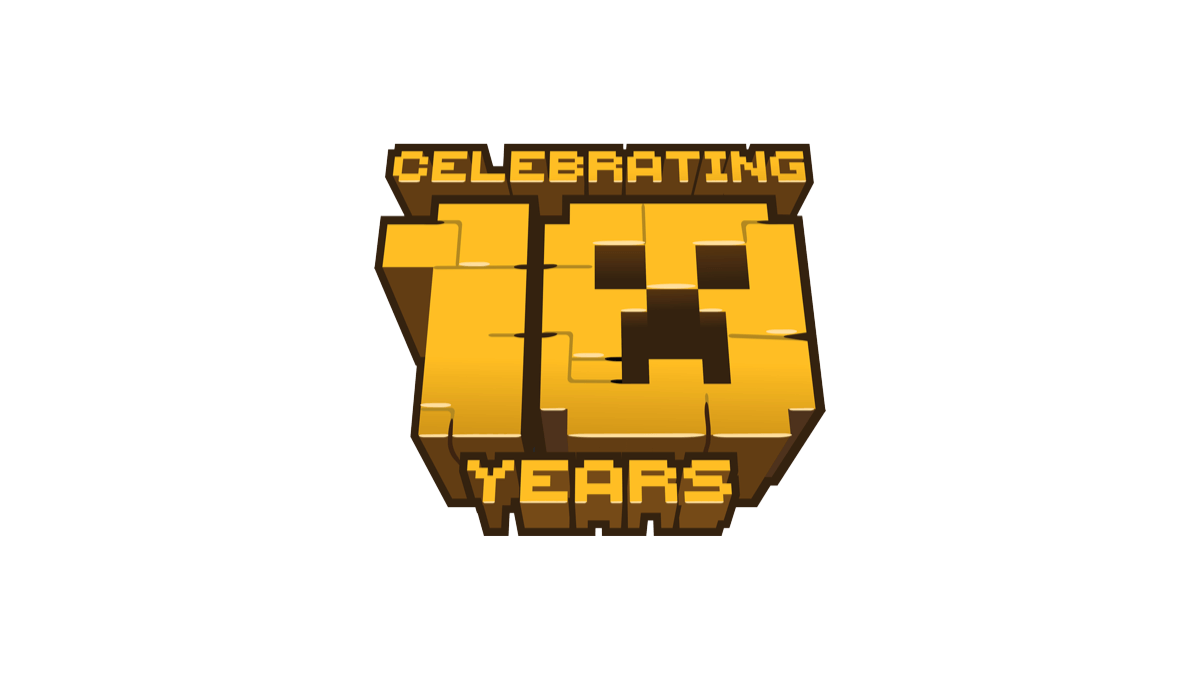
When Minecraft celebrate 10 years of bringing happiness to millions (my children included), they stuck with their block-world design style and created a logo with that featured the face of a popular character. A bold, gold shape with the name above and years below made for a really cool, on-brand concept.
More Details →St Francis Elementary School 50th Anniversary Logo
This logo starts with a double-line number fifty in the school's classic gold color. By overlapping the 5 and 0 in the number, they created a woven, infinity effect. And by shrinking the number 0 slightly, they were able to have room for the word "anniversary" and "th" for the 50. Finally, the zero creates a circle where they were able to neatly place their traditional green, round logo.
More Details →Snowbird 50th Anniversary Logo
Snowbird's classic wings mark is one of the most well-known logos in the ski industry. To celebrate their 50th anniversary, the used a block number 50 in the brand's iconic red color with the wings inset in the number 0. The mark was clean, bold, and easy to recognize for anyone familiar with the snowbird brand.
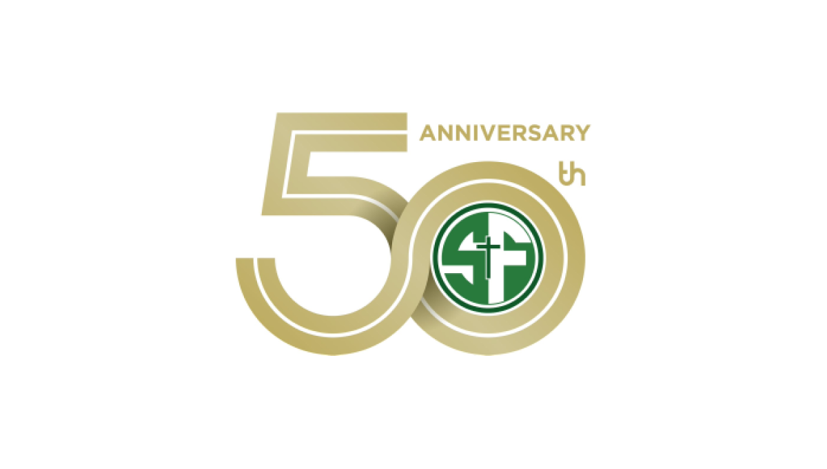
More Details →Mt Hood Meadows 50th Anniversary Logo
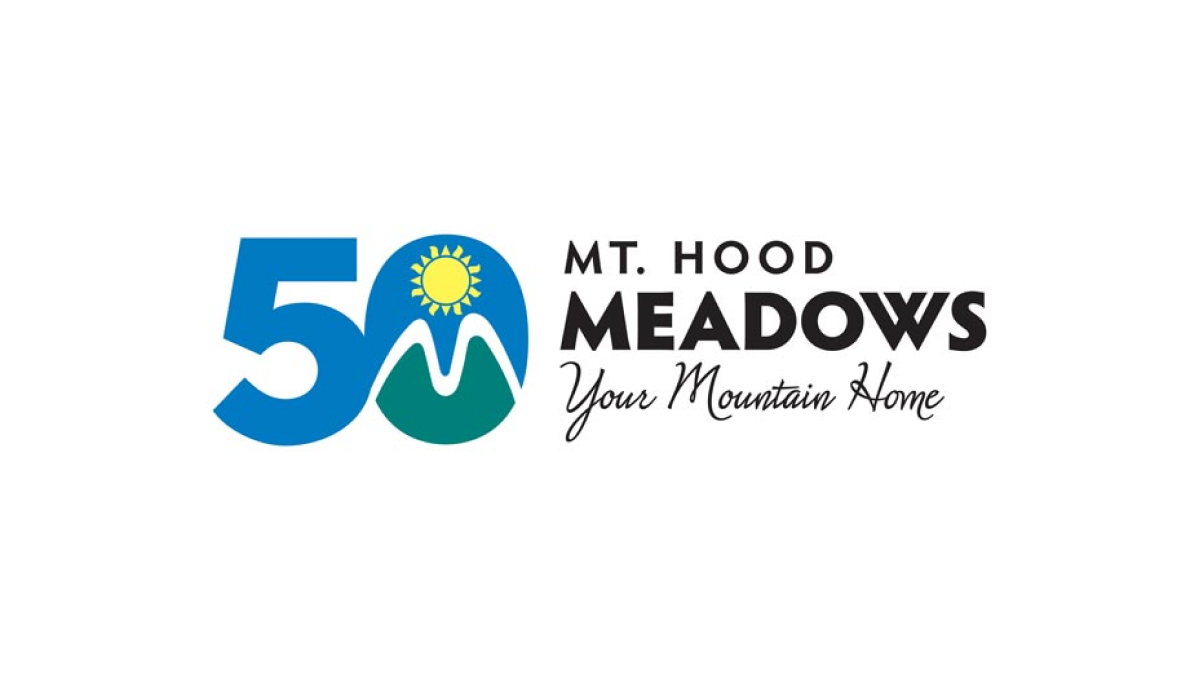
The resort's green, blue, and yellow mark normally sits in a crest-style shape to the left of the word mark. To transition to the anniversary design, the resort simply placed that mark inside the 0 of the number 50 similarly to the left of the word mark. This made their logo both unique to the celebration but also easy to recognize by their audience.
More Details →Canadian Tire Motorsports Park 50th Anniversary Logo
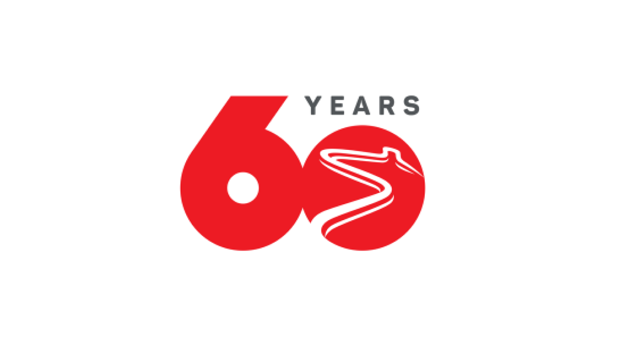
Simplicity is the theme of this number-focused anniversary logo. With the brand's bold, red color at the heart and the number 60 representing the bulk of the design's footprint, by shrinking the number zero to make room for the word "years" and adding a racetrack shape into that same zero, they have a classy, clean logo that checked all the boxes they needed.
More Details →