Retro Anniversary Logos
Sun Valley 90th Anniversary Logo
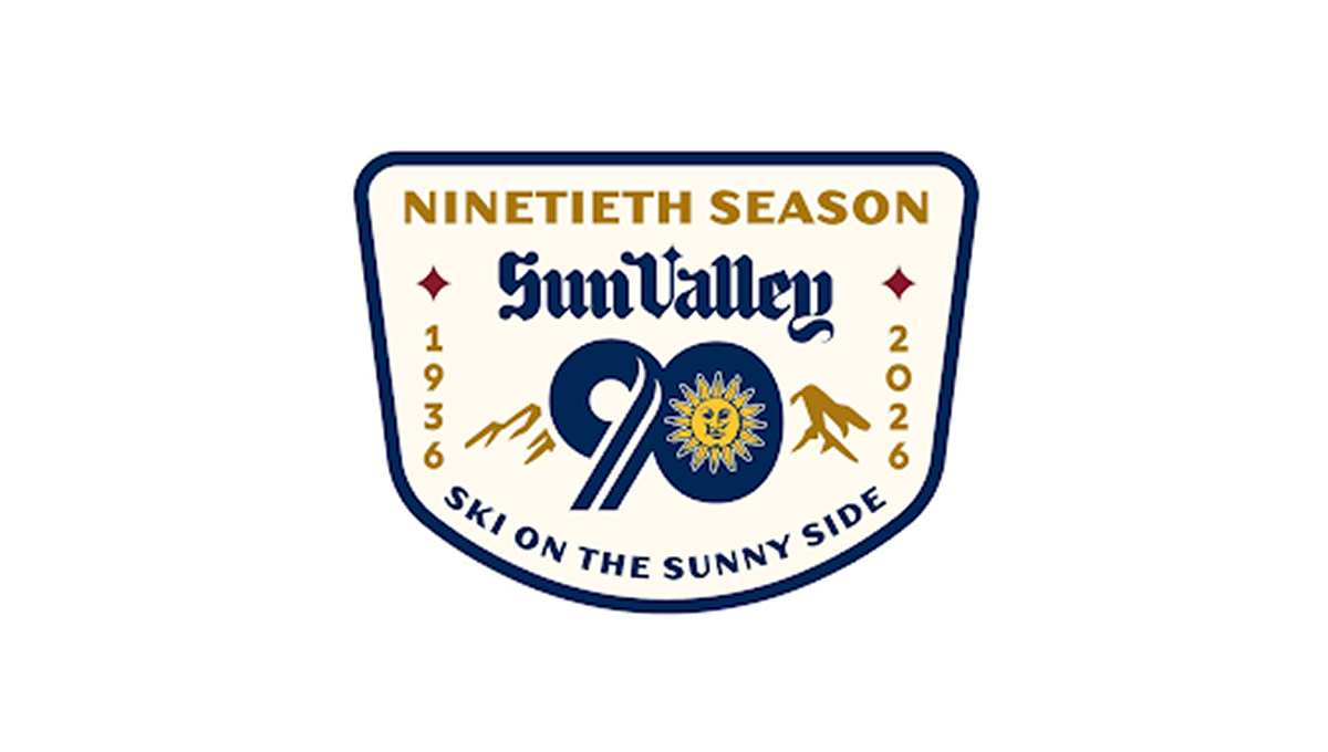
This anniversary logo has a classic, welcoming look that feels tied to tradition and place. The badge shape gives it a sturdy, established feel. A large number marks the milestone season, while mountain shapes and a bright sun suggest outdoor fun and warmth. The lettering feels timeless and confident. The colors are rich but friendly, and the overall design feels proud, cheerful, and quietly celebratory without being too bold.
More Details →Jackson Hole 60th Anniversary Logo
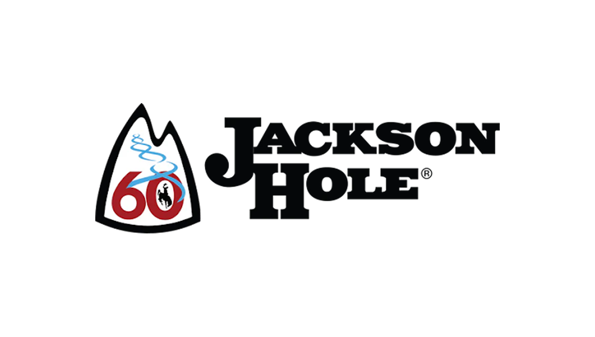
The anniversary logo has a clean, simple look with a strong outdoor feel. It centers on a mountain-shaped badge that suggests nature and adventure. The number 60 stands out, marking a long history. A soft, flowing line represents fresh ski tracks. The colors are bold but calm, and the overall design feels balanced, timeless, and quietly celebratory.
More Details →Acura Grand Prix of Long Beach 50th Anniversary Logo

You could take away almost all of the context of this logo and still know that it's for an auto race. The thick, parallel lines of the number fifty along with the checkered flag embedded neatly inside mimic the classic track maps and diagrams that are so familiar in both the actual sport and virtually in games. Places beside the word mark you can see how well the designers matched this addition to the original logo.
More Details →Tampa Bay Rowdies 50th Anniversary Logo

The Tampa Bay Rowdies have always had a classic word mark within their crest, but the designers of this anniversary logo scored an absolute peach of a goal with this design. A large number 50 sits below that word mark with a ribbon weaving in an our of the numbers containing the years of their operation. Best of all, however, are the other design elements they created in tandem with the logo that give their brand a lot of great pieces to work with.
More Details →Washington Capitals 50th Anniversary Logo

We love a good retro logo and this is a perfect example of that. Old school styles, shapes, and colors are combined into a clean design that puts a large number 50 in red, a hockey stick in blue, classic starts below and the team's traditional logo at the top. The result is a really nice logo in a square shape that's easy to use across online and social channels.
More Details →National Parks Service + America 250 250th Anniversary Logo

With the 250th anniversary of the United States coming up, the America 250 organization is not only doing their own anniversary logos for the country as a whole but also the groups that make up key parts of the American brand. The National Parks Service is one of those and this clean logo featuring a large 250 behind the Statue of Liberty and the word America is a clean, retro image seen on many NPS marketing assets.
More Details →Encyclopaedia Britannica 250th Anniversary Logo

One of the most well-known brands in the world, Encyclopaedia Britannica's 250th anniversary logo features their classic thistle mark spread across three vertical book-spine rectangular shapes. In each of those shapes is a digit of their anniversary. Their name at the top and the word anniversary at the bottom lock up and balance this simple, clean design.
More Details →National Arts Fesitval 50th Anniversary Logo
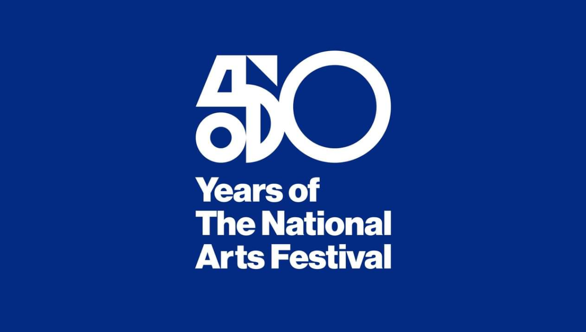
This logo was used primarily on this blue background and combines two nice designe elements to make the whole. The first is a combination of shapes to create a unique, creative number 5 that resembles a bit of modern art. The second is the classic helvetica-style font that is so common in art contexts. Together, this logo is clean, unique, and meaningful.
More Details →Boyne Mountain 70th Anniversary Logo
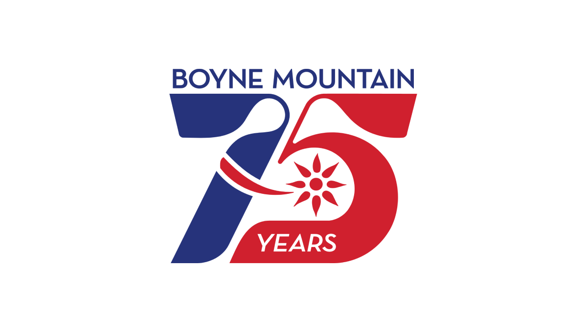
Retro was the name of the game as Boyne Mountain pulled visuals and colors from the early days of their history to create a number mark that was both easy to read but also neatly tied back to the original brand from all those years ago. Above that number mark is the name of the resort to complete the design. This logo as looked fantastic in all white on dark backgrounds and the shape lended itself well to use as social media avatars.
More Details →Massanutten 50th Anniversary Logo
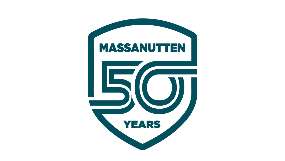
Massanutten went retro for this clean, badge-style logo by starting with a crest shape. Inside that crest is a double-line number fifty with the bottom part of the five connecting with the left edge and the top part of the zero extending to connect with the right. The name of the resort sits above the number with the word years below to complete this clean, effective logo design.
More Details →Dust Bowl Brewing 10th Anniversary Logo
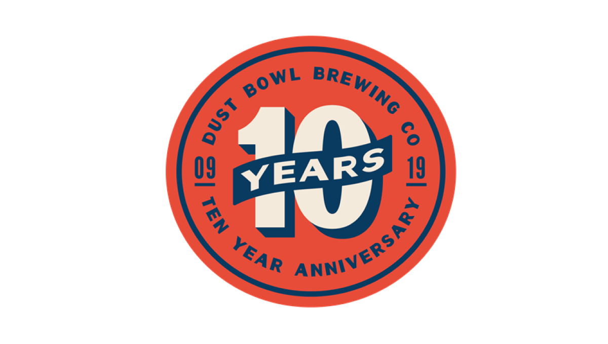
This retro-style logo uses the classic blue and orange colors famous in old-school newspaper and magazine ads. In the center of the circle is a large number 10 with a banner across holding the word "years". Around the outside of the circle is the name of the brewery and some wording to clarify the reason for celebration.
More Details →MLB All Star Game 50th Anniversary Logo
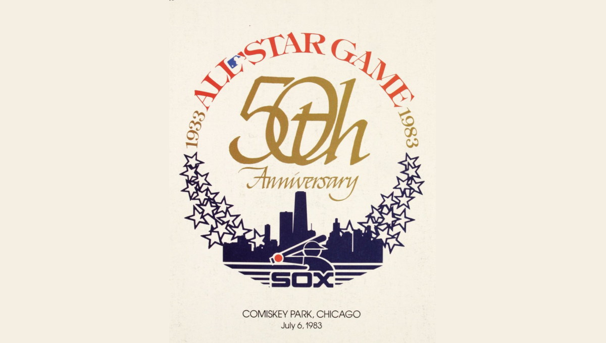
This mark was featured on a poster and sets a few elements into a clean, round shape with a "50th" in gold in the center. On the bottom sits a blue silhouette of the Chicago skyline with blue shares curving up and to the side of the skyline to begin forming the circling. On the top is red lettering signifying the occasion with the start and current years in gold connecting the two and completing the circle.
More Details →Atari 50th Anniversary Logo
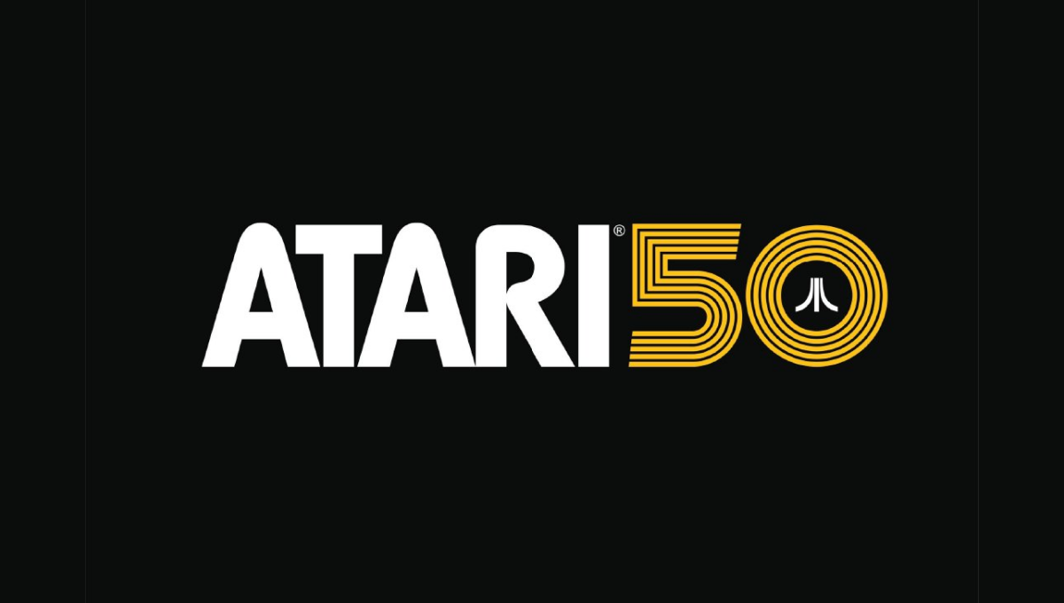
As one of the truly classic brands of early gaming and technology, Atari combined their classic word mark with the three diverging lines in this lockup that's designed for a dark, black background. A line-art version of the number 50 holds the mark in the 0 with a clean gold color providing both contrast with the white but easy readability on the black.
More Details →Kelly Canyon 60th Anniversary Logo
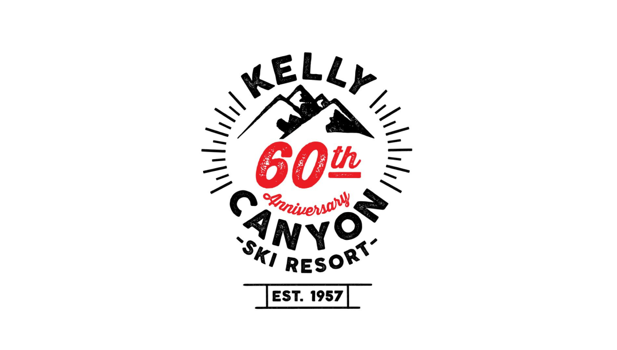
Kelly Canyon gave their designed lots of creative freedom and focused on a mark that was fun and recognizable rather than one that has strong, visual ties back to their original brand. The clean line-art design that they came up with works great in many situations - web, print, etc. - and creates a separate brand for their annversary.
More Details →Blacktail Mountain 25th Anniversary Logo
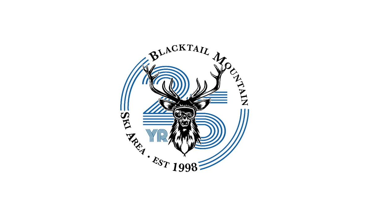
Blacktail Mountain went away from their primary logo with this mark and used a retro, line-art style number with a classic circular bar of text around and deer graphic to tie it all together and back to the core brand. It's a nice, clear, simple design and the retro feel of the number gives it a unique feel that's easy to recognize and remember.
More Details →Big White 60th Anniversary Logo
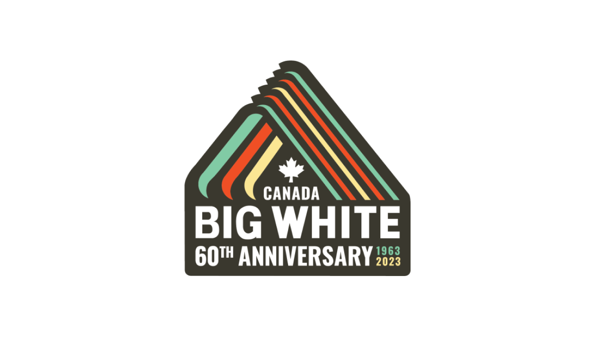
With a throwback to one of Big White Mountain Resort's original logos, this adaptation brings in a modern, sticker-style badge and extra line of text to hold the anniversary label, with a three-color design that's also a little bit retro. A simple combination of past and present, this is a great use of original logos with modern design needs.
More Details →