125th Anniversary Logos
US Open 125th Anniversary Logo

This 2025 U.S. Open logo has a clean, traditional look with a touch of elegance. The text is clear and spaced out, with “125th U.S. Open” and “Oakmont” standing out. At the center is a simple image of a squirrel, adding a classic feel. It feels formal and steady, fitting for a long-standing and respected event.
More Details →FC Barcelona 125th Anniversary Logo

The anniversary logo features a clean and modern design that blends tradition with a sense of celebration. It includes bold, simple shapes and a familiar crest, subtly updated to mark a special milestone. The colors are rich and meaningful, reflecting the identity of the group it represents. Numbers and symbols are placed thoughtfully, suggesting the passage of time and a proud history. Overall, the design feels respectful and strong, with a touch of elegance.
More Details →Utah Division of Arts & Museums 125th Anniversary Logo

This simple logo sets the original word mark on the right and adds a stylized number 125 to the left. Similar to other anniversary logos, they stagger the digits of the number to add a little bit more design and depth tha having the number alone. Filling the gap left by this stagger are two ribbon shapes that tie the logo back to the meaning and mission of the organization.
More Details →American Bakers Association 125th Anniversary Logo
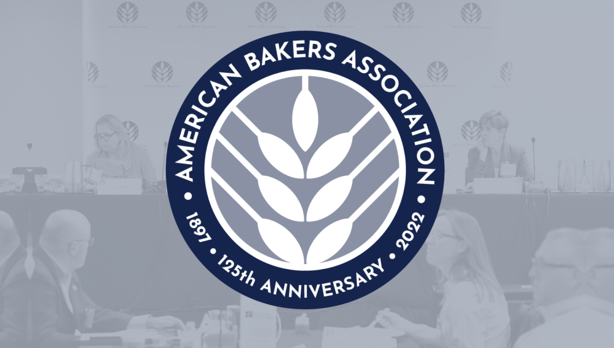
Using the round shape so often found in anniversary logos, this mark adds a clean, on-brand white silhouette of wheat in the center as the visual anchor for the design. Around the perimeter of the circle in a thick blue band wits the name of the organization, the years of operation, and the classic anniversary callout to complete the circle and add clarity to the reason for this separate mark.
More Details →Coca Cola 125th Anniversary Logo
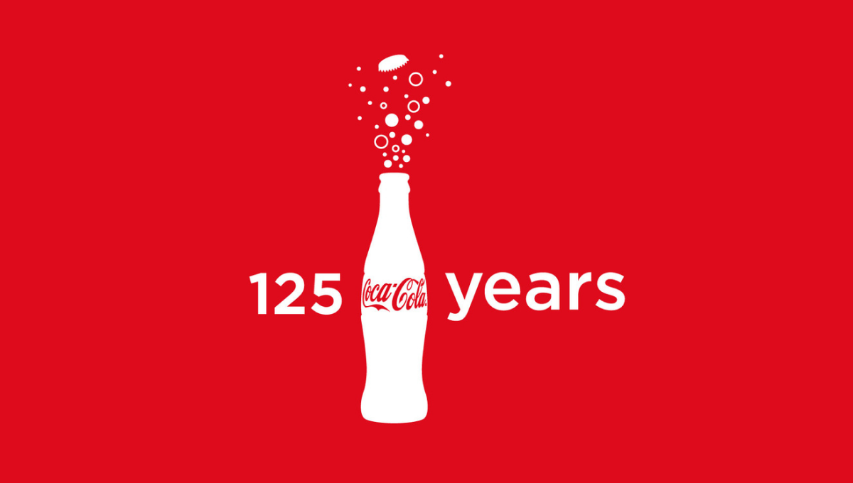
Imagine having a brand so powerful that you only need the shape of your packaging for people to instantly recognize its source. In this case, they also included the logo on the bottle, but it's almost unnecessary. With bubbles coming out the top and text to the left and right, these elements were combined in various lockups but this one - which also showed up on some packaging - was among the more popular.
More Details →University of North Texas 125th Anniversary Logo
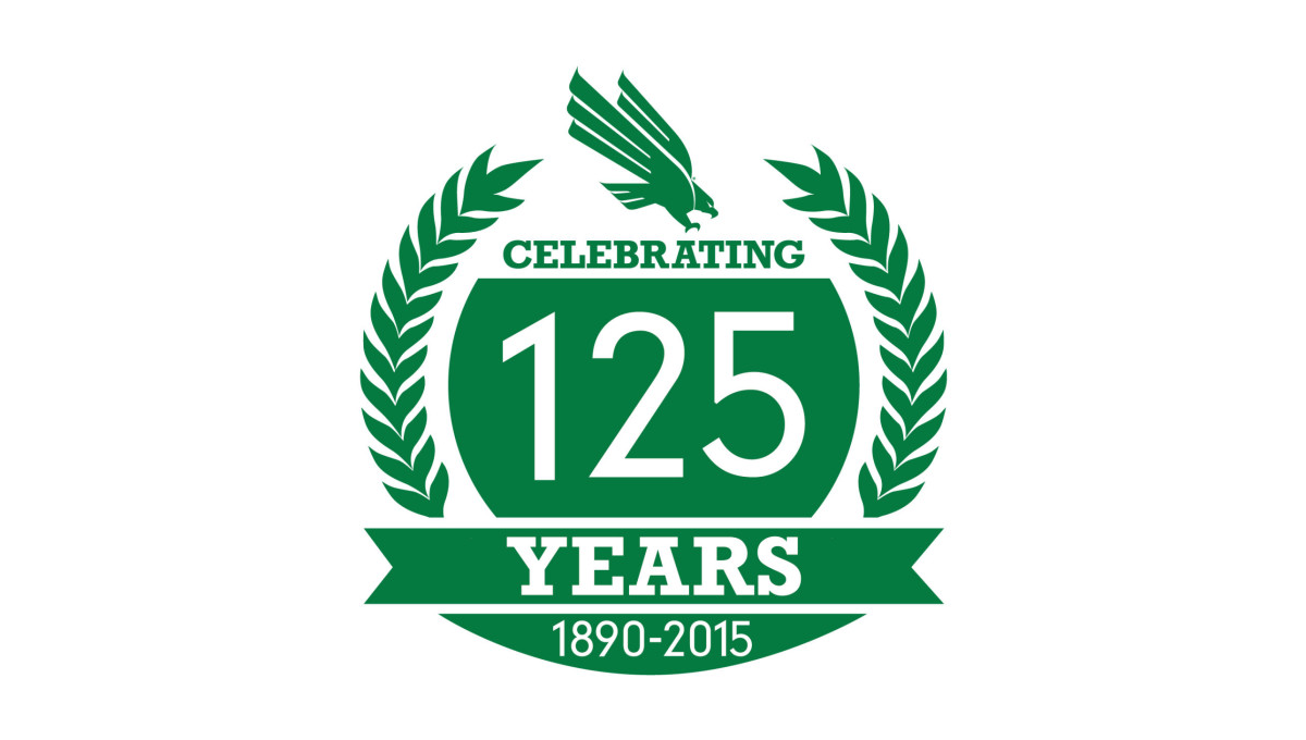
With a classic laurel-leaf style of many crests and anniversary logos, this mark uses these illustrations to create a simple, round shape to work with. Inside that shape is a large number 125 along with the words celebrating, years, and the years of operation. A ribbon holds some of these words while the gab between the laurels at the top is filled with the university's traditional logo.
More Details →Northern Illinois University 125th Anniversary Logo
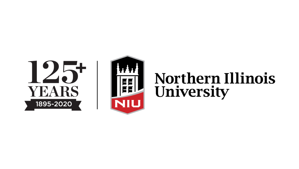
With the popular vertical-line style as the foudnation, this university placed their traditional logo on the right side of the line and a stylized number to higlight the anniversary they're celebrating on the lft. By using the same typefaces alongside the original logo, this mark makes no mistake about which brand is celebrating and creates a clean, well-designed package that can be used easily in marketing collateral.
More Details →City of Waukesha 125th Anniversary Logo
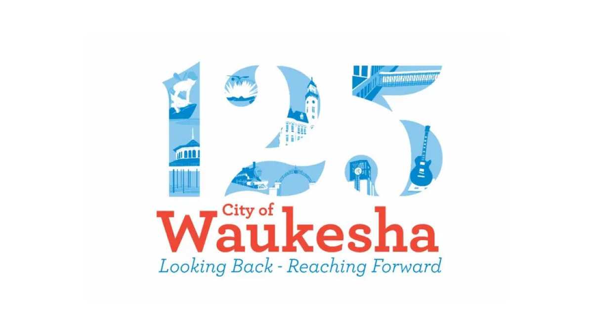
This logo places illustrations from many of the city's most notable landmarks in the number 125 to create a nice visual anchor for the city's anniversary. Complimenting the traditional red of the original logo, the number uses multiple shades of blue to keep the clear edges of the number but provide enough contrast to make each landmark easy to identify.
More Details →Hobart 125th Anniversary Logo
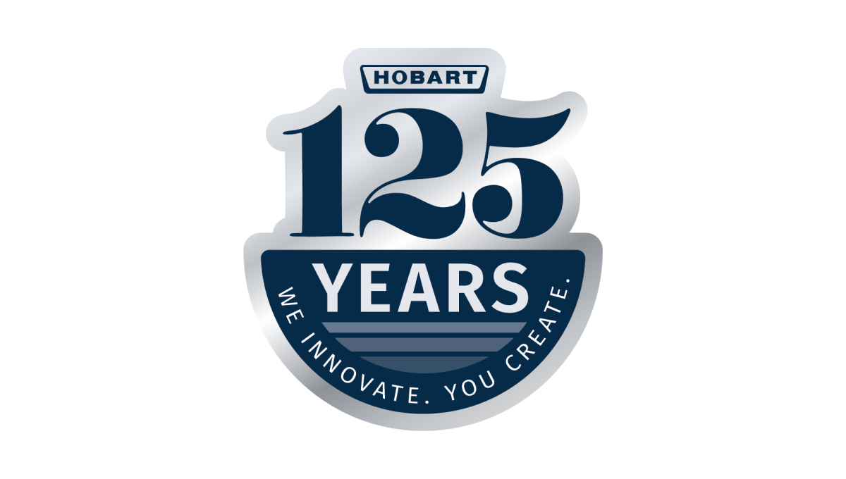
Using a look of the classic stainless steel material that many of their products are created from combined with the brand's traditional blue color, this clean mark places a large 125 and the main logo above a semicircle holding the word "years" and a tagline to celebrate the occasion and reinforce the company's main message, mission, and values.
More Details →Drexel University 125th Anniversary Logo
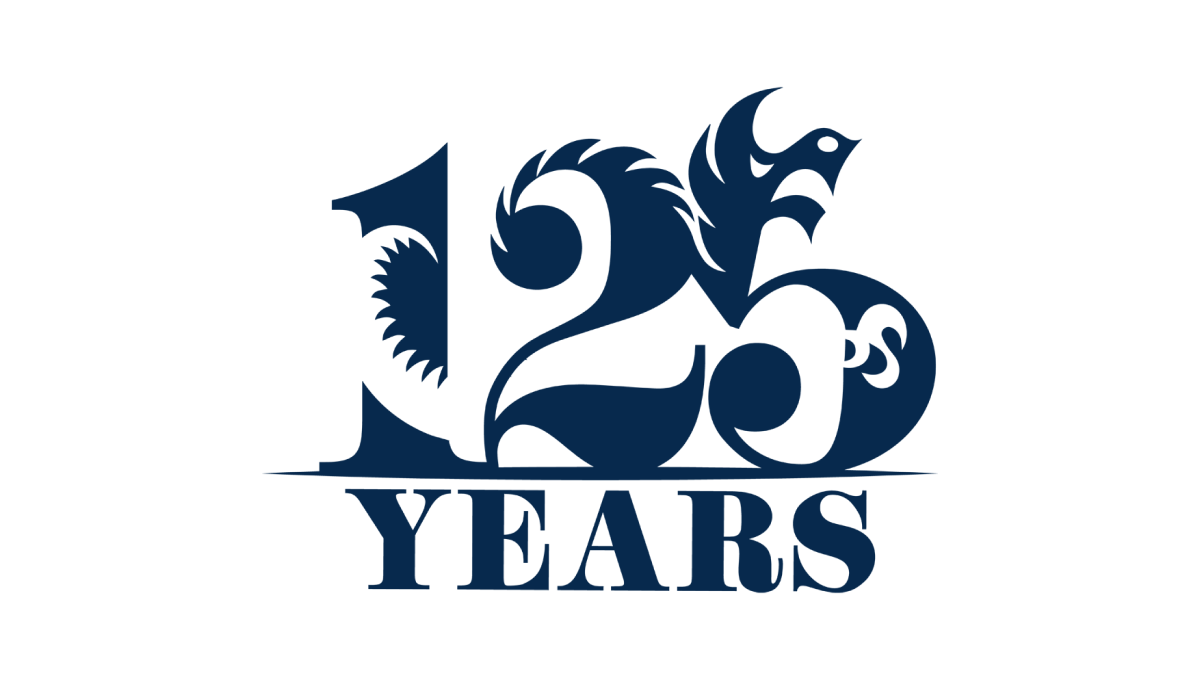
Designed by a student as part of a year-long project, this beautiful anniversary logo combines a large, block number 125 with the school's famous dragon logo to create a design that, remarkably, is easy to identify both elements within despite using a single color. With a block word "years" below, this is a beautiful example of design and art in a thoughtful, meaningful logo.
More Details →University of Chicago 125th Anniversary Logo
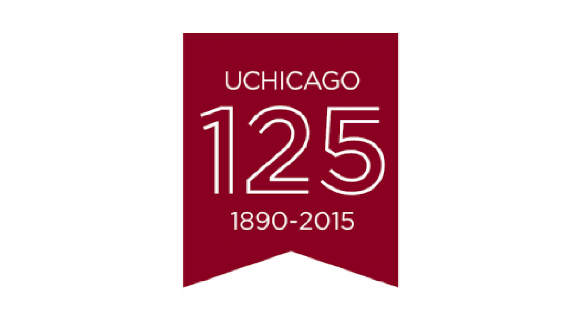
Keeping it simple, this logo uses a vertical ribbon-style banner in the school's main brand color to create a space for this celebratory mark. With a line-art depiction of the number 125 in the center, the name of the school above the number, and the years of operation below, this mark checks all the boxes in a clean, simple package.
More Details →DePaul University 125th Anniversary Logo
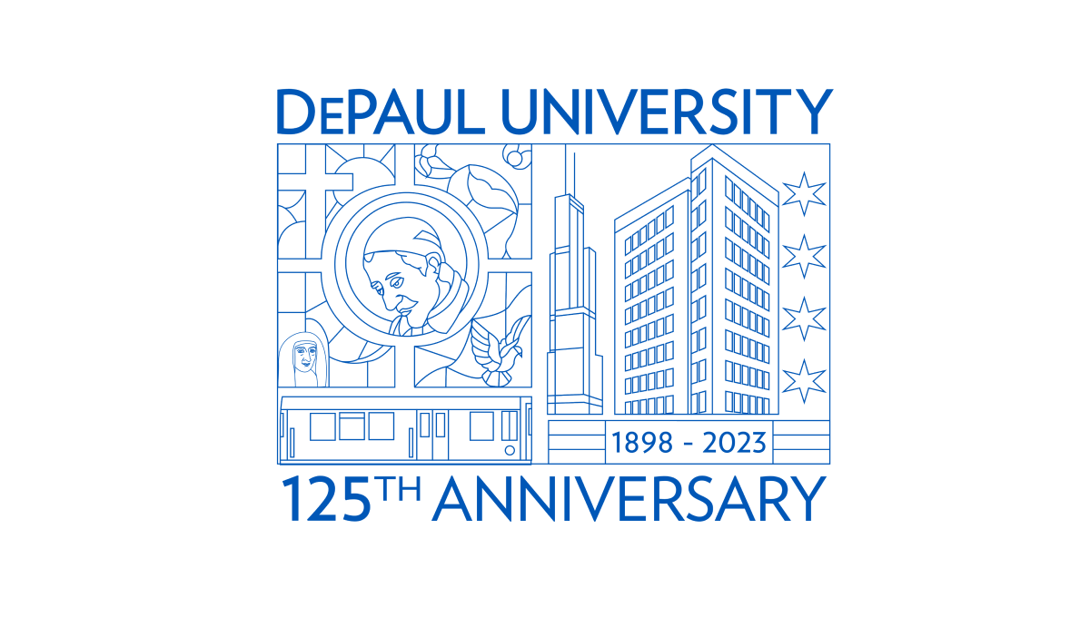
Using beautiful line art of the city in which this university is location and famous figures from their story and history, this annivesary logo is an incredible design that stands out from traditional annivesary logos. With this art at the center, playing the name of the school and the year that is being celebrated above and below in the same brand blue is all that was needed to balance out this design.
More Details →Yosemite National Park 125th Anniversary Logo
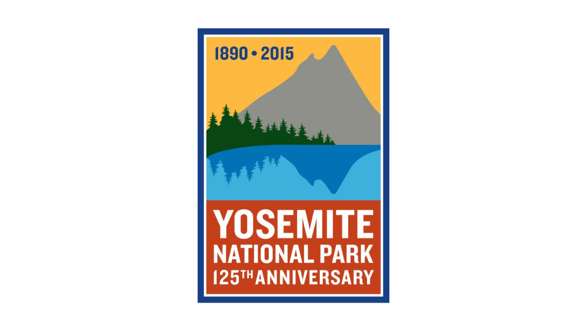
While other logos that include illustrations contain detailed depictions of well-known features, this vertical rectangle logo goes simple with a silhouette of a mountain and trees reflecting in a lake. Behind the mountain sits a yellow sky that contains the years of operation with a block of red at the bottom to hold the name of reason for celebration. A blue border surrounds the rectange to hold the elements together and neatly frame the design.
More Details →Silver Cross Hospital 125th Anniversary Logo
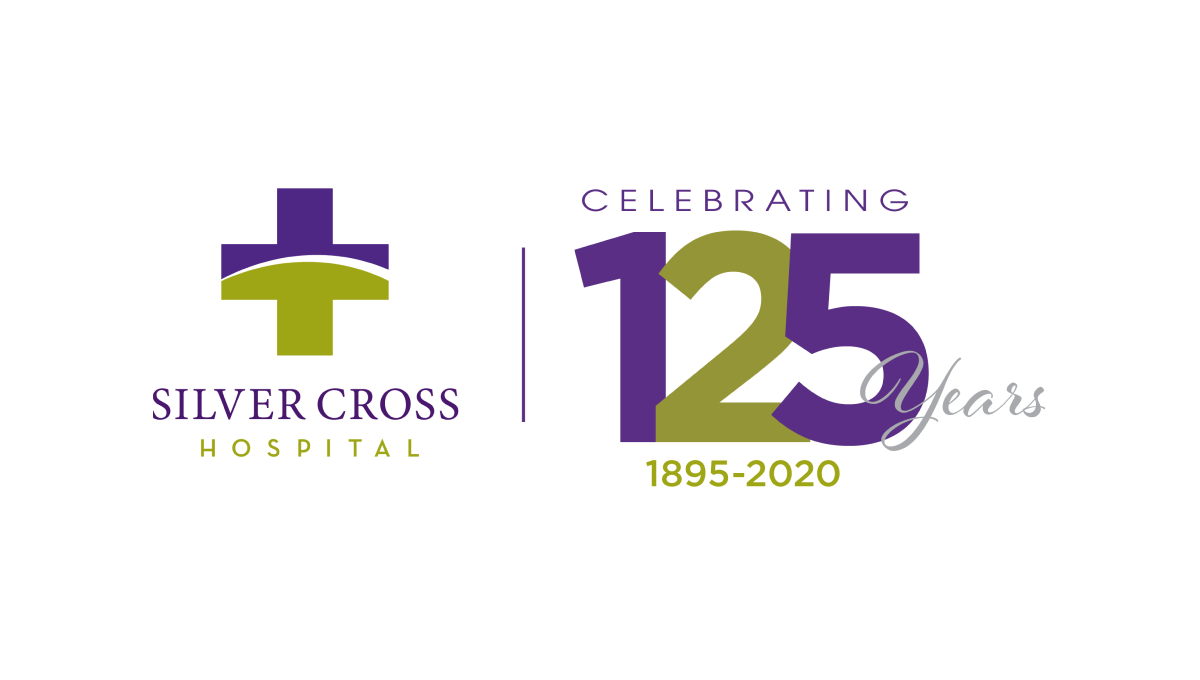
Similar to how some branded events ask partners to place their logo next to the event's logo with a line between for an co-branded marketing, this logo does something similar with a line between the traditional logo and a stylized number with a few words for balance and clarity around. With the number in the brand's original purple and gold/green, it's a simple way to create a clean, effective anniversary logo variation.
More Details →Temple University Hospital 125th Anniversary Logo
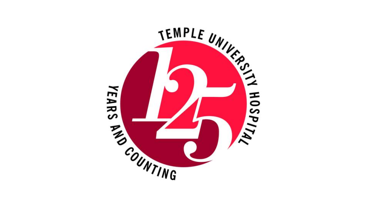
Two digits in a number creates their own design styles and three digits does the same. At 125 years, Temple University's Hospital stacked the three digits on an angle to create a clean layout for the number and focal point of this logo. Placing a circle behind the the university's classic colors and words wrapping around indicating the name and forward-looking vision for the organization, this logo is clean, simple, and effective.
More Details →