Entertainment Anniversary Logos
Family Guy 25th Anniversary Logo
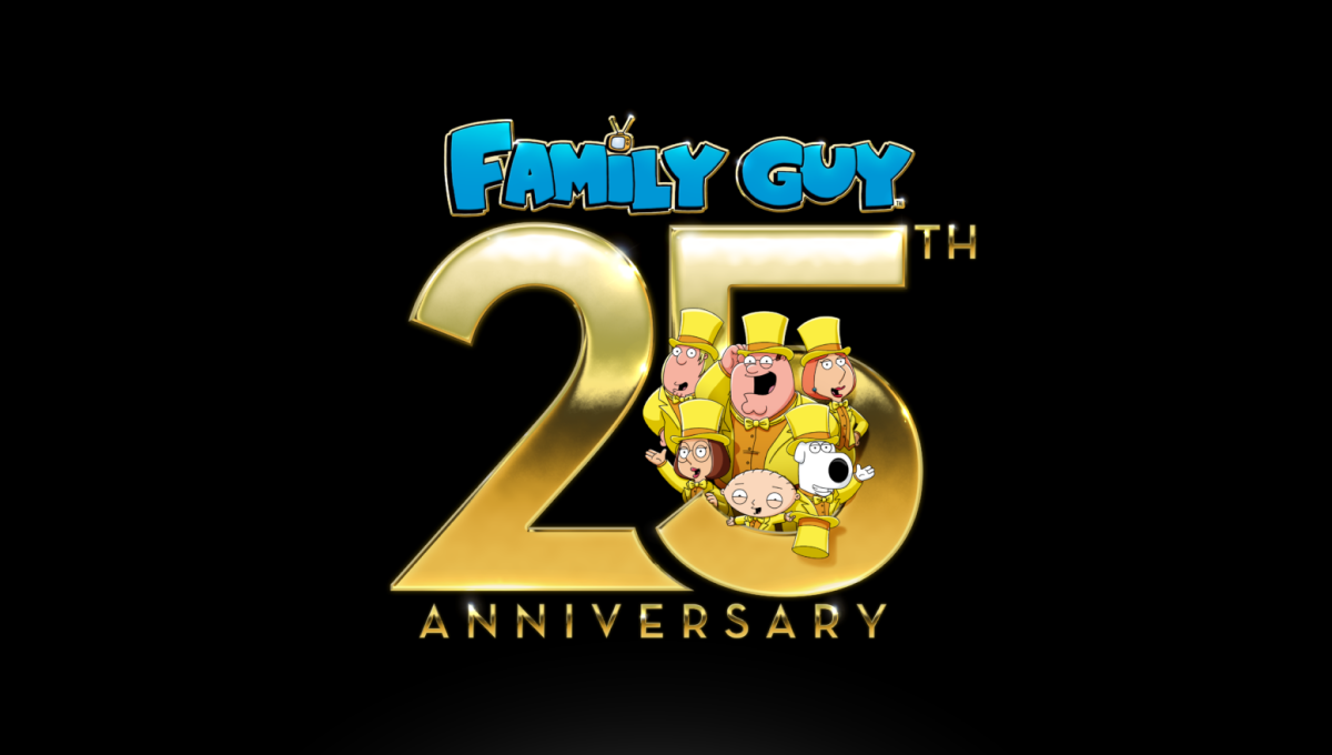
This anniversary logo has a bold, celebratory style with a playful and eye-catching layout. Large metallic numbers create a strong focal point, while bright colors and familiar illustrated characters add personality and energy. The milestone is clearly emphasized, with the characters integrated into the design to create a sense of fun and connection. A dark background helps the gold elements stand out, giving the overall logo a festive, polished, and memorable appearance.
More Details →Disney Shanghai 10th Anniversary Logo
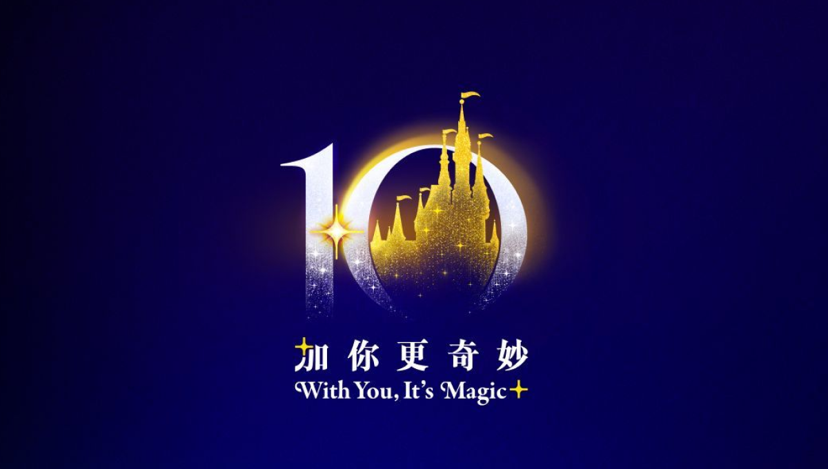
This anniversary logo uses a rich blue and gold color palette to create a polished and celebratory feel. The large “10” is designed with soft glowing effects, while a castle-like silhouette in the center adds a sense of imagination and wonder. Small sparkling details help give the design a magical atmosphere without making it overly complex. The mix of elegant typography and simple visual elements makes the logo feel memorable, festive, and connected to a long-standing brand celebration.
More Details →Kirby 20th Anniversary Logo
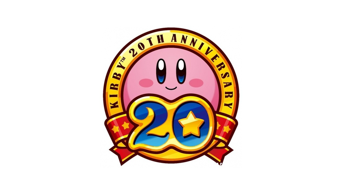
This anniversary logo shows a round, pink character with a soft smile at the center of a bright badge. The design uses warm gold and red colors, giving it a celebratory feel. A large number “20” sits in front, with a small star adding a playful touch. Ribbon shapes and bold outlines make it feel special and proud, like a milestone being honored in a fun, friendly way.
More Details →KUER 90.1 65th Anniversary Logo
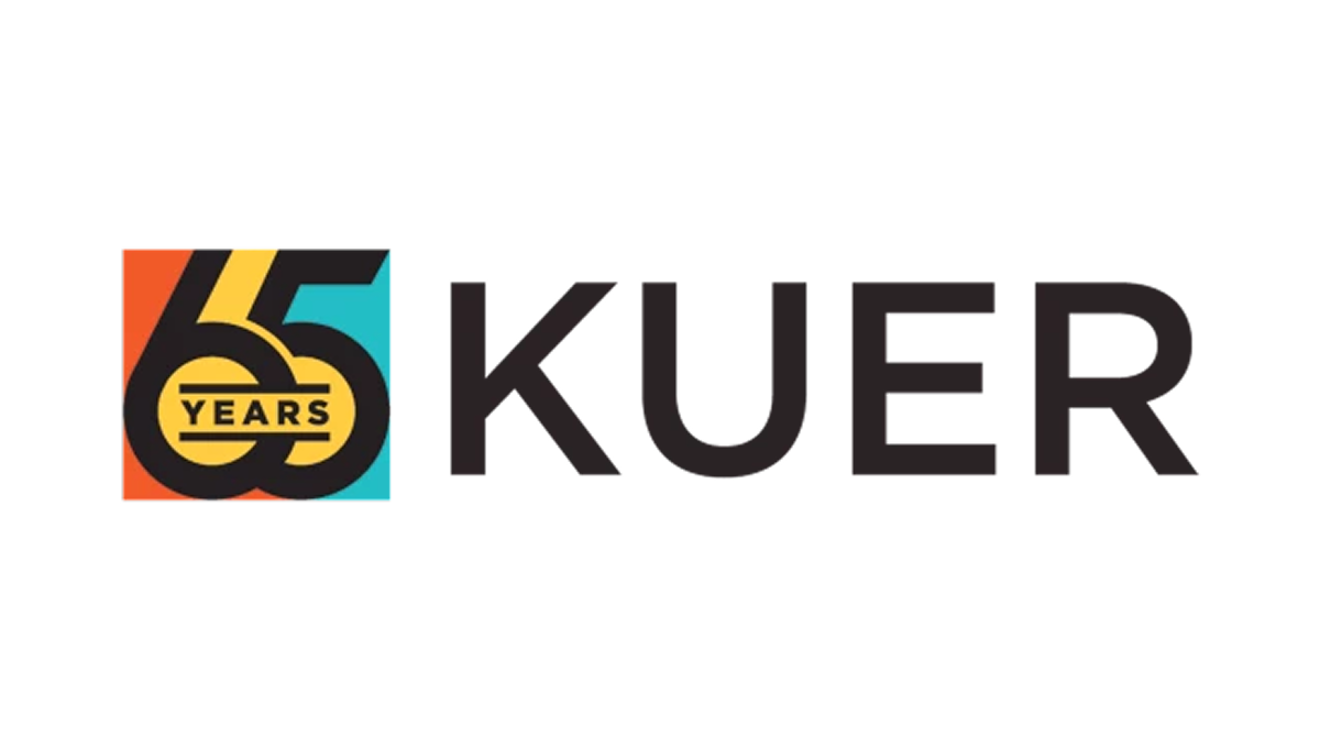
This anniversary logo features a clean, modern design with a mix of bold and light text. It highlights the number "65" to mark a special milestone, standing out in large, simple lettering. The colors are soft but eye-catching, giving the design a fresh and balanced look. The layout feels organized and clear, combining the station's name with the anniversary number in a way that looks both professional and easy to read. It gives a sense of history and progress.
More Details →Jaws 50th Anniversary Logo

This 50th anniversary logo has a bold and dramatic style. The number “50” is big and solid, with the word “JAWS” placed tightly above the number in its well-known red lettering. The colors are on the dark side, giving it a strong and serious feel. The design feels classic and a bit intense, matching the tone of what it’s celebrating, while still keeping things clean and focused.
More Details →Rudolph the Red-Nosed Reindeer 60th Anniversary Logo

The anniversary logo for Rudolph the Red-Nosed Reindeer features a minimalist design that emphasizes simplicity and abstraction. The logo utilizes bold lines and circular shapes to represent Rudolph's iconic features, such as his nose and antlers. The use of negative space and geometric forms gives the logo a modern and clean look, while still maintaining a festive and recognizable connection to the beloved holiday character. This design approach reflects a contemporary take on traditional holiday imagery.
More Details →Tomy Toys 100th Anniversary Logo

Some logos seem to be well equiped to pair with a number of add-on to celebrate something like an anniversary logo and this is one of those. A rounded blue rectanged with the name of the company anchors the traditional logo on the left and by placing a stylized number 100 to the right - in this case by turning the zeros into an infinity sign - they've got a balance package that keeps the original logo as both the main element and the focal point of the design.
More Details →Duolingo 10th Anniversary Logo

A logo is a tool and the design of that tool depends on where and how you need to use it. This logo is a perfect example of that given that the vast majority of people who see this logo will be the millions of users of this popular app. So their logo took on the form of a square, fun shape featuring their popular mascot so it could be used as an element within the app like badges and awards. It's such a smart move.
More Details →Columbia Pictures 100th Anniversary Logo
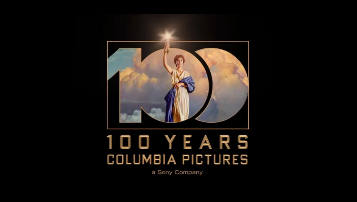
Columbia Pictures' opening sequence has been seen dozens of times by millions of moviegoers. So when they wanted to create a recognizable but simple anniversary logo, they simply overlaid a large, block 100 on this classic imagery. The result is clean, easy to understand, and an instantly, clean connection back to their original brand.
More Details →Sesame Street 50th Anniversary Logo
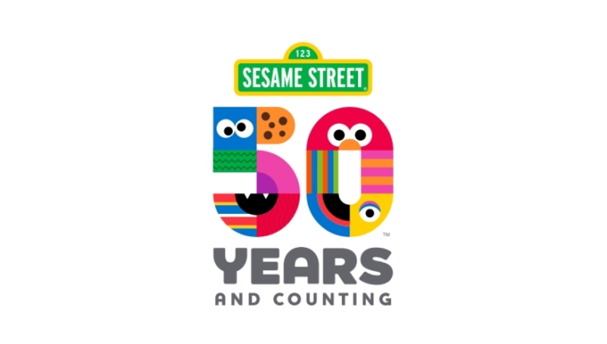
There are so many classic visuals within the Sesame Street story and this logo found a way to weave many of them - from Cookie Monster to Big Bird - into a single design. The result is a colorful number fifty that, set below the traditional street sign logo, is both representative of the story as well as a playful vibe that is perfectly on brand.
More Details →Six Flags 50th Anniversary Logo
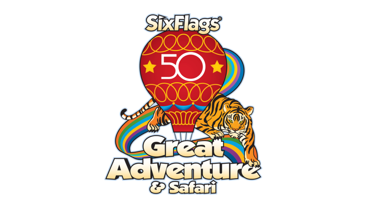
Throwing back to a classic design from the 1970s, this logo takes that original design full of rainbows, balloons, bubble letters, and hues that saw their heyday fifty years ago and adds just enough of a number in the center to make it easy for their audience to recognize the reason for and adaptation of their logo.
More Details →Jurassic Park 30th Anniversary Logo
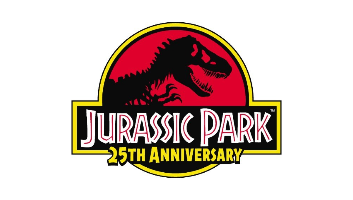
This famous first installment of what is now a multi-part video series already had an iconic logo that was not only the logo for the movie, but the fictional park inside the movie. So instead of starting from scratch, they added the words "25th anniversary" below the words in the traditional logo and called it good.
More Details →Legoland Florida 10th Anniversary Logo
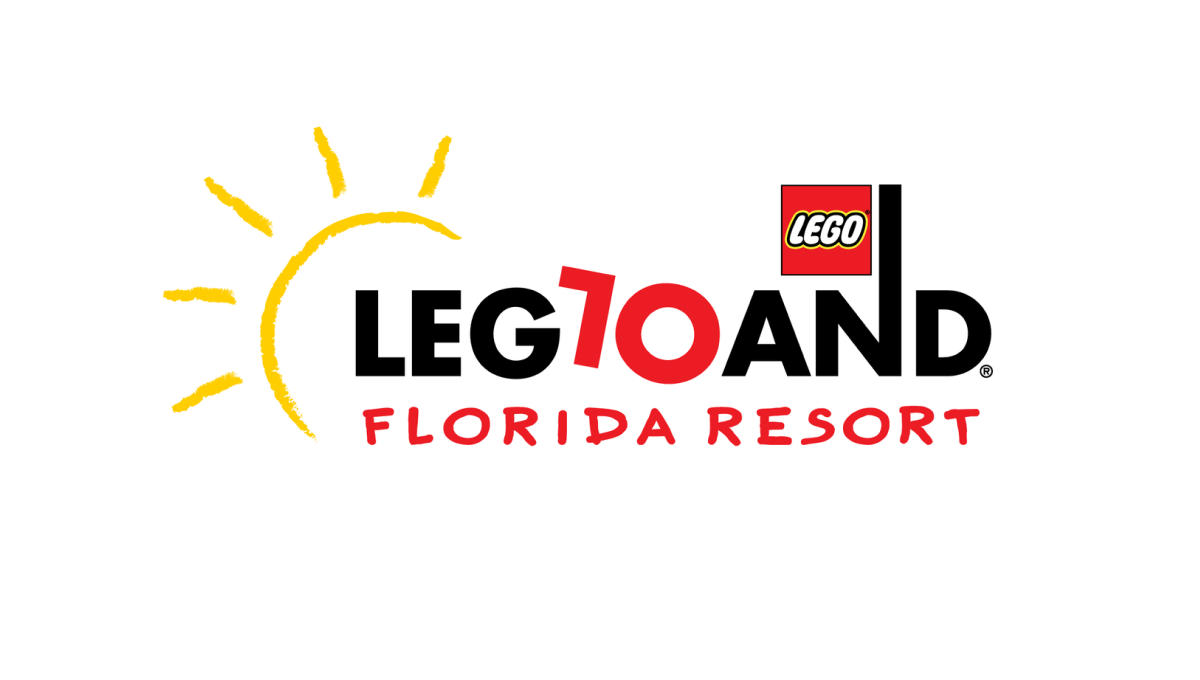
Legoland is a fun, playful place, so the logo of their 10th anniversary started with the same tone. The L and O of the word mark are converted to a 1 and 0 to both keep much of the original, recognizable mark but also make it easy to spot the reason for the change. By making the number slightly askew, it kept the playful tone while producing a design that was easy to swap for the existing mark.
More Details →Star Wars 40th Anniversary Logo
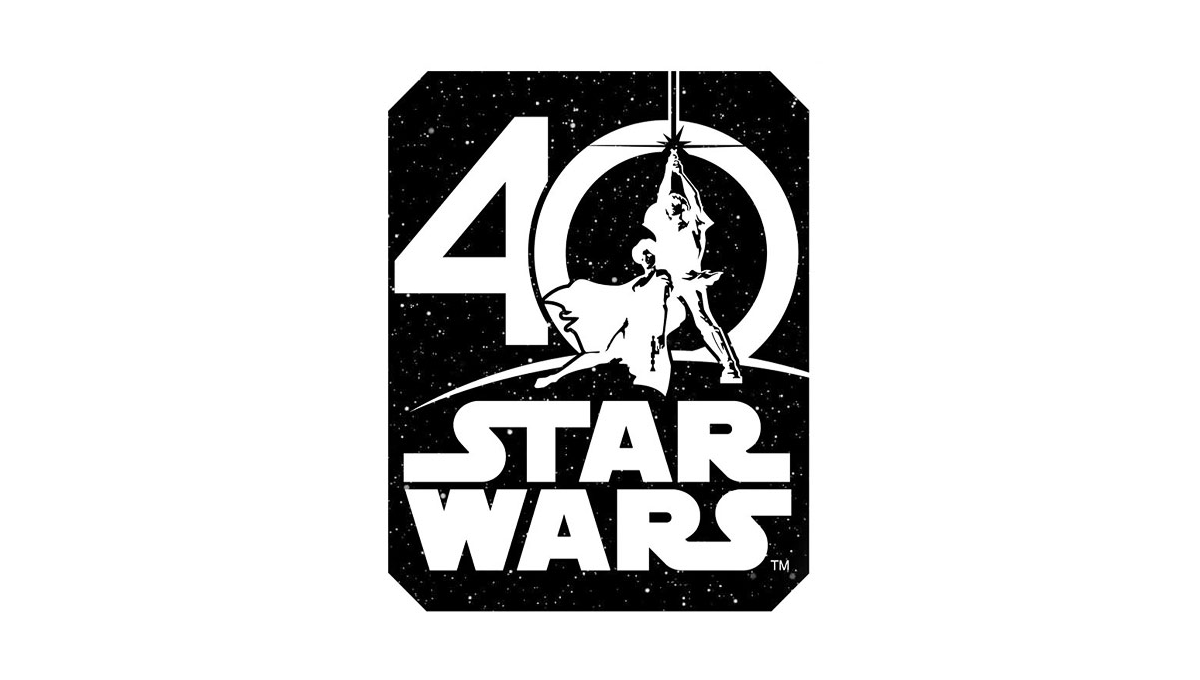
Using the classic image from the cover of the original movie, this logo places this iconic imagery in the center of a zero for the number 40. Below that, the traditional logo is stacked to create a foundation for this logo. Around the logo is a square, black shape to create the dark, space theme of the movie series.
More Details →Warner Bros. 90th Anniversary Logo
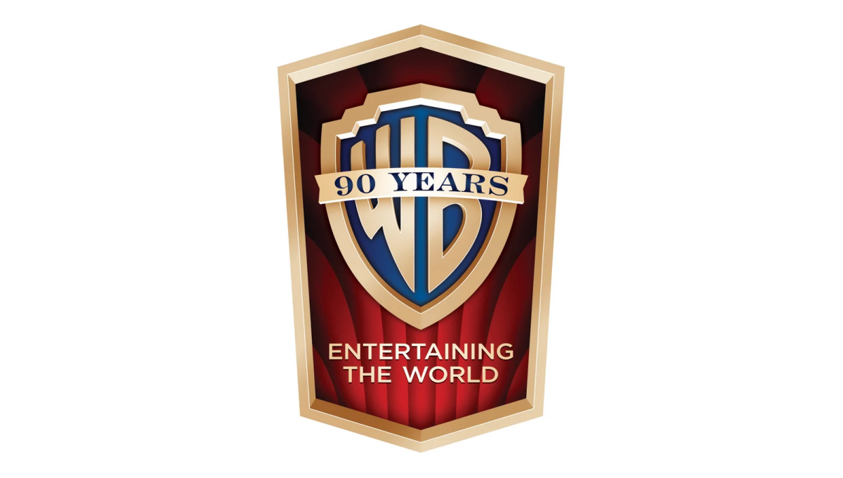
This detailed mark carries the classic feel of the brand's opening sequence that intro their films. The traditional logo sits inside a vertical crest with the brand's famous red curtains falloing behind to fill in the space behind the mark. In the space left at the bottom of the badge sits their company tagline to provide balance.
More Details →Warner Bros. 100th Anniversary Logo
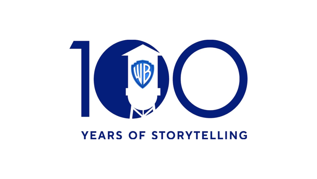
Starting with a large, block number 100, this logo fills in the first zero to create a canvas for their design. Next, the famous Warner Bros. watertower is placed inside that first zero with a slightly different blue color holding their traditional WB badge. Below the number 100 the words "years of storytelling" give the 100 context and reinforce what their brand is all about.
More Details →