Green Anniversary Logos
Kahuna 25th Anniversary Logo
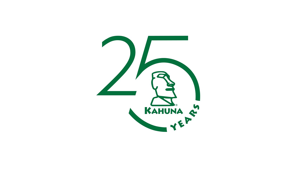
This anniversary logo has a clean and modern look with a simple green color theme. The large “25” design creates the main shape, while a curved circle element gives it a balanced and connected feel. In the center, there is a stylized island-inspired figure that adds character and brand identity without too much detail. The “Years” text follows the curve in a subtle way, helping the overall design feel smooth, professional, and celebratory while still staying minimal and easy to recognize.
More Details →Hooper City Tomato Days 100th Anniversary Logo
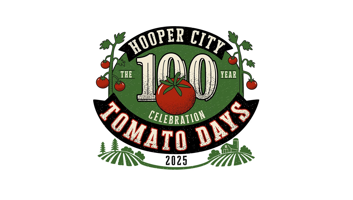
The logo uses a bold number 100 in the center with a tomato shape overlapping it, showing this event’s big milestone year. Around that, there’s simple text for the place and event name in a curved layout. On the sides and below, there are basic plant and field shapes that give it a slightly rustic, homey feel. The colors are earthy reds and greens with an old-fashioned, slightly worn look to the letters and shapes.
More Details →Peninsula Hot Springs 20th Anniversary Logo

The anniversary logo has a clean, simple look with a modern feel. It uses soft colors and smooth shapes that give it a calm and celebratory vibe. A large number stands off to the side, marking an important milestone, while the surrounding elements show the company's name. There’s a gentle blend of old and new in the design, with just enough detail to feel meaningful without being too busy. It feels thoughtful, yet light.
More Details →Winnepeg 150th Anniversary Logo

The Winnipeg 150th Anniversary logo is a rich tapestry of symbolism reflecting the city's heritage and Indigenous roots. At its core, the design features the outline of a turtle shell, representing Turtle Island, overlaid with the current footprint of Winnipeg. Elements such as the North Star, the Red and Assiniboine rivers forming the profile of Mother Earth, a crocus (part of the city crest), and sage and tobacco crops are intricately woven into the logo. This emblem encapsulates Winnipeg's journey, celebrating its shared stories and future aspirations.
More Details →Eastern Michigan University 175th Anniversary Logo

There are a few elements that show up regularly in both anniversary logos as a whole and designs for universities, and while this holds to a fairly traditional design, it does so in a nice clean pckage. Around the outside of the circle is the name of the university, in the center is the big number for the years of operation. A few laurel leaves curving around the sides to fill in the gaps and two rings to hold it all together and you've got a simple but effective design.
More Details →Big Cypress National Preserve 50th Anniversary Logo

The National Park Service has done a number of anniversary logos over the years and I love how they let the colors and styles of the area influence each one instead of a more copy and paste approach. This is another examples of that with unique fonts, bright colors, and imagery that have a different vibe than other logos but come together to create yet another tidy design that can be used in many situations.
More Details →Tampa Bay Rowdies 50th Anniversary Logo

The Tampa Bay Rowdies have always had a classic word mark within their crest, but the designers of this anniversary logo scored an absolute peach of a goal with this design. A large number 50 sits below that word mark with a ribbon weaving in an our of the numbers containing the years of their operation. Best of all, however, are the other design elements they created in tandem with the logo that give their brand a lot of great pieces to work with.
More Details →Uni Watch 25th Anniversary Logo

With a sports/university theme, I love that this logo kept that vibe int he design as well. In this case, a large number 25 sits in the center in the classic sports lettering. Below sits imagery associated with their original brand. Around the edge is a thick green circle to hold the description of the brand the reason for the celebration.
More Details →Duolingo 10th Anniversary Logo

A logo is a tool and the design of that tool depends on where and how you need to use it. This logo is a perfect example of that given that the vast majority of people who see this logo will be the millions of users of this popular app. So their logo took on the form of a square, fun shape featuring their popular mascot so it could be used as an element within the app like badges and awards. It's such a smart move.
More Details →Poynter 50th Anniversary Logo

Simple doesn't have to mean boring as this anniversary logo from Poynter proves. Yes, it's a simple number fifty with the usual word mark sitting above. But by adding just a little bit of depth to create the appearance of a three-dimensional, fading and twisting surface to that number? They created a really simple, but clean, design that matches the tone of the company overall without overcomplicating the design.
More Details →HSMAI Foundation 100th Anniversary Logo

The original logo for this foundation already had quite a few elements, so I appreciate that design kept it simple by adding a large number 100 below the base of the original, using their tagline as a divider between the main mark and the anniversary addition. The design uses the same colors and fonts to create a nice pair to the traditional mark. There's a lot going on, but it works nicely together.
More Details →Family Search 130th Anniversary Logo

Nothing fancy, this anniversary logo starts with a base of the traditional logo in the horizontal layout. Above that they place a bit of a tagline or mission statement in the secondary orange color sometimes used with this brand. At the top is a large number 130 with just a bit of gradient applied to the brand green for a little depth. The result is clean and recognizabe.
More Details →Edmonton Elks 75th Anniversary Logo
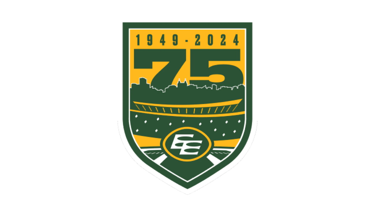
Using the classic sports style of large numbers, bold fonts, and crest-style shapes, this anniversary logo combines imagery that makes it clear the context is football and enough of the original brand to tie it back to the traditional mark. A large number 75 rises up from behind the stadium to complete this well-designed logo.
More Details →Kentucky State Parks 100th Anniversary Logo
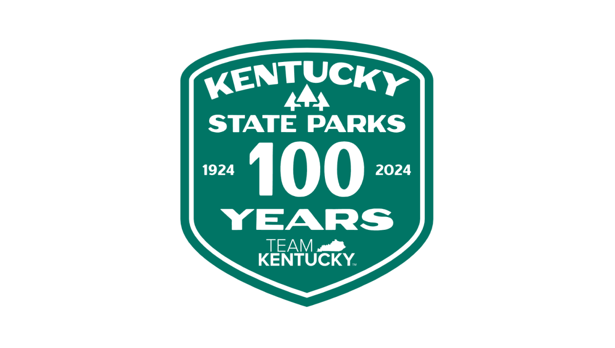
Using the classic parks-style badge, old-school fonts common on vintage posters, and a large number 100 to anchor the design, this badge-style logo combines a lot of elements - the name of the organization, the years, the state, etc. - into a conhesive design that is easy to picture being something that would have existed 100 years ago when Kentucky State Parks was organized.
More Details →Nigeria Foundation 20th Anniversary Logo
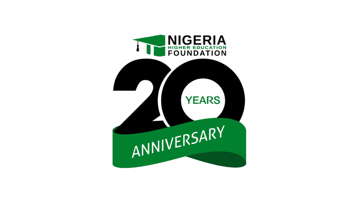
This logo takes a smart approach of combining two separate, but complimentary, designs: the traditional logo at the top and a number mark below that. This number mark features an overlapping number twenty with a three-dimensional ribbon covering up the bottom part of the number in the same brand green as the original logo. The result is clean, simple, and effective.
More Details →Meadow Mill 25th Anniversary Logo
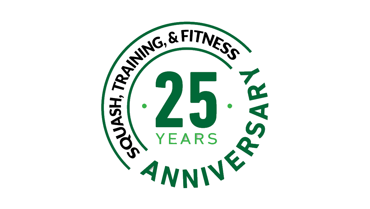
While many logos are meant to stand alone and represent the company as a whole, this design was simply meant to be paired with the traditional logo, website, or other assets. Around the left side of the circle is a list of the reasons people love this fitness center while the center holds the number 25 and the other side of the circle is ringed with the word anniversary.
More Details →De La Salle School 70th Anniversary Logo
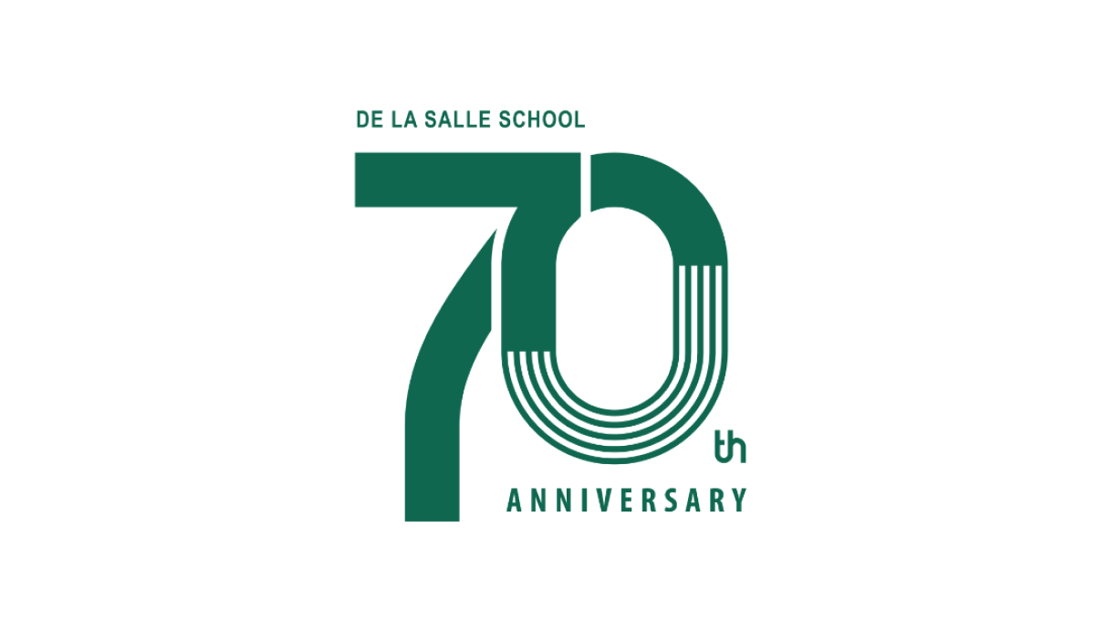
This clean design goes big on a large number 70 to mark the occasion of the celebration and places the name of the school along the top of the number seven and the word annivesray below the number zero. The mark may not be as easy to swap with their traditional logo, but with a clean style and wider shape it's a great fit for banners, swag, and events that often accompany the way universities celebrate the occasion.
More Details →Capital Area Food Bank 40th Anniversary Logo
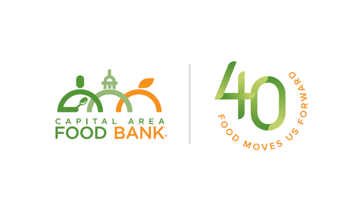
Using what has become a very common and effective design for anniversary logos, this mark starts with the traditional logo on the left, a vertical line for separation, and a separate mark that is solely about the year rather than something tied specifically to the logo. In this case, a green number 40 with an our circle of text with the organizations tagline.
More Details →University of North Texas 125th Anniversary Logo
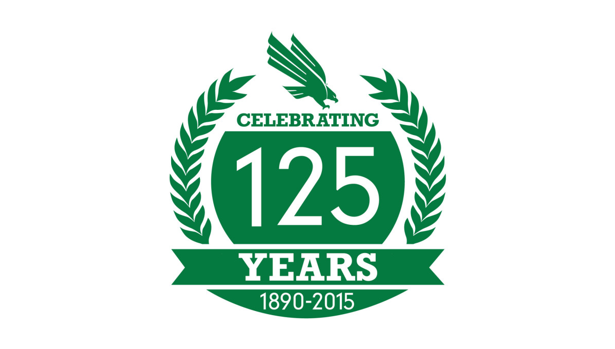
With a classic laurel-leaf style of many crests and anniversary logos, this mark uses these illustrations to create a simple, round shape to work with. Inside that shape is a large number 125 along with the words celebrating, years, and the years of operation. A ribbon holds some of these words while the gab between the laurels at the top is filled with the university's traditional logo.
More Details →Hydraulics Online 15th Anniversary Logo
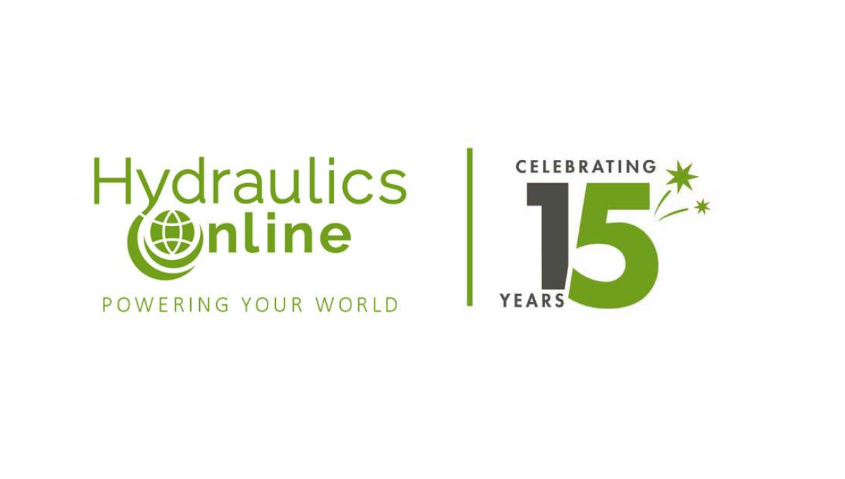
This side-by-side layout using a brand's original logo is becoming more and more common, for good reason. A vertical line seperates this media outlet's traditional logo from a simple design using a number fifteen. Even if this number was using readily available stock imagery of their annersary number, the combination of this mark and their usual design makes it a clean lockup that's easy to tie back to the original brand.
More Details →The Way International 80th Anniversary Logo
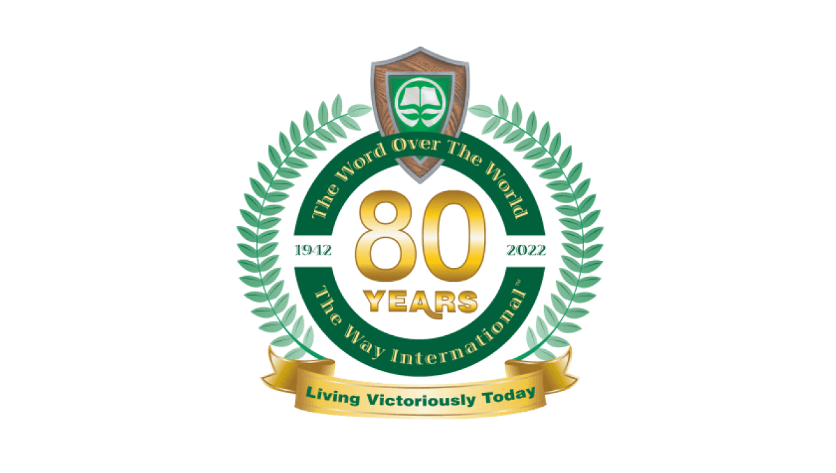
Adding a number of elements you'll see in anniversary logos, this logo uses a thick circle to hold one ring of words, another ring outside of that holding the classic Laurel leaf pattern, and a banner at the bottom where they've played the organization's motto. In the center is placed their year of celebration with the original logo situated at the top.
More Details →South Coast Pediatric Dentistry 10th Anniversary Logo
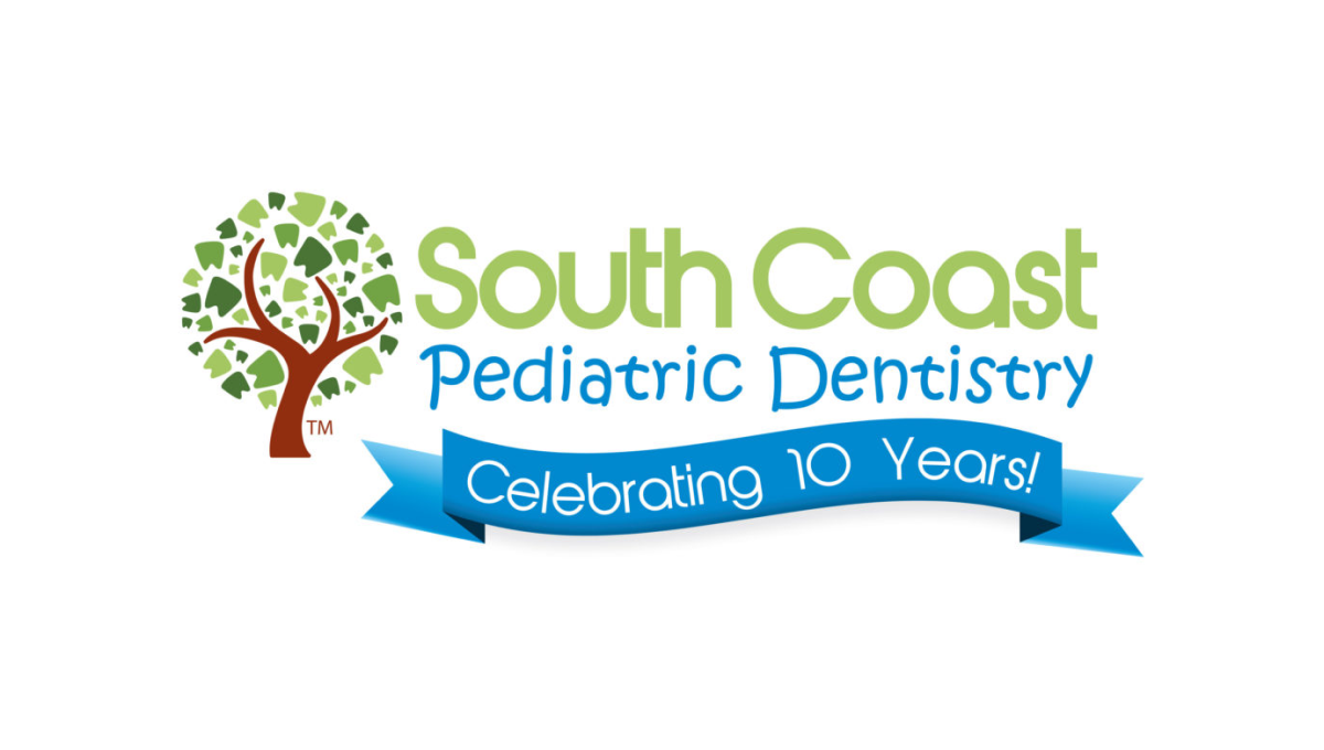
Instead of reinventing the wheel for their anniversary logo, this dentistry office simply added a clean blue banner below the words in their traditional mark. The banner is designed in a way to match the colorful, playful tone of the original mark and doesn't extend too far below the traditional logo's dimensions to make it easy to swap in and out of marketing collateral during and after the anniversary.
More Details →Traditional Bank 120th Anniversary Logo
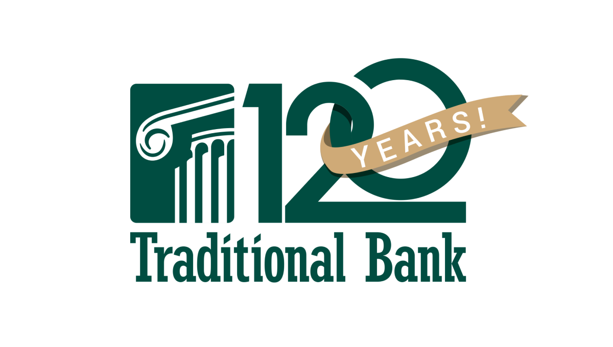
Normally the silhouetted columns in this logo sit in line with the name, but for this logo design they placed that mark above the words and enlarged it slightly which created room for a large number 120. This number features overlapping characters and a vertically offset 0 as well as a gold ribbon holding the word years that wraps around part of the number.
More Details →Wright State University 50th Anniversary Logo
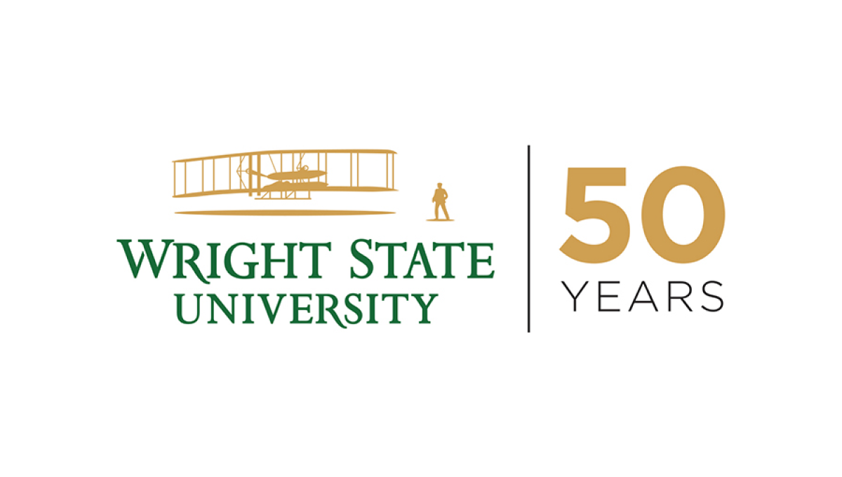
Using a style that is becoming more and more common for anniversary logos, Wright State simplye takes their traditional logo and places a vertical line between that mark and a simple anniversary mark that focuses on the number rather than a unique design. In this cast, a large number 50 in their brand gold with the word "years" below in their brand green.
More Details →Swain Resort 75th Anniversary Logo
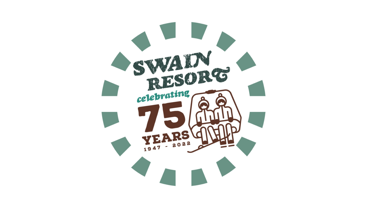
Swain Resort's anniversary logo start's with the brand's traditional green color and creates a shape using a dashed line circle. Inside sits the resort's name with maroon text highlighting the reason for the celebration. Finally, to the right of the years, sits an illustration of a ski chair in the same maroon color to add a playful tie back to the resort's primary activity.
More Details →Joshua Tree National Park 75th Anniversary Logo
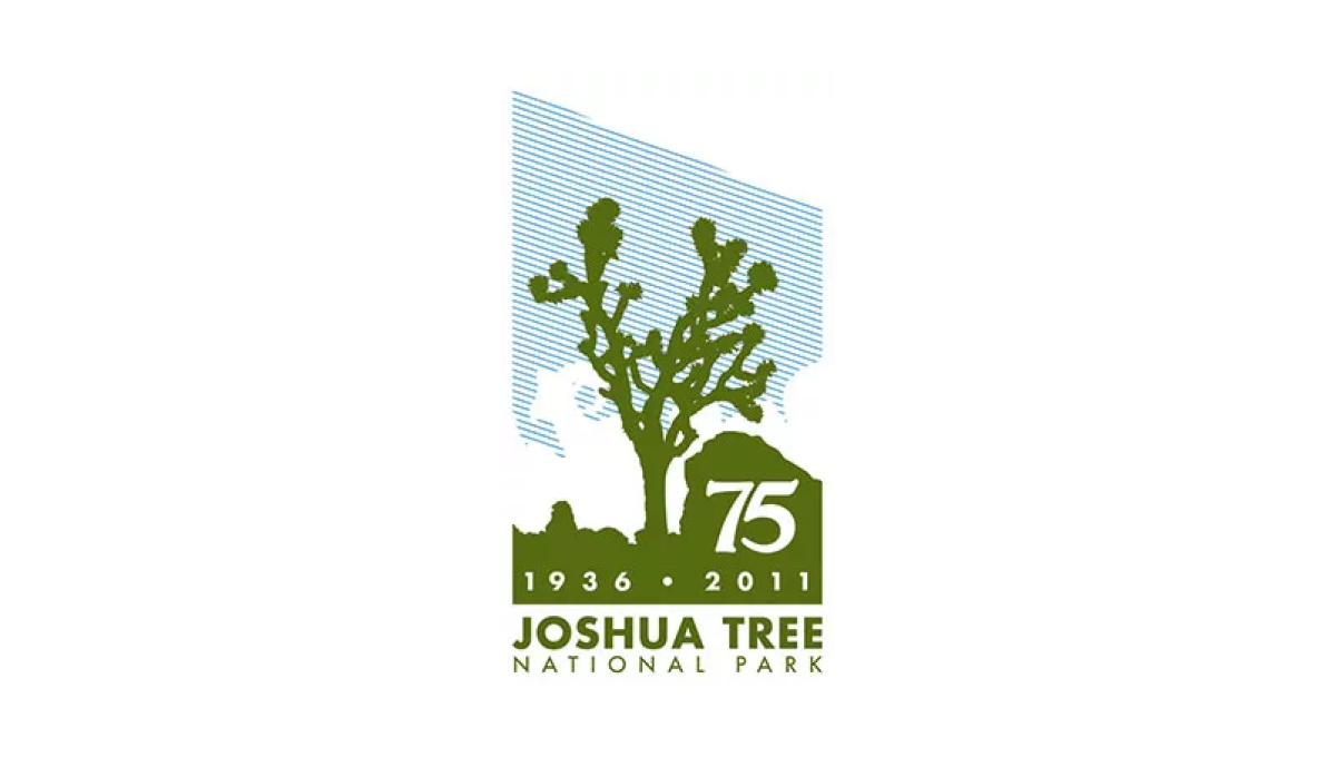
Joshue Tree is a unique national park and this logo carries that feeling with a unique shape and design. First, a vertical rectangle holds a line-hard depiction of blue sky, white clouds, and a green silhouette of the famous trees found in the park. Below that sits the name of the park and inside the green area is placed the milestone and years of celebration. However, by adding a downward angle across the top of the rectangle, the designers gave this logo a sharp, striking look that stands apart from other anniversary designs.
More Details →National Park Service Volunteer 50th Anniversary Logo
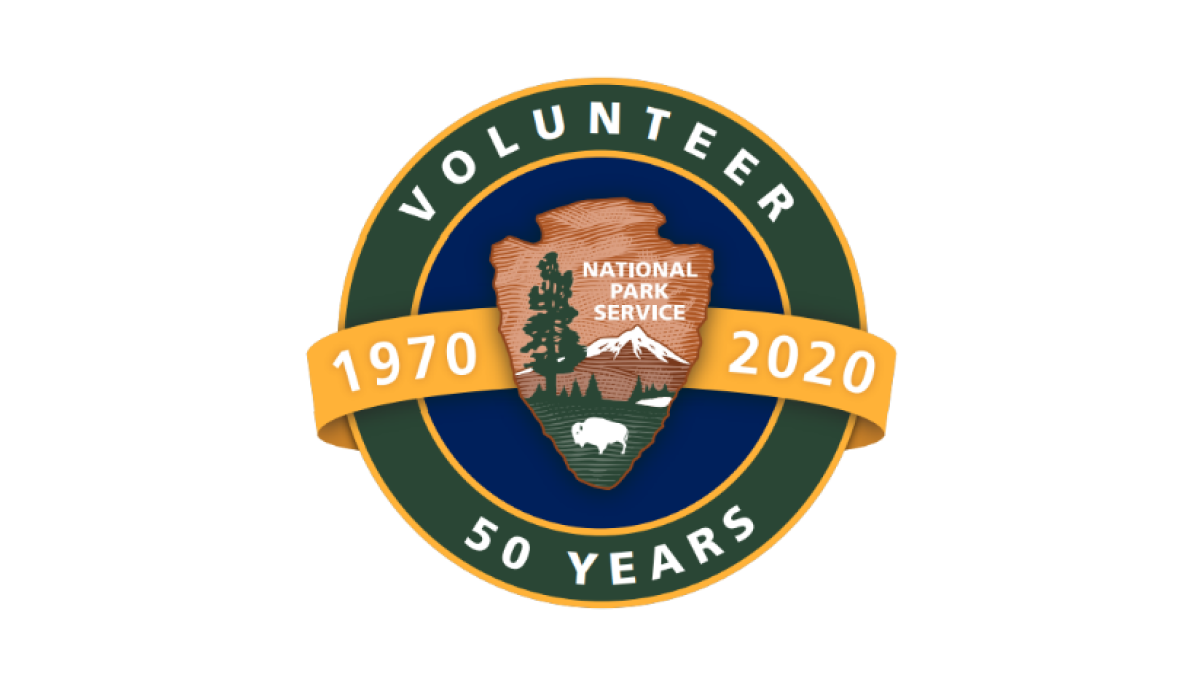
Building on the National Park Service's original logo in the center, this mark adds a circle behind to form a seal and hold wording that specifies this logo is for their volunteer program and the year they're celebrating. Behind the original log and in front of the circle sits an orange ribbon holding the years this program has been in place.
More Details →Acadia National Park 100th Anniversary Logo
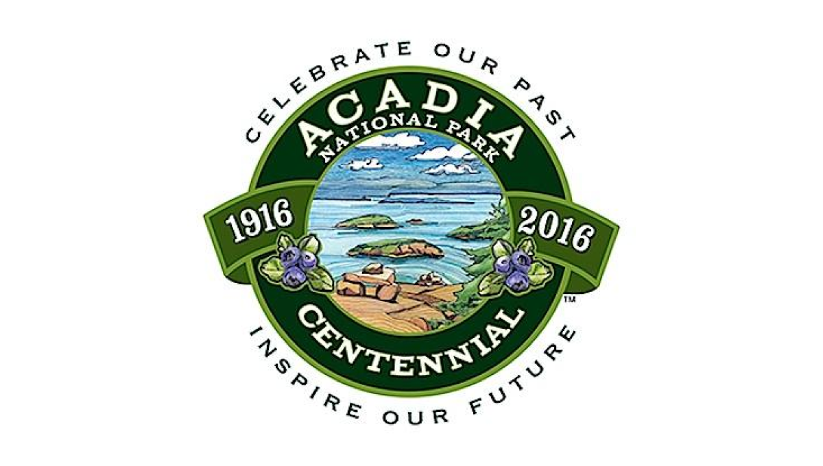
This seal-style logo uses a number of details to create a clean, balanced whole. First, a green circle with wide rim holds the name of the park and the word "centennial". Next, the inner circle is filled with an illustration depicting to beautiful shores and plants found in the park. A ribbon then holds the years of operation with arcing words above and below the seal holding the motto.
More Details →National Park Service 100th Anniversary Logo
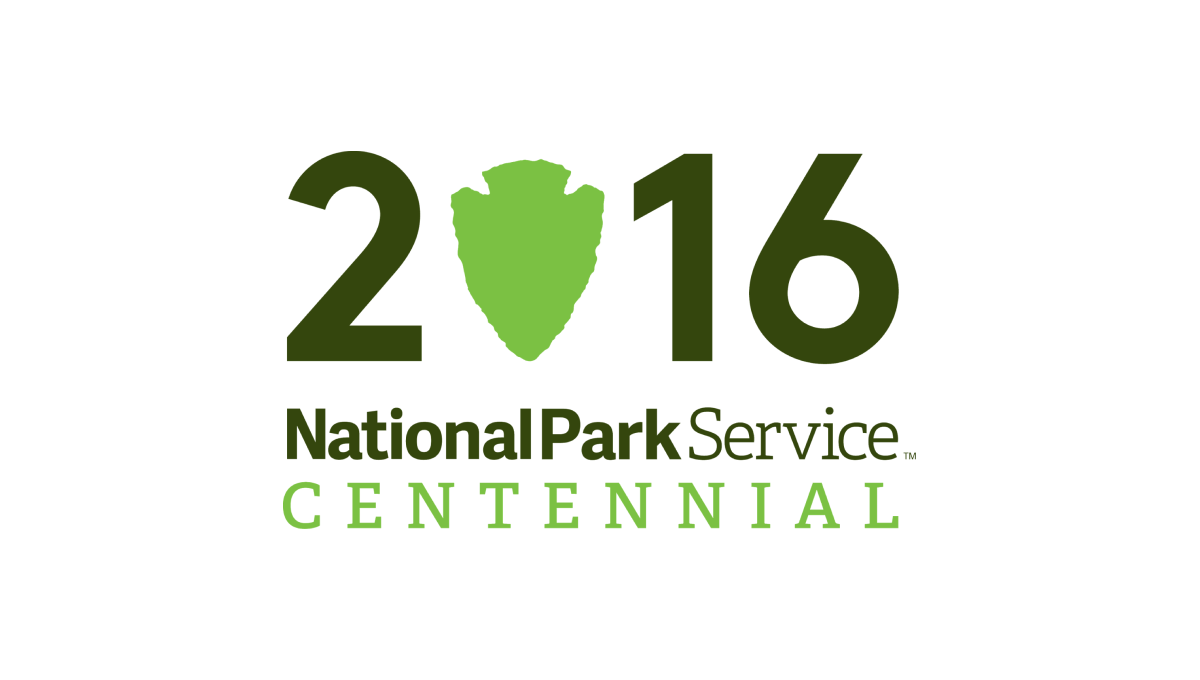
Starting with a large, block number 2016 to signify the year of the annivesary, this logo takes a recognizable shape that holds the National Park Serivice's primary logo - a downward pointing arrowhead - and swaps that for the number zero in a slightly lighter green. Below the number sits a word mark with the name of the organization and the word "Centennial" below in the same green as the arrowhead.
More Details →Maryland Hospital Association 50th Anniversary Logo
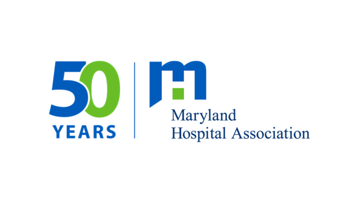
If you want a simple, effective anniversary logo then take note of what the MHA and many other brands are doing. This organization took their original logo, drew a vertical line to the left side, and on the other side of the line placed a simple number mark in their brand colors. The result is effective, balanced, and doesn't require the level of design and planning as a logo that starts from scratch.
More Details →PACE NSC 25th Anniversary Logo
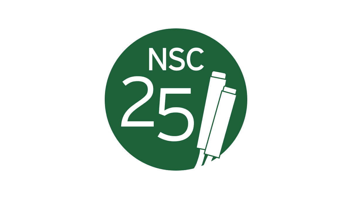
The Partnership for Academic Competition Excellence (PACE) is a 501(c)(3) non-profit that runs a quizbowl competition called the National Scholastic Championship (NSC). So their logo begins with a green circle in their primary brand color and adds a large number 25 on the left side with the two and five staggered to fit the shape of the circle. On the right, a simple illustration of the clickers they use in their comptition adds relevance with the name of the organization across the top.
More Details →NC Early Childhood Foundation 10th Anniversary Logo
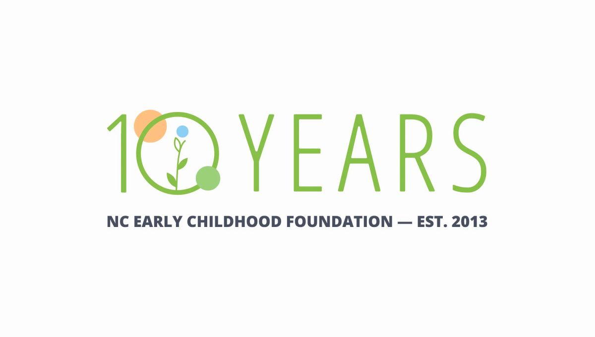
Simple and playful, this logo fits exactly the tone you'd expect from an organization design to help children. With the name of the organization in plain text below, they use this visual line to hold the lighter mark above. With simple shapes and friendly colors denoting growth and optimism, it's a great, on-brand design to support this milestone in their organization's history.
More Details →Canton Youth Hockey 50th Anniversary Logo
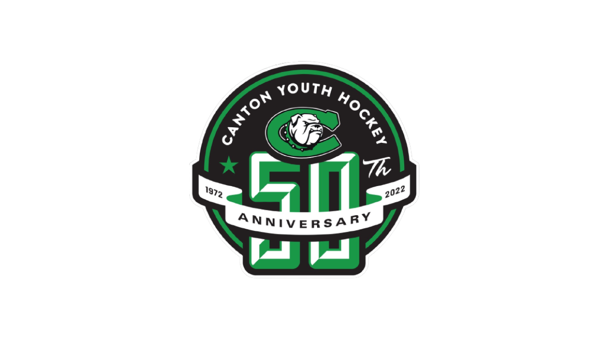
With the classic badge-style design that is so popular with sports anniversary logos, this logo places a large number 50 on a round, black background that also contains the name and "th" fo complete the reference to the year. Above that, a clean ribbon wraps the number 50 to hold the word "anniversary" and years of their operation.
More Details →Big White 60th Anniversary Logo
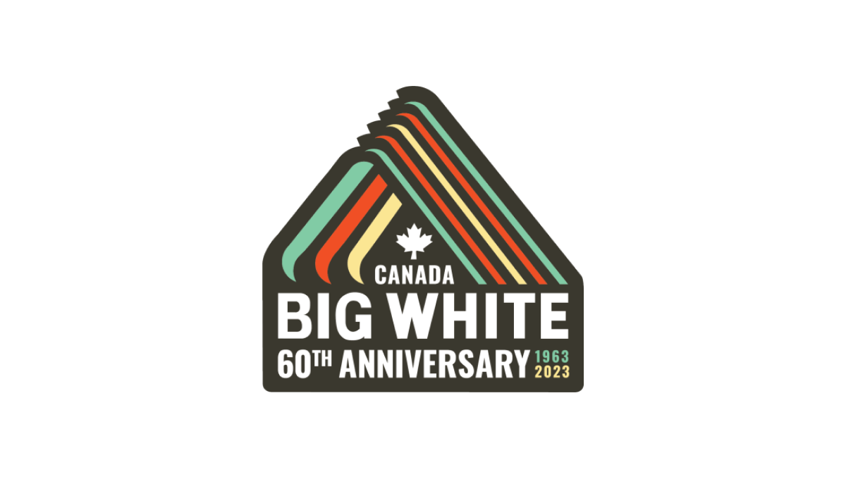
With a throwback to one of Big White Mountain Resort's original logos, this adaptation brings in a modern, sticker-style badge and extra line of text to hold the anniversary label, with a three-color design that's also a little bit retro. A simple combination of past and present, this is a great use of original logos with modern design needs.
More Details →