Complex Anniversary Logos
Hooper City Tomato Days 100th Anniversary Logo
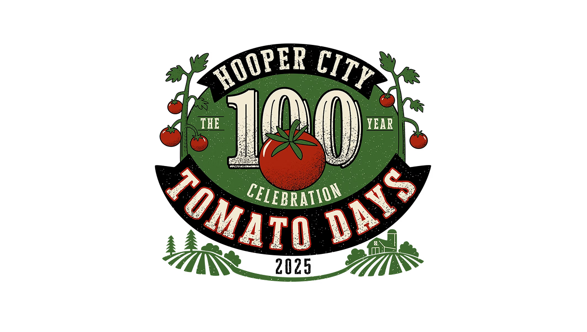
The logo uses a bold number 100 in the center with a tomato shape overlapping it, showing this event’s big milestone year. Around that, there’s simple text for the place and event name in a curved layout. On the sides and below, there are basic plant and field shapes that give it a slightly rustic, homey feel. The colors are earthy reds and greens with an old-fashioned, slightly worn look to the letters and shapes.
More Details →X Games 30th Anniversary Logo

The anniversary logo has a clean and modern look, using soft colors and simple shapes. It shows the number 30 in a bold style, with the words “years” and the event name placed nearby. There’s a sense of movement or connection in the way the elements come together. The design feels both respectful of the past and hopeful for the future. Overall, it’s a bold and balanced way to mark an important milestone.
More Details →ICEE 50th Anniversary Logo

This 50th anniversary logo has a fun and playful feel. The number “50” is large and bold,in a gold color that stands out. The word “ICEE” is placed to the left of the 50, using its familiar logo style. There’s also a small banner underneath that says “Icee-versary,” adding to the celebratory look. The overall design feels cheerful and energetic, reflecting a lighthearted brand marking a big anneversary in a lively way.
More Details →Rimouski Oceanic 30th Anniversary Logo

While it's not clear that this logo is for a hockey team at first glanace, we have no problem with them leaning into their community and past given the awareness of this logo is likely fairly concentrated geographically. The circles represent the St. Lawrence river and the porthole of a boat, while an illustration of the well-known Pointe-au-Pere lighthouse shines on the team's past and future.
More Details →HSMAI Foundation 100th Anniversary Logo

The original logo for this foundation already had quite a few elements, so I appreciate that design kept it simple by adding a large number 100 below the base of the original, using their tagline as a divider between the main mark and the anniversary addition. The design uses the same colors and fonts to create a nice pair to the traditional mark. There's a lot going on, but it works nicely together.
More Details →Ripfast Bodybuilding 25th Anniversary Logo
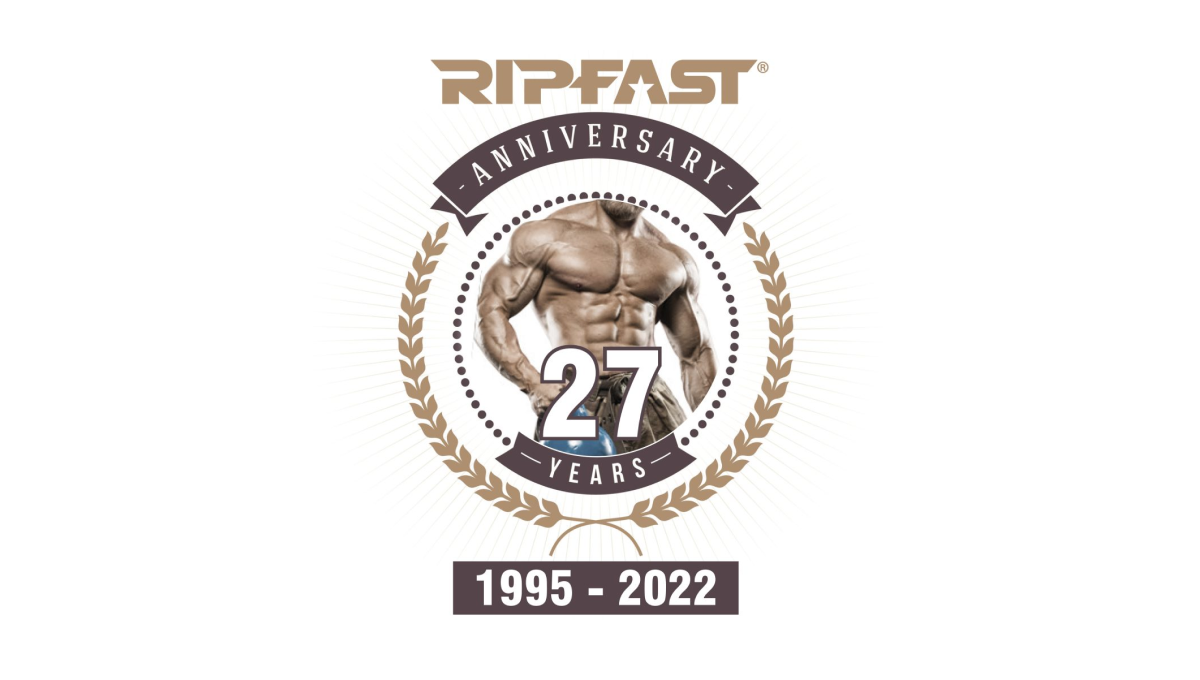
If your brand is bodybuilding, placing the photo of a ripped individual in the center is a pertty simple, on-brand way to start a logo. With a number layered above, a round circle with laurel leaves surrounding, and the traditional logo placed at the top, this logo may have a few more elements that typical anniversary logos but they work together pretty well.
More Details →Stone Brewing 25th Anniversary Logo
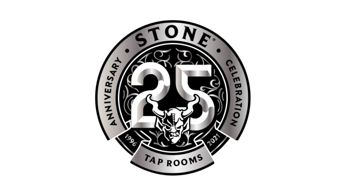
Similar to earlier anniversary logos for Stone Mountain Brewing, this logo starts with the brand's traditional mark set in the bottom center and then adds layers of graphics behind. In this case, a large, 3D number 25 held in a circle with the name of the brewery and illustrations to create texture within this monochromatic design.
More Details →Six Flags 50th Anniversary Logo
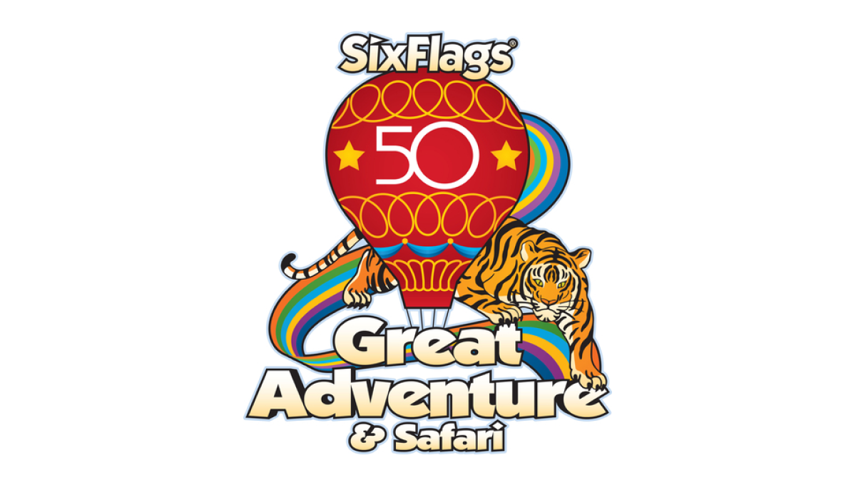
Throwing back to a classic design from the 1970s, this logo takes that original design full of rainbows, balloons, bubble letters, and hues that saw their heyday fifty years ago and adds just enough of a number in the center to make it easy for their audience to recognize the reason for and adaptation of their logo.
More Details →United States Disc Golf Championship 25th Anniversary Logo
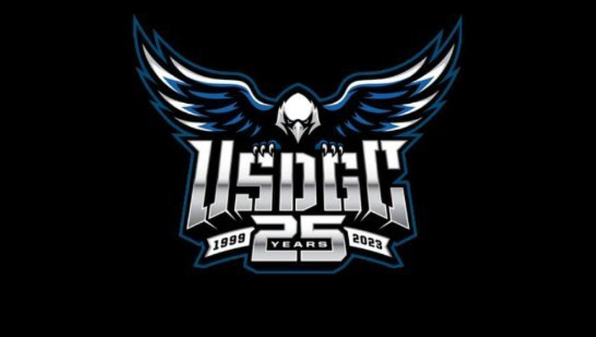
With the sport growing at a record pace, the United States Disc Golf Championship wanted to celebrate their 25th anniversary with a logo worthy of the sport's budding brand. With their traditional logo set in the center, a large bald eagle behind, and the number 25 below, the design adds a metalic sheen for a clean, classy finish.
More Details →Monopoly 80th Anniversary Logo
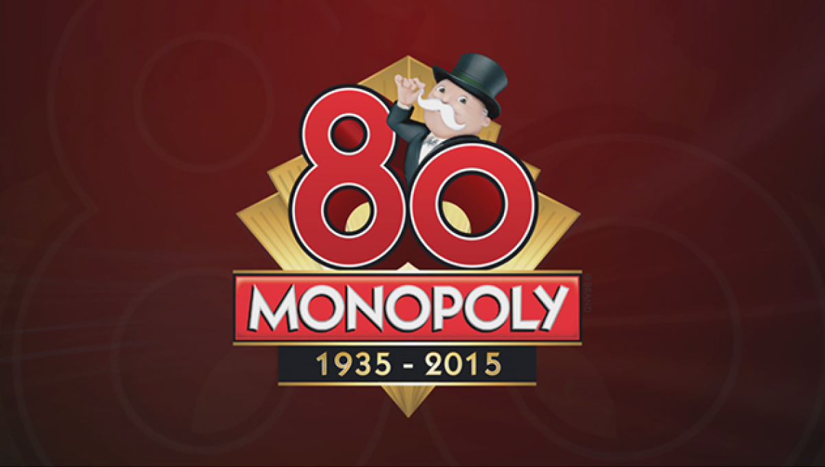
Monopoly applied classic board game design to this anniversary logo that features the traditional, rectangular logo for the game at the bottom of a diamond with a large, three-dimensional number 80 sitting above. Below the years of the game's existence are included with simple, gold lines to keep a sharp look that balances the rest of the design.
More Details →Super Mario Bros. 35th Anniversary Logo
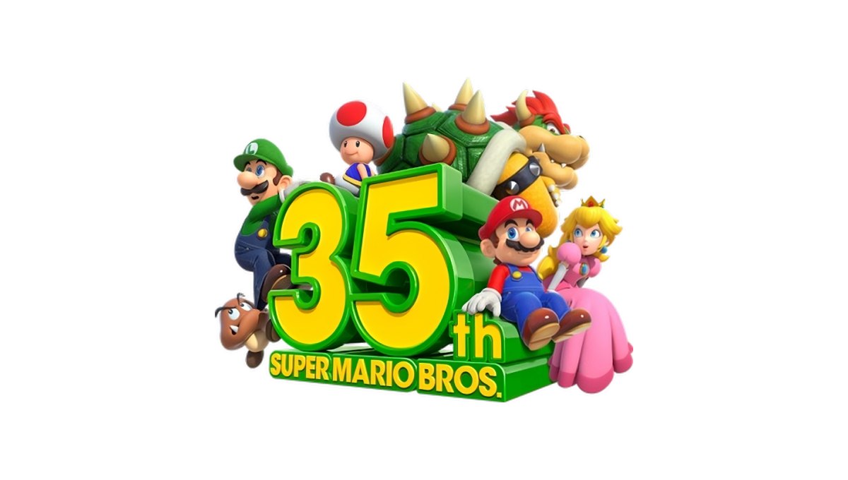
Some anniversary logos are simple, clean shapes that can be used in a variety of situations. This may not be one of them. A three dimensional block shape of the anniversary sits in the center facing away and to the left. Surround the number are similarly three dimensional graphics of many of the series' most popular characters.
More Details →1st Choice Mortgage 30th Anniversary Logo
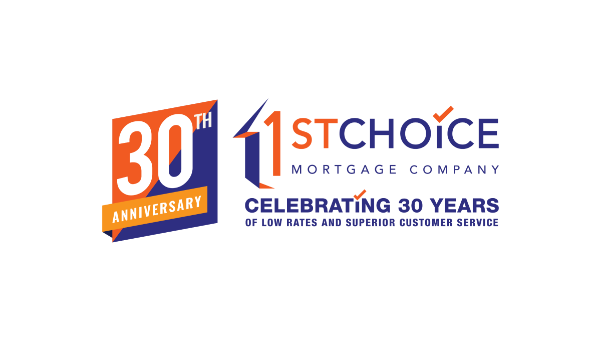
This adaptation of their original logo adds a two-color badge to the left side of their traditional logo that leans into the two primary colors of the brand as well as a third color to add contrast. With a word-heavy original logo, more text below that, and a new shape introduced with the badge, there's a lot going on with this logo but it all ties together nicely.
More Details →