60th Anniversary Logos
Mountain Creek 60th Anniversary Logo
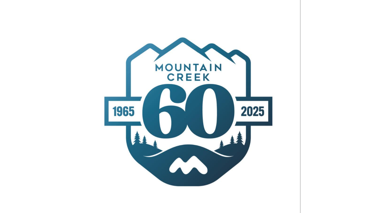
This anniversary logo has a calm, outdoors style with a badge-like shape. Mountains sit at the top, suggesting nature and strength. The large number “60” stands in the center, making the milestone clear. Small trees and flowing lines add a peaceful, grounded feeling. Soft blue tones give it a steady, trustworthy look. Overall, the design feels reflective and proud, marking many years of growth and connection to place.
More Details →Jackson Hole 60th Anniversary Logo
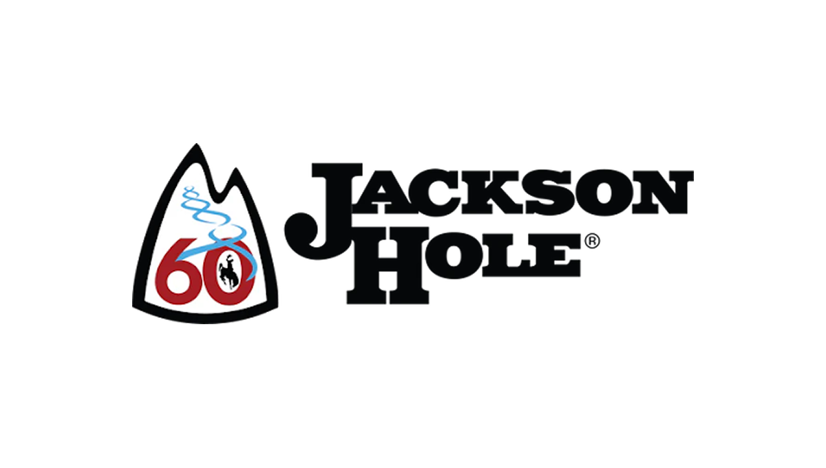
The anniversary logo has a clean, simple look with a strong outdoor feel. It centers on a mountain-shaped badge that suggests nature and adventure. The number 60 stands out, marking a long history. A soft, flowing line represents fresh ski tracks. The colors are bold but calm, and the overall design feels balanced, timeless, and quietly celebratory.
More Details →Whistler Blackcomb 60th Anniversary Logo
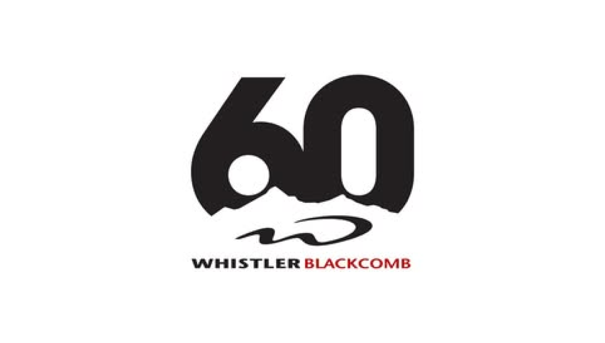
The logo centers on a large, bold 60 in dark lettering, with a rough, uneven edge along the bottom that suggests mountains or natural terrain. Below the number is their logo. The name appears underneath in clean, straightforward text, with a small pop of color for contrast. The overall design feels modern and minimal, marking the anniversary in a strong but understated way.
More Details →Martock 60th Anniversary Logo
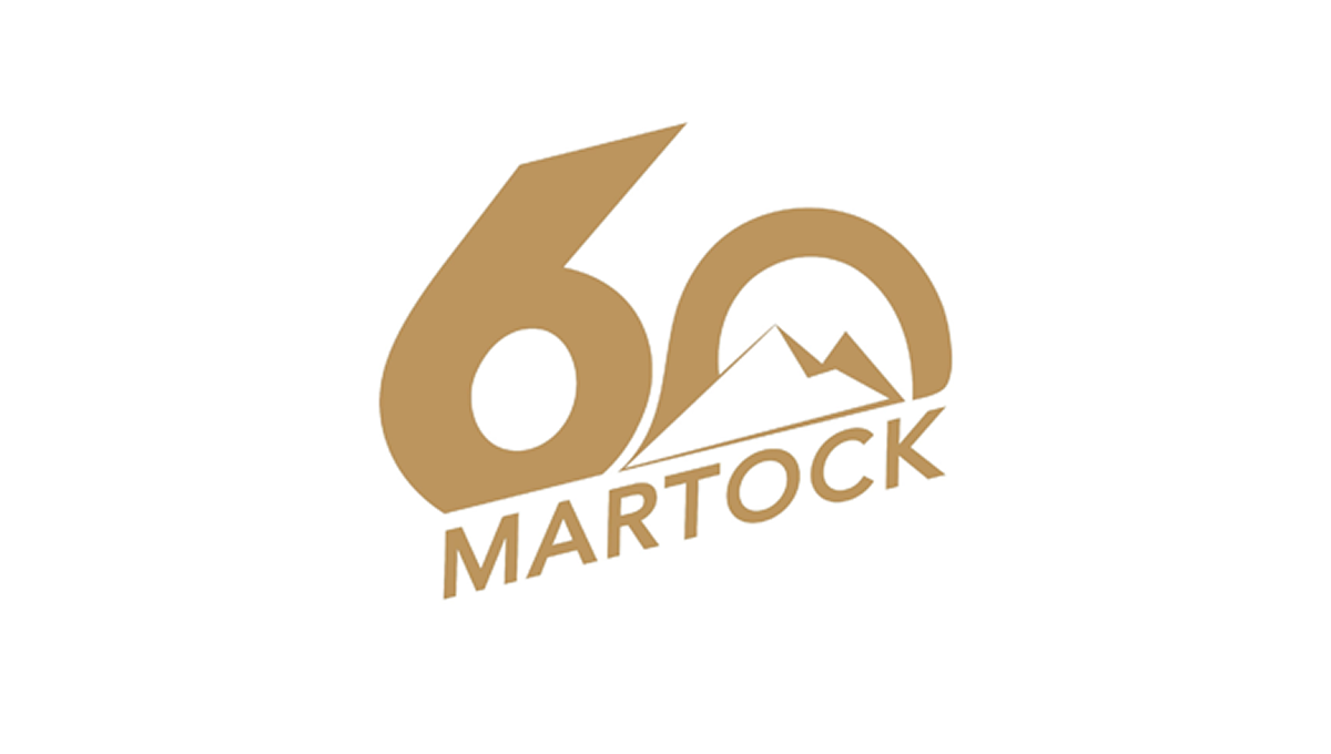
The logo features a large, bold 60 as the main focus, using smooth, rounded shapes. Inside the zero is a simple mountain outline that hints at an outdoor setting. Below, the name appears in clean, angled lettering that feels modern but grounded. The single warm color gives the design a calm, unified look. Overall, it feels straightforward and confident, marking an important anniversary without too many extra details or decoration.
More Details →Diamond Peak 60th Anniversary Logo
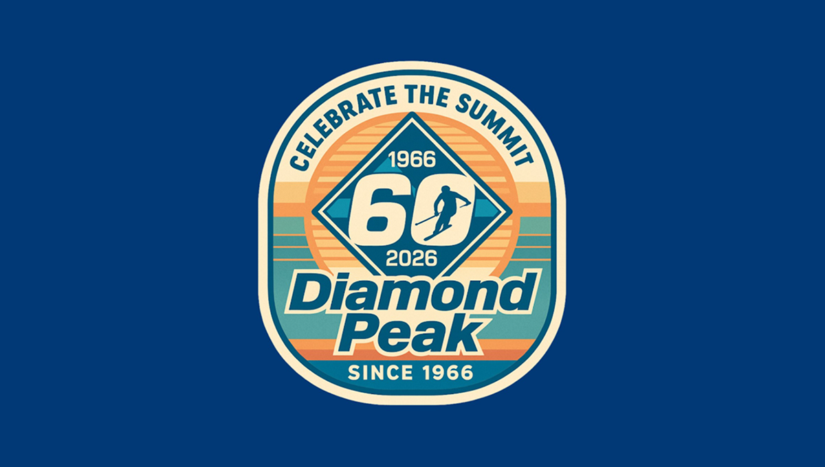
The anniversary logo has a rounded badge shape with layered colors and a vintage feel. In the center is a large 60, framed by a diamond shape, with dates above and below to mark the milestone. A small skier figure adds a sense of motion and outdoor spirit. The background uses soft stripes and warm tones, while the text curves around the design, giving it a balanced, classic look that feels celebratory and familiar.
More Details →Castle Mountain Resort 60th Anniversary Logo
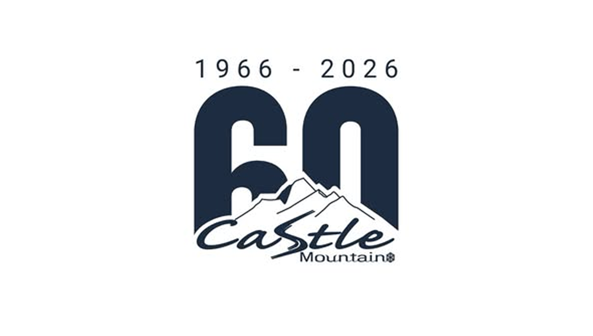
The anniversary logo shows a big 60 in dark block numbers with the years “1966 – 2026” above it, marking six decades. Below the numbers is a simple mountain shape and the name of the resort in a casual, flowing script. The style feels calm and grounded, with smooth edges and easy contrast between the bold numerals and the softer text and graphic, giving a clean and clear sense of time passing and celebration.
More Details →MT Rose 60th Anniversary Logo

This anniversary logo has a smooth, elegant look with a large number “90” that draws attention right away. The company name appears below in a clean, simple font, giving it a classic and steady feel. The colors are soft but still noticeable, and there’s a curved banner that adds a nice touch of movement. Overall, the design feels calm, proud, and timeless.
More Details →Rudolph the Red-Nosed Reindeer 60th Anniversary Logo

The anniversary logo for Rudolph the Red-Nosed Reindeer features a minimalist design that emphasizes simplicity and abstraction. The logo utilizes bold lines and circular shapes to represent Rudolph's iconic features, such as his nose and antlers. The use of negative space and geometric forms gives the logo a modern and clean look, while still maintaining a festive and recognizable connection to the beloved holiday character. This design approach reflects a contemporary take on traditional holiday imagery.
More Details →The Doors 60th Anniversary Logo

The Doors already has a simple but extremel recognizable logo. So instead of overdesigning some new mark coming from a different direction, they took that original mark, put the silhouettes of the band members poking up from behind, and places a simple ribbon across the middle part of the design to hold an anniversary label. Simple, smart, and effective.
More Details →Hotel Leto Hydra 60th Anniversary Logo

If you're a classy hotel that's celebrating your anniversary, kimple it simple, elegant, and minimalistic is a common and effective move. A large number 60 in thin, slightly offset lines sites above the traditional word mark. Below the logo sits the years of operation which is always a nice addition in case this logo shows up outside of the year of the anniversary to clarify when the milestone took place.
More Details →Love's Travel Stops 60th Anniversary Logo

A place that's supposed to be a friendly place to stop during your travels, this logo for loves starts with a big, friendly number that adds a little bit of shading to suggest a soft, rounded feel. A classic ribbon holds the word years with the years of operation at the bottom. All of this is held in a crest-like shape that keeps that friendly, rounded style around the corners and leaves just enough room for Love's original logo at the top.
More Details →The Kahala Hotel & Resort 60th Anniversary Logo

A hotel and resort in Hawaii, this logo normally features just the flower in the place where the number 60 sits in this anniversary variation. Not only did they design a number 60 that neatly matches the original logo in font and weight, they also cleverly pinned their original flower mark "behind the ear" of the number sixty. This clean adaptation looks beautiful and has a nice nod to the culture of the area.
More Details →Park City Resort 60th Anniversary Logo
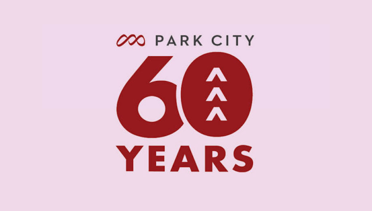
Park City Resort's 60th anniversary celebration needed a simple logo and this design combined the resort's original logo at the top, a large number 60 with shapes to tie the number back to the mountains the resort is famous for, and the word years at the bottom all on the brand's original brick red color.
More Details →Adidas 60th Anniversary Logo
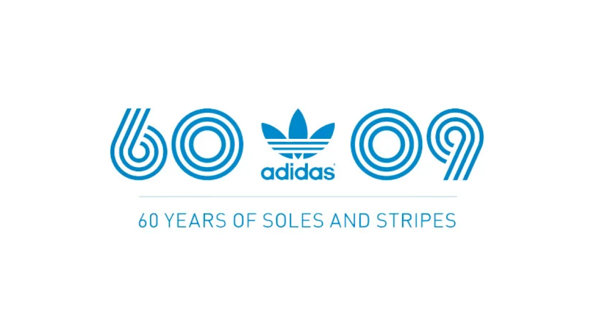
Three strips, classic blue color; that's about all Adidas needed to set the tone for a recognizable mark and they did exactly that. Three lines to form the anniversary they're celebrating and a 09 to mark the year of celebration. With the traditional mark placed in the middle, this logo is as simple as it is effective.
More Details →Everton Park State High School 60th Anniversary Logo
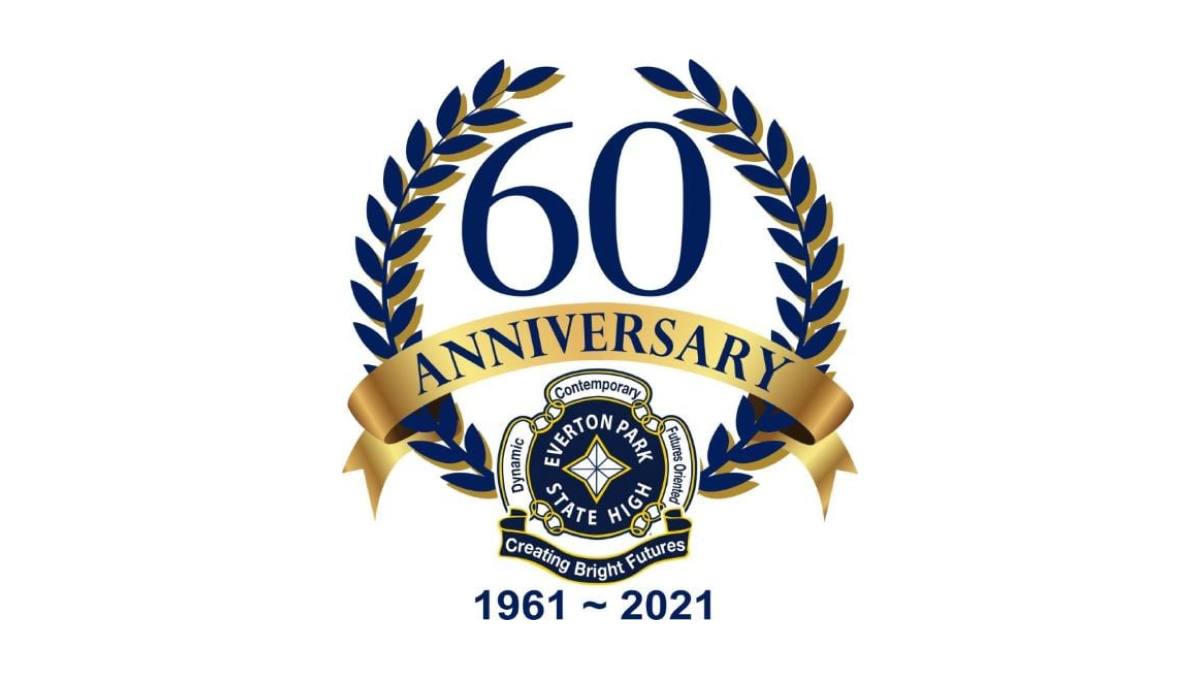
Sometimes marketers think there are two options for anniversary logos: go with a stock design or do something custom. But this team saw a nice middle ground by starting with one of the classic, stock 60th anniversary logos found online but finding one that matched their brand so they could insert their traditional mark in the bottom center and their years of operation to make this logo their own. A simple way to get a logo that is both easy to create and customized to their brand.
More Details →Sega 60th Anniversary Logo
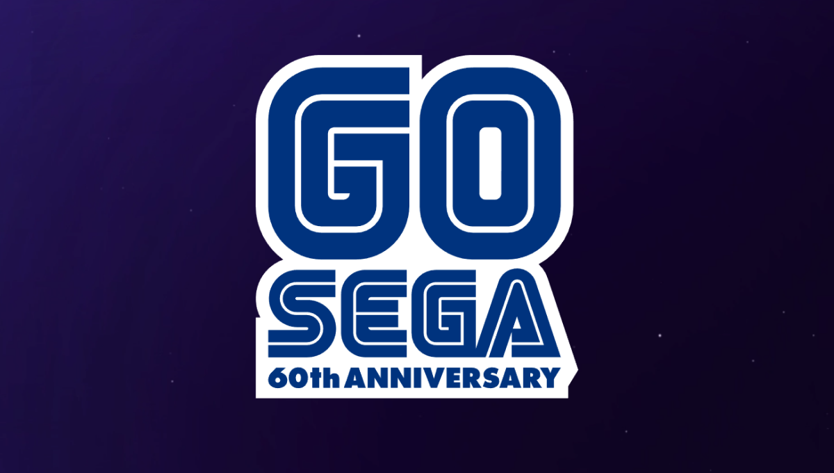
One of the most well-known aspects of the Sega brand are the block letters with a thin, inner-line creating a unique typeface that becomes even more easily recognized in their classic blue. In this case, they simple placed a large number 60 above their traditional word mark and the phrase "60th anniversary" below in the same typeface and color to create a nice mark that would work well in a variety of situations.
More Details →Los Angeles Dodgers 60th Anniversary Logo
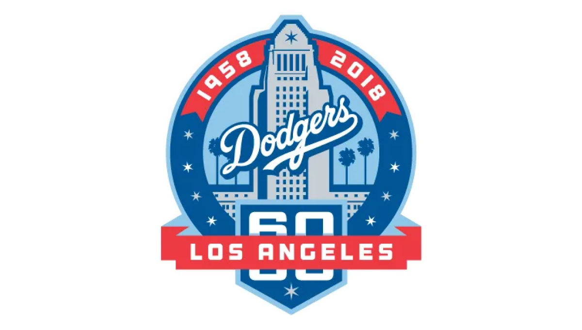
With the famous Los Angeles City Hall as the backdrop, this mark uses a blue circle for the main shape and places an illustration of that building in the center. Above that the years of operation wrap around the top edge of the circle. At the bottom a home-plate shape holds the number 60 with a ribbon holding the name of the city.
More Details →New York Mets 60th Anniversary Logo

Similar to other baseball teams who celebrate anniversary logos, this mark begins with a baseball field for the shape. In this case, the outline is in the team's famous orange and blue colors with a large blue sixty set in the center. At top of the field sits the team's original logo, at the bottom is the year the team was founded, with a ribbon holding the word "annivesary" set just below the number 60.
More Details →City of Virginia Beach 60th Anniversary Logo
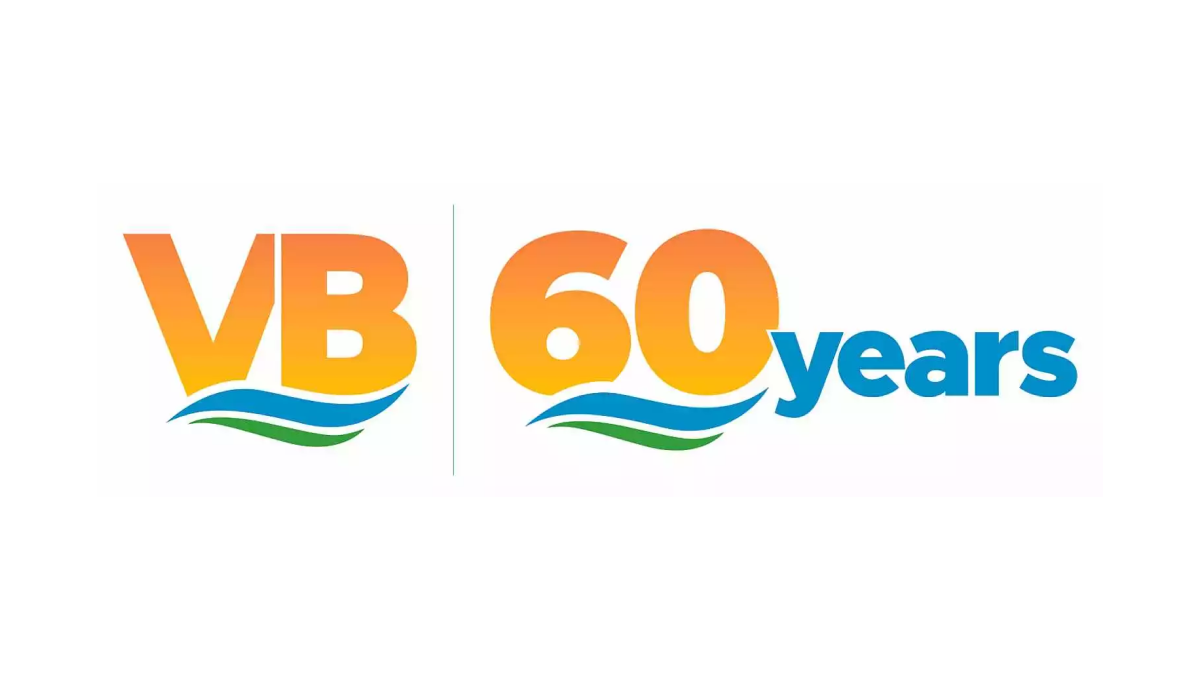
Borrowing from the city's well-known VB mark, this anniversary logo uses the same orange gradient of the VB in the original mark for the number sixty in the anniversary version. Below the same blue waves of the original mark sit with a large word "years" just to the right of this mark in the same blue as the wave. This logo also features the original mark just to the left of this new mark for an easy-to-recognize lockup.
More Details →University of Missouri - St. Louis 60th Anniversary Logo
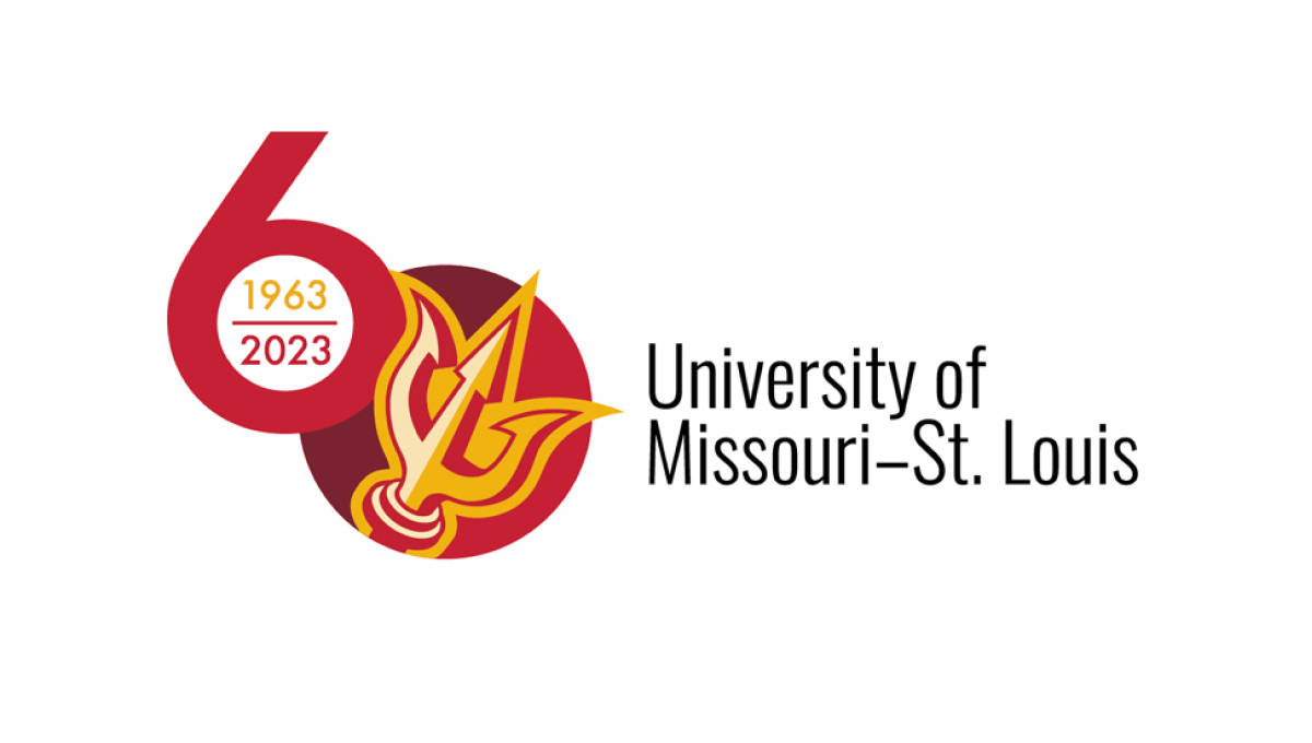
This logo sets the stage with a large number sixty with the six shifted up from the zero. Inside the six sits the years of operation for the organization, inside a filled-in zero sits the school's trident mark. This strong mark sits to the left of the name of the organization in black text, stacked on two lines and lined up vertically with the zero.
More Details →Buffalo Bills 60th Anniversary Logo
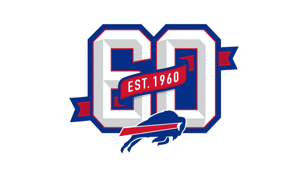
This logo builds on the classic shape, style, and format of the numbers you may see on a football jersey. Weaving in and out of both the number six and zero is a ribbon that identifies what year this footbal team was established. Below that sits the Bills' original mark to make it clear which team this logo is tied to which also reflects the colors used in the ribbon and numbers.
More Details →Samoa Independence 60th Anniversary Logo
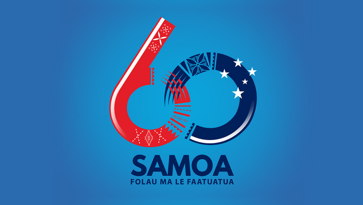
Designed for a light blue background, this logo starts with a large nuumber 60 with the ring of the six and the left side of the zero elegantly overlapping using patterns and shapes tied to the Samoan culture. At the bottom sits the name of the country with a series of starts just above and to the right of the zero to create balance and add extra meaning.
More Details →USA-Mali Diplomatic Relations 60th Anniversary Logo
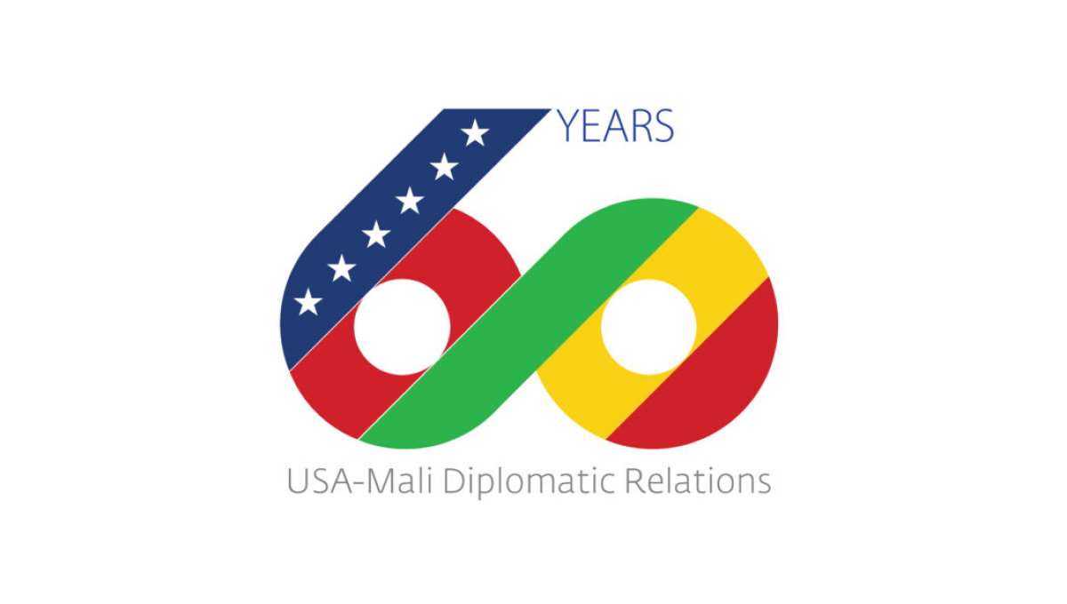
Starting with a large number 60, this logo uses diagonal stripes in the colors of both contries with a thick, green stripe creating a bridge between the two numbers and color palettes. On the upper left diagonal a line of stars is placed to represent the USA, to the right the word years sits, and below this number is a simple description of the occasion in a light, thin typeface.
More Details →Fountain Valley 60th Anniversary Logo
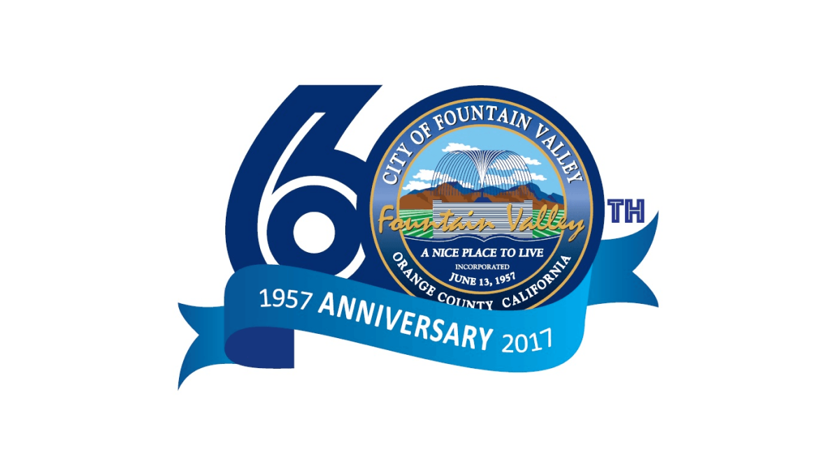
This logo starts with a large number sixty in a dark blue color. In the number zero, an illustration of a foundation sits inside a small seal-style shape with the town's name, motto, and location. Below that a lighter blue ribbon holds the word anniversary with the year the city was founded on one side and the year of this anniversary on the other.
More Details →Sugar Land Texas 60th Anniversary Logo
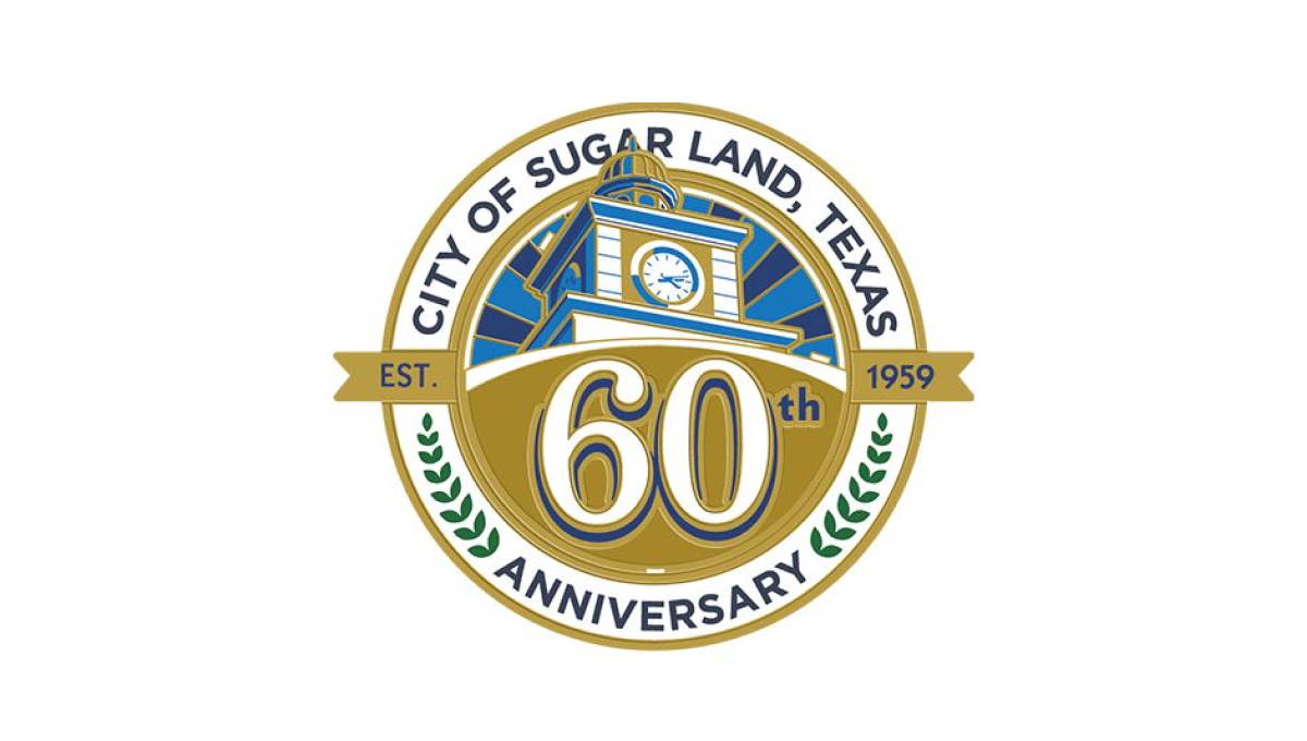
With a seal-style shape to start, this logo places the name of the town, the word anniversary, and laurel leaves in an arc between the outer edge and inner ring. Inside the smaller circle sits an illustration of city hall with a large number 60 sitting just below than on a gold background. A smaller ribben between the number and the illustration holds the years the city was founded and the current year of celebration.
More Details →Cedar Hills Community Church 60th Anniversary Logo
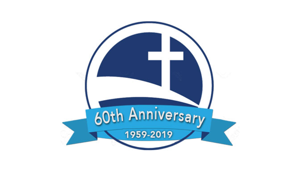
Some logos spend a lot of time creating space for text and names, but this logo keeps it super simple by simply placing the mark for the church - a cross on a sloping curve - inside of a circle. Then in front of that circle placing a blue ribbon that holds the reason for the celebratio and the years of operation.
More Details →Ski Area Management Magazine 60th Anniversary Logo
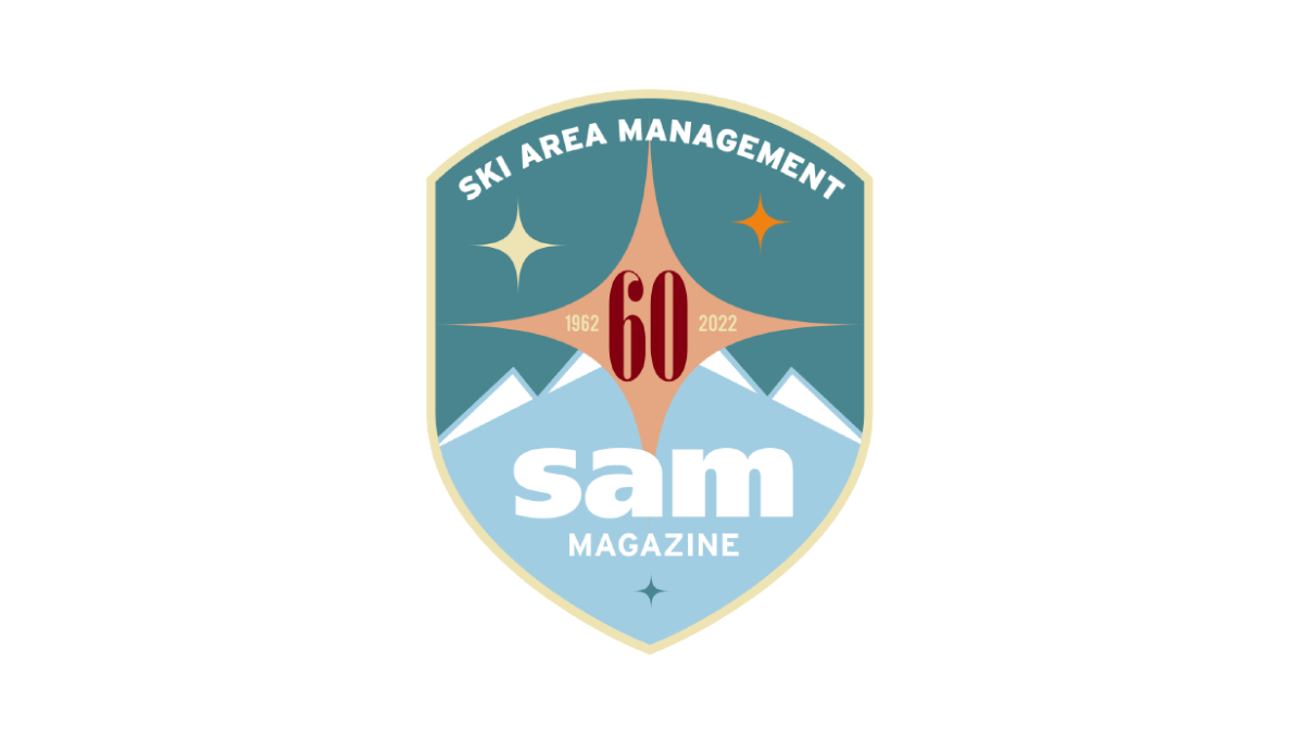
It's not often you see a magazine celebrate their 60th anniversary, but this is exactly what SAM did and celebrated with a clean, crest-style badge in two shades of teal as the base. At the top, their written logo follows the curve of the top of the crest with their traditional lowercase "sam" word mark placed at the bottom. In the center, a red number 60 with a star shape behind to fill in the space and provide balance.
More Details →Paynesville Hospital 60th Anniversary Logo
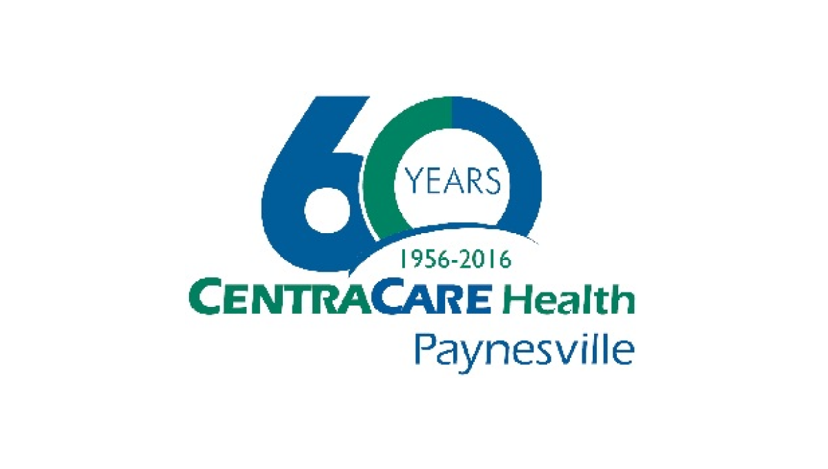
One of the strongest ways to build an anniversary logo is to start with a large, block-lettered versio of the anniversary year. Instead of a "th" this logo opts for the word "years" inside the 0 while this mark rises up from behind the traditional logo and adds a little carved out space to include the years of operation. With everything matched to the original blue and green brand colors, it ties back nicely to the original.
More Details →Steamboat 60th Anniversary Logo
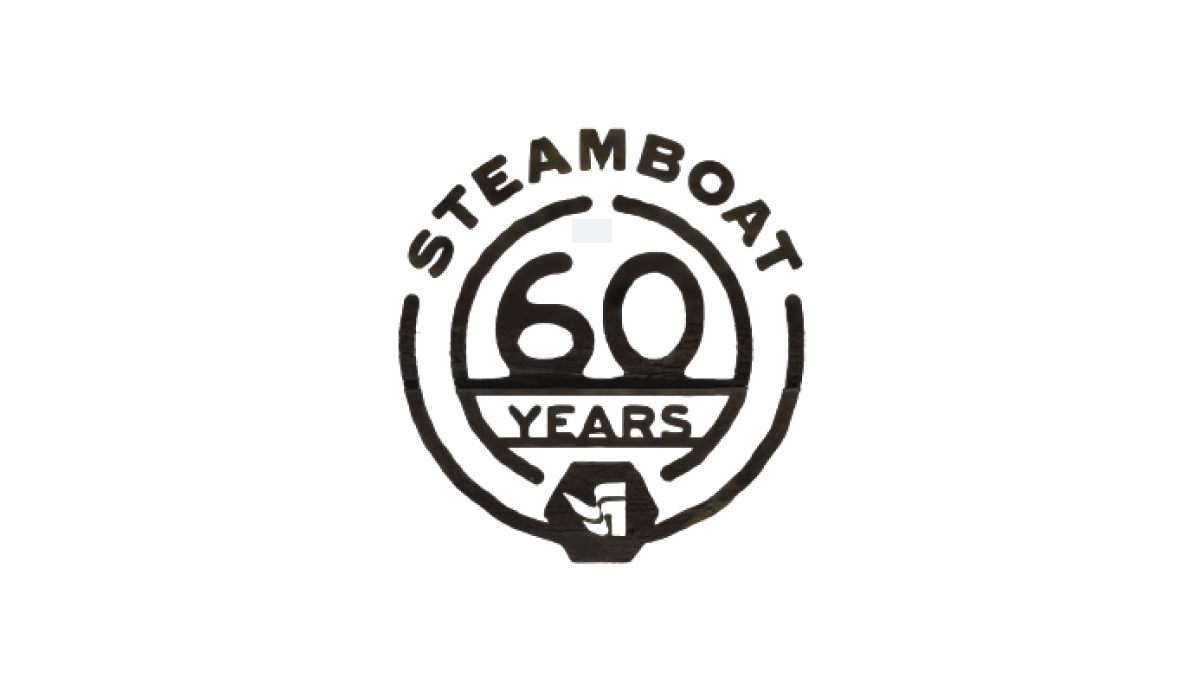
Steamboat used a really sharp bit of line art for their 60th anniversary. With the resort name arched across teh top, the number 60 set in the middle, and the word "years" set just below with a partial center ring to hold it all together, the resort's famous flag mark sits as an achor at the bottom to create mark that was easy to use and adapt to many situations during their anniversary season.
More Details →Snow Trails 60th Anniversary Logo
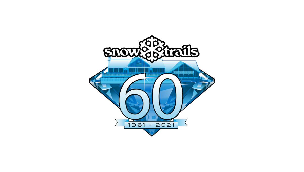
With a diamond anniversary on the calendar, Snow Trails began their design with that exact shape as a backdrop. Building on their brand blue color and adding in a stylized version of their base lodge inside the diamond, a large number 60 sits above the diamond with a small ribbon containing the years below that. Finally, the brand's original logo sits at the top to make the mark easy to recognize.
More Details →King Pine 60th Anniversary Logo
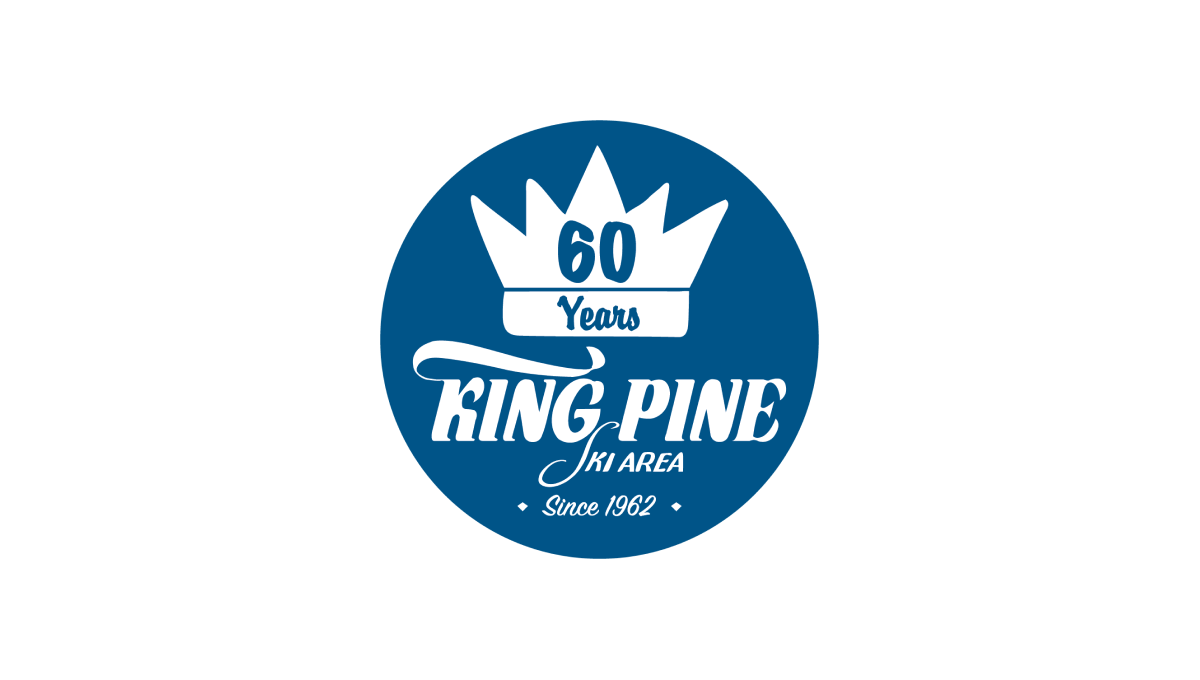
King Pine started with a filled circle in their brand blue color and placed a white version of their logo / word mark in the bottom center to tie back to their original brand and anchor the rest of the design. Above that a crown - referencing back to the "King" portion of the name - with the annversary number in the center balances to the top, with a "since" label at the bottom creates clean balance for the rest.
More Details →Kelly Canyon 60th Anniversary Logo
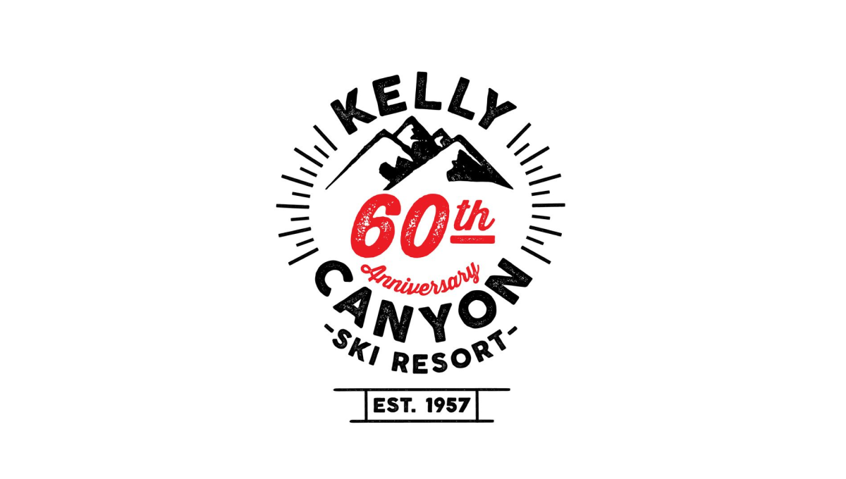
Kelly Canyon gave their designed lots of creative freedom and focused on a mark that was fun and recognizable rather than one that has strong, visual ties back to their original brand. The clean line-art design that they came up with works great in many situations - web, print, etc. - and creates a separate brand for their annversary.
More Details →Big White 60th Anniversary Logo
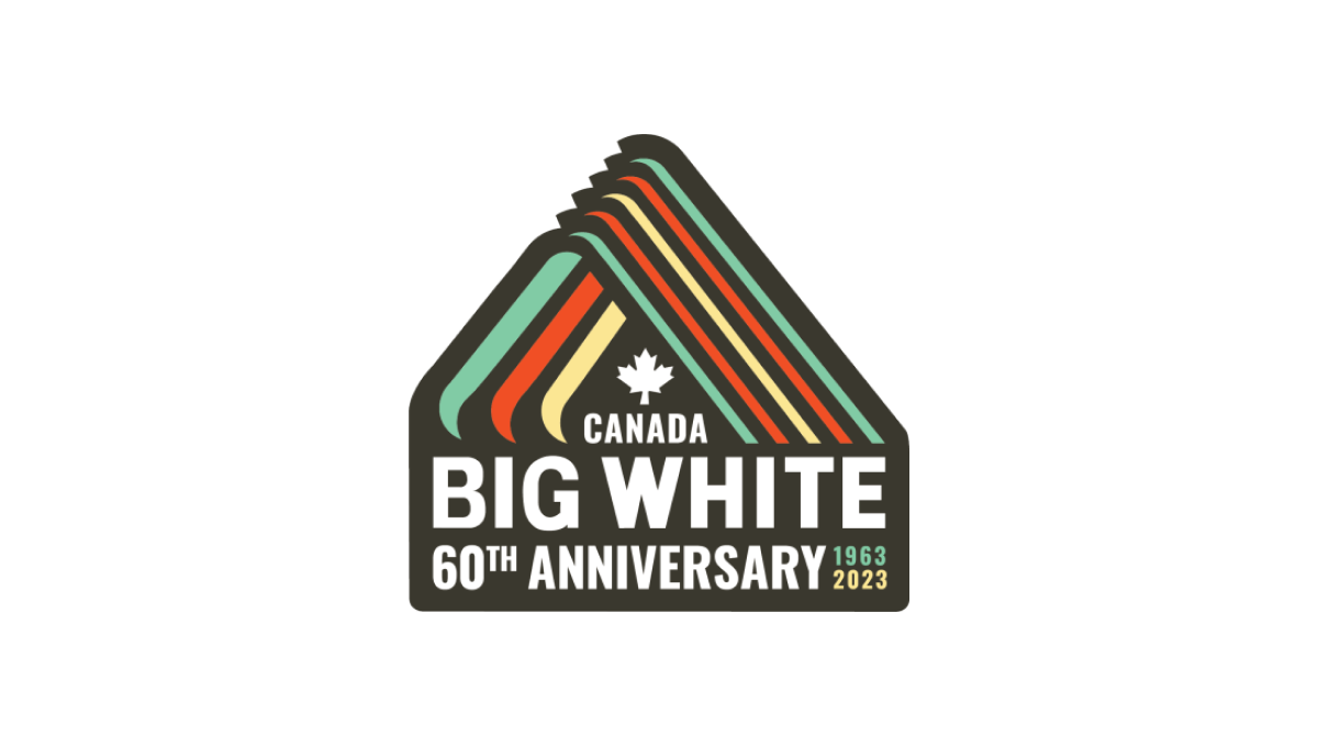
With a throwback to one of Big White Mountain Resort's original logos, this adaptation brings in a modern, sticker-style badge and extra line of text to hold the anniversary label, with a three-color design that's also a little bit retro. A simple combination of past and present, this is a great use of original logos with modern design needs.
More Details →