40th Anniversary Logos
Cameron & Mittleman LLP 40th Anniversary Logo
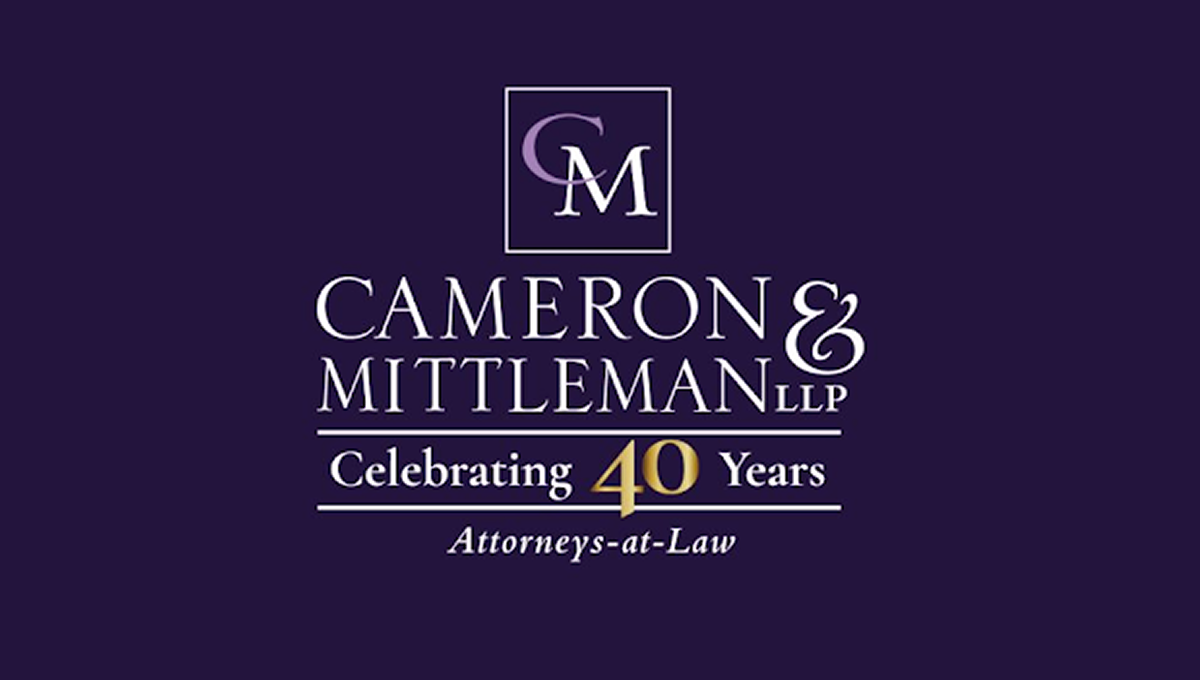
This anniversary logo has a clean, traditional look with a simple layout and a formal style. A dark background is paired with light-colored lettering, while a gold accent helps draw attention to the anniversary milestone. The company name is displayed in large, easy-to-read text, with a small monogram placed above it inside a thin border. A short celebratory message and a descriptive line below complete the design, giving it a professional and established appearance.
More Details →Brock Built 40th Anniversary Logo

This anniversary logo features a clean, modern design with a bold number "40" that stands out clearly. The company name is displayed in a strong, straightforward font underneath, giving it a solid and professional feel. The colors are simple and balanced, creating a calm and confident look. Overall, the design feels respectful and steady, marking the anniversary in a clear and tasteful way.
More Details →Hendrick Motorsports 40th Anniversary Logo
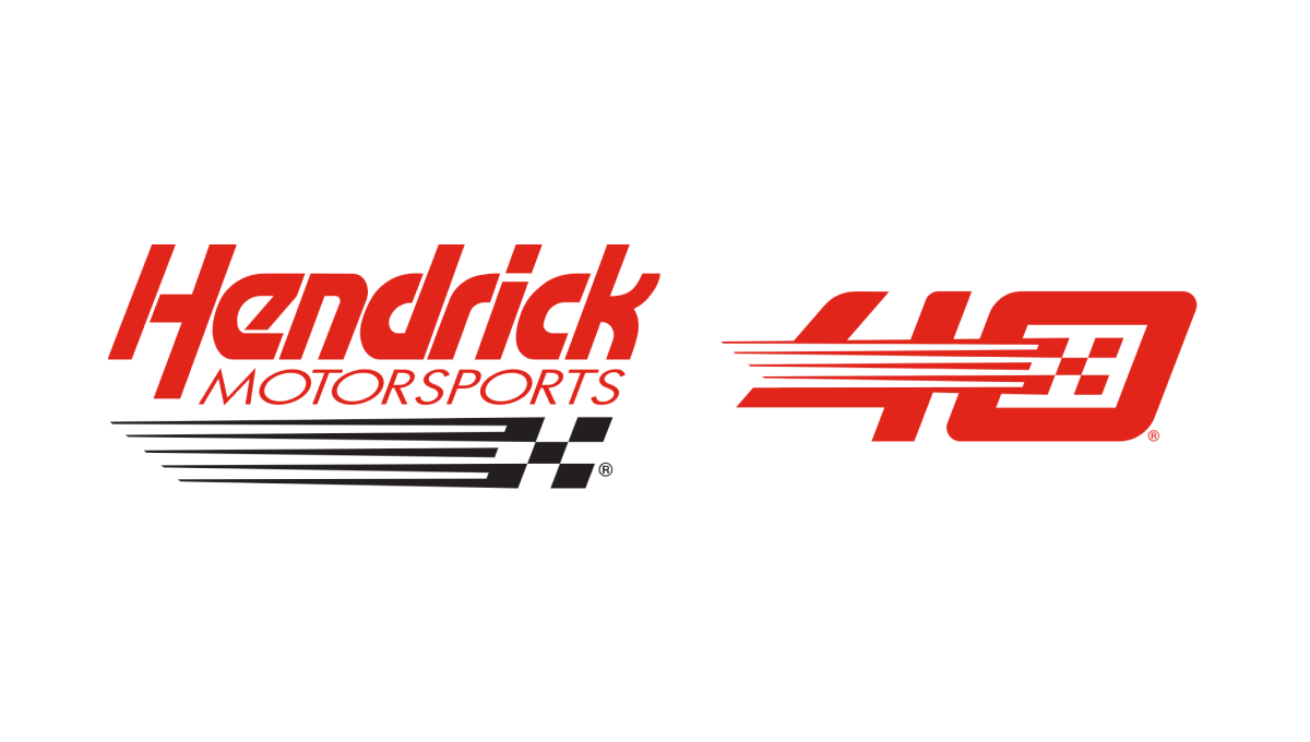
This logo takes the popular side-by-side approach that keeps the original logo as is and adds a unique number mark to the side. In this case, their design team designed a number 40 that features the same slant, color, and checkered flag motif of their original to create a number that neatly matches their original logo but also has enough elements to be recognized on its own by core fans.
More Details →IDEA Health & Fitness Association 40th Anniversary Logo
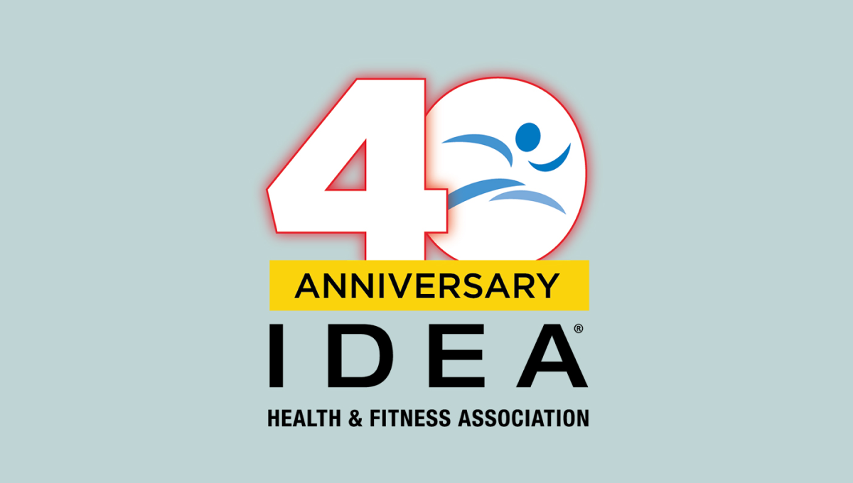
A large, block number 40 anchors this anniversary logo design. Both are outlined in red but the zero holds the blue mark that's traditionally used for this fitness organization's brand. Below is a yellow rectangle with a black word "anniversary" with the name of the organization sitting below to create balanced shaped that fits well in a square or circle avatar.
More Details →Apple France 40th Anniversary Logo
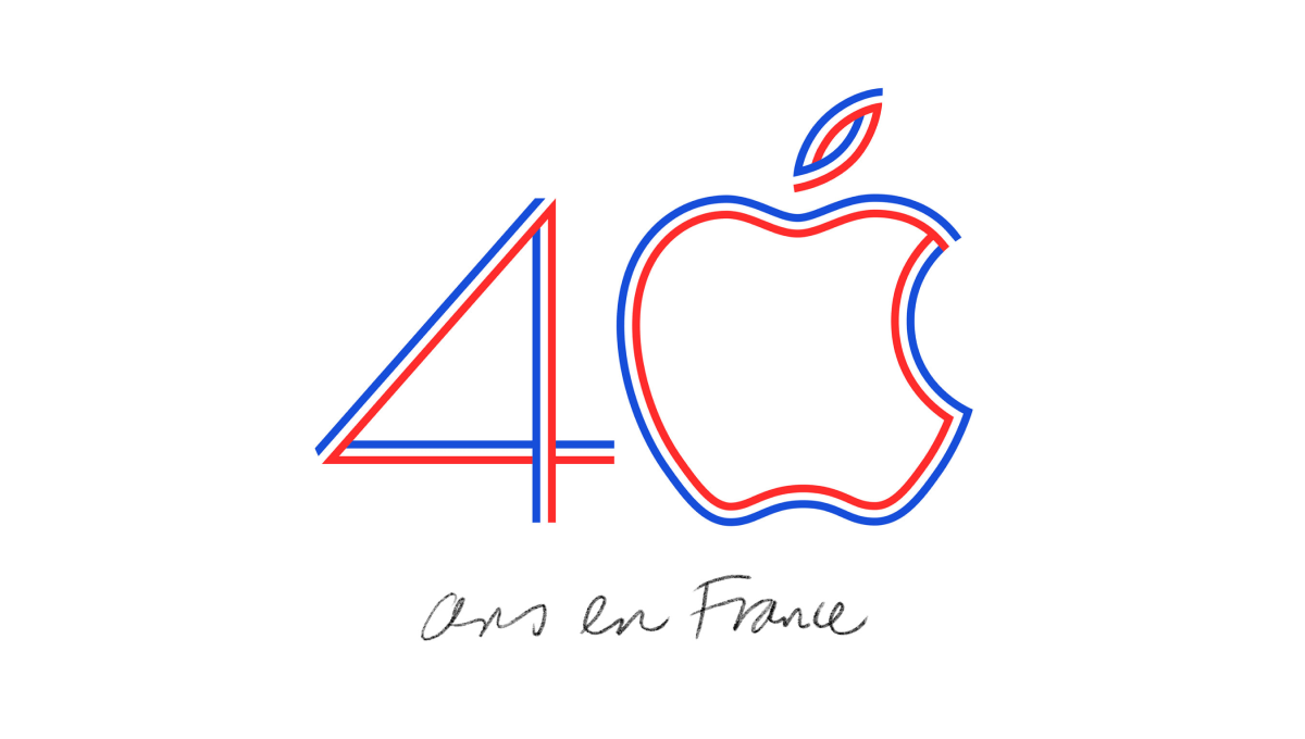
Using the classic Apple logo for the zero in the number 40, this logo uses the three colors of the French flag to create a line-art style logo that neatly combines both the traditional mark for this computer company and the colors that represent the branch of the company they were hoping to celebrate with this special design.
More Details →Regional Food Bank 40th Anniversary Logo
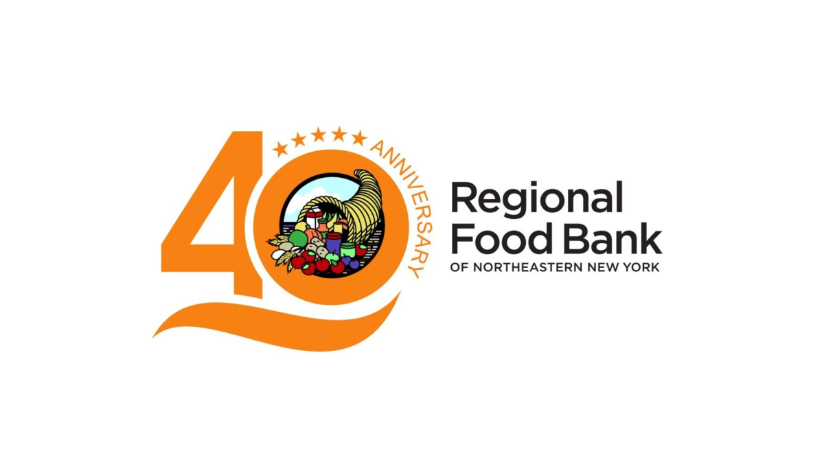
By placing this organizations logo in the zero of the number 40, this mark easily ties the anniversary design to the original logo for easy reconition and swapping during the anniversary year. A few extra elements are also added to this design including a line below the number 40 and a series of stars and the word anniversary curved around the right side of the zero.
More Details →Capital Area Food Bank 40th Anniversary Logo
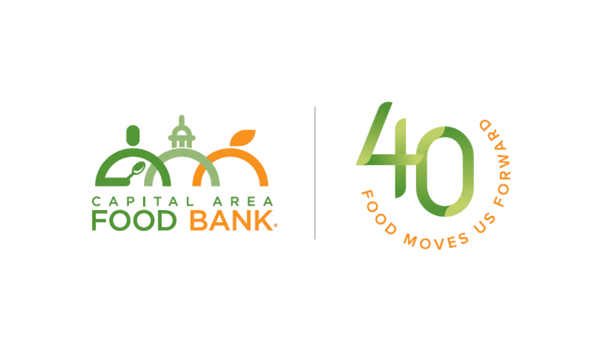
Using what has become a very common and effective design for anniversary logos, this mark starts with the traditional logo on the left, a vertical line for separation, and a separate mark that is solely about the year rather than something tied specifically to the logo. In this case, a green number 40 with an our circle of text with the organizations tagline.
More Details →Star Wars 40th Anniversary Logo
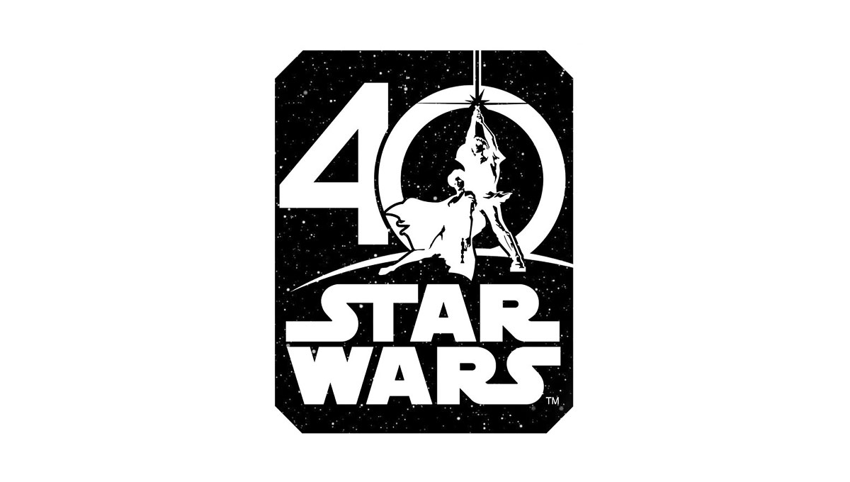
Using the classic image from the cover of the original movie, this logo places this iconic imagery in the center of a zero for the number 40. Below that, the traditional logo is stacked to create a foundation for this logo. Around the logo is a square, black shape to create the dark, space theme of the movie series.
More Details →Attractions Ontario 40th Anniversary Logo
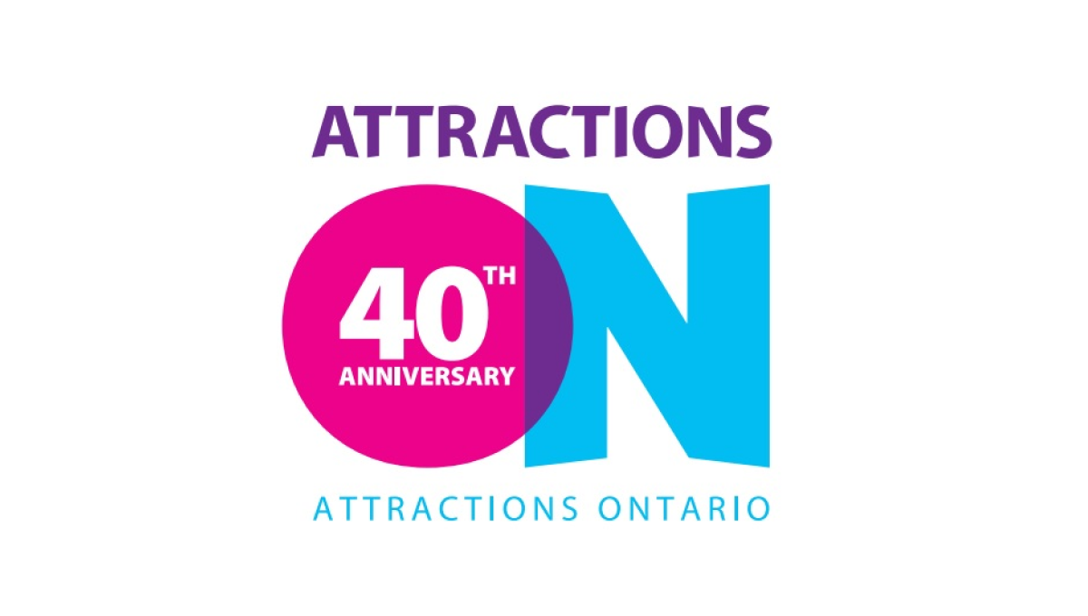
If you've visited a rest area in Ontario you've probably seen their simple logo that features an overlapping O and N. Given the large empty space that already existed in the first letter of their name, they simply placed text to signify their anniversary inside of that O and called it good. The original brand remains but the celebration is clearly visible.
More Details →DC Hospital Association 40th Anniversary Logo
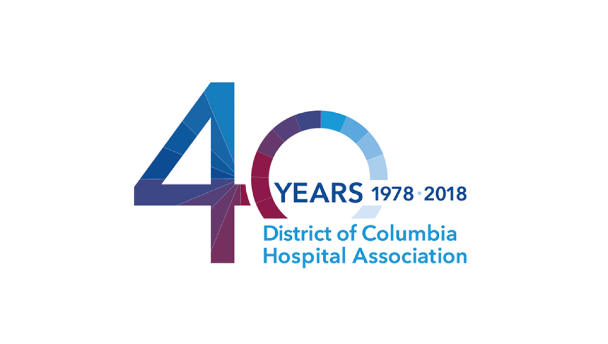
With the organization's name is light blue normal text and the word "years" with a date range above late, this logo takes a large number 40 and places it to the side and behind of that block of text. This makes the 40 easy to read by keeps the logo compact and balanced. Multiple colors used in this brand's identify break up the number 40 and add a slight gradient going left to right.
More Details →Valley Oral Surgery 40th Anniversary Logo
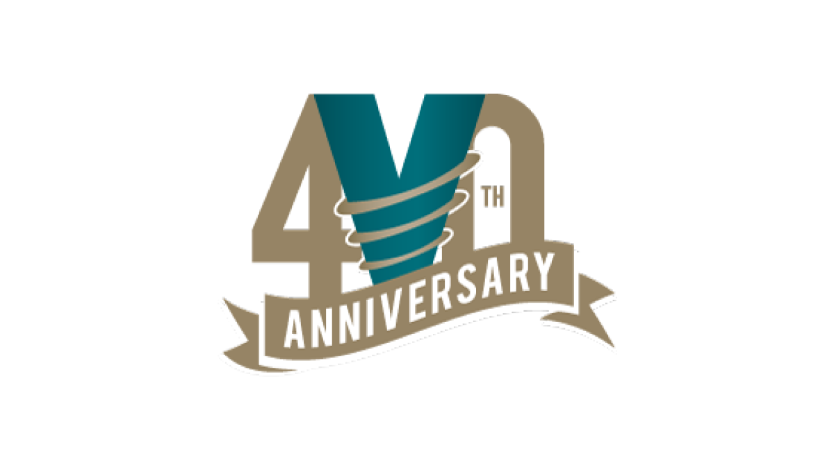
This logo combines the original V the brand has already been using in their original green color with two elements that stand out and compliment the design. First, a number 40 flanks the original mark while maintaining balance. Then, a ribbon holds the word anniversary below and in front to frame the upper part of the design. Good spacing and balance gives this logo a nice feel.
More Details →Las Vegas Aviators 40th Anniversary Logo
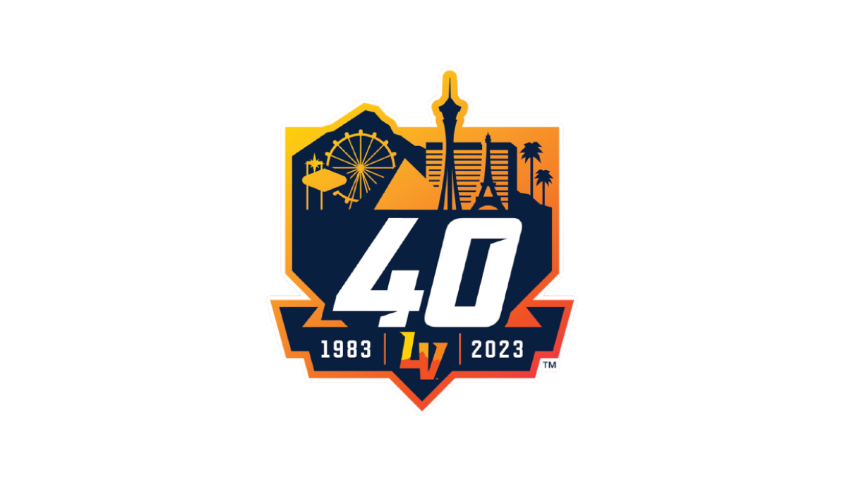
This logo combines three clean layers that establish a nice visual heirarchy for each element. First, an orange gradient creates a badge-style backdrop. Next, a skyline of prominant Las Vegas landmarks in a darker color creates a nice reference back to their home town with a punchout for the team's mark at the bottom. Finally, a large number 40 and the years of existence in white stand out in clear contrast from the rest to draw attention to the key message.
More Details →Hidden Valley 40th Anniversary Logo
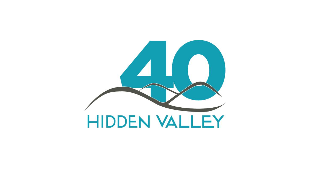
Hidden Valley's 40th anniversary logo keeps a very simple concept with a large number 40 in their brand blue / teal color peeking up from behind their original logo. While simple, the weight, size, and placement of the number give this logo extra weight and a clear reference to the milestone that is missing in some logos that add more diminutive references to their anniversary.
More Details →