Food Anniversary Logos
Reser's 75th Anniversary Logo
The logo celebrates a 75-year milestone with bold colors as the main focus. It uses clean, classic lettering and a smooth layout that feels both modern and respectful of the past. A banner curves across the bottom, mentioning the anniversary, adding a sense of movement. The color choices are warm and timeless, giving it a sense of tradition and pride. Overall, the design feels strong and simple, marking a long and steady journey.
More Details →ICEE 50th Anniversary Logo
This 50th anniversary logo has a fun and playful feel. The number “50” is large and bold,in a gold color that stands out. The word “ICEE” is placed to the left of the 50, using its familiar logo style. There’s also a small banner underneath that says “Icee-versary,” adding to the celebratory look. The overall design feels cheerful and energetic, reflecting a lighthearted brand marking a big anneversary in a lively way.
More Details →Dum Dums 100th Anniversary Logo
When you make a candy that is loved by children, you need a logo to extends the fun, playful vibe of their original mark and that's exactly what Dum Dums did here. This logo features a large number 100 in the same font as their logo and using the child-relevant word birthday instead of the adult-minded anniversary. The candle replacing the number 1 is a perfect way to both break up the color red and reinforce the birthday language of the sub text.
More Details →Coca Cola 125th Anniversary Logo
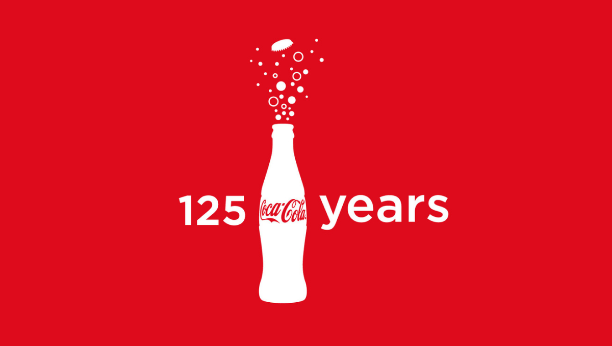
Imagine having a brand so powerful that you only need the shape of your packaging for people to instantly recognize its source. In this case, they also included the logo on the bottle, but it's almost unnecessary. With bubbles coming out the top and text to the left and right, these elements were combined in various lockups but this one - which also showed up on some packaging - was among the more popular.
More Details →Regional Food Bank 40th Anniversary Logo
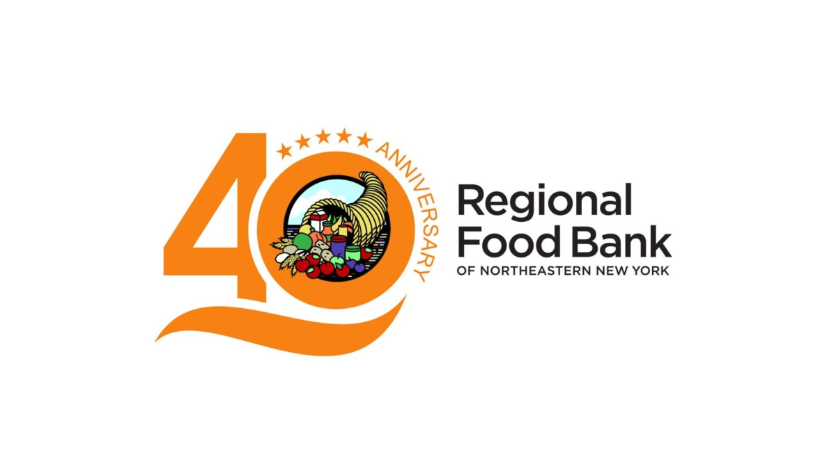
By placing this organizations logo in the zero of the number 40, this mark easily ties the anniversary design to the original logo for easy reconition and swapping during the anniversary year. A few extra elements are also added to this design including a line below the number 40 and a series of stars and the word anniversary curved around the right side of the zero.
More Details →Capital Area Food Bank 40th Anniversary Logo
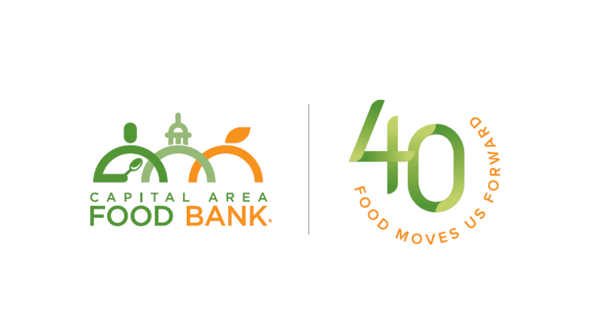
Using what has become a very common and effective design for anniversary logos, this mark starts with the traditional logo on the left, a vertical line for separation, and a separate mark that is solely about the year rather than something tied specifically to the logo. In this case, a green number 40 with an our circle of text with the organizations tagline.
More Details →Aggie Ice Cream 100th Anniversary Logo
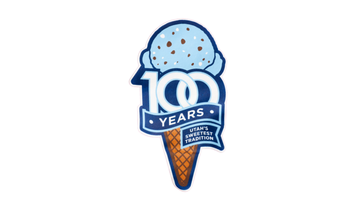
A stable of Utah State University's history, the ice cream shop within this school's campus wanted to celebrate their famous treats with a logo. So they started with an icre cream cone in the classic aggie blue, added a block number 100 in front of that with a ribbon below that wrapped below to contain the words "years" and "Utah's sweetest tradition." The logo was featured in the shop and on logo t-shirts and hats available in the store and online.
More Details →


