Healthcare Anniversary Logos
Maryland Hospital Association 50th Anniversary Logo
If you want a simple, effective anniversary logo then take note of what the MHA and many other brands are doing. This organization took their original logo, drew a vertical line to the left side, and on the other side of the line placed a simple number mark in their brand colors. The result is effective, balanced, and doesn't require the level of design and planning as a logo that starts from scratch.
More Details →St. Rose Dominican 75th Anniversary Logo
With a gold circle as the background, a stylized line-art representation of their classic buildings sits inside and words describing "celebrating 75 years" wrap around the rim. In a clean, slightly curved ribbon sit the words "St. Rose Dominican" to put the name of the organization front and center in this sharp, badge-style anniversary logo.
More Details →Sisters of Charity Hospital 10th Anniversary Logo
In a style that's become a bit more common, this anniversary logo takes the traditional logo and places a vertical line between it and an anniversary graphic to the left. This anniversary graphic uses a block number 10 in the brand's traditional blue color with a vertical word "year" through the zero and the word "celebrating" above. This gives them a clean lockup for their anniversary without having to redesign the original logo.
More Details →DC Hospital Association 40th Anniversary Logo
With the organization's name is light blue normal text and the word "years" with a date range above late, this logo takes a large number 40 and places it to the side and behind of that block of text. This makes the 40 easy to read by keeps the logo compact and balanced. Multiple colors used in this brand's identify break up the number 40 and add a slight gradient going left to right.
More Details →Anderson Hospital 45th Anniversary Logo
Keeping it simple, Anderson Hospital started with their traditional logo in the classic dark blue color as a base and built vertically from there. First came a red banner holding the word "anniversary" with the number 45 in brand blue above that. To keep balance, the word "years" is inset within the number 5 to avoid it sticking too far out to the side of the number which provides the focal point and primary visual weight for the logo.
More Details →Adams Memorial Hospital 100th Anniversary Logo
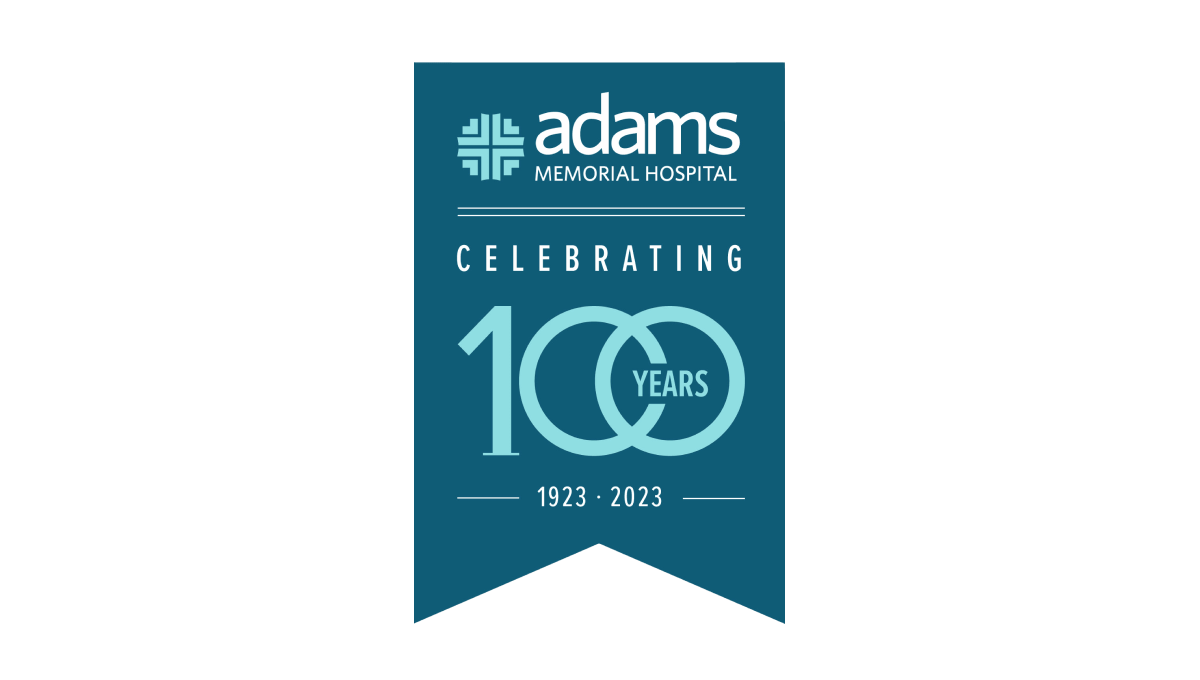
This unique layout for an annversary logo starts with a hanging banner shape in a shade slightly darker than the company's traditional teal color. Then, working downward, they add the primary brand logo followed by a styled "100 years" graphic. The 100 is in the brand color and features overlapping zeros with the word "years" inset within that overlap. Finally, extra text is placed above and below the number to add flow and balance.
More Details →Nicklaus Children's Hospital 70th Anniversary Logo
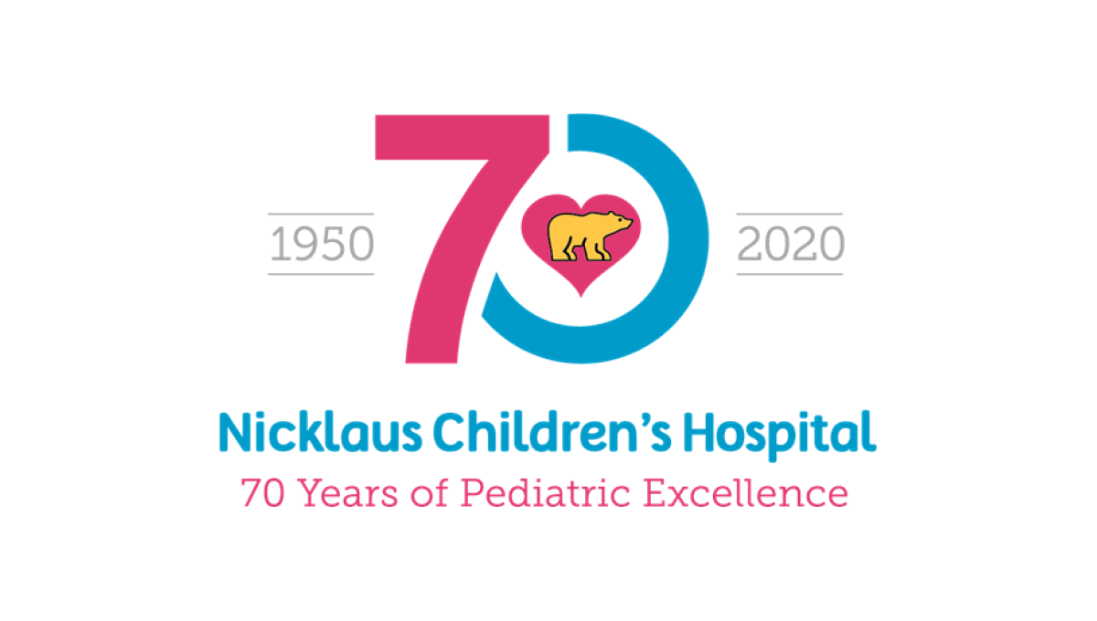
This hospital has a very recognizable logo with a golden bear (Jack Nicklaus' famous nickname and mark) inside a pink heart. By using that mark as the focal point and building a blue and pink number 70 around it, this created a tie back to the traditional brand and gave them space to add wording below and to the sides of the logo, clarifying the name for those not as familiar with the original.
More Details →Caboolture Hospital 25th Anniversary Logo
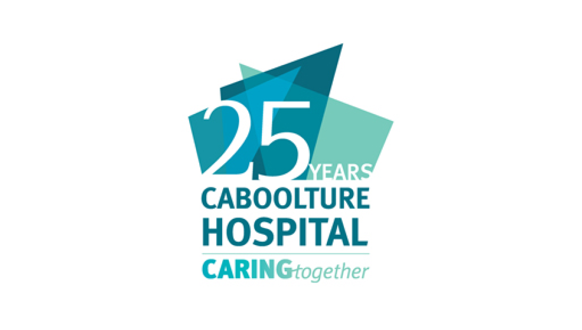
This logo does a great job of using the original word mark as the base for an anniversary extension. By placing some brand-related shapes above they gave themselves space for placing their anniversary number. Not only the number, in fact, but the word years as well to create a nice, balanced logo that ties strongly back to the original brand.
More Details →Silver Cross Hospital 125th Anniversary Logo
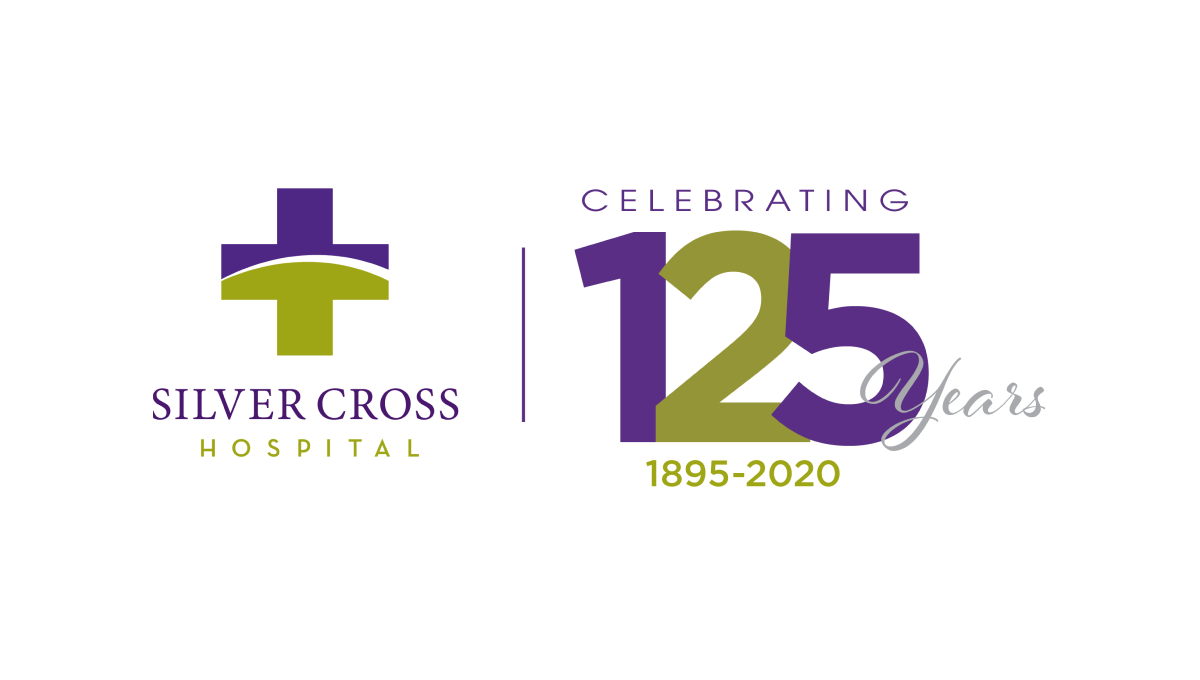
Similar to how some branded events ask partners to place their logo next to the event's logo with a line between for an co-branded marketing, this logo does something similar with a line between the traditional logo and a stylized number with a few words for balance and clarity around. With the number in the brand's original purple and gold/green, it's a simple way to create a clean, effective anniversary logo variation.
More Details →Temple University Hospital 125th Anniversary Logo
Two digits in a number creates their own design styles and three digits does the same. At 125 years, Temple University's Hospital stacked the three digits on an angle to create a clean layout for the number and focal point of this logo. Placing a circle behind the the university's classic colors and words wrapping around indicating the name and forward-looking vision for the organization, this logo is clean, simple, and effective.
More Details →Paynesville Hospital 60th Anniversary Logo
One of the strongest ways to build an anniversary logo is to start with a large, block-lettered versio of the anniversary year. Instead of a "th" this logo opts for the word "years" inside the 0 while this mark rises up from behind the traditional logo and adds a little carved out space to include the years of operation. With everything matched to the original blue and green brand colors, it ties back nicely to the original.
More Details →Memorial City Medical Center 50th Anniversary Logo
This hospital logo puts their name in dark, block letters at the bottom and simply adds a clean garphic above that to highlight the occasion for this adaptation of their brand. A large, block number 50 in blue is covered on the bottom third by an orange ribbon that contains the word "anniversary" and sits just narrower than the words below for a nice, vertically tapered shape that would work great on a website, swag, or social media avatar.
More Details →U of R Dept of Psychiatry 75th Anniversary Logo
Never inteneded to stand on its own, this mark only appears on university-branded marketing like their anniversary web page, so it focused only on the department of the school. This name wraps in a circle around the number 75 with their brand values covering two lines below to reinforce their identify even as they expand it with this anniversary logo.
More Details →
