Media Anniversary Logos
Guiness World Records 70th Anniversary Logo

This anniversary logo is a nice take on the traditional guinnes world records logo. They just placed a '7' of the same style in front of their logo-- and BAM! Anniversary logo! It works really well, with the traditional logo being a 0 and having all the classic elements as the normal logo. The classic blue color works well to mark an imporant milestone.
More Details →Vox 10th Anniversary Logo

Vox is a classic example of a company that cares deeply about brand consistency. And when you care about consistency, it can sometimes be either challenging or uneccessary to create an anniversary logo that adds in a bunch of new elements. So, Vox didn't. They took one of the existing brand fonts, made it nice and bold for a number 10, and placed their logo inside hugging the right line of the number 10. Clean, on-brand, effective.
More Details →The Doors 60th Anniversary Logo

The Doors already has a simple but extremel recognizable logo. So instead of overdesigning some new mark coming from a different direction, they took that original mark, put the silhouettes of the band members poking up from behind, and places a simple ribbon across the middle part of the design to hold an anniversary label. Simple, smart, and effective.
More Details →Hydraulics Online 15th Anniversary Logo
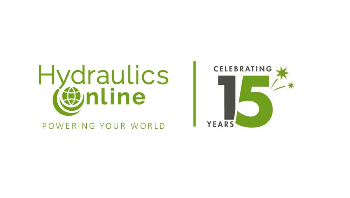
This side-by-side layout using a brand's original logo is becoming more and more common, for good reason. A vertical line seperates this media outlet's traditional logo from a simple design using a number fifteen. Even if this number was using readily available stock imagery of their annersary number, the combination of this mark and their usual design makes it a clean lockup that's easy to tie back to the original brand.
More Details →Attractions Ontario 40th Anniversary Logo
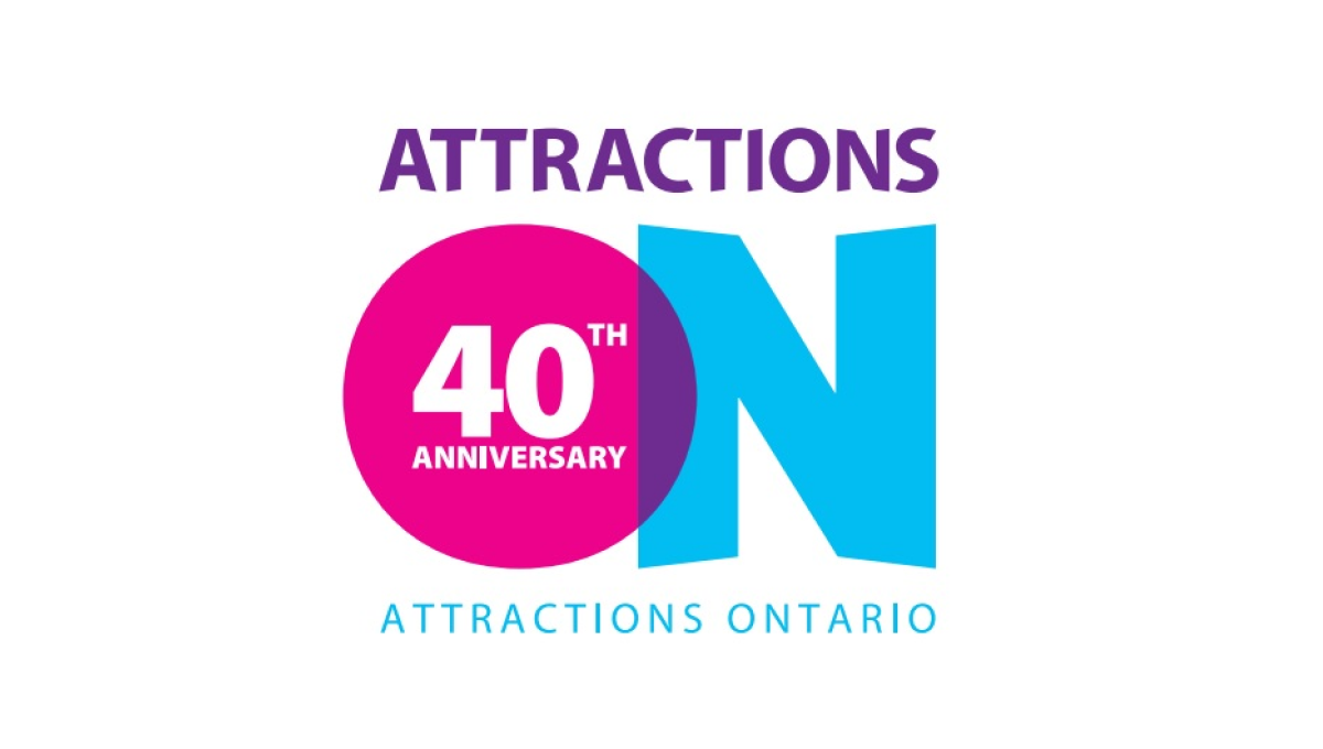
If you've visited a rest area in Ontario you've probably seen their simple logo that features an overlapping O and N. Given the large empty space that already existed in the first letter of their name, they simply placed text to signify their anniversary inside of that O and called it good. The original brand remains but the celebration is clearly visible.
More Details →Ski Area Management Magazine 60th Anniversary Logo
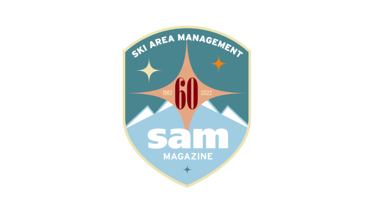
It's not often you see a magazine celebrate their 60th anniversary, but this is exactly what SAM did and celebrated with a clean, crest-style badge in two shades of teal as the base. At the top, their written logo follows the curve of the top of the crest with their traditional lowercase "sam" word mark placed at the bottom. In the center, a red number 60 with a star shape behind to fill in the space and provide balance.
More Details →