Non Profit Anniversary Logos
Hooper City Tomato Days 100th Anniversary Logo
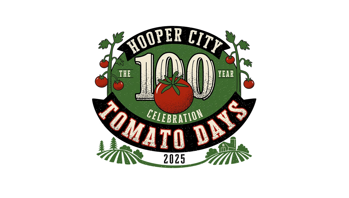
The logo uses a bold number 100 in the center with a tomato shape overlapping it, showing this event’s big milestone year. Around that, there’s simple text for the place and event name in a curved layout. On the sides and below, there are basic plant and field shapes that give it a slightly rustic, homey feel. The colors are earthy reds and greens with an old-fashioned, slightly worn look to the letters and shapes.
More Details →TASB 75th Anniversary Logo

I really like the way this logo works with the simple design and shape of the original word mark. Since their logo is all black, they added color behind the number 75 and their years of operation. And with a heavy weight to their original mark, they went vertically down from the logo with heavier squares to create a clean, square design that matches that original weight.
More Details →Utah Division of Arts & Museums 125th Anniversary Logo

This simple logo sets the original word mark on the right and adds a stylized number 125 to the left. Similar to other anniversary logos, they stagger the digits of the number to add a little bit more design and depth tha having the number alone. Filling the gap left by this stagger are two ribbon shapes that tie the logo back to the meaning and mission of the organization.
More Details →HSMAI Foundation 100th Anniversary Logo

The original logo for this foundation already had quite a few elements, so I appreciate that design kept it simple by adding a large number 100 below the base of the original, using their tagline as a divider between the main mark and the anniversary addition. The design uses the same colors and fonts to create a nice pair to the traditional mark. There's a lot going on, but it works nicely together.
More Details →Camp Pasquaney 130th Anniversary Logo

Circles are a shape that feature in many anniversary logo designs and this one does the same to great effect. The name of the camp arcs over the top, the years of operation fill the center, and a simple set of graphics including a campfire at the center bottom fill out the shape and give it a little bit of weight to keep the design from feeling top-heavy, a common issue with round designs like this.
More Details →Dee Foundation 50th Anniversary Logo

The Dee Foundation often uses a logo that only includes the text shown on the right side of this design. So being, they could pair that with an anniversary mark without having to fight with the shape or color or weight of the original logo. A large number 50 filled with a slight gradient and two faces making the negative space in the number zero made for a really classy logo to use during their anniversary year.
More Details →Onstage Ogden 75th Anniversary Logo

Onstage Ogden uses a simple, text-only wordmark for their traditional logo so this gave them the chance to add a mark for their anniversary without competition with their usual mark. In this case they kept the two-tone theme but combined a number seven on the left with a square extending to the right and the number five subtracted from that shape. A nice little design that's easy to swap with their usual mark.
More Details →Family Search 130th Anniversary Logo

Nothing fancy, this anniversary logo starts with a base of the traditional logo in the horizontal layout. Above that they place a bit of a tagline or mission statement in the secondary orange color sometimes used with this brand. At the top is a large number 130 with just a bit of gradient applied to the brand green for a little depth. The result is clean and recognizabe.
More Details →The Consumers Association of Singapore 50th Anniversary Logo

In this case, we don't have to guess what their design concept was. To quote from the case study (see "source" link for this logo) about this logo, "The logo integrates the anniversary tagline to highlight the theme of the anniversary — Past, Present and Future. The arrow is designed with a sense of motion to represent the passage of time. The logo concept incorporates the arrow into the shape of the number 50 to create a sense of motion — moving forward. While the arrow head denotes the future, the circular motion of the arrow reflects how the past can provide a strong foundation for CASE to strive towards greater excellence in the future."
More Details →Ogden Nature Center 50th Anniversary Logo

This is a really creative, simple solution to an anniversary logo that alters the original logo very little while making a clear, unique design for their celebration. In this case, they already had a round shape for their mark, they simple added a ring of gold around that circle and wording the mark the celebration. This keeps the proportions and sizing of the logo almost identical to the original so swapping to and from this logo is easy during and after the anniversary year.
More Details →Deer Valley Music Festival 20th Anniversary Logo

This creative logo uses a large number 20 in the center as the main focal point of the design. With a silhouette of the mountains that surround the venue at the bottom and line art of the night time sky above, the result is a really compelling, creative mark and shape. Around three sides of that shape sit the various names and groups affiliated with the program.
More Details →Battes of Saratoga 250th Anniversary Logo

Starting with a large number 250 in the center in the classic, handwritten style of the era it represents, this logo builds around it using a seal-style round shape that features the name and a small cannon icon. Wrapping around the bottom is a red ribbon with the tagline of this famous moment in United States history.
More Details →Millennium Challenge Corporation 20th Anniversary Logo

While this logo may seem simple and harder to recognize than other, well-known logos, the star shape containing an adaptaion of the American flag is the organizations original logo that is used across their marketing campaigns. With just a simple number 20 peeking out from the left side of that mark, they created a new mark that celebrates the occasion without overcomplicating the design.
More Details →Quad Cities Housing Council 25th Anniversary Logo

This is a really clean, effective example of a common anniversary logo design style where the traditional logo is placed side by side (in this case with a small divider line) with a number mark. This number mark uses a cut out silhouette of a house to tie it back to the original logo and meaning. Along the bottom sits wording to mark the occasion.
More Details →National Arts Fesitval 50th Anniversary Logo
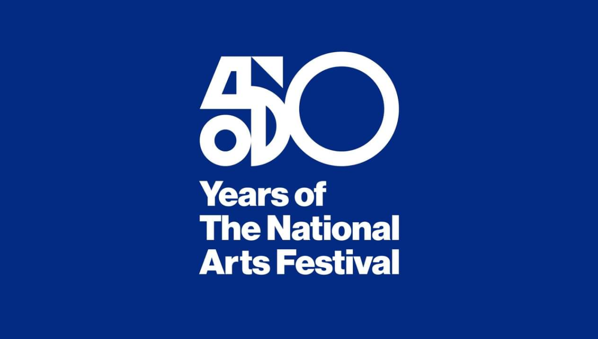
This logo was used primarily on this blue background and combines two nice designe elements to make the whole. The first is a combination of shapes to create a unique, creative number 5 that resembles a bit of modern art. The second is the classic helvetica-style font that is so common in art contexts. Together, this logo is clean, unique, and meaningful.
More Details →Nigeria Foundation 20th Anniversary Logo
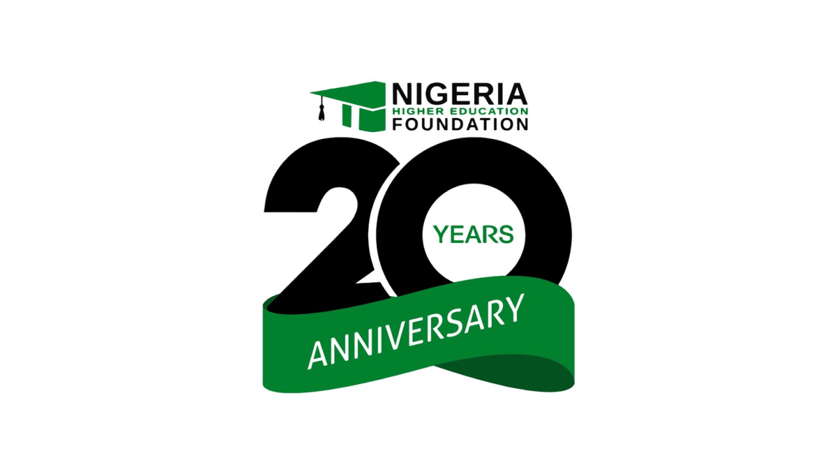
This logo takes a smart approach of combining two separate, but complimentary, designs: the traditional logo at the top and a number mark below that. This number mark features an overlapping number twenty with a three-dimensional ribbon covering up the bottom part of the number in the same brand green as the original logo. The result is clean, simple, and effective.
More Details →European Distance & E-Learning Network 30th Anniversary Logo

This brand found themselves in a unique position when designing an anniversary logo because their existing logo already resembed the shape of a number. By placing the number 3 above the "ED" with a similar width as those to letters combined and doing the same with the 0 and "EN", the acronym and number mark created a unique, balanced shape that incorportated their existing logo.
More Details →American Bakers Association 125th Anniversary Logo
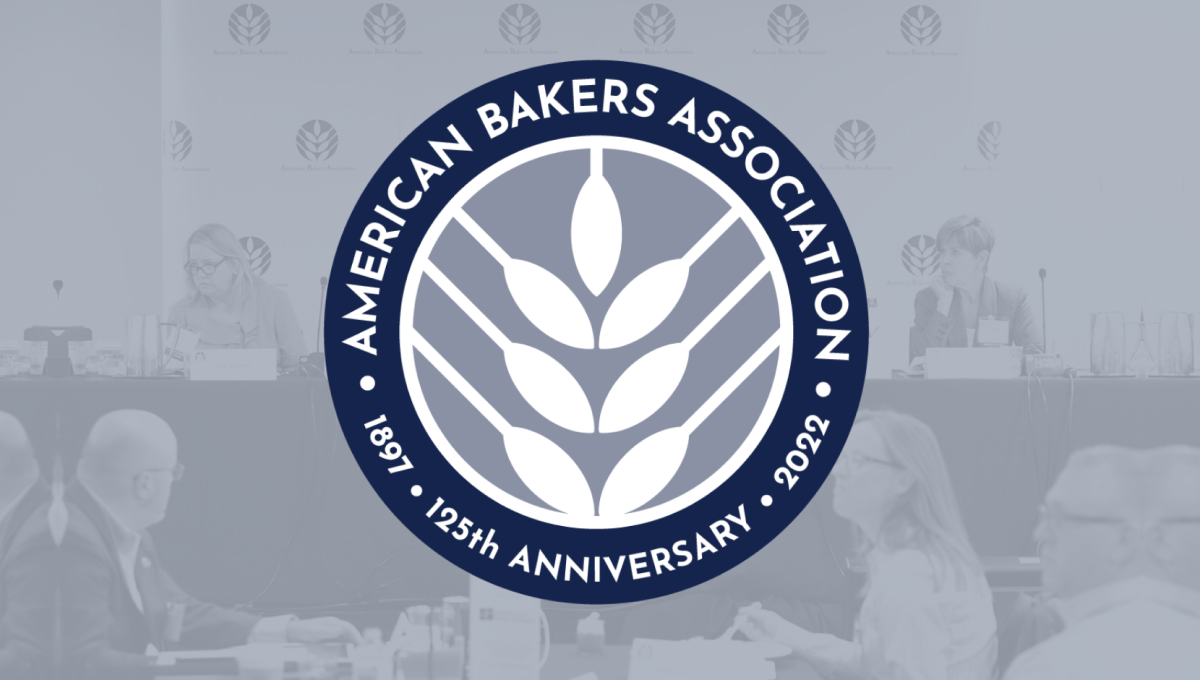
Using the round shape so often found in anniversary logos, this mark adds a clean, on-brand white silhouette of wheat in the center as the visual anchor for the design. Around the perimeter of the circle in a thick blue band wits the name of the organization, the years of operation, and the classic anniversary callout to complete the circle and add clarity to the reason for this separate mark.
More Details →United Nations 70th Anniversary Logo
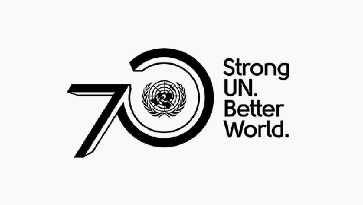
The United Nations logo is one of the most recognizable in the world, so placing this near the visual center of their design was a great move. By placing the number zero around that mark and the number zero ahead of it using a similar style to the logo, they create a strong lockup that's clean and on brand. A tagline to the right rounds out this design and adds a little bit of visual balance.
More Details →Smithsonian Institute 175th Anniversary Logo
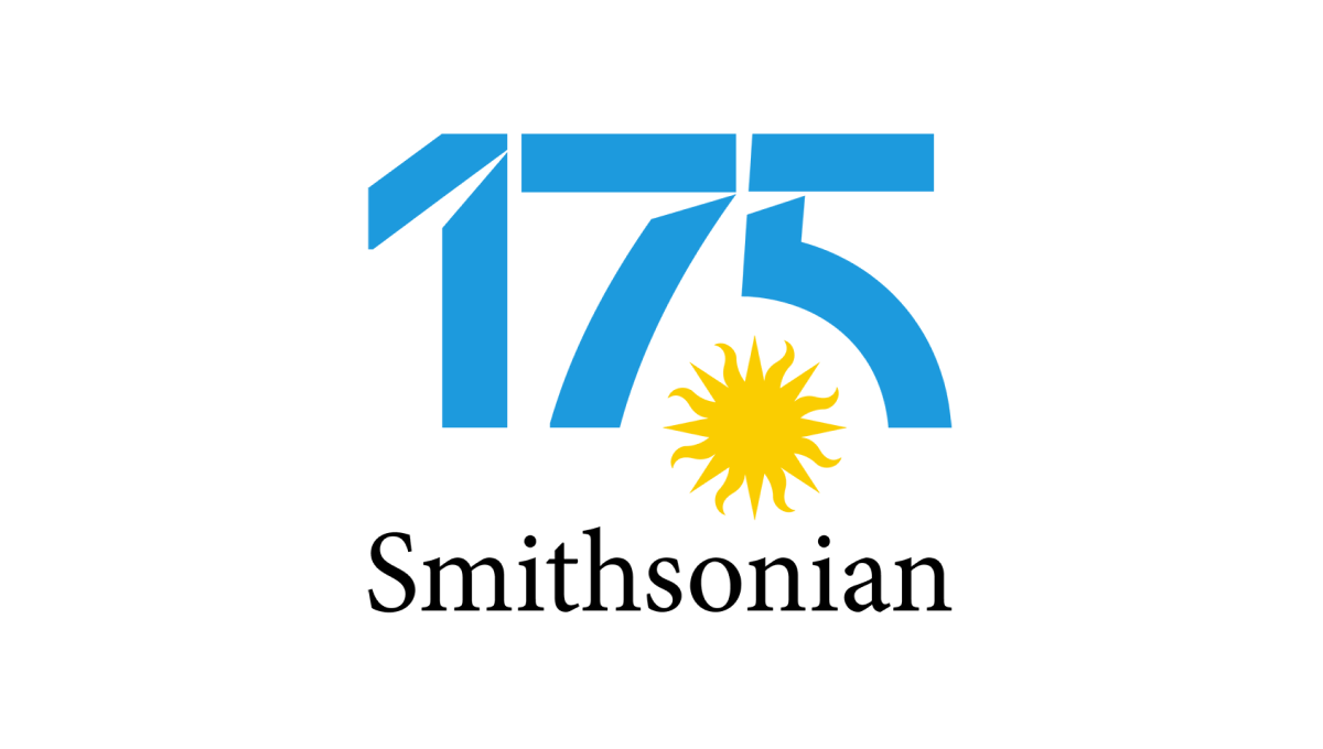
Normally the Smithsonian logo features a yellow sun on a blue circle. Wanting to keep the colors and shape of the original for their anniversary design, their team separated the blue from the yellow, placed the sun on it's own in the gap between the 7 and 5, and then used that backgroudn blue for the color inside the number in this logo. The traditional word mark on the bottom rounded it out and made it easy to recognize.
More Details →The Way International 80th Anniversary Logo
Adding a number of elements you'll see in anniversary logos, this logo uses a thick circle to hold one ring of words, another ring outside of that holding the classic Laurel leaf pattern, and a banner at the bottom where they've played the organization's motto. In the center is placed their year of celebration with the original logo situated at the top.
More Details →Windsor Historical Society 100th Anniversary Logo
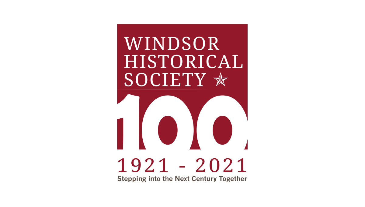
Starting with a square in the non-profit's traditional maroon color, this logo adds a large, block number 100 overlapping the bottom to create a strong, visual anchor for the design. At the top is the organization's name and mark, below the square are their years of operation, and at the bottom is the group's motto to create a tidy, on-brand design with a strong tie back to their usual brand.
More Details →Save the Bay 50th Anniversary Logo
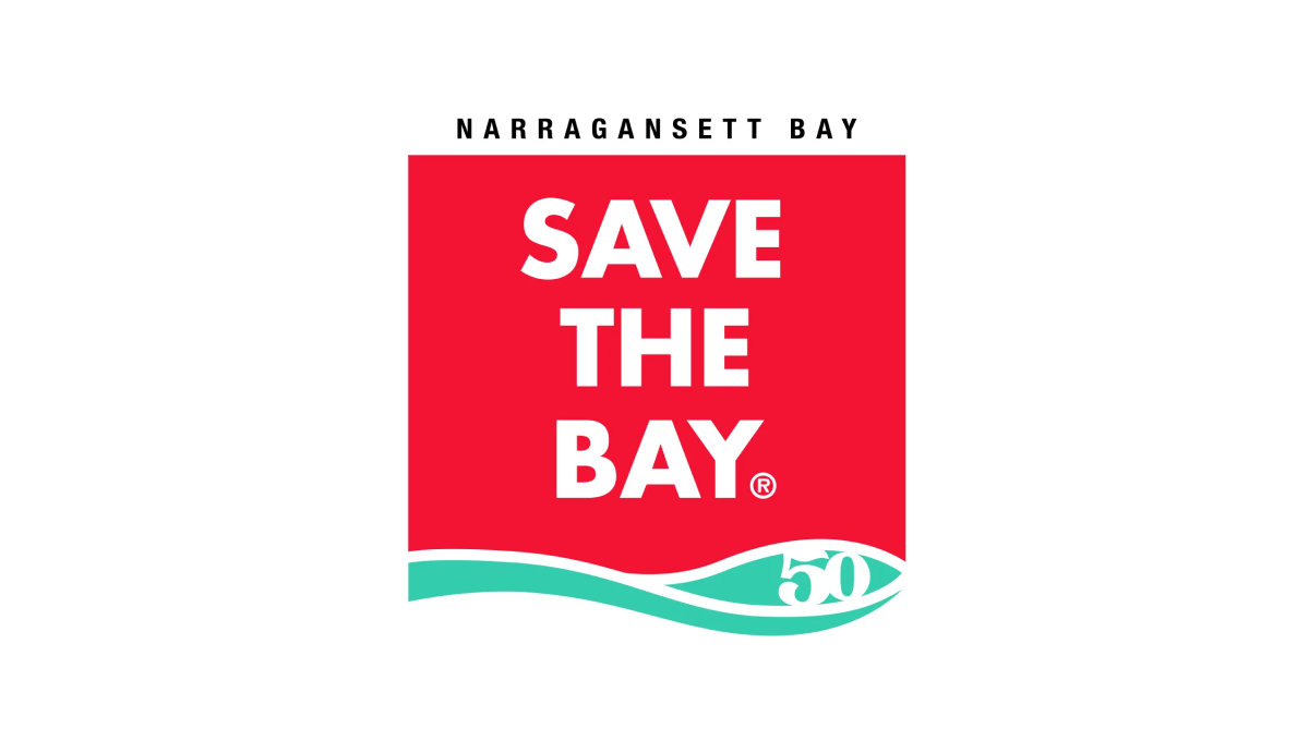
To create their anniversary logo, Narragansett Bay took their traditionally horizontal motto and stacked the words into a square with a solid background. With their traditional mark at the bottom and the name of the city at the top to create a clean, square mark that works well during their anniversary and beyond.
More Details →Cambridge Community Center 90th Anniversary Logo
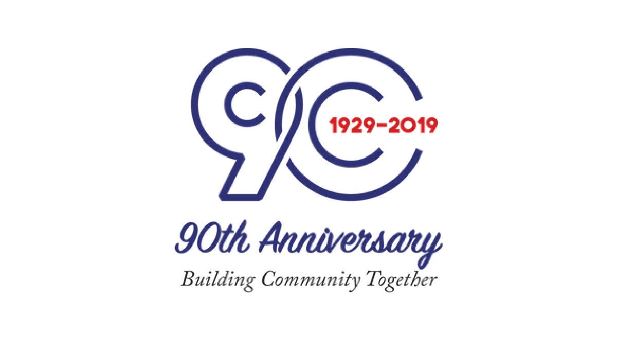
This line-art style logo starts with the year of the annversary in large, outline-style characters that slightly overlap to create a nice, compact shape. Inside the zero are the years of operation. Below the number sits a written recognition of the anniversary with the center's motto and goal written below to balance out the design.
More Details →The Landings Association 50th Anniversary Logo
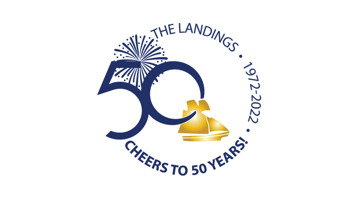
Keeping it simple, this logo places the name of the organization, the years of operation, and a celebratory message in a curving circle of words to create the rough shape. On the left side, the remaining gap in the words is filled with a large number fifty and an illustration of fireworks behind. In the center, a ship representing the orgnaization's main brand sits just in front of and below the number.
More Details →PACE NSC 25th Anniversary Logo
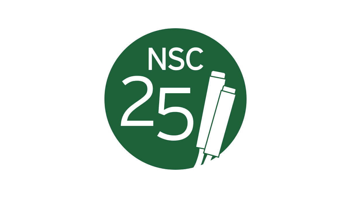
The Partnership for Academic Competition Excellence (PACE) is a 501(c)(3) non-profit that runs a quizbowl competition called the National Scholastic Championship (NSC). So their logo begins with a green circle in their primary brand color and adds a large number 25 on the left side with the two and five staggered to fit the shape of the circle. On the right, a simple illustration of the clickers they use in their comptition adds relevance with the name of the organization across the top.
More Details →United Way of the Midlands 100th Anniversary Logo
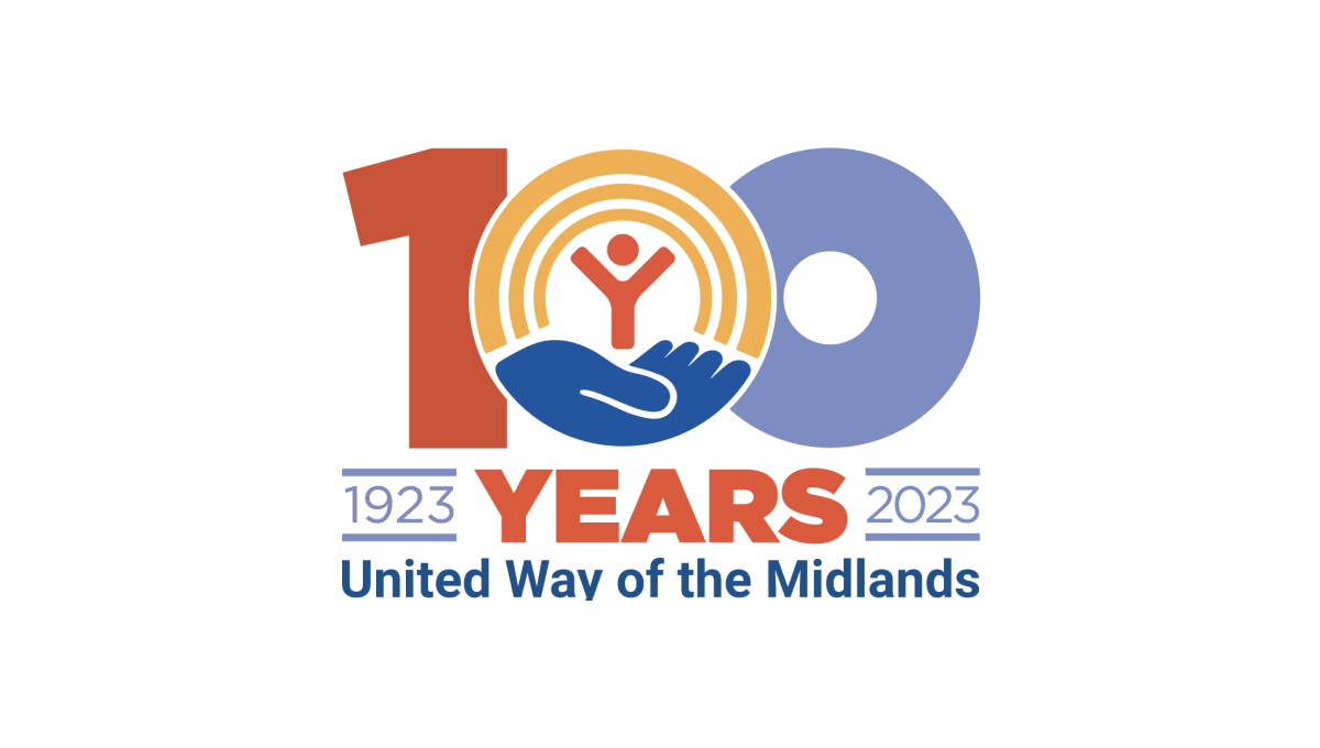
Like other United Way anniversary logos, this logo uses the classic red, gold, and blue colors of the original brand with a large, block number 100 in the center to anchor the logo. The United Way logo sits neatly in the center zero with the word "years" bloe and tha date range on either side to add balance. Finally, the name of the chapter is displayed at the bottom for a clean, on-brand logo.
More Details →NHS Retirement Fellowship 45th Anniversary Logo
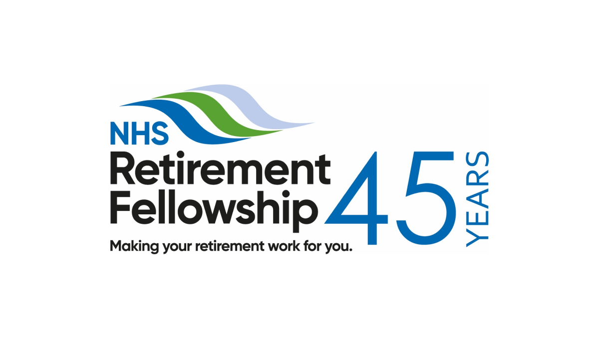
This logo keeps it simple by adding a number 45 to the right of their traditional logo. By putting that number in the brand's traditional blue and a vertical word "years" to the side, they created a simple, effective logo that doesn't stray from the original brand and doesn't add too much complexity around their hope to celebrate this milestone.
More Details →NC Early Childhood Foundation 10th Anniversary Logo
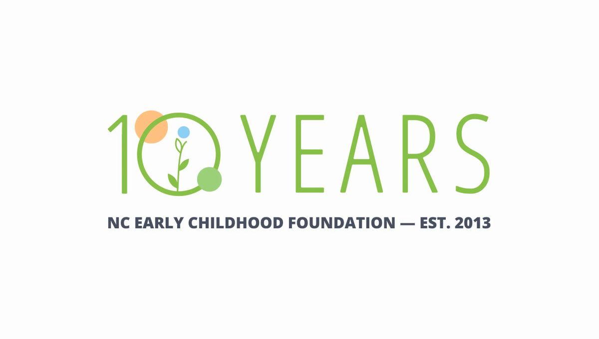
Simple and playful, this logo fits exactly the tone you'd expect from an organization design to help children. With the name of the organization in plain text below, they use this visual line to hold the lighter mark above. With simple shapes and friendly colors denoting growth and optimism, it's a great, on-brand design to support this milestone in their organization's history.
More Details →IDSA Foundation 20th Anniversary Logo
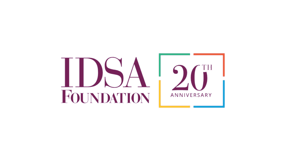
This clean annivesary logo starts with the organization's original logo and adds a balanced, square shape with 4 complimentary colors to form a clean frame. Inside that frame they return to the brand color with a large number 20 in the same color and typeface as the original logo. This preserves the recognizable original logo while adding a clear reference to the anniversary they're celebrating.
More Details →Disability Wales 50th Anniversary Logo
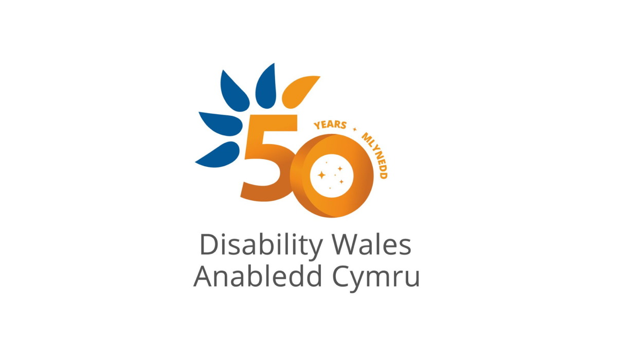
Diability Wales original logo is almost identical to this minus the number 50 in the center. Using orange for the number helps it stand out from the original curved, blue feather design and gives the logo a nice solid anchor in the center to keep things balanced. This similarity in size and shape also makes this logo easy to swap with the original logo in marketing and other designs.
More Details →C&W Champions 10th Anniversary Logo
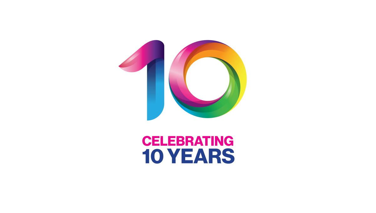
This logo takes a unique angle in that the only visual reference to the original brand is the color and shape of the mark. These rainbow, twisting three-dimensional characters mimic the style used in the organizations main logo and makes it easy for those aware of the original brand to easily connect it back to the mark it's related to.
More Details →Amstrong Air & Space Museum 50th Anniversary Logo

This badge-style logo features a prominent number wrapped in imagery and colors that align with the airforce, space, etc. theme that the museum - named after Neil Armstrong - is known for. A wrapped ribber contains the years of operation with an off-white background so set it apart from any white backgrounds it's used on.
More Details →