Fitness Anniversary Logos
Ripfast Bodybuilding 25th Anniversary Logo
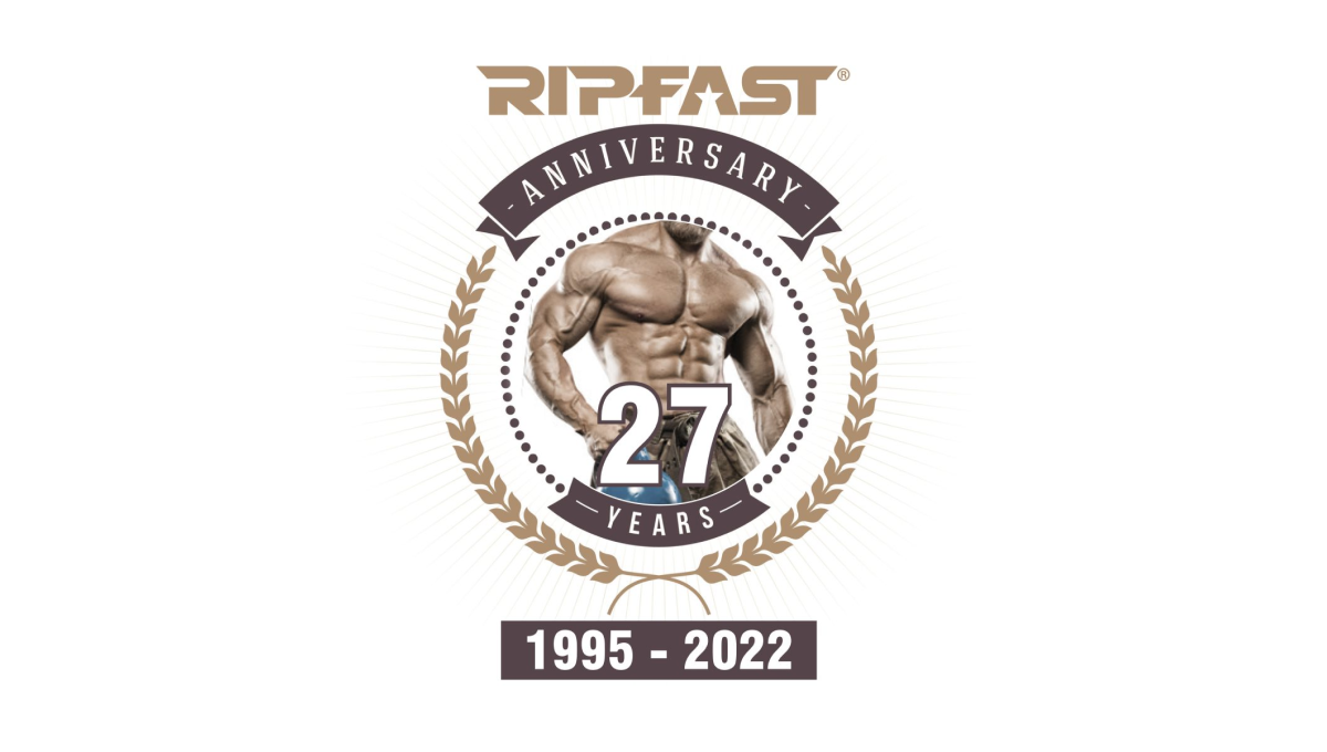
If your brand is bodybuilding, placing the photo of a ripped individual in the center is a pertty simple, on-brand way to start a logo. With a number layered above, a round circle with laurel leaves surrounding, and the traditional logo placed at the top, this logo may have a few more elements that typical anniversary logos but they work together pretty well.
More Details →Pro Source Fitness 20th Anniversary Logo
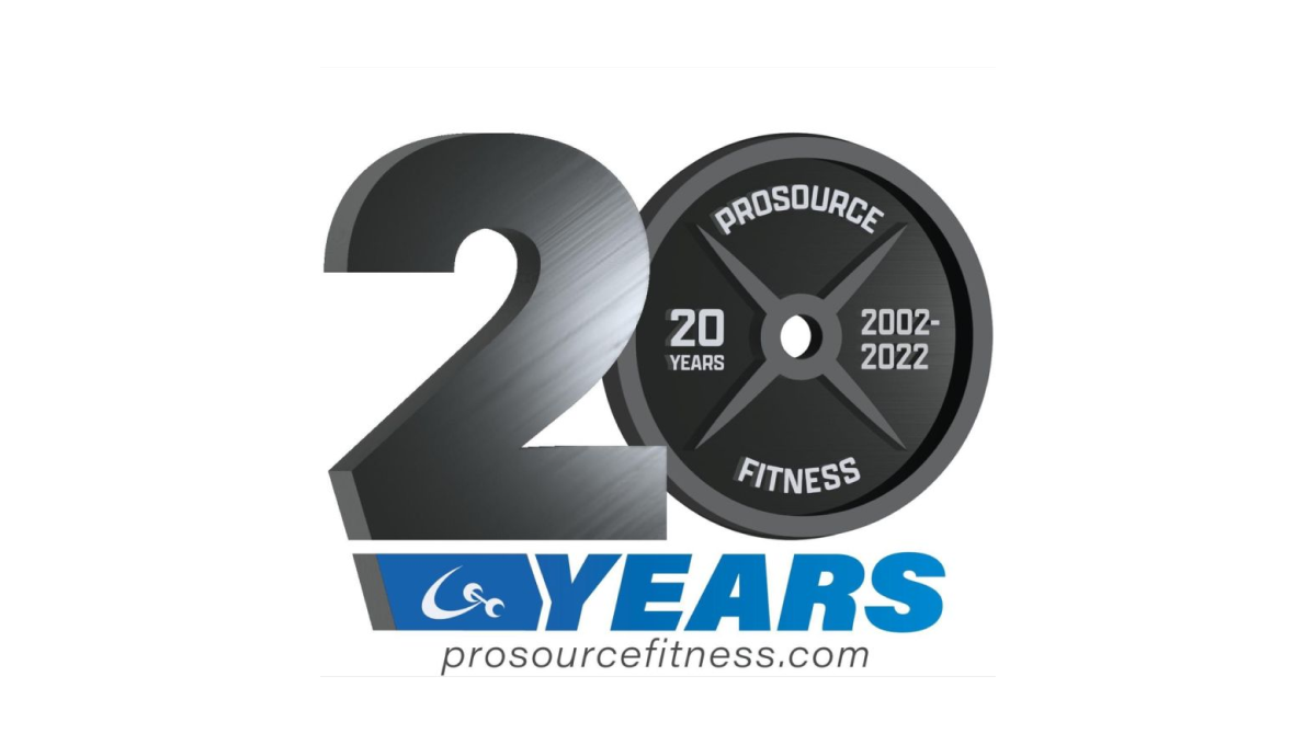
When you run a gym and you're celebrating an anniversary with a new logo, why not use a part of that gym that is both ubiquitous but also shaped like a zero? By using a plate as one digit and adding some metalic sheen to the number 2, this gym create a clever, on-brand mark. Below sits the name of the gym in the brand's primary blue colors.
More Details →New Gregory Gym 25th Anniversary Logo
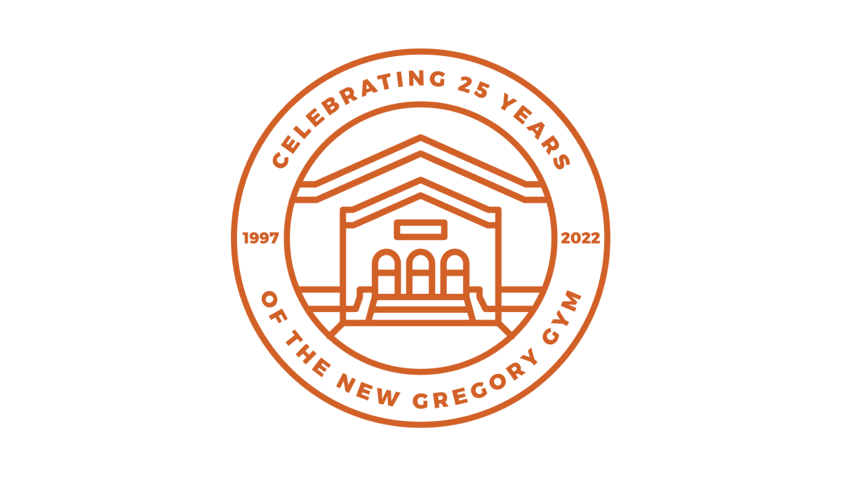
This beautifully simple line-art style logo combines a seal-style shape with two rings to hold the name of the organization and the anniversary details. In the center is a clean illustration of the front side of the building. Together, the design is not only a beautiful blend of a recognizable element of the brand with a unique design that elegently marks the anniversary.
More Details →Meadow Mill 25th Anniversary Logo
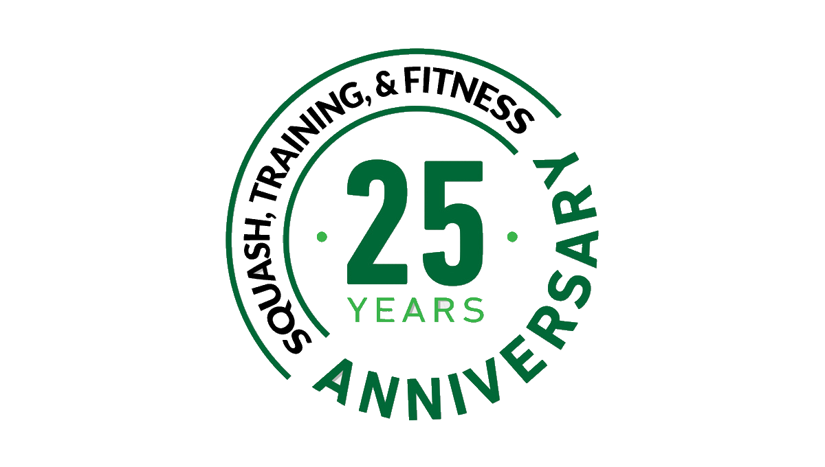
While many logos are meant to stand alone and represent the company as a whole, this design was simply meant to be paired with the traditional logo, website, or other assets. Around the left side of the circle is a list of the reasons people love this fitness center while the center holds the number 25 and the other side of the circle is ringed with the word anniversary.
More Details →IDEA Health & Fitness Association 40th Anniversary Logo
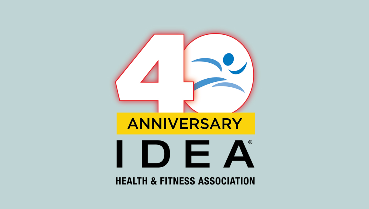
A large, block number 40 anchors this anniversary logo design. Both are outlined in red but the zero holds the blue mark that's traditionally used for this fitness organization's brand. Below is a yellow rectangle with a black word "anniversary" with the name of the organization sitting below to create balanced shaped that fits well in a square or circle avatar.
More Details →Brown's Gym 30th Anniversary Logo
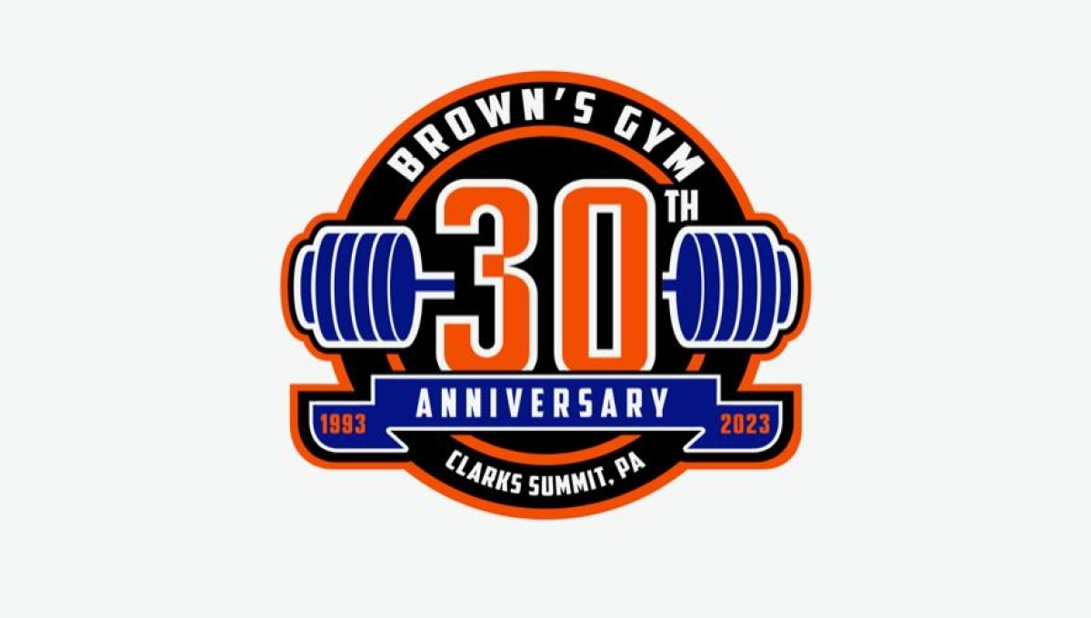
Using a classic sports logo style of a round circle with a ribbon across the lwer section, this logo places a large number 30 in the center with a clever barbell placed behind to tie back to the original brand and industry. Along the top sits the gym's name with the city and state in which the gym is located spelled out across the bottom to complete the logo.
More Details →