Creative Anniversary Logos
Blue Jays 50th Anniversary Logo
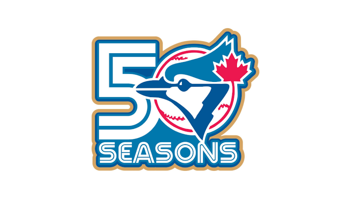
This anniversary logo has a bold and energetic design with a clean, sports-inspired style. The milestone number is the main focus, while a familiar team graphic is blended into the layout to create a unified and recognizable look. A limited color palette with a subtle accent color helps the design stand out without feeling overly busy. Overall, the logo presents the anniversary in a simple, memorable way that reflects tradition, pride, and a long history.
More Details →Fusion Bangor 20th Anniversary Logo
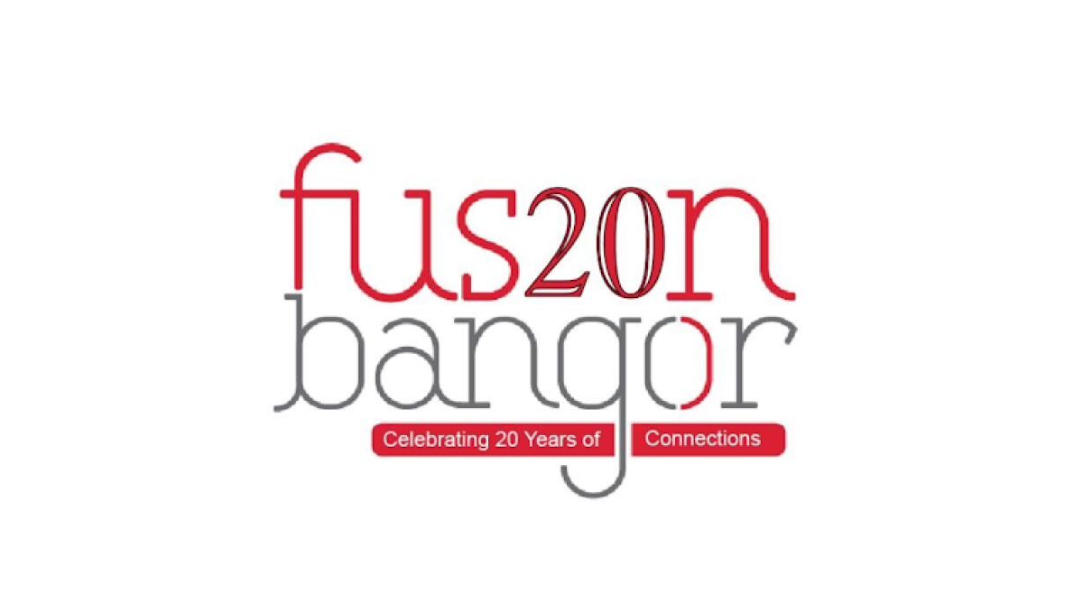
This anniversary logo has a modern and minimal style with a light, open layout. Thin lettering and a simple color palette create a clean, contemporary look, while the anniversary number is blended into the main name to make the milestone stand out without overpowering the design. Small colored bars below contain a short celebratory message, adding balance and visual interest. Overall, the logo feels fresh, approachable, and designed to highlight a lasting connection.
More Details →Peninsula Hot Springs 20th Anniversary Logo

The anniversary logo has a clean, simple look with a modern feel. It uses soft colors and smooth shapes that give it a calm and celebratory vibe. A large number stands off to the side, marking an important milestone, while the surrounding elements show the company's name. There’s a gentle blend of old and new in the design, with just enough detail to feel meaningful without being too busy. It feels thoughtful, yet light.
More Details →Smokey Bear 80th Anniversary Logo

This anniversary logo has a warm and friendly feel, with a playful yet respectful tone. It features a familiar face at the center, reminding viewers of a long-standing message. The number 80 is clearly shown, along with simple text to mark the milestone. The colors and style give it a classic, outdoorsy look, fitting for the subject. Overall, the design feels both nostalgic and celebratory, honoring many years of a well-known figure and what they stand for.
More Details →Winnepeg 150th Anniversary Logo

The Winnipeg 150th Anniversary logo is a rich tapestry of symbolism reflecting the city's heritage and Indigenous roots. At its core, the design features the outline of a turtle shell, representing Turtle Island, overlaid with the current footprint of Winnipeg. Elements such as the North Star, the Red and Assiniboine rivers forming the profile of Mother Earth, a crocus (part of the city crest), and sage and tobacco crops are intricately woven into the logo. This emblem encapsulates Winnipeg's journey, celebrating its shared stories and future aspirations.
More Details →The Doors 60th Anniversary Logo

The Doors already has a simple but extremel recognizable logo. So instead of overdesigning some new mark coming from a different direction, they took that original mark, put the silhouettes of the band members poking up from behind, and places a simple ribbon across the middle part of the design to hold an anniversary label. Simple, smart, and effective.
More Details →Boudin Bakery 175th Anniversary Logo

I love this logo because it's a reminder that a logo should work for your needs, not just fit the criteria of what everyone else has done. In this case, their logo combines local landmarks and colors into a banner-style graphic that ties the year, the history, and the original mark into a design that would be easy to place on banners outside the bakery and labels, print materials, and labels inside.
More Details →Bousfields 50th Anniversary Logo

The original logo for this brand features a matching circle in the upper left area as you see in the bottom right. By keeping the bottom right circle as a zero and adapting the top left into a number 5, the difference was both easy to spot but neatly subtle. They get to keep building brand recognition by using something close to their usual logo but also highlight their milestone.
More Details →Bahamas Development Bank 50th Anniversary Logo

It can be tricky to design an anniversary logo when your original logo has so much color, but the designers for this bank did a great job of both choosing a gold that would compliment that palette but also using similar depth, shading, and styles of that original mark to make the combination of the two match really nicely. Set alongside their traditional word mark, this design adds a lot of visual weight to the original but does so with purpose and balance.
More Details →Warren Miller 75th Anniversary Logo

When you make ski movies and are also celebrating an anniversary, why not merge the concept of cover art with the classic anniversary logo angle with art that includes a skier image behind but a large number 75 in front that bleeds into the edges. The original word mark sits inside the square to add a little balance a reminder about which company this design is tied to.
More Details →Lexington Kentucky 250th Anniversary Logo
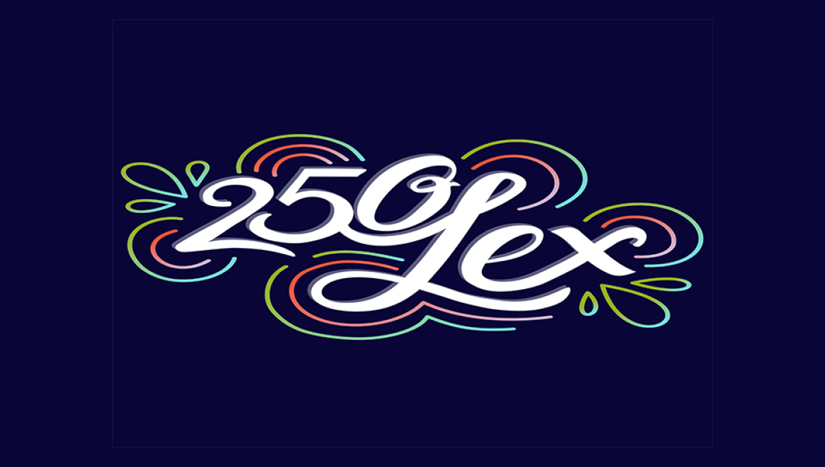
This design is fairly unique among anniversary logos. It features a scripted number 250 nestled up against the word Lex in white centered on the designs. Around the design are concentric rings in the city's colors that also feature leaf-like shapes on either end. The design is clean, unique, but also puts the name and year front and center for easy recognition.
More Details →Columbia Pictures 100th Anniversary Logo
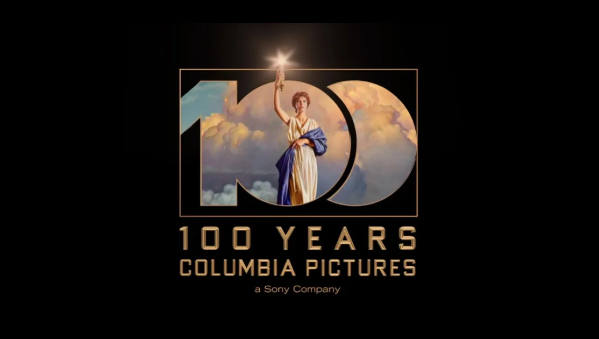
Columbia Pictures' opening sequence has been seen dozens of times by millions of moviegoers. So when they wanted to create a recognizable but simple anniversary logo, they simply overlaid a large, block 100 on this classic imagery. The result is clean, easy to understand, and an instantly, clean connection back to their original brand.
More Details →Millennium Park 20th Anniversary Logo
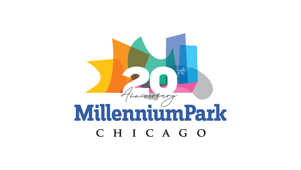
Millennium Park is recognizable for a number of unique architectural features and this logo uses semi-transparent colors to layer these iconic shapes into a single graphic. A number 20 sits above this colorful design with the name of the park sitting below to create balance and base for the rest of the design to sit above.
More Details →New York Giants 100th Anniversary Logo
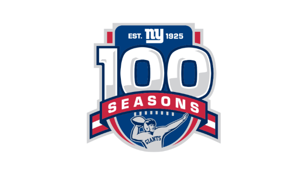
Anchored visually with a large number 100 inside a classic sports-style crest, this logo uses more classic sports vibes to created a logo that has depth and a cohesive design. At the top of the 100 sits the team's original logo, below sits a ribbon holding the word seasons, and a football icon at the bottom completes this logo.
More Details →Pro Source Fitness 20th Anniversary Logo
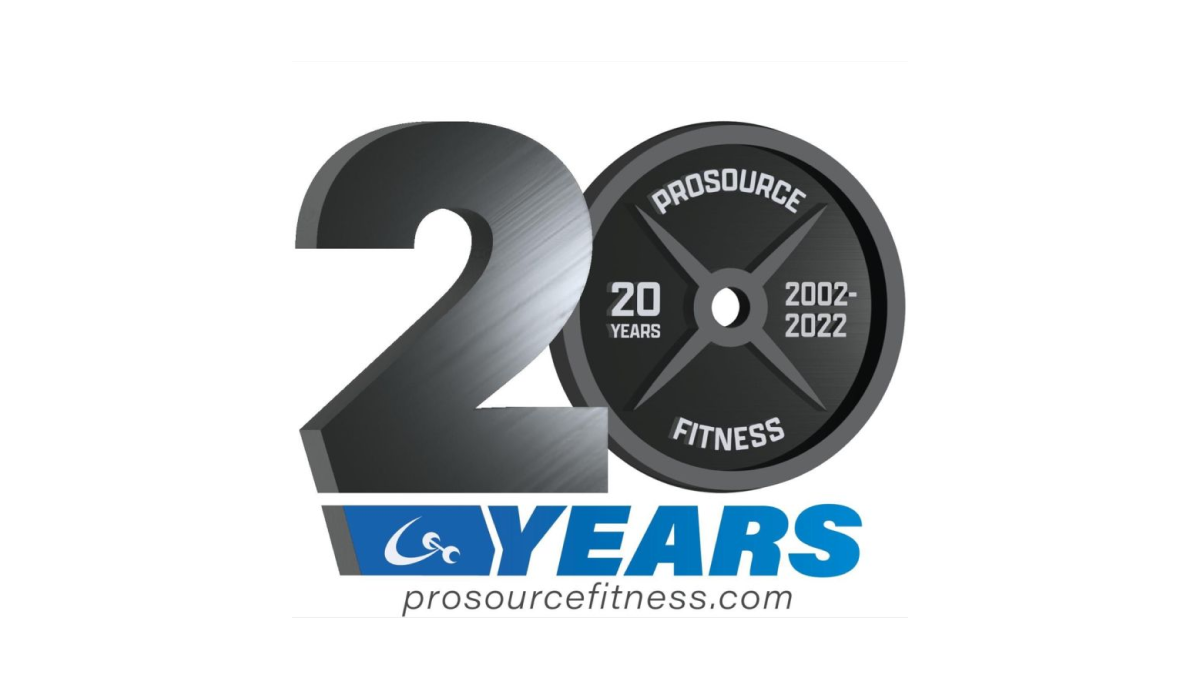
When you run a gym and you're celebrating an anniversary with a new logo, why not use a part of that gym that is both ubiquitous but also shaped like a zero? By using a plate as one digit and adding some metalic sheen to the number 2, this gym create a clever, on-brand mark. Below sits the name of the gym in the brand's primary blue colors.
More Details →Blue Moon Brewing Company 20th Anniversary Logo
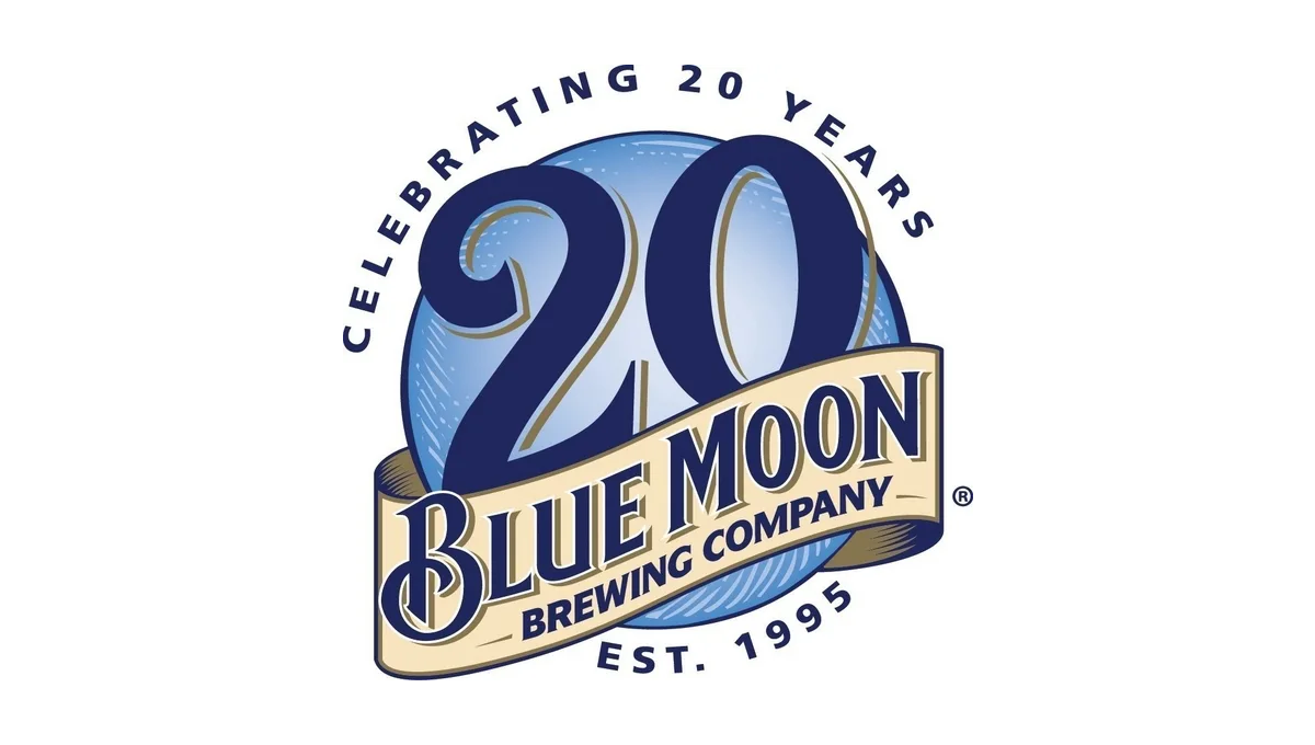
Blue Moon's famous blue circle and ribbon had all the elements the designers needed to adapt for an anniversary logo. By moving the ribbon down to expose more of the blue circle and placing a darker number 20 in the area left behind, this logo is easy to recognize but also being unique. Simple lettering above and below helped clarify the reason for celebration and round out this design.
More Details →Goldenwest Credit Union 85th Anniversary Logo
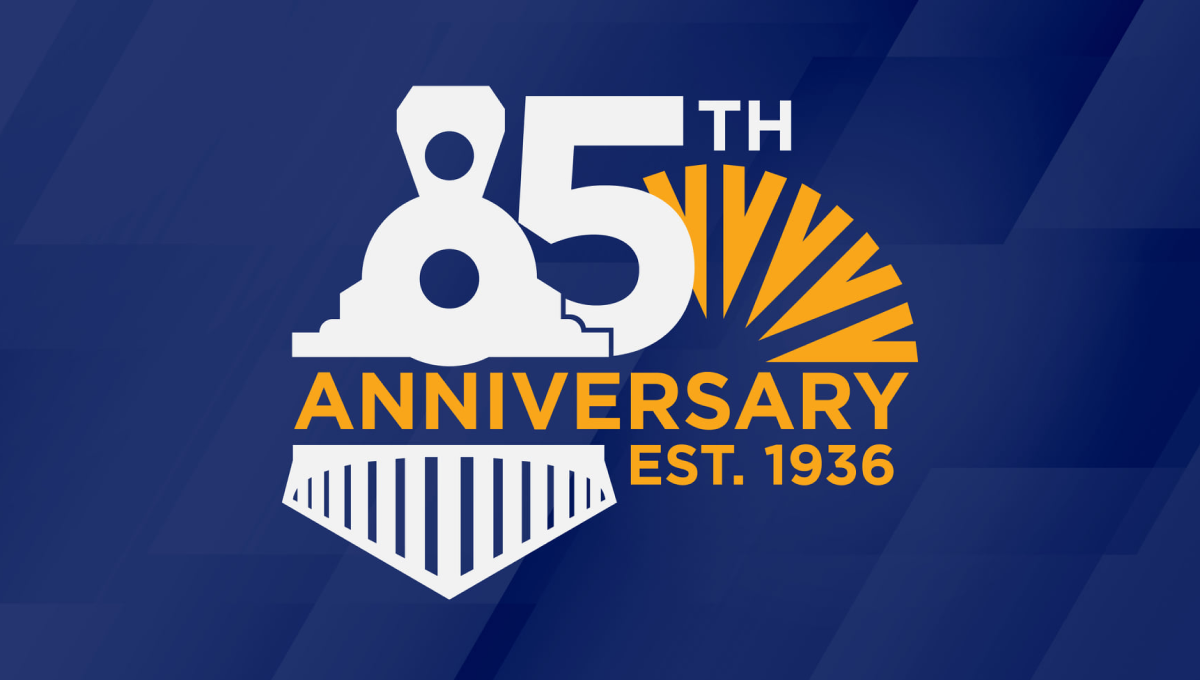
Goldenwest was originally founded as the Ogden Railway and Depot Company Employees Federal Credit Union, so on their 85th anniversary they tipped their hats to their rail-related roots by turning the number 8 into an illustration of a train engine. With their traditional mark peeking out from the side and the word anniversary across the middle, the design was a fun recognition of how far they've come.
More Details →Lincoln Memorial 100th Anniversary Logo
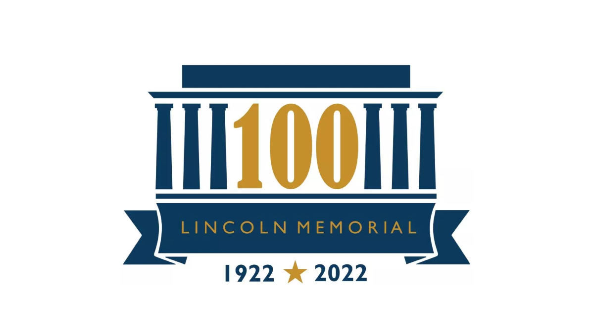
As one of the most recognizable monuments in the country, this logo leaned into this famous design for their anniversary logo. By replacing three of the pillars with a large, elongated number 100, the designers created a clean layout but also one that one easy to recognize even without the ribbon and dates along the bottom clarifying what is being celebrated and the years of operation.
More Details →Tolsa 65th Anniversary Logo
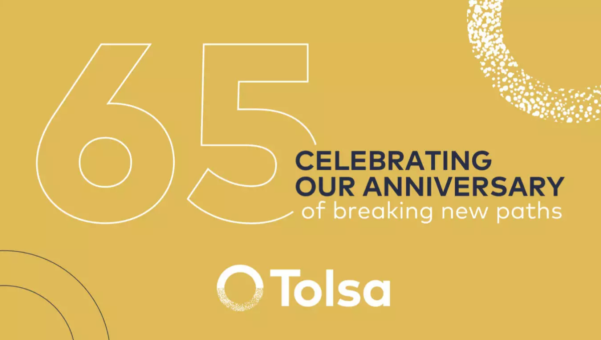
Sometimes what you need isn't a logo as much as a graphic. So while this graphic may no fit the traditional rules of a logo, it does serve its purpose really well. With a background in the brand's gold color, the logo at the bottom, an enlarged mark in the top right, and the number and reason for celebration in the middle, this graphic worked well on thier website as a content block and on social media.
More Details →Truly Nolen 85th Anniversary Logo
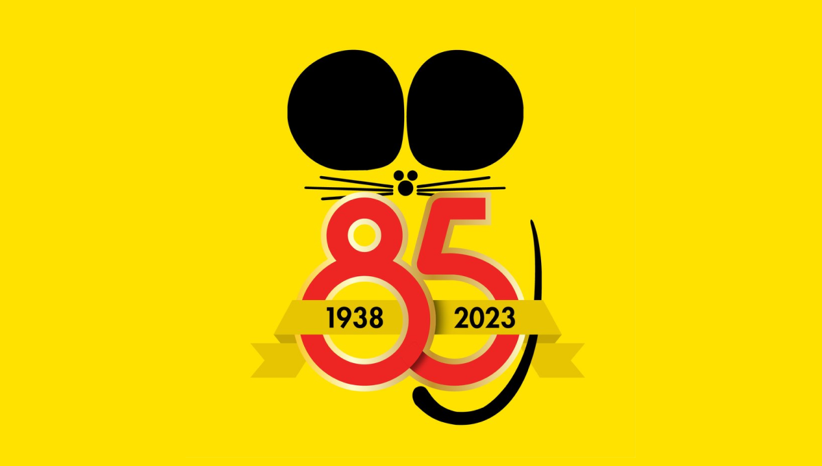
Famous for the black ears that are seen throughout their branding and products, Truly Nolen used the same concept as the starting point for their anniversary logo. A large block number 85 below the ears specified the year, a ribbon held the years of operation, and a thin, black tail made this mark easily recognizable.
More Details →