Government Anniversary Logos
America 250 250th Anniversary Logo

You could take an anniversary logo for an idea as large as the United States in many directions, but the America 250 folks kept it simple and clean. A capitalized word in black sits above a number 250 made ot of a single, continuous red, white, and blue ribben with just a bit of rounding extension above and below the top and bottom of the normal number sizing. The result is really clean, balanced, and effective.
More Details →National Parks Service + America 250 250th Anniversary Logo

With the 250th anniversary of the United States coming up, the America 250 organization is not only doing their own anniversary logos for the country as a whole but also the groups that make up key parts of the American brand. The National Parks Service is one of those and this clean logo featuring a large 250 behind the Statue of Liberty and the word America is a clean, retro image seen on many NPS marketing assets.
More Details →Council Of Europe 75th Anniversary Logo

Using the same shape, color, and words of their original logo, this anniversary variation replaces the mark - a stylized letter C surrounded by yellow stars - with a large number 75 surrounded by fewer stars but in the same yellow hue. By using the exact same shape this mark would have been incredibly easy to swap out with their traditional logo both during and after the anniversary celebrations.
More Details →Lexington Kentucky 250th Anniversary Logo
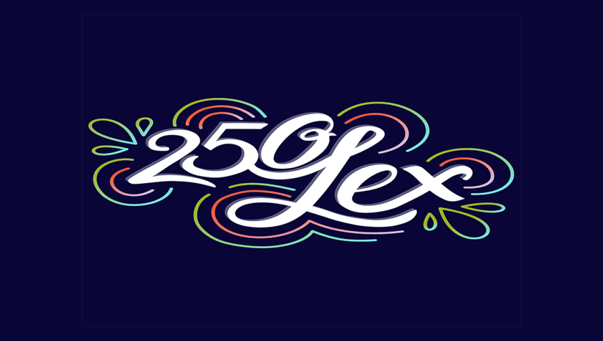
This design is fairly unique among anniversary logos. It features a scripted number 250 nestled up against the word Lex in white centered on the designs. Around the design are concentric rings in the city's colors that also feature leaf-like shapes on either end. The design is clean, unique, but also puts the name and year front and center for easy recognition.
More Details →Millennium Park 20th Anniversary Logo
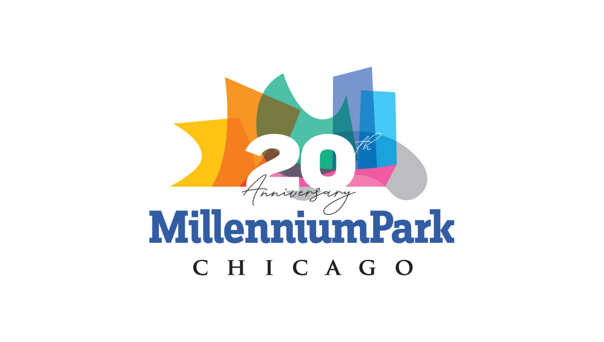
Millennium Park is recognizable for a number of unique architectural features and this logo uses semi-transparent colors to layer these iconic shapes into a single graphic. A number 20 sits above this colorful design with the name of the park sitting below to create balance and base for the rest of the design to sit above.
More Details →Kentucky State Parks 100th Anniversary Logo
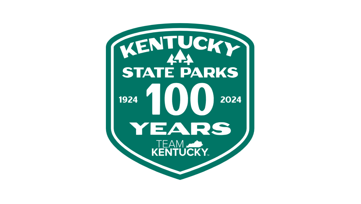
Using the classic parks-style badge, old-school fonts common on vintage posters, and a large number 100 to anchor the design, this badge-style logo combines a lot of elements - the name of the organization, the years, the state, etc. - into a conhesive design that is easy to picture being something that would have existed 100 years ago when Kentucky State Parks was organized.
More Details →Lincoln Memorial 100th Anniversary Logo
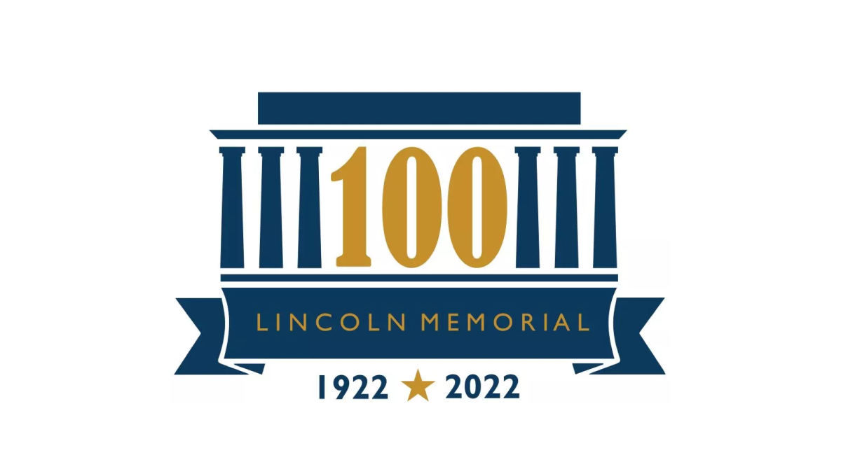
As one of the most recognizable monuments in the country, this logo leaned into this famous design for their anniversary logo. By replacing three of the pillars with a large, elongated number 100, the designers created a clean layout but also one that one easy to recognize even without the ribbon and dates along the bottom clarifying what is being celebrated and the years of operation.
More Details →Samoa Independence 60th Anniversary Logo
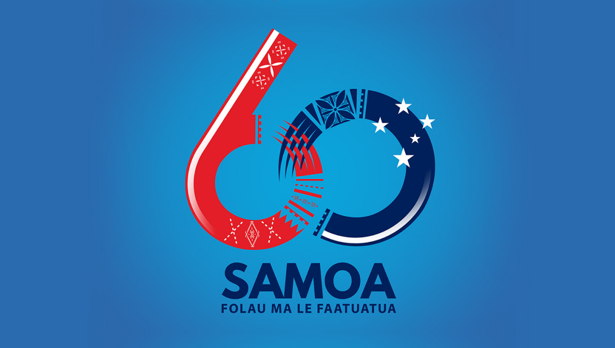
Designed for a light blue background, this logo starts with a large nuumber 60 with the ring of the six and the left side of the zero elegantly overlapping using patterns and shapes tied to the Samoan culture. At the bottom sits the name of the country with a series of starts just above and to the right of the zero to create balance and add extra meaning.
More Details →USA-Mali Diplomatic Relations 60th Anniversary Logo
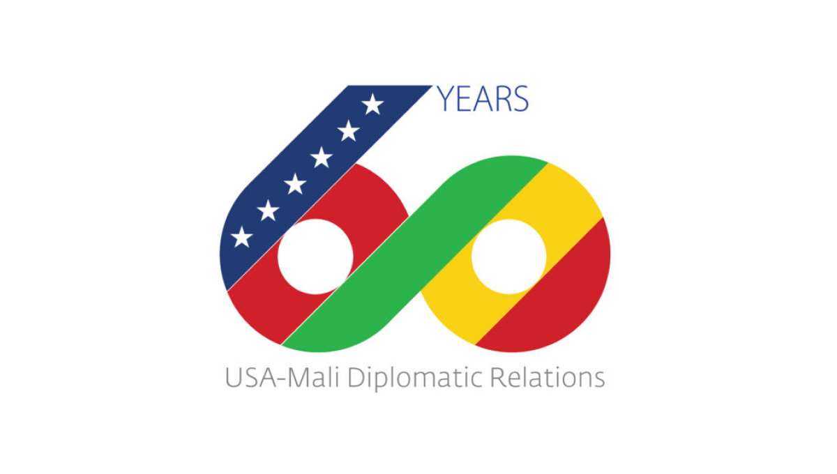
Starting with a large number 60, this logo uses diagonal stripes in the colors of both contries with a thick, green stripe creating a bridge between the two numbers and color palettes. On the upper left diagonal a line of stars is placed to represent the USA, to the right the word years sits, and below this number is a simple description of the occasion in a light, thin typeface.
More Details →