Zions Bank 150th Anniversary Logo
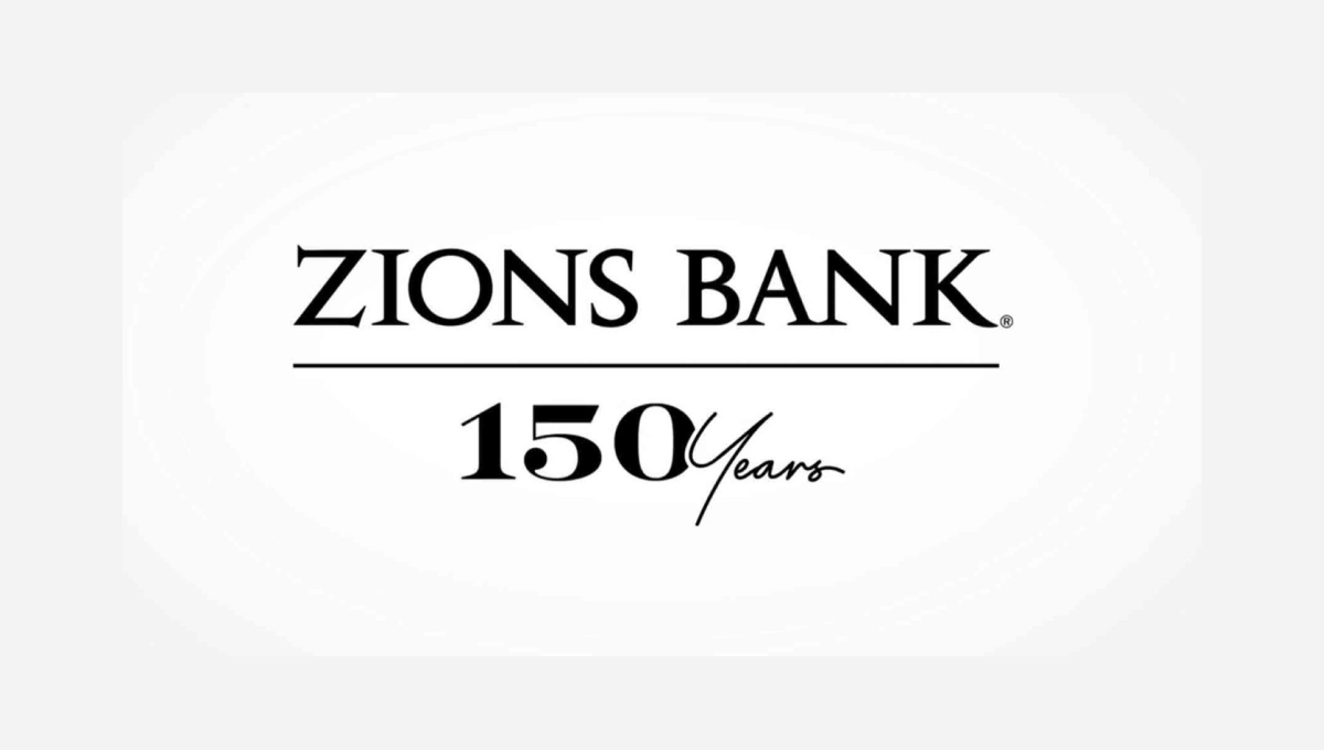
The traditional brand for this bank features the dark, serifed typeface you see at the top, so this logo build on that professional look. instead of placing a vertical line with the anniversary mark to the left or right, this logo places a horizontal line below the existing logo and then adds a simple number mark a similar font and color as the original logo. Given how wide their existing mark is, this was a great move to provide a little bit of balance and avoid further stretching the logo horizontally.