Corporate Anniversary Logos
Fusion Bangor 20th Anniversary Logo
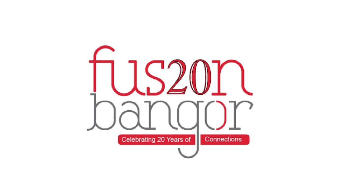
This anniversary logo has a modern and minimal style with a light, open layout. Thin lettering and a simple color palette create a clean, contemporary look, while the anniversary number is blended into the main name to make the milestone stand out without overpowering the design. Small colored bars below contain a short celebratory message, adding balance and visual interest. Overall, the logo feels fresh, approachable, and designed to highlight a lasting connection.
More Details →Cameron & Mittleman LLP 40th Anniversary Logo
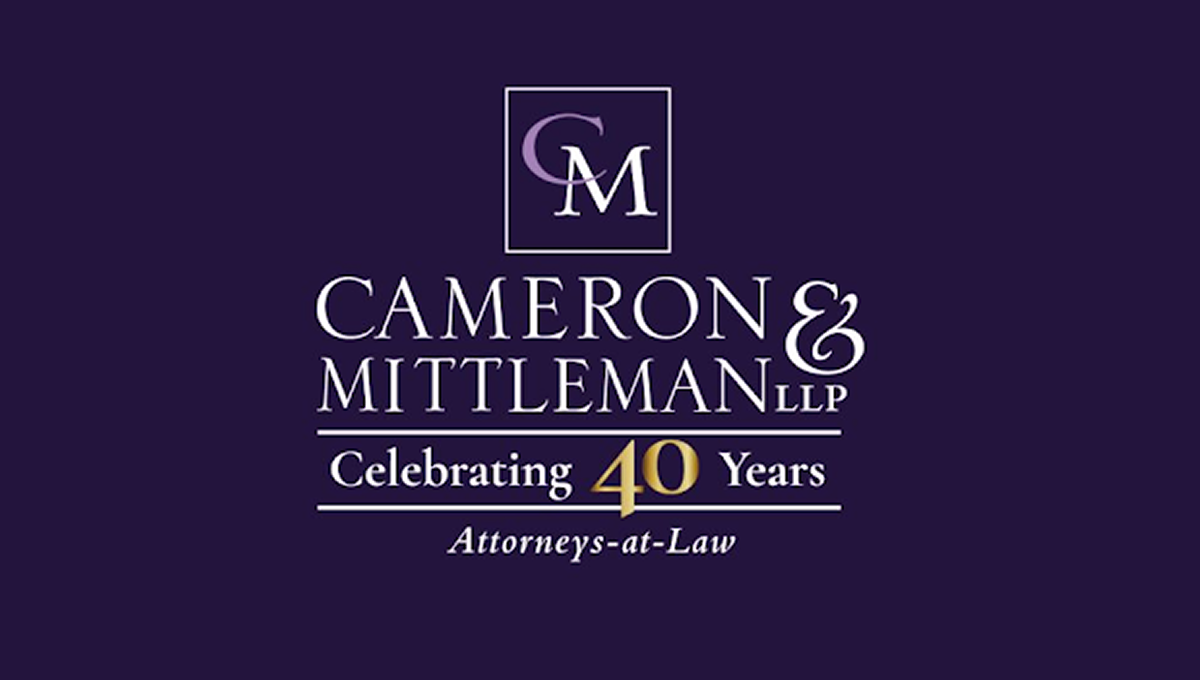
This anniversary logo has a clean, traditional look with a simple layout and a formal style. A dark background is paired with light-colored lettering, while a gold accent helps draw attention to the anniversary milestone. The company name is displayed in large, easy-to-read text, with a small monogram placed above it inside a thin border. A short celebratory message and a descriptive line below complete the design, giving it a professional and established appearance.
More Details →Scott & Company 30th Anniversary Logo
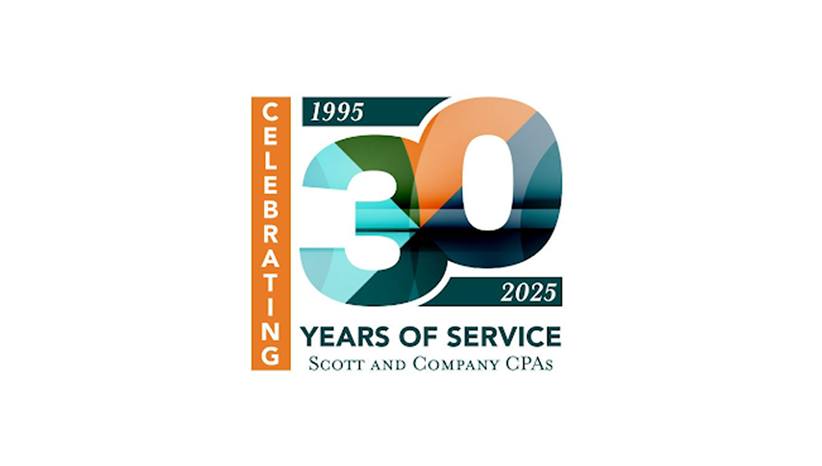
This anniversary logo features a bold “30” design with layered geometric shapes and soft gradient colors that create a modern and professional appearance. The mix of teal, orange, and dark blue tones gives the logo a balanced and polished feel. Simple date details and clean typography help highlight the milestone while keeping the design easy to read. Overall, the logo has a corporate yet celebratory style that feels contemporary, recognizable, and suitable for long-term brand recognition.
More Details →