Scott & Company 30th Anniversary Logo
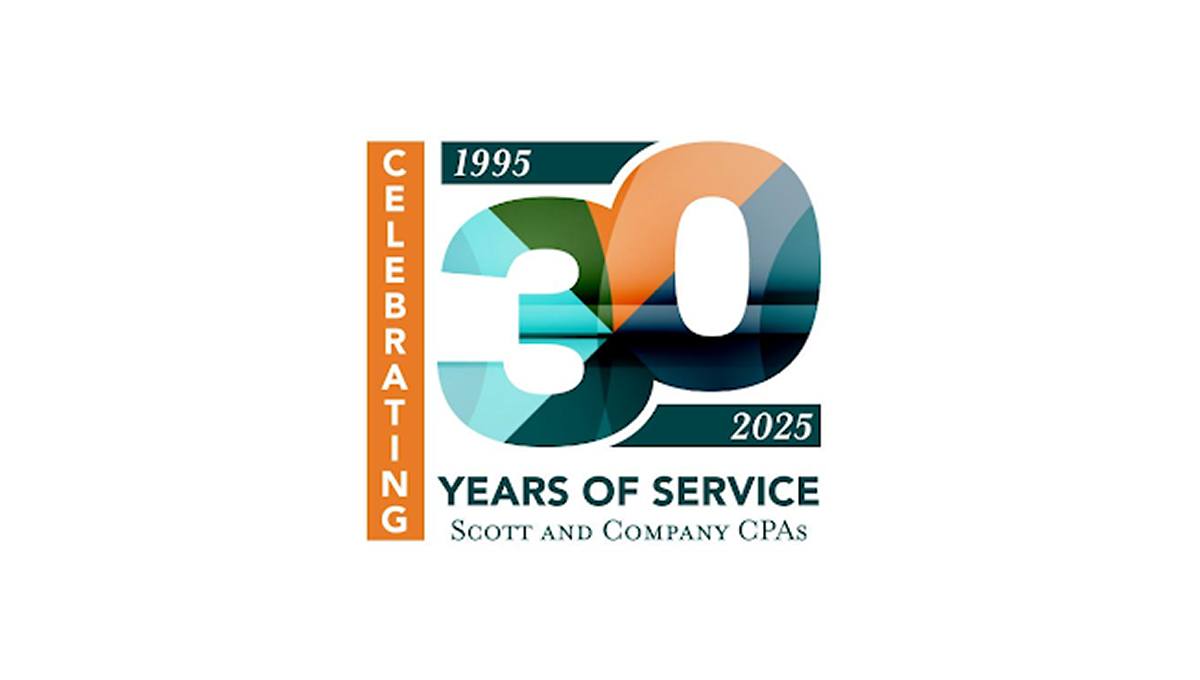
This anniversary logo features a bold “30” design with layered geometric shapes and soft gradient colors that create a modern and professional appearance. The mix of teal, orange, and dark blue tones gives the logo a balanced and polished feel. Simple date details and clean typography help highlight the milestone while keeping the design easy to read. Overall, the logo has a corporate yet celebratory style that feels contemporary, recognizable, and suitable for long-term brand recognition.