Cameron & Mittleman LLP 40th Anniversary Logo
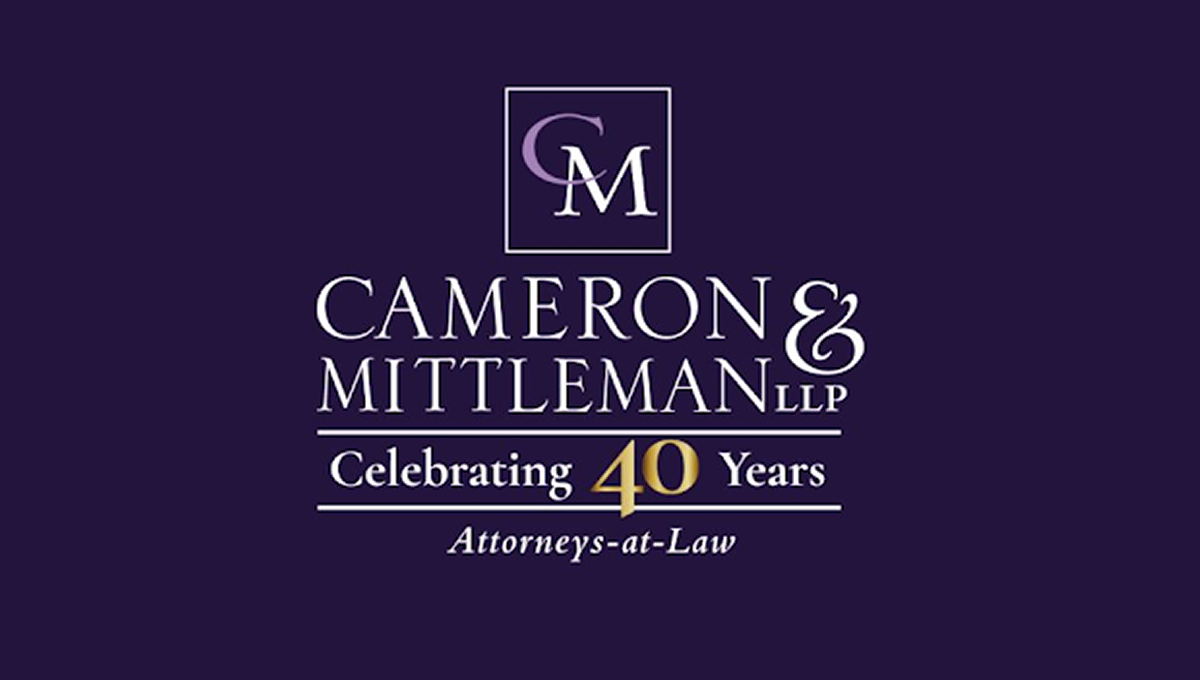
This anniversary logo has a clean, traditional look with a simple layout and a formal style. A dark background is paired with light-colored lettering, while a gold accent helps draw attention to the anniversary milestone. The company name is displayed in large, easy-to-read text, with a small monogram placed above it inside a thin border. A short celebratory message and a descriptive line below complete the design, giving it a professional and established appearance.
Source:
https://www.linkedin.com/posts/michael-lourie-a1124b1_clientspotlight-branddesign-40yearmilestone-activity-7419423671750131712-YL1M