Hampton Roads Moving and Storage 35th Anniversary Logo
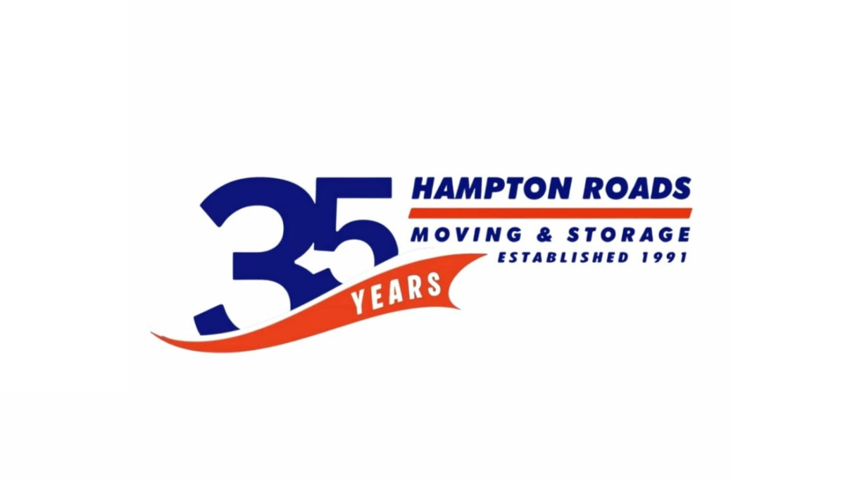
This anniversary logo uses a bold and simple layout with a large “35” as the main focus. The design combines dark blue and bright orange colors to create a strong but friendly look. Curved shapes and flowing lines give it a sense of movement and energy, while the text is clean and easy to read. Smaller details, like the establishment year and anniversary wording, help suggest experience and long-term service without making the design feel too busy or overly formal.