Kahuna 25th Anniversary Logo
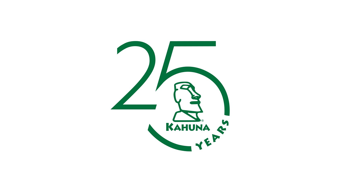
This anniversary logo has a clean and modern look with a simple green color theme. The large “25” design creates the main shape, while a curved circle element gives it a balanced and connected feel. In the center, there is a stylized island-inspired figure that adds character and brand identity without too much detail. The “Years” text follows the curve in a subtle way, helping the overall design feel smooth, professional, and celebratory while still staying minimal and easy to recognize.