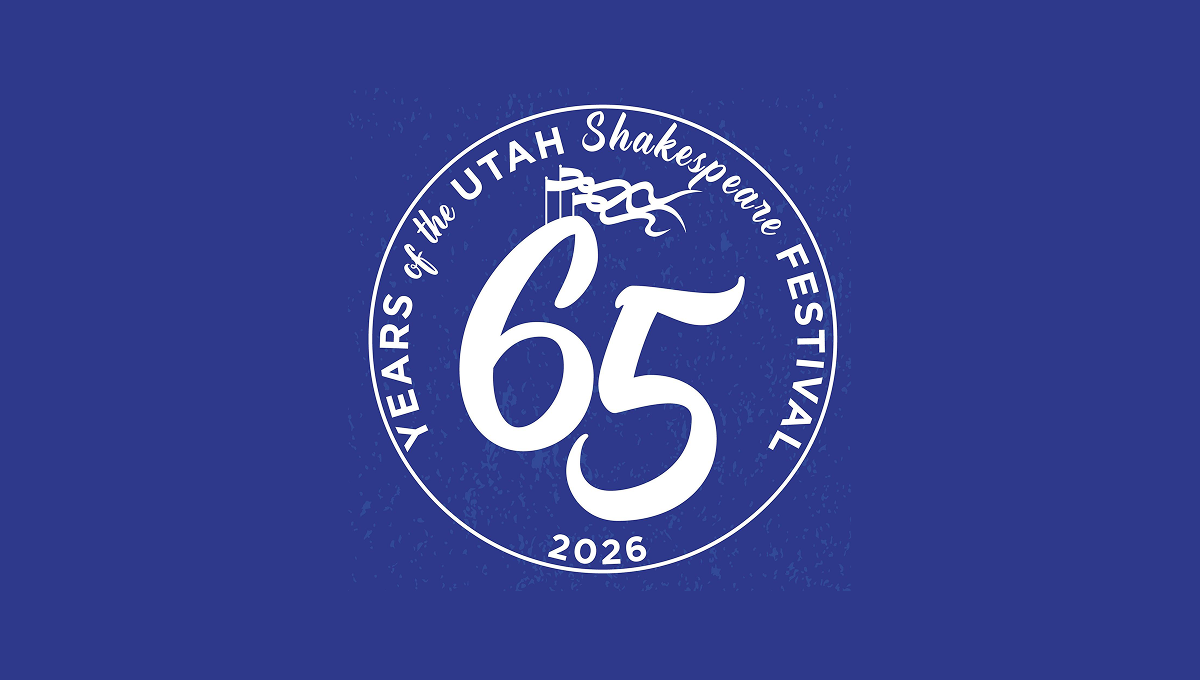
Utah Shakespeare Festival 65th Anniversary Logo
This anniversary logo has a bold, round design with a strong, classic feel. A large “65” sits in the center, standing out clearly and suggesting an important milestone. The words around the edge form a circular frame, giving the logo balance and unity. A small flag detail adds a subtle historical touch. The single color palette feels calm and timeless, while the slightly textured background gives it warmth and character. Overall, it feels celebratory, traditional, and respectful of history.
