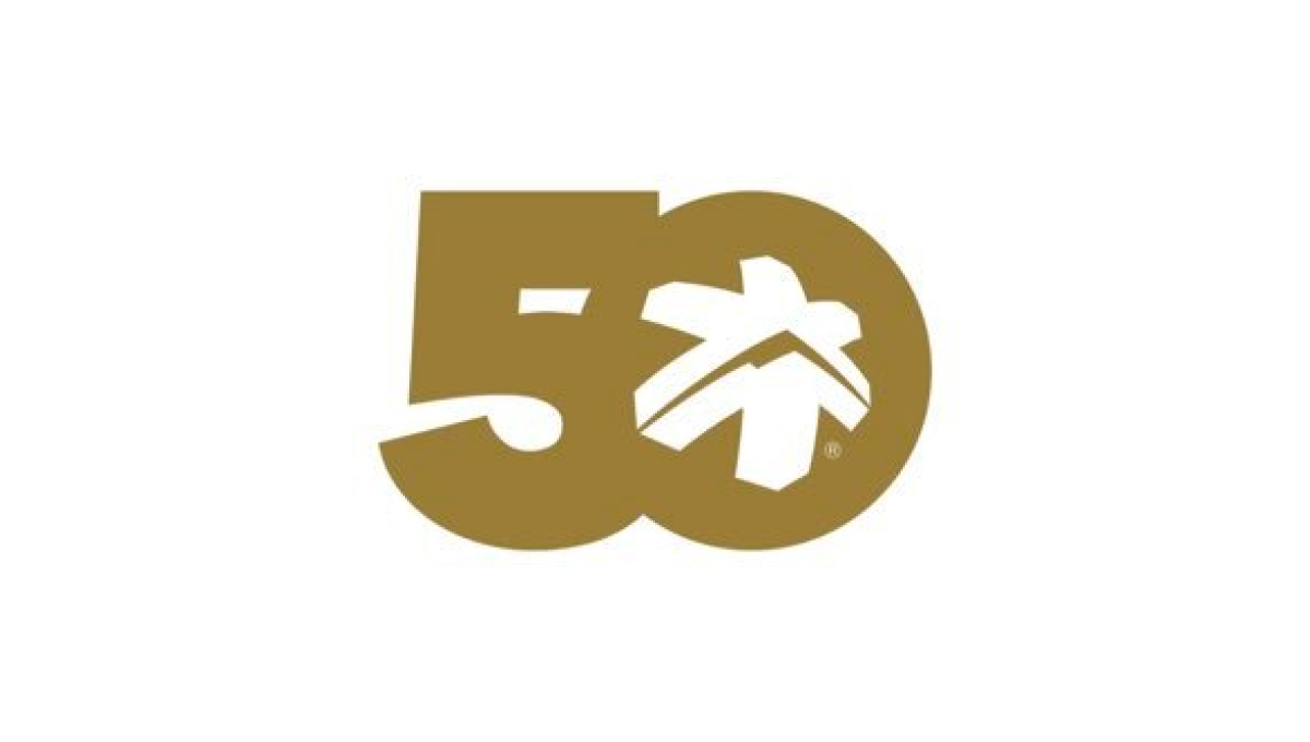
The Consumers Association of Singapore 50th Anniversary Logo
In this case, we don't have to guess what their design concept was. To quote from the case study (see "source" link for this logo) about this logo, "The logo integrates the anniversary tagline to highlight the theme of the anniversary — Past, Present and Future. The arrow is designed with a sense of motion to represent the passage of time. The logo concept incorporates the arrow into the shape of the number 50 to create a sense of motion — moving forward. While the arrow head denotes the future, the circular motion of the arrow reflects how the past can provide a strong foundation for CASE to strive towards greater excellence in the future."


