Buffalo Sabres 50th Anniversary Logo
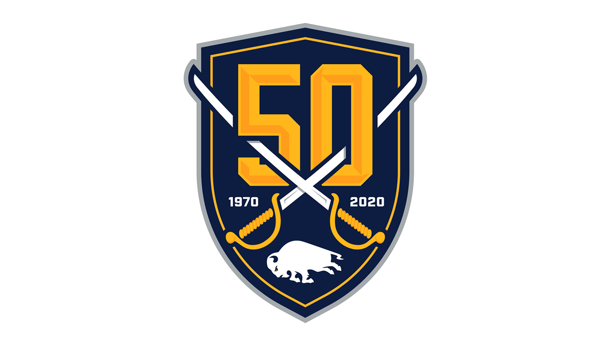
The logo features a large gold number 50 set against a dark navy shield with a thin gold border. Two crossed white hockey sticks stretch across the numbers, creating a strong sports theme. Curved gold details sit on either side, while the founding and anniversary years appear near the center. A white buffalo shape at the bottom adds another distinctive element. The bold colors and layered design give the logo a strong, traditional athletic appearance.
Source:
https://www.nhl.com/sabres/news/sabres-unveil-logos-for-50th-anniversary-season-307119256