Los Angeles Kings 60th Anniversary Logo
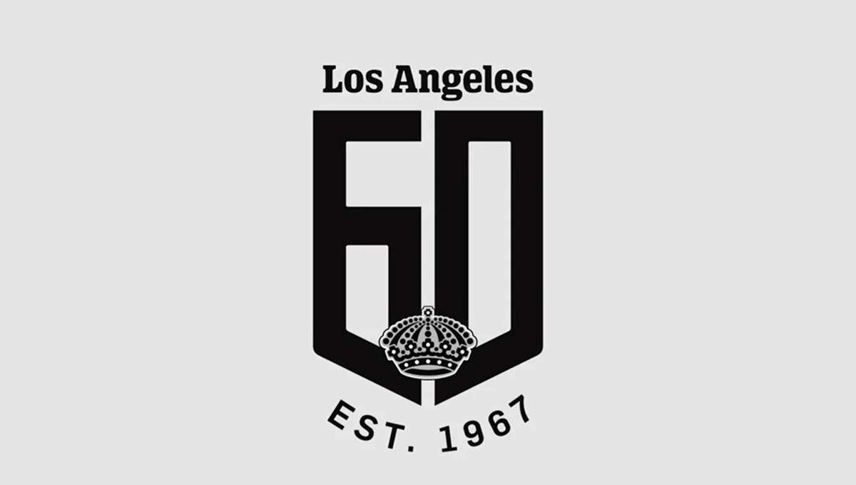
The logo features a large black number 60 with a bold, shield-like shape and a decorative crown placed near the center. The Los Angeles name sits above the main design, while the founding year is displayed below in curved lettering. A row of diamond shapes and small star details runs along the bottom, adding extra decoration. The simple black-and-white color scheme gives the design a clean, classic, and slightly elegant appearance.
Source:
https://www.nhl.com/news/topic/short-shifts/los-angeles-kings-unveil-60th-anniversary-logo